Add your feed to SetSticker.com! Promote your sites and attract more customers. It costs only 100 EUROS per YEAR.
Pleasant surprises on every page! Discover new articles, displayed randomly throughout the site. Interesting content, always a click away
A house into a home 28 Mar 2017, 3:23 pm
I recently joined in on an initiative with Casper, providing a few “move-in essential” tips for turning a new house into a cozy, home-y space. If you haven’t heard of Casper, they are a cutting edge mattress company providing affordable mattresses that are absurdly comfortable, and they also make moving easy since they simply arrive at your door in a box! They even offer sheets and pillows too for added coziness! We all know having a good night’s sleep is #1 in a new home, so it makes sense that they are trying to help people who are moving into a new home feel comfortable and happy! Even as I work on my own house – endlessly renovating and trying to furnish – I feel when I add my smaller, personal touches I actually start to capture that warm & fuzzy feeling you should get when you feel “home”.
Casper suggested tips #1-#3 and asked me to chime in for #4-#6:
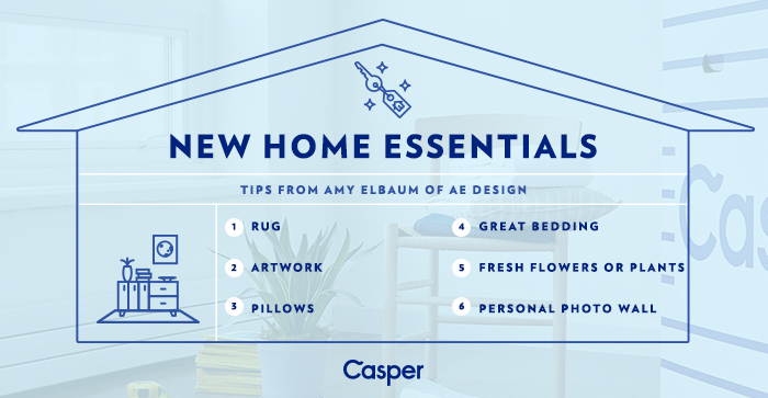
Let’s get into it!
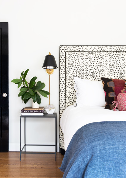
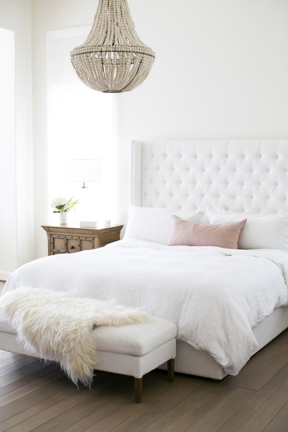
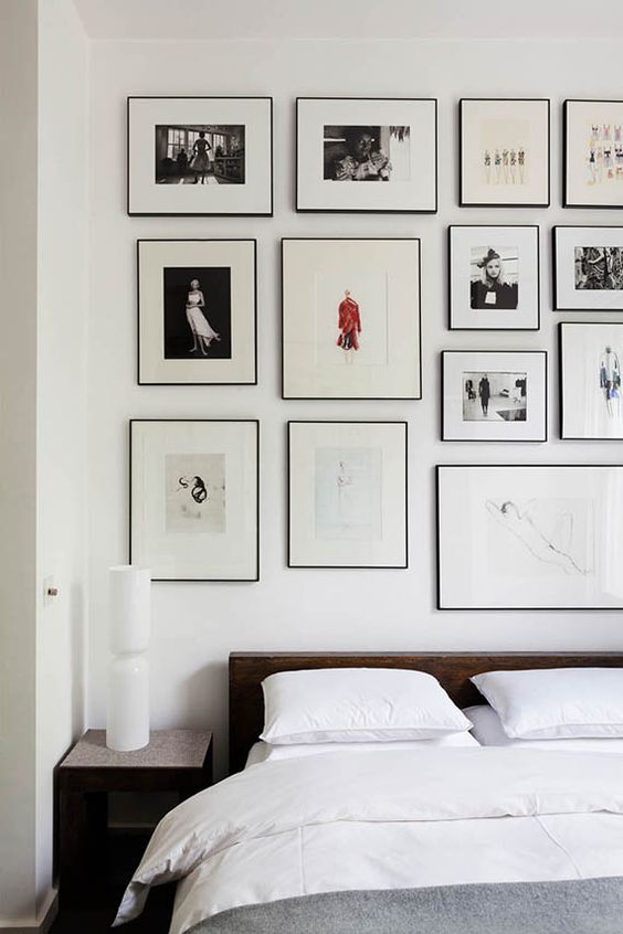
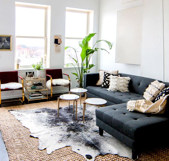
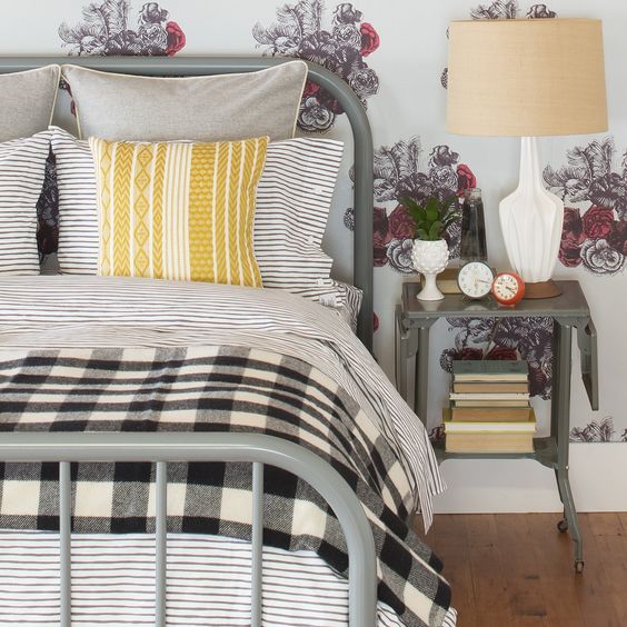
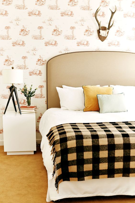
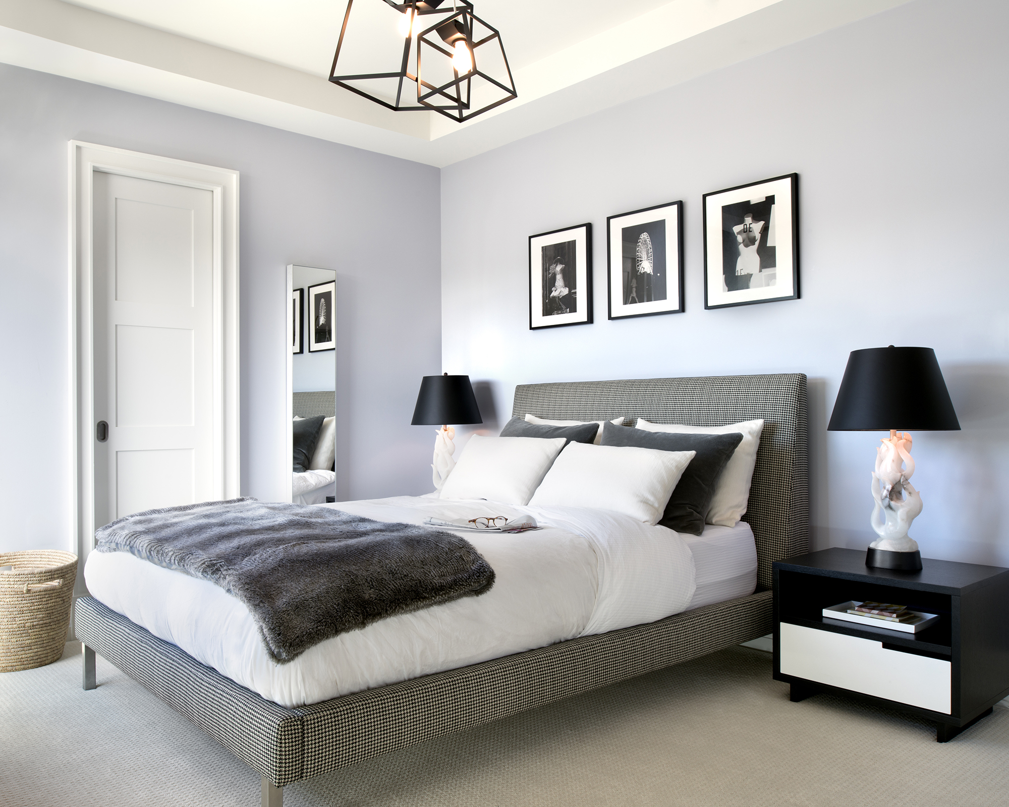
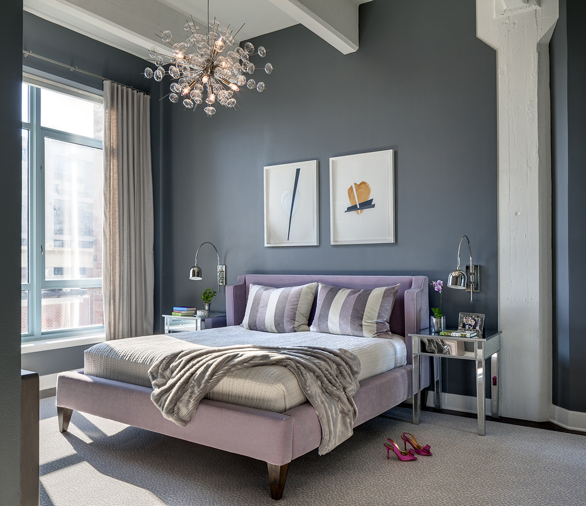
Great Bedding:
Is there seriously anything better than new, luxurious, super soft bedding to make you feel like you are HOME? Definitely not. But great bedding goes above and beyond thread count – your bedding can transform a room and should always be considered as a part of the larger design scheme. Check out how some of these bedrooms were totally rocked out by their bedding alone:
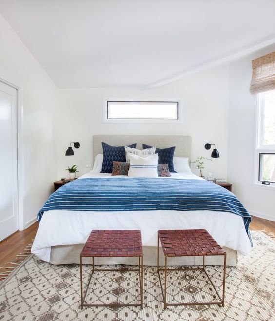
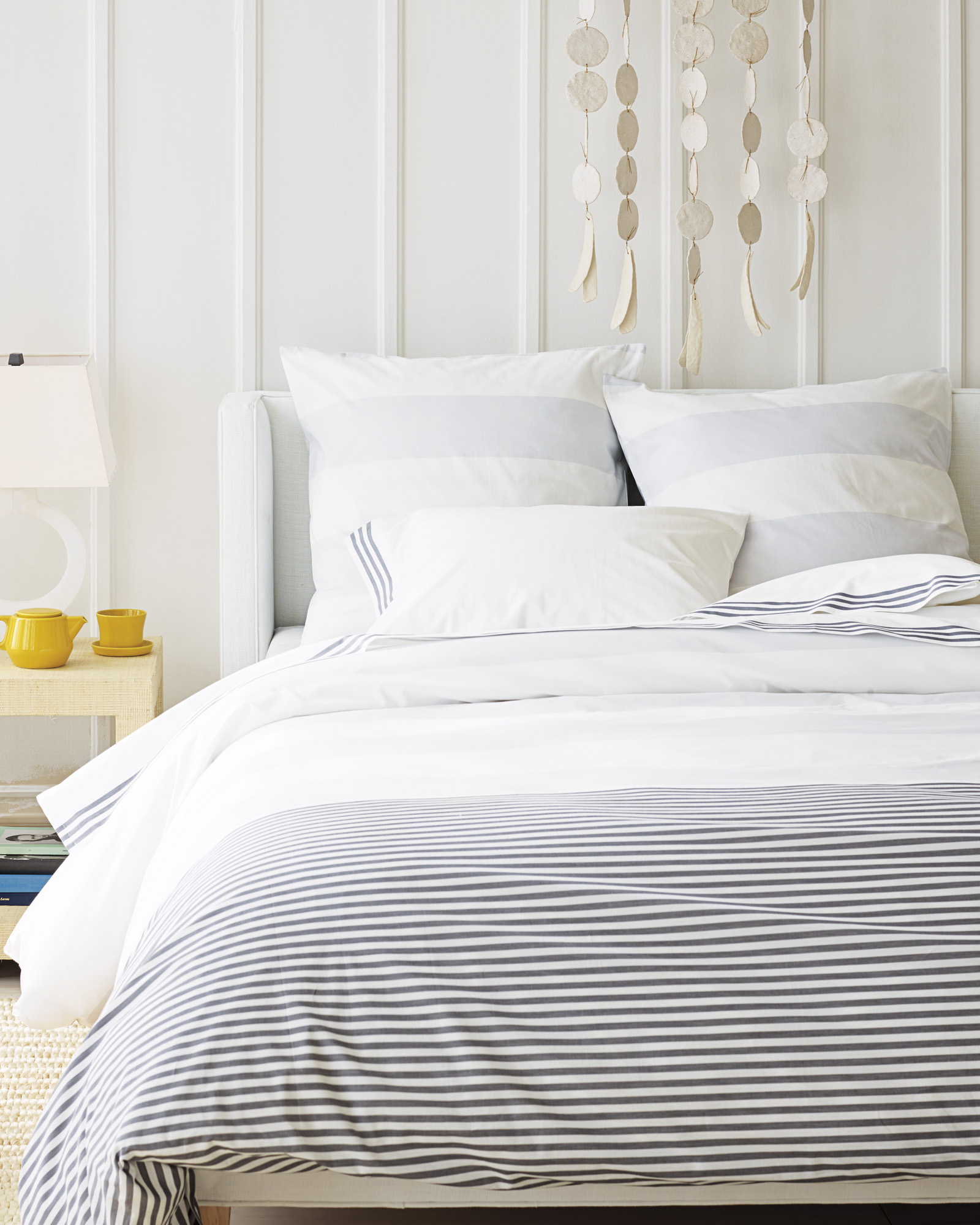
While I am a huge fan of the all white bedding situation, adding pops of colors and patterns through throws and pillows can turn any ordinary bedroom into a wow space.

Blush sheets? Genius. They give this super simple bed design a little something extra.
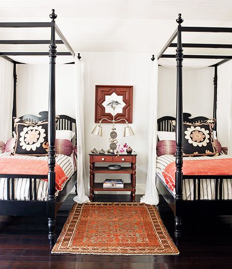
Tying in antique textiles can bring a bedroom to the next level. I love the boldness of the bedding on these twin beds in an otherwise quiet room.

This custom dyed green bedding makes a huge statement against the white walls yet feels so calm and serene. Love it!
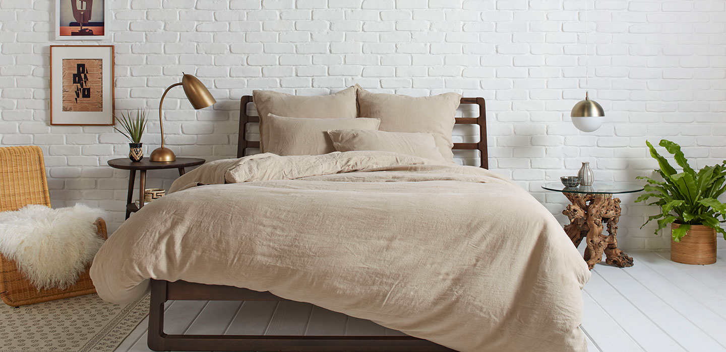
I have always dreamed of having an all white bed, and after years of yelling at my husband for eating in bed, obsessively cleaning my dog’s paws and our recent bout with Brady’s stomach bug, I am hanging up my hat and flat out giving up on that dream. Our bedroom is certainly not on the priority list in our house, but once I get to it I will definitely be considering new bedding options.
I recently got to attend the Parachute Hotel in Venice and see their new lines of bed linens and was totally wowed. I love their subdued colors and organic, natural vibe. They just came out with a tan color that seems to be speaking to me (please don’t tell me tan is as easy to get dirty as white UGH):
I am also a big QUILT person, as is my husband. We both tend to wake up super hot and sweaty when using a down comforter, so we use quilts year round. Love these patchy options from Parachute: 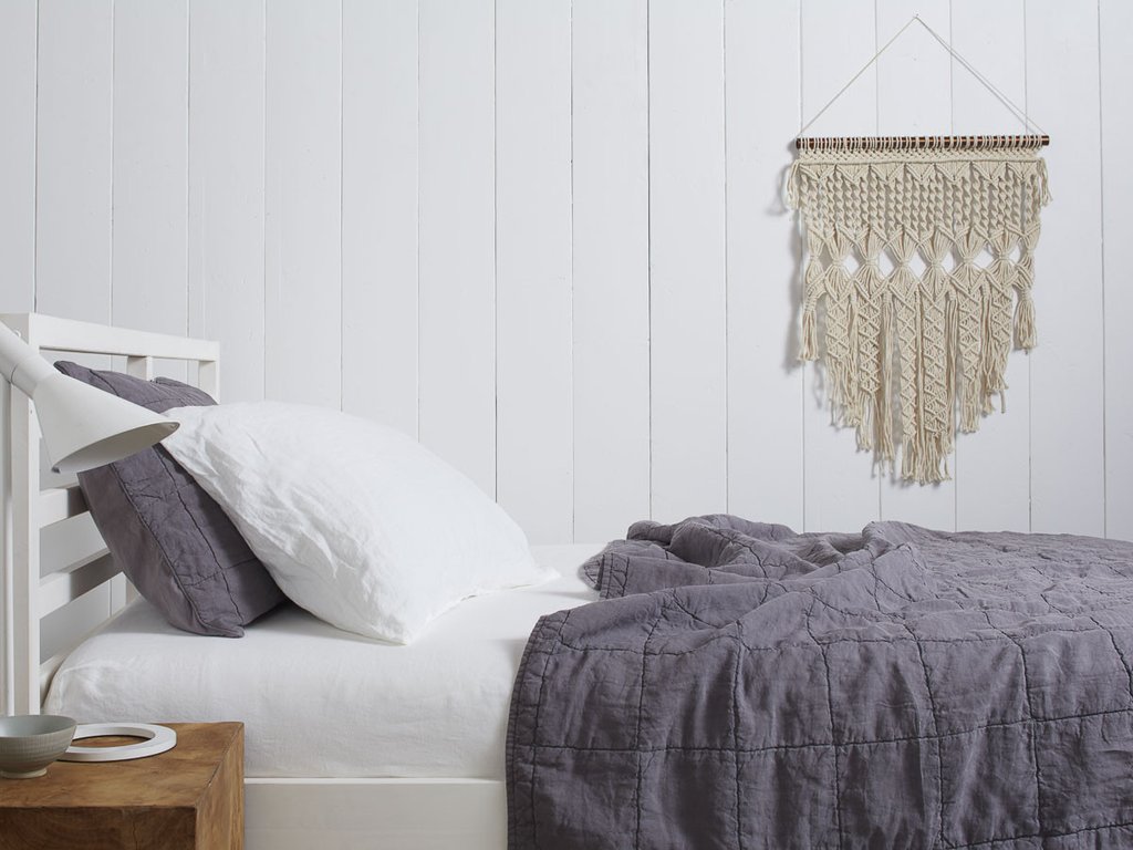
Now that looks like something that would take my family quite some time to destroy.
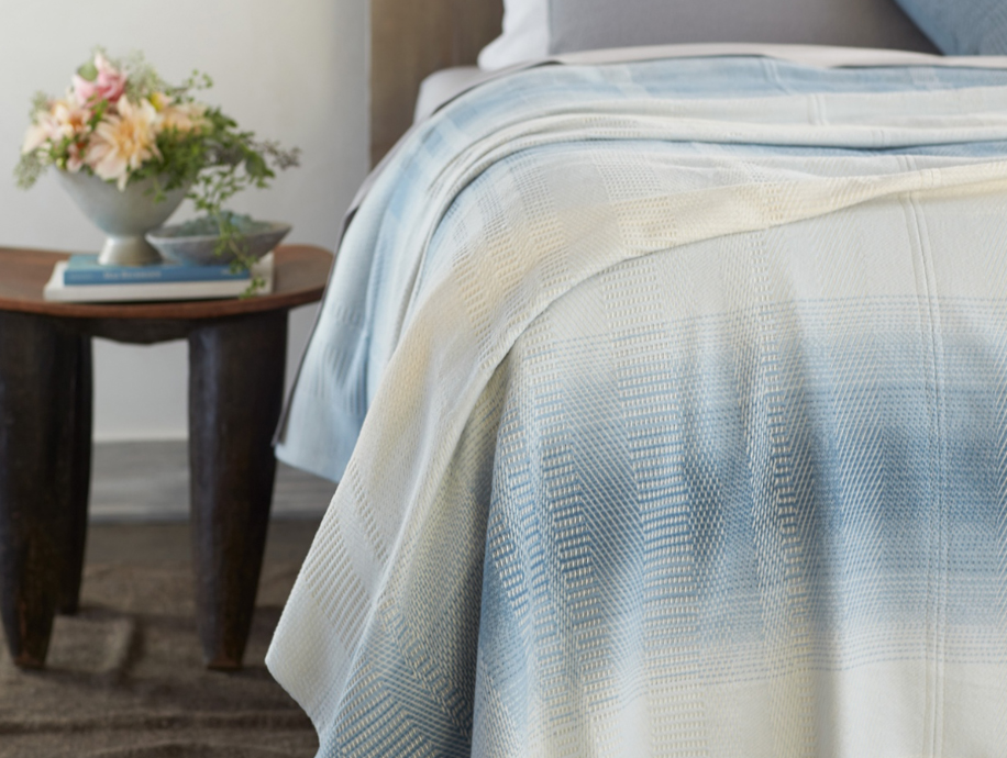
I was also recently introduced to Coyuchi home, which has amazing organic bedding and more. I love their Strata blanket as an accent piece over a neutral bed:
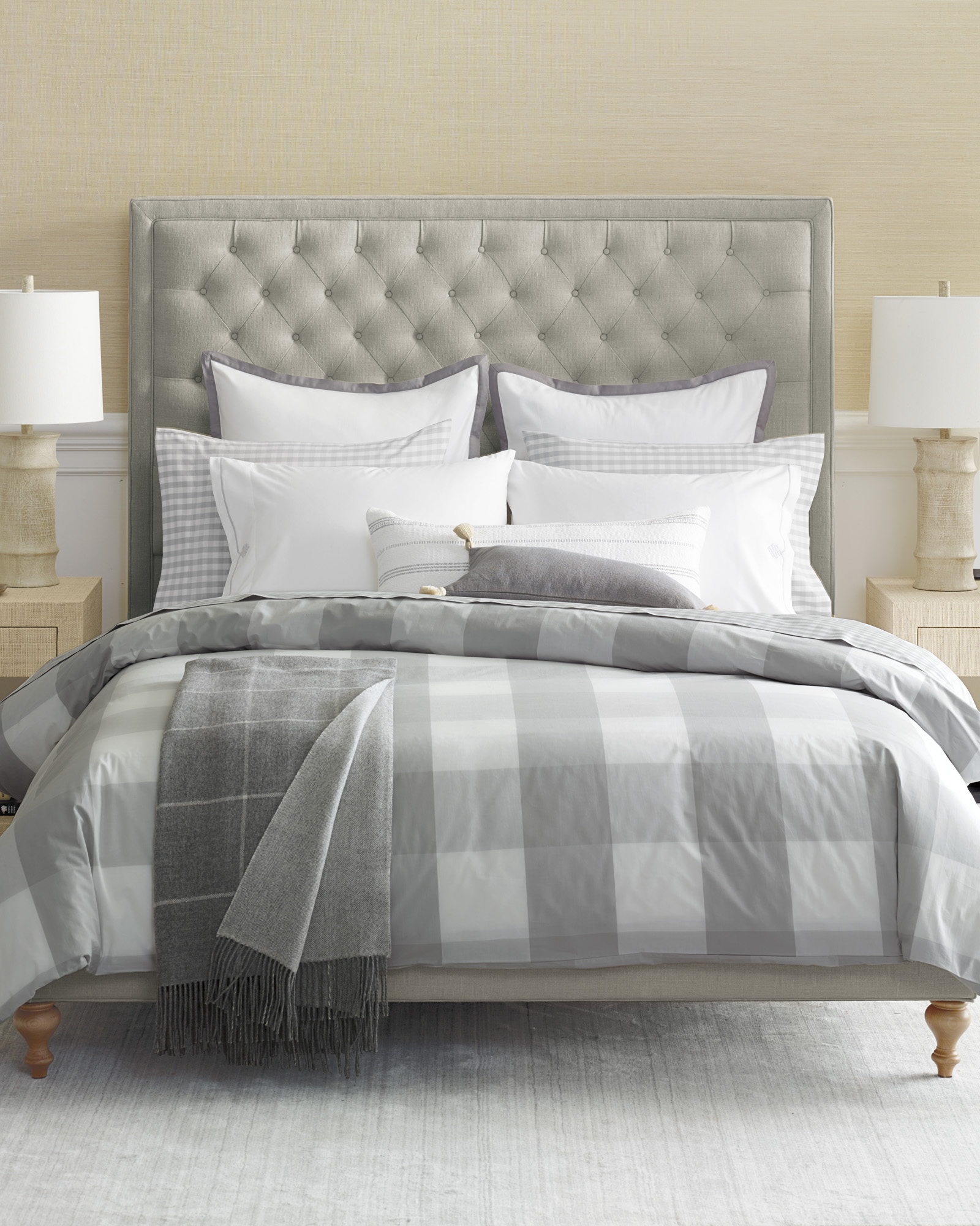
For something more whimsical, I have always loved Serena & Lily’s ever growing bedding collection. Here’s a few I have had my eye on lately:

Fresh Flowers or Plants
Fresh greenery will literally add life to your space. From a small arrangement on a bedside table to a fun statement tablescape in the dining room, flowers and plants definitely add to a cozy, lived-in home.

I have about the exact opposite of a green thumb, but can give you some pointers on easy things to keep alive (and why I am so excited to be seeing faux plants on the rise!).
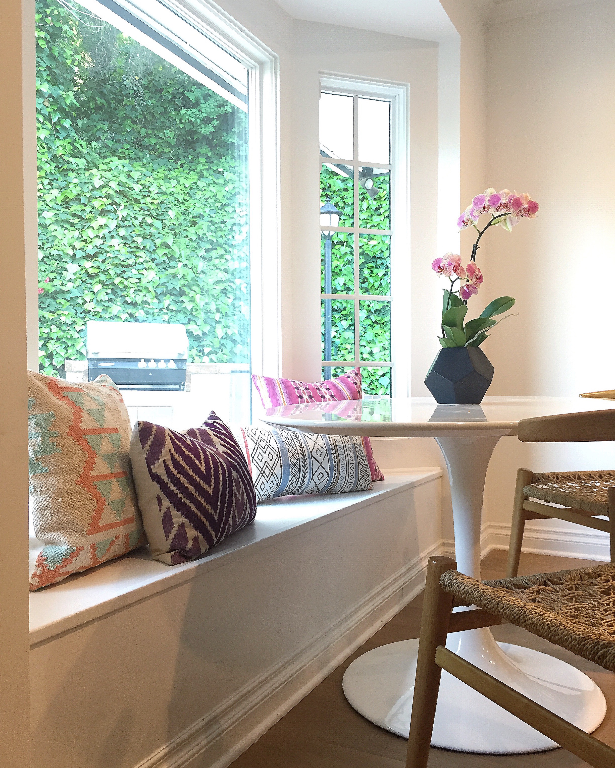
I have always found orchids SUPER EASY to keep alive and that they always look super chic and styled all on their own. This one on my current kitchen table I have had for 2.5 months, have watered probably 3 times, and it is currently making my house look amazing (the cute little geometric vase from Dwell studio isn’t hurting either):
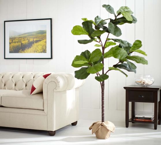
The next venture I plan to take in my living room is getting a faux potted plant, likely a fig tree. I recently advised my clients in Malibu to get themselves a fig tree, and a few months in they are struggling to keep that beauty alive 
Enter the amazingness of the faux plant. Lots of options these days – I am likely to splurge on this beauty from Pottery Barn:
Bam! Place that bad boy in a fab basket and call it a day. My son/dog/husband can try all they want but there will be no dirt to throw and I will not have to strain myself to keep yet another person alive in this house! There are more faux plant options at Target, Home Goods, and World Market 
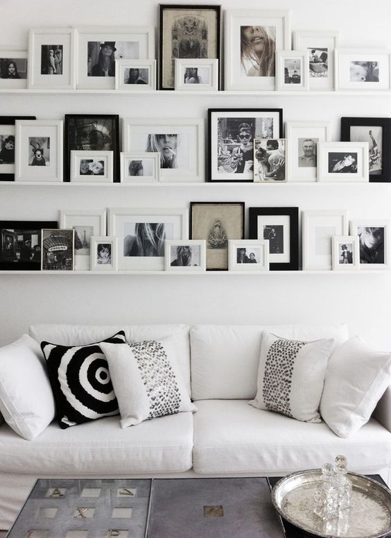
Personal Photo Wall
Last but not least, there is nothing that brings more of you into your home than YOU! Personal photos displayed in a tasteful way are a must. I am of course a fan of the gallery wall, but am always looking for new ways to show off my cool family and friends.
Here is what I had in my old townhouse, which was limited in wall space so I fit what I could:
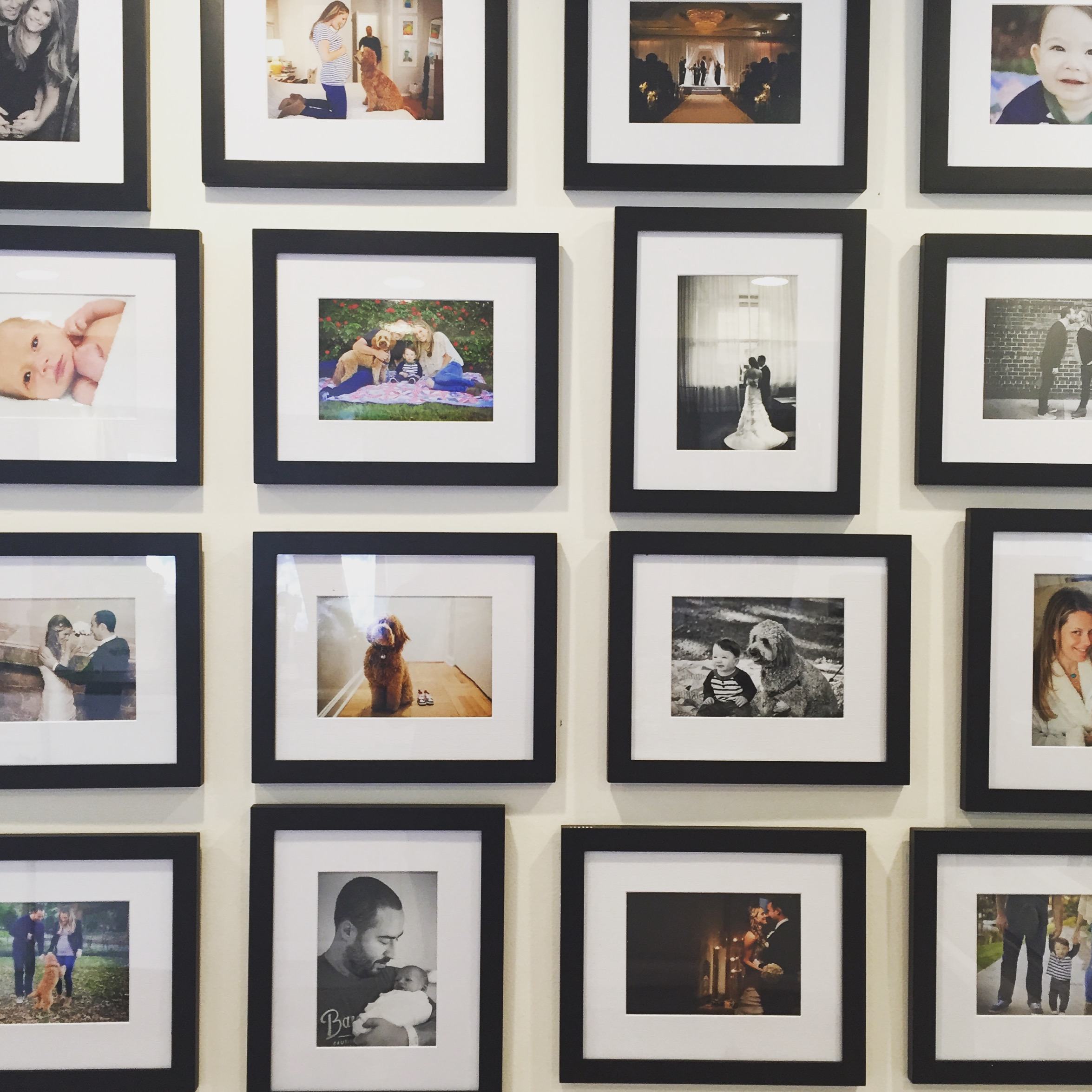
Hi family! I kept things streamlined by using all the same size black frames with white mats and varied on horizontal vs landscape direction.
Now that I am a big girl and have humungous, endlessly empty walls, I have goals to add to this collection and span an entire hallway of photos:
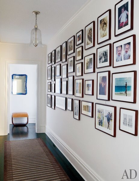
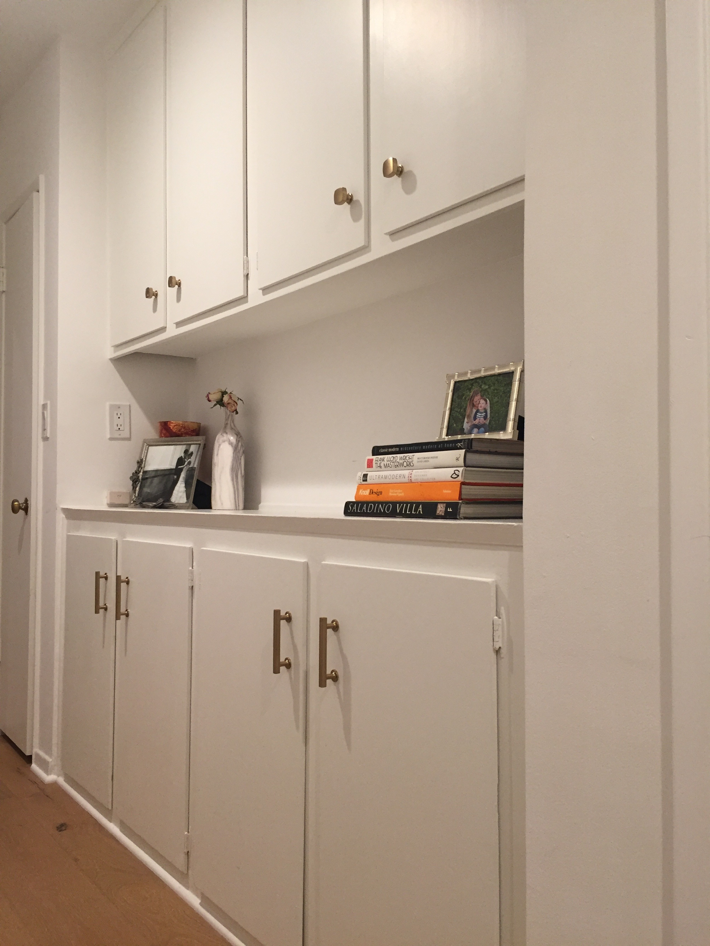
I also have a nice little built-in in one of my hallways that I will probably re-arrange and re-decorate for the rest of my life that I think could host a whole bunch of leaning family photos. See said space below:
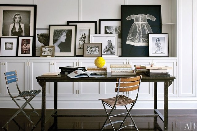
I saw this image of leaning images on a shelf that definitely left me feeling inspired:
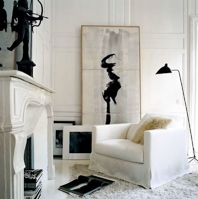
I love gallery walls period so will just leave a few more here to admire: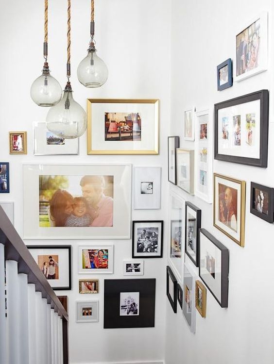
So that about wraps it up, the AE guide to making a new house feel like a home. I’m still working on that over here, but will keep my own advice in mind as I continue to transform my own house.
xo, AE
The post A house into a home appeared first on los angeles interior design firm.
Warm it up for winter! 24 Jan 2017, 6:31 pm
When I was contacted by Douglas Elliman’s Florida real estate team to write a post about how to winter-ize your home, I was stoked to get on it. As a former New Yorker and graduate of the University of Wisconsin, I know a thing or two about winters – not to mention this LA winter has not been the most pleasant! And though I have a large closet in my home dedicated to housing all my winter coats and boots that don’t get a ton of use out here on the west coast, I also believe there are lots of ways you can warm up your home and not just your wardrobe in those cold months. So today I am sharing some tricks on what you can do to make your home more cozy as those temps keep dropping (is it spring yet?!):
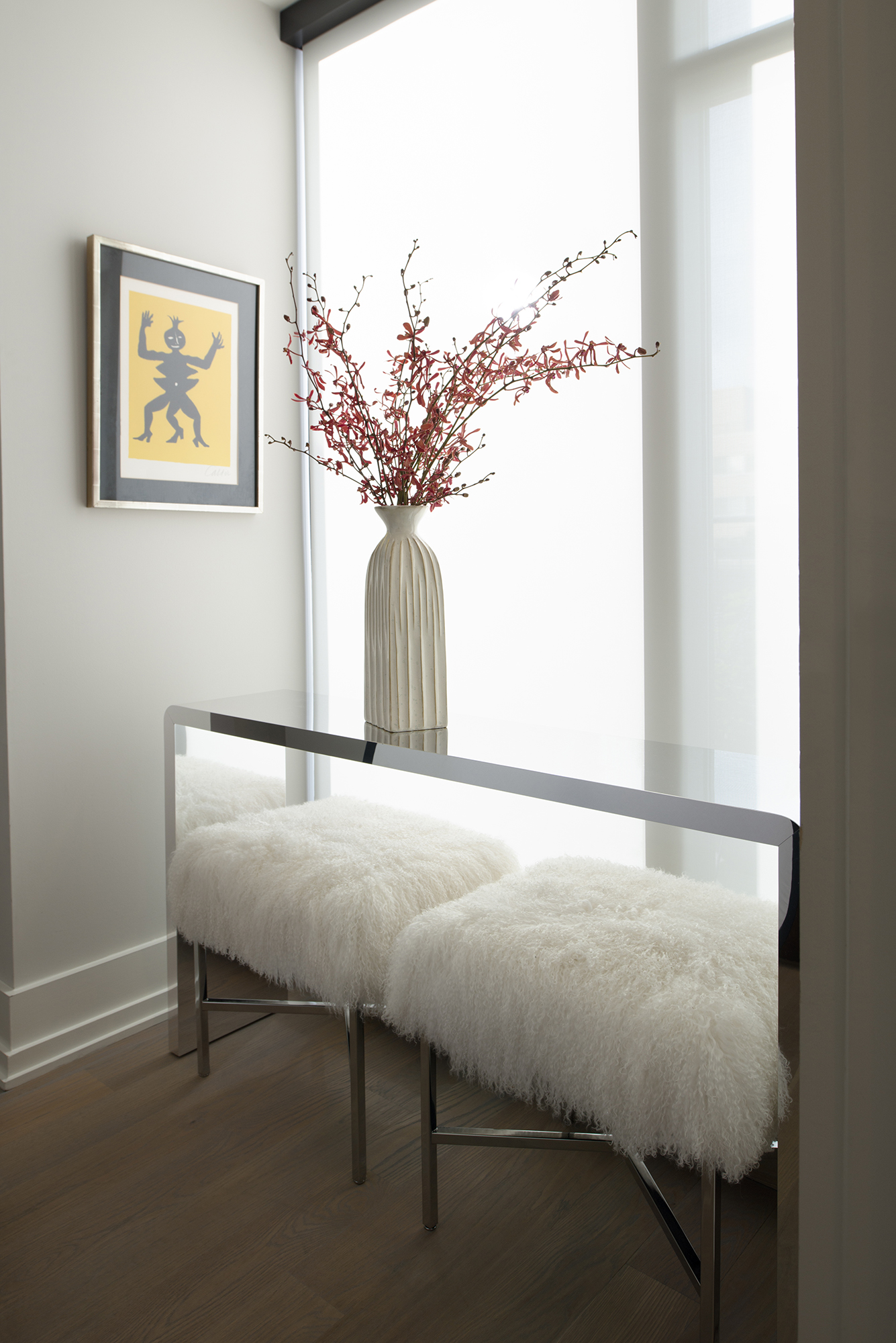
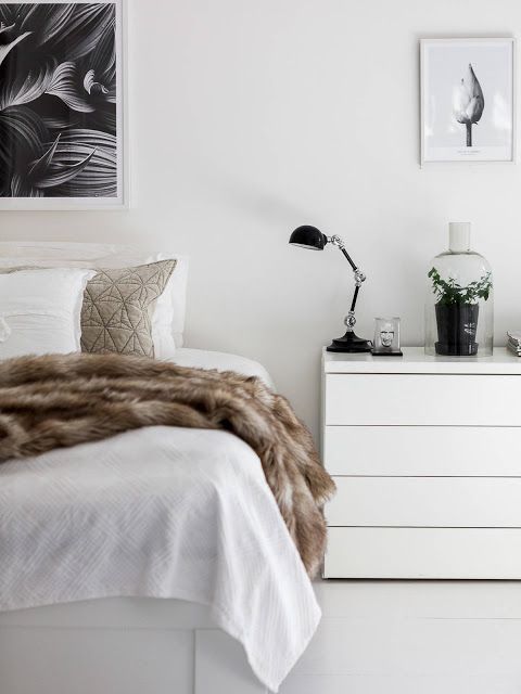
1) Faux Fur: I love faux fur for just about everything and anything (including clothes and shoes) but this is a really easy way to warm up your space. Use it on a throw, a pillow, a rug or upholster something fun:
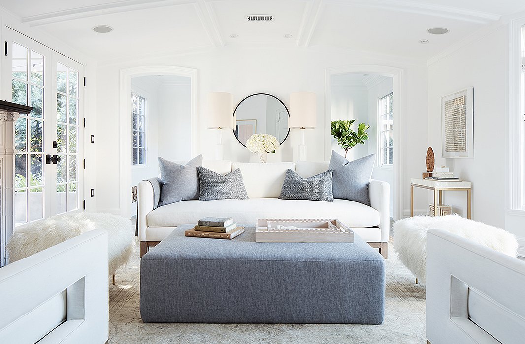
In our DC condo project we added these faux sheepskin ottomans to sit under a console and provide warmth as well as additional seating:
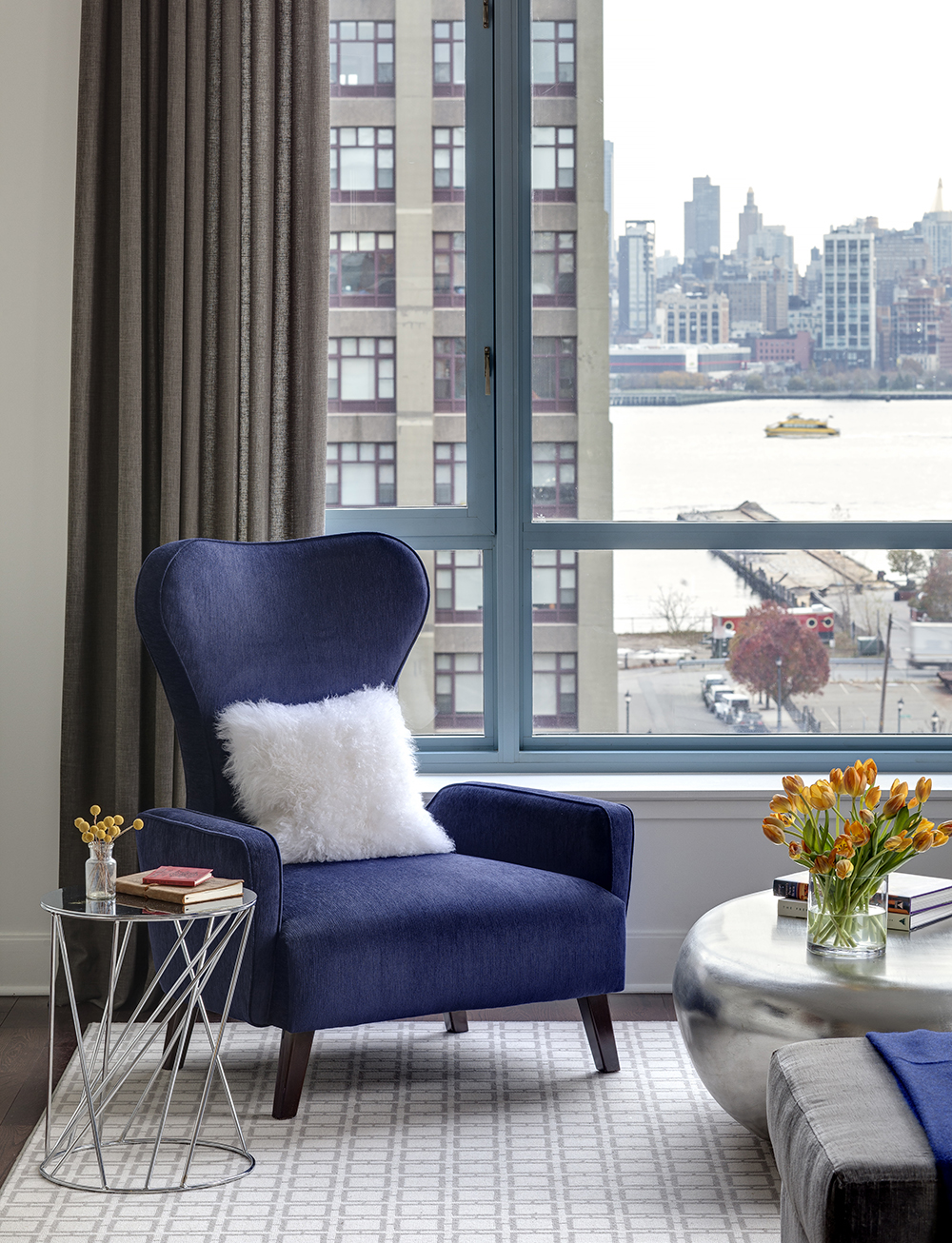
Yet again in our Hoboken Condo project we added a simple white sheepskin pillow to warm up this royal blue and chrome vignette:
And this is a design board I put together for a former client for her master bedroom – the white faux sheepskin rug really warms up the space:
Which leads me to another tip…
2) Layer Rugs: I love rugs, and one is never enough. Adding a layered rug instantly adds depth, texture and warmth to any space. I love a vintage rug over a natural fiber rug and of course a faux hide over anything is magical:
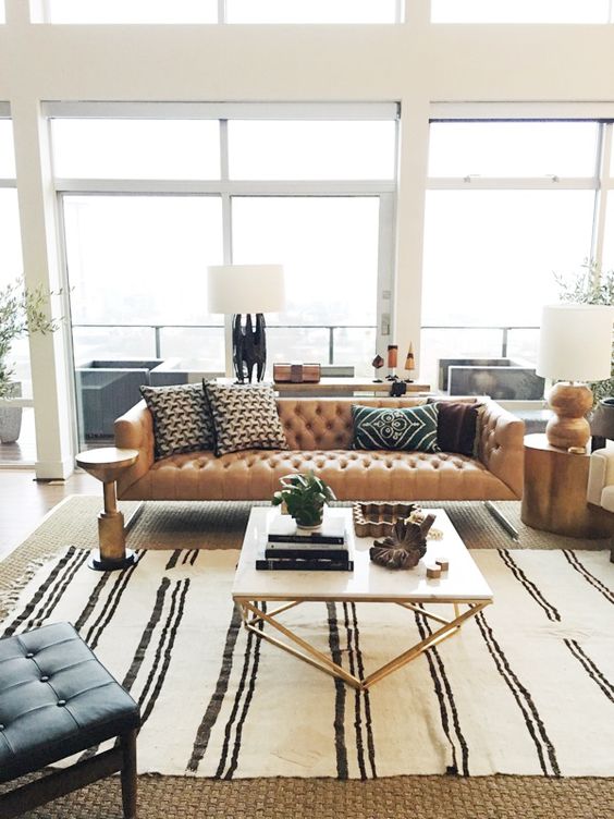
I also love to layer with rugs diagonally – see the design board I created for my own master bedroom (which I am hopeful one day will become a reality) where I layered a vintage rug diagonally over a neutral jute rug:

3) Winter white: we all know I will never have a room with white furniture in my house (cue the waterworks) but if you can swing it (read: are a mature awesome adult who has no messy husband/child/dog or are an empty nester with children in college) it is a MUST, especially in winter. Add white wherever you can, especially in different tones:

I am lucky enough to be currently working with some empty nesters who agreed to purchase this unbelievable, one of a kind white sofa from Shine by Sho:
We will be adding white textured pillows to make it even WHITER! Yay!
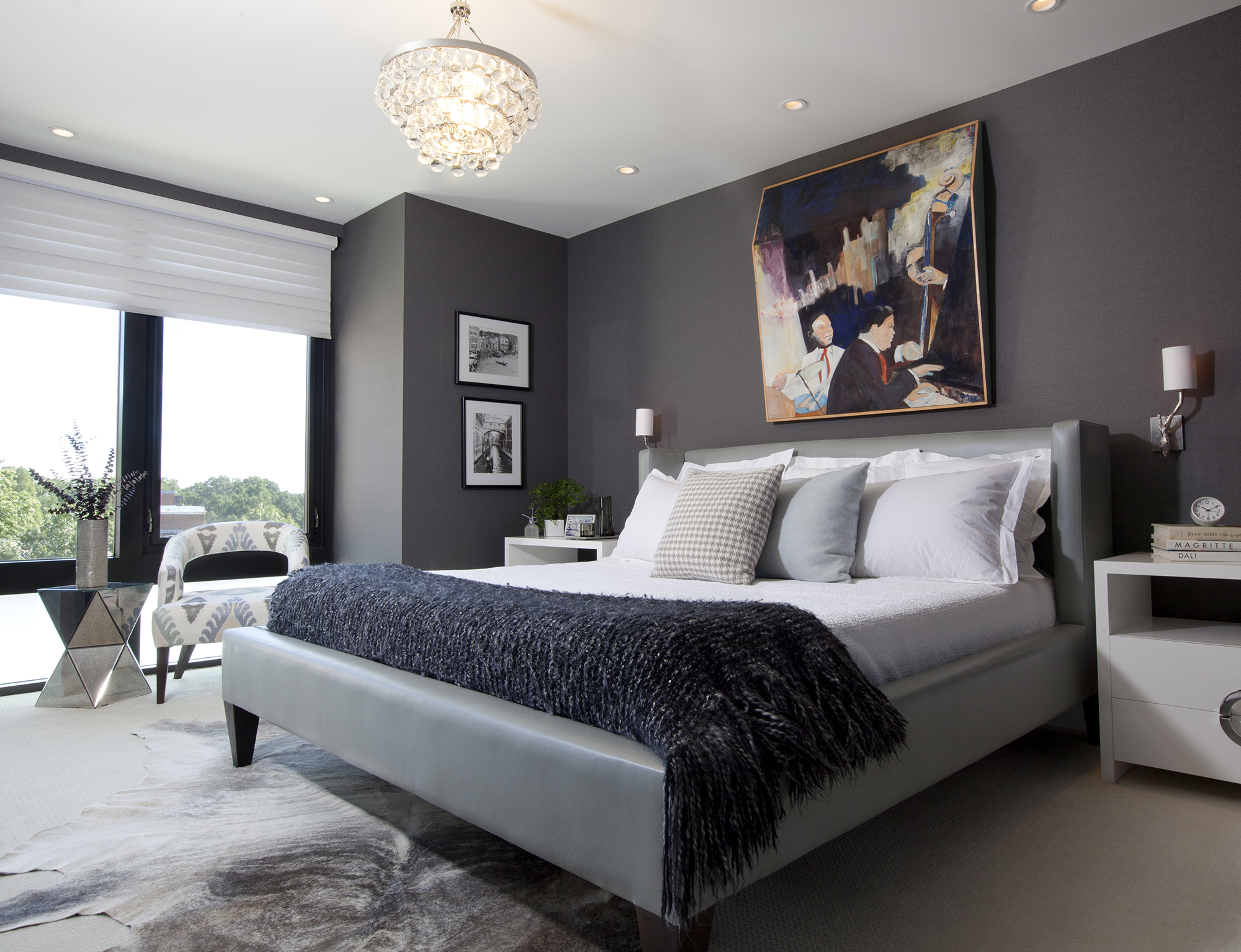
4) Throw a throw on it: adding a throw blanket to a sofa or bed is not only practical in the winter but also again adds warmth and dimensions to the space. Bonus points if you can bring in a plaid or buffalo check print:
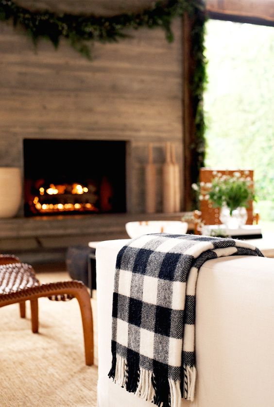
I almost always advise my clients to throw a throw on it – here are some living room and bedroom shots from our past projects where a throw has warmed things up exponentially:

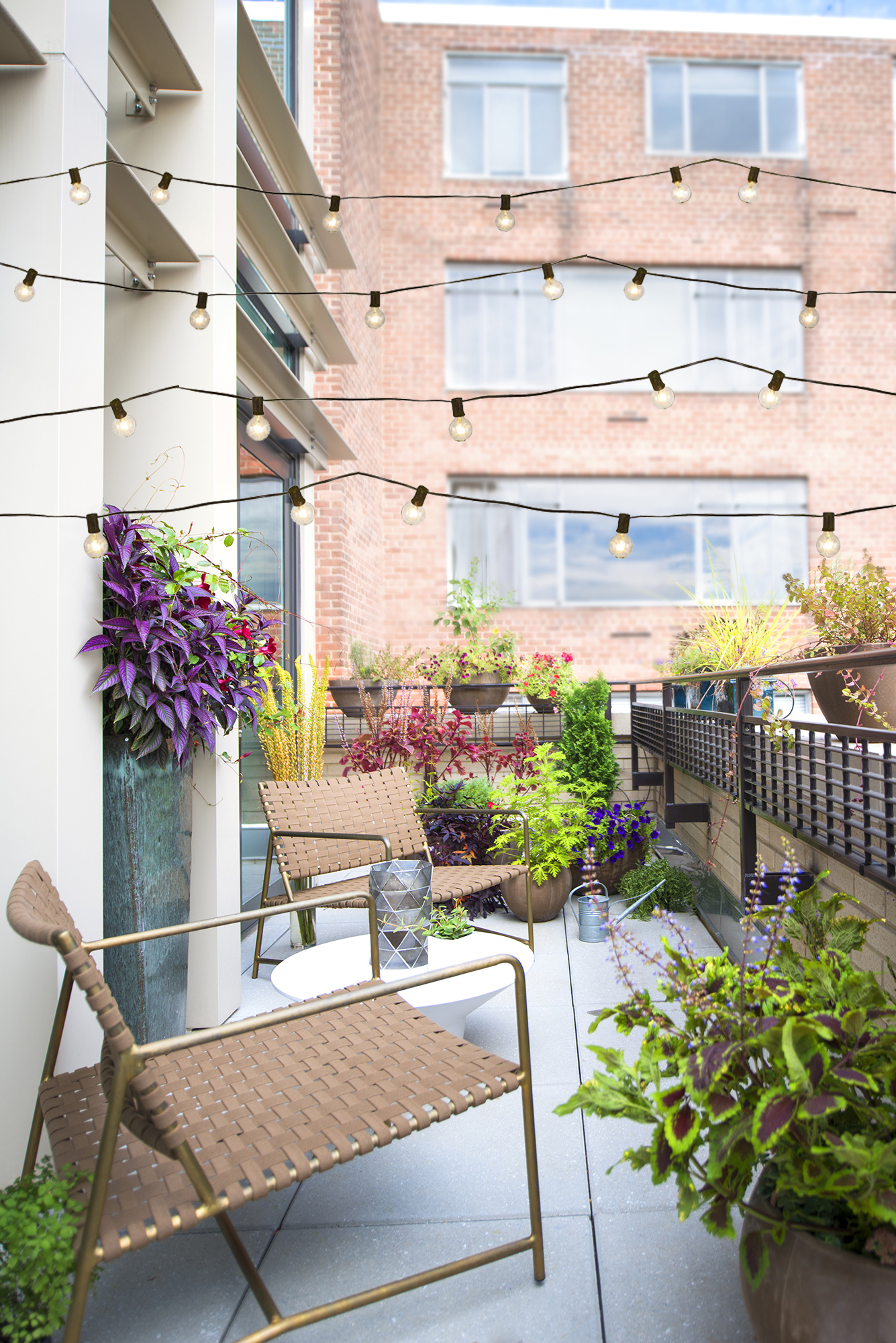
5) String up some lights: lighting is everything really, and it can transform the atmosphere of a space, especially an outdoor space. If you live somewhere with tolerable weather or if you are brave enough to face winter head on in the east coast or Midwest, warm it up with some mood lighting. These all white string lights add the perfect amount of warmth and atmosphere:
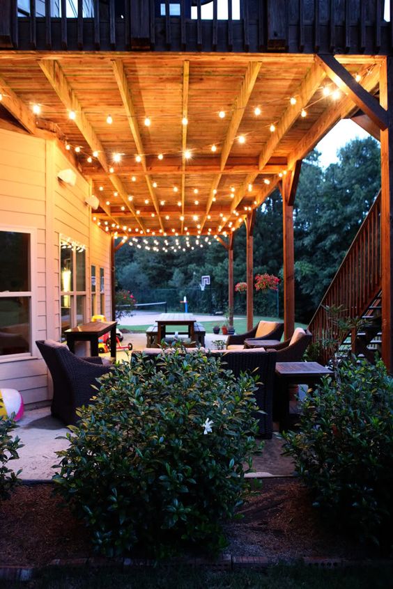
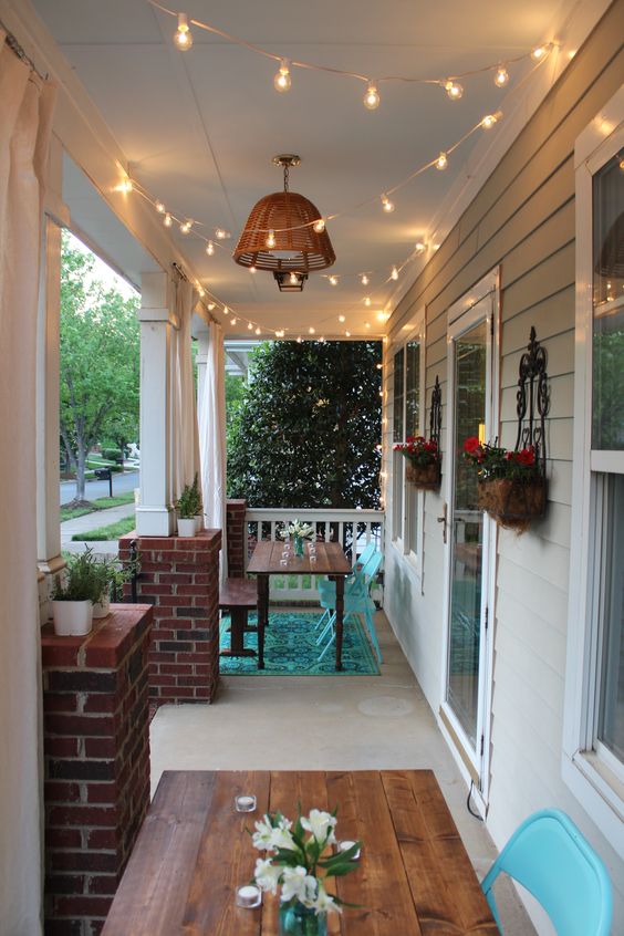
Would be so great to add some string lights to the terrace from our DC Condo project. Adds such a warm glow right??
It looks like warmer weather is headed our way here in LA, but a lot of you have several months to go still! Stay warm…xo, AE
The post Warm it up for winter! appeared first on los angeles interior design firm.
Dreamy, dreamy dressing room 18 Jan 2017, 11:05 pm
So we are settled into our new house (more like “settled” as we have little furniture, no light fixtures, and the exterior of our house looks like a big hot mess). None the less – it is so lovely to be here and finally live in the space we have been working so hard on over the last few months. The transformation of the bathrooms and kitchen has been really something and I am so looking forward to someday having it all done! Just kidding, I am a designer and I will never EVER be done
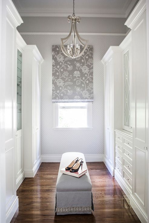
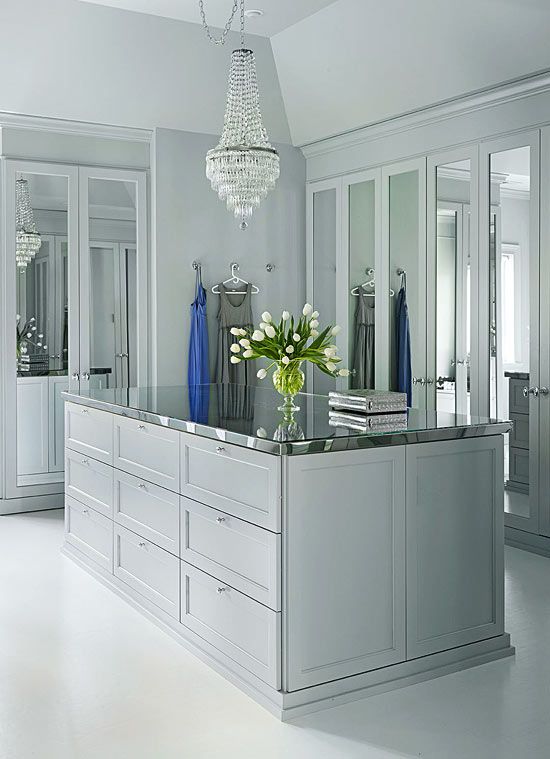
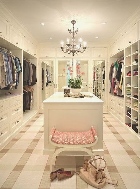
One of the spaces we did not touch (sadly) is my master closet. I have hopes that at some point we will build something spectacular, but for now I can only fantasize, which is also fun! I have thinking of what this space would be like for me….now we all know I am more of a modern girl – clean lines, graphic patterns, black & white – but when it comes to my DREAM dressing room, I actually gravitate towards something very classic and feminine.
Here are some images that give me LIFE:

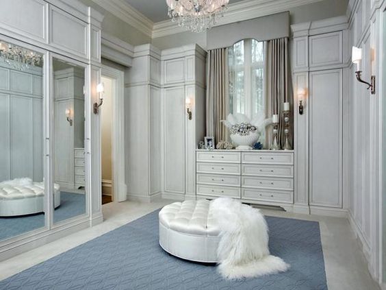
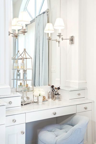
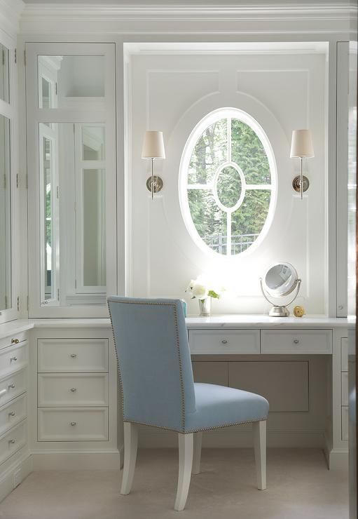
I love the white classic moldings and details as well as the cool blues and grays in the rugs and furniture.
Another essential feature to a great dressing room is WALLPAPER (wait, when is wallpaper not an important feature??)
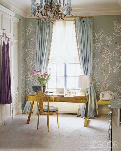
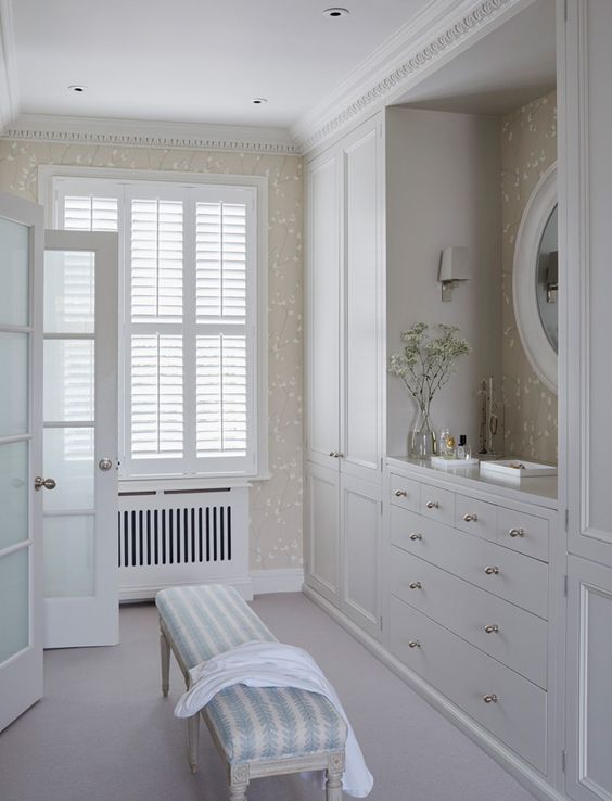 I have always loved mural wallpapers for a dressing room – the top image from Aerin Lauder’s home has always been a favorite image of mine – but I also like something subtle that gives the room a really serene feel.
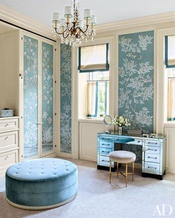
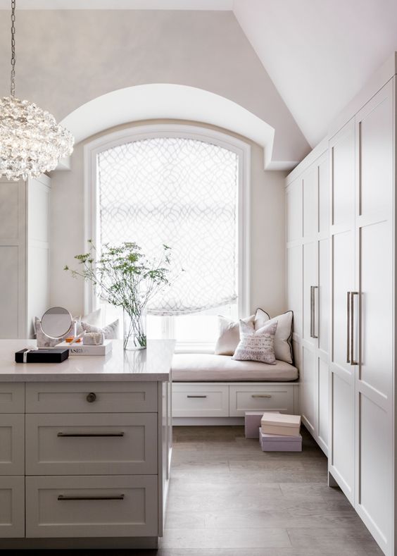
Another super important factor in a dressing room is lighting (duh!). A glorious chandelier can really transform a space and give you the soft lighting you need to select your best outfit yet:
The last few details for me include some sort of animal print-esque carpeting:

And an uber feminine ottoman, for putting on your fancy heels:

So, that leads to my design, of my dreamiest, most magical dressing room:
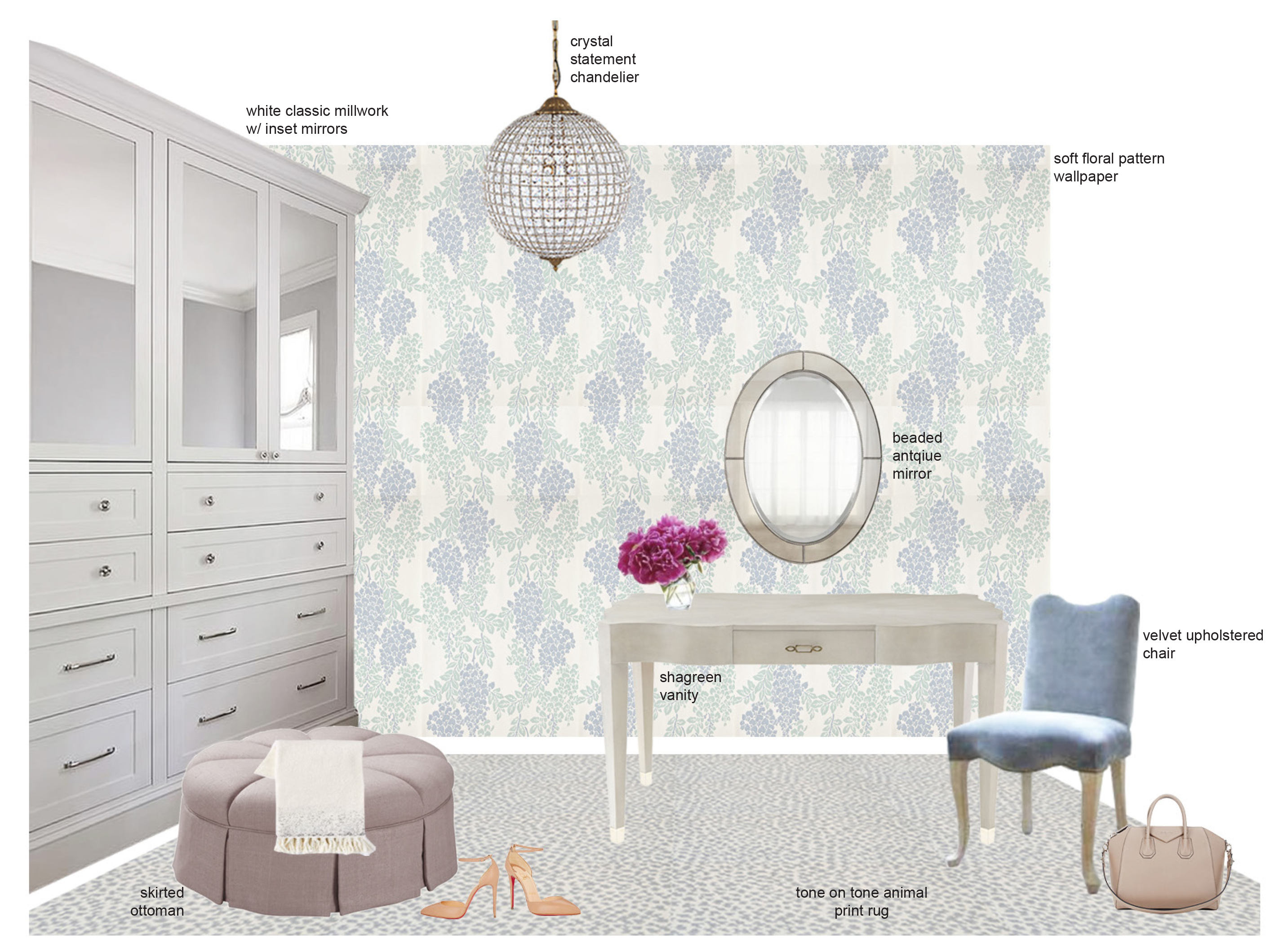 Ugh, I love it! May have to build a bigger house next time to accommodate. Live and learn!
Lets go through some of my choices, starting with wallpaper:
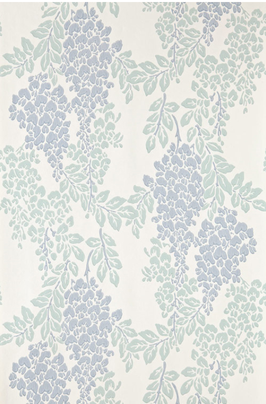
This is from Farrow & Ball’s wallpaper collection, called Wisteria. I love their take on traditional patterns – they feel timeless yet modern at the same time.
Next up is the carpet:
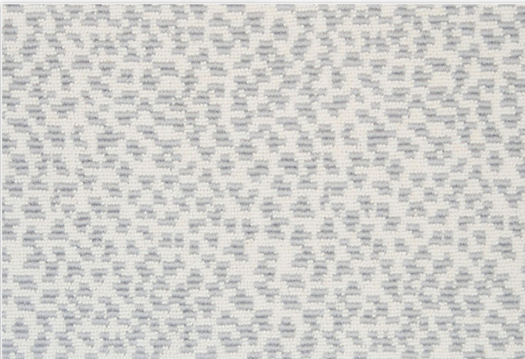
This is the Kubra pattern from Stark. I used it once before in a very feminine bedroom:
Next up is the blingy bling bling chandelier:

This is the poppy pendant from Arhaus. Check out the rest of their lighting collections here. Perfect for a feminine dressing room!
The vanity is a shagreen covered desk from Bernhardt. I love the feminine, clean shape:
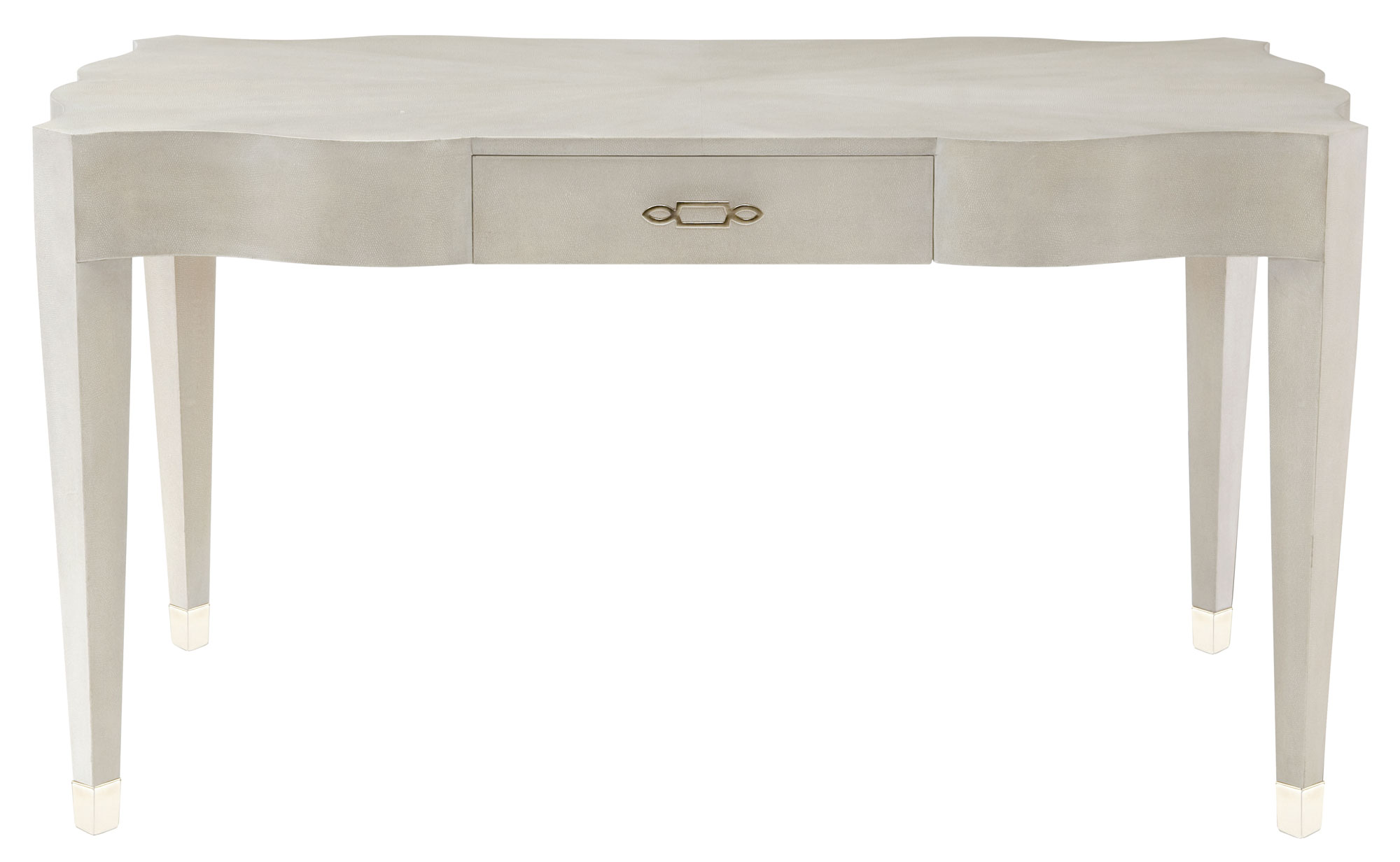
Those scalloped edges kill me!
The upholstered chair is a deco style piece from Mecox Gardens:
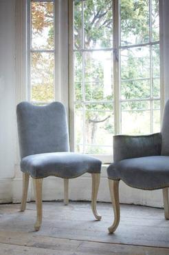
I have actually lusted after this chair for years. So simple yet so stunning.
The mirror is from Horchow:
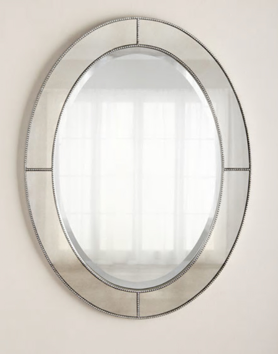
This mirror adds a slight antique-y look that fits in so well in this space.
Lastly the ottoman – had to be something skirted because where else would I ever put something like this?? I took inspiration from an ottoman by Edward Ferrell:
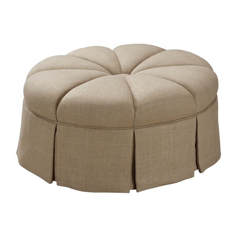 I took the liberty of making it a light blush colored upholstery to add a hint of color to the scheme.
Well, I’ll keep dreaming over here but also keep posting updates of what is ACTUALLY happening in our house. xo, AE
The post Dreamy, dreamy dressing room appeared first on los angeles interior design firm.
Update: Jack & Jill Bathroom 2 Jan 2017, 8:40 pm
Okay – 12 days til move in. We are actually on schedule, thanks to my wonderful contractor and his crew who worked through all the holidays for us. It won’t be 100% but it will be close enough! As we patiently await the marble and lacquered doors for the kitchen, the bathrooms are kicking ass.
The jack & jill bathroom (aka Brady’s bathroom for now) has been really fun to design. I wanted to do something bold and different and youthful. I also wanted to make sure it was kid-friendly in terms of materials and design. It was already set up as a jack & jill, which means it is accessible from 2 bedrooms, and hopefully that other bedroom will one day be for baby #2!
Here is a look at the before:


 The only real issue with the existing layout was there was only a small shower (no tub) and a double vanity. In an ideal world we would have a shower/tub combo AND a double vanity, but there isn’t room for both. So, we decided to make a single vanity and change the shower stall to a tub/shower combo. We demo’d everything, but kept the plumbing in the same place which makes things much simpler.
I knew I wanted to do a black & white tile in here, and I was considering doing a encaustic cement tile on the floor because I LOVE them, but I was told by so many experts that they are very difficult to maintain and do not wear well. Considering this is a bathroom for kids, that just didn’t seem like the smart choice. Lucky me, I walked into Classic Tile in Santa Monica and found these awesome PORCELAIN (read: indestructible) tiles:
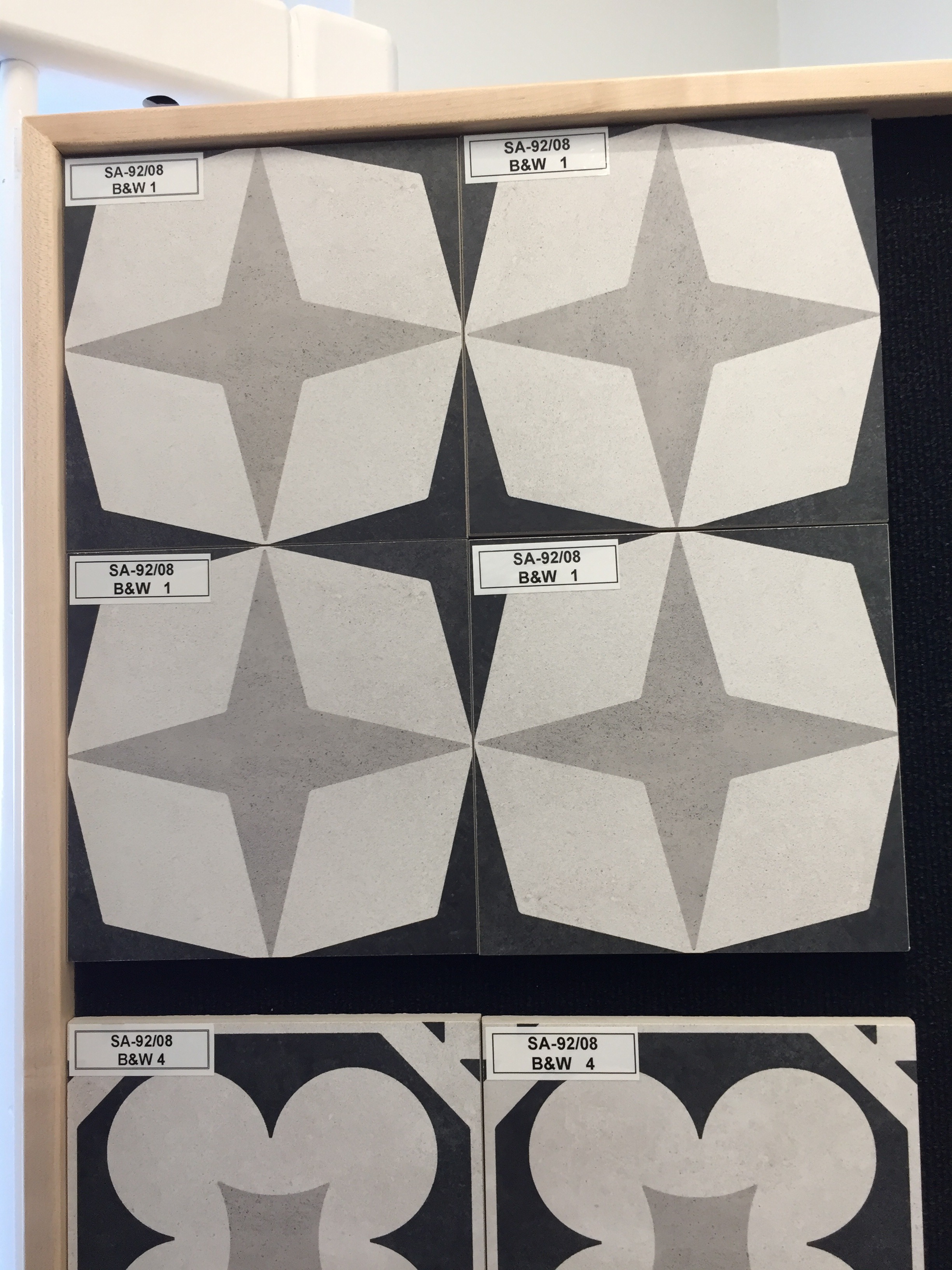
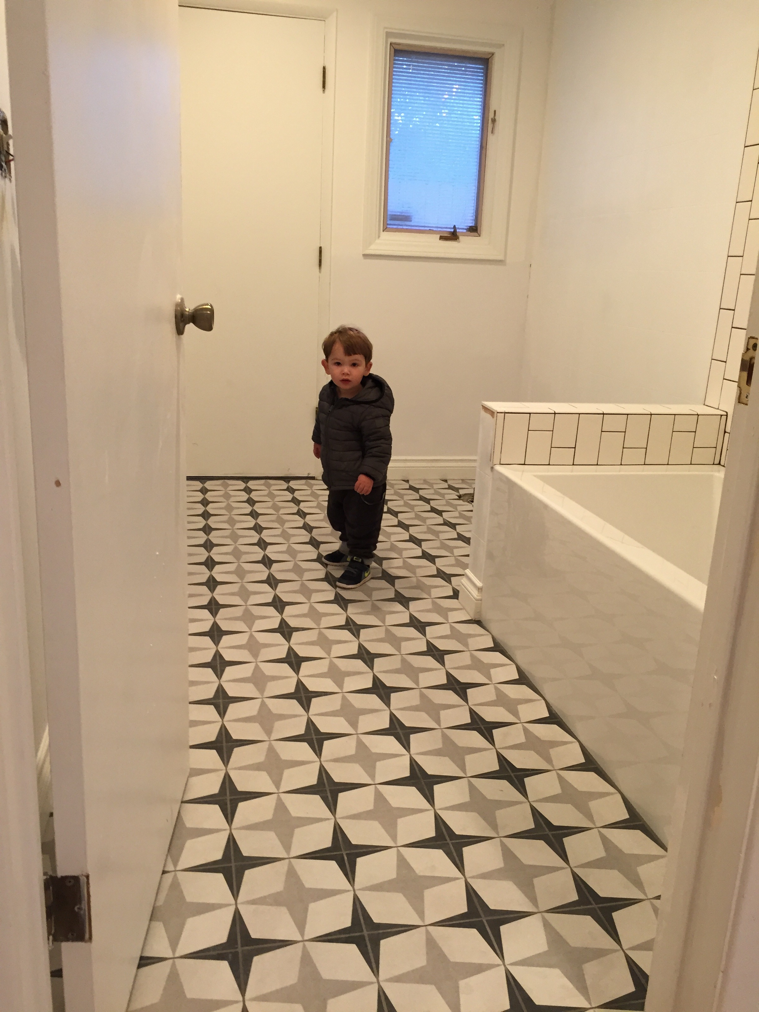
I love that they are black & white & grey and I love LOVE the star pattern. It was the perfect fit, and so I designed the rest of the room around it:
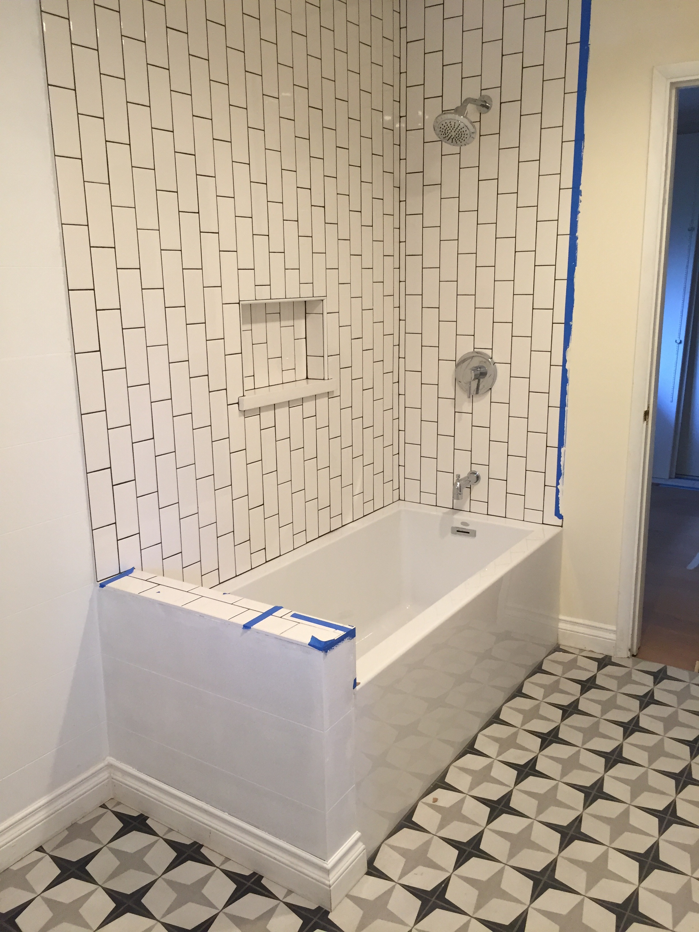
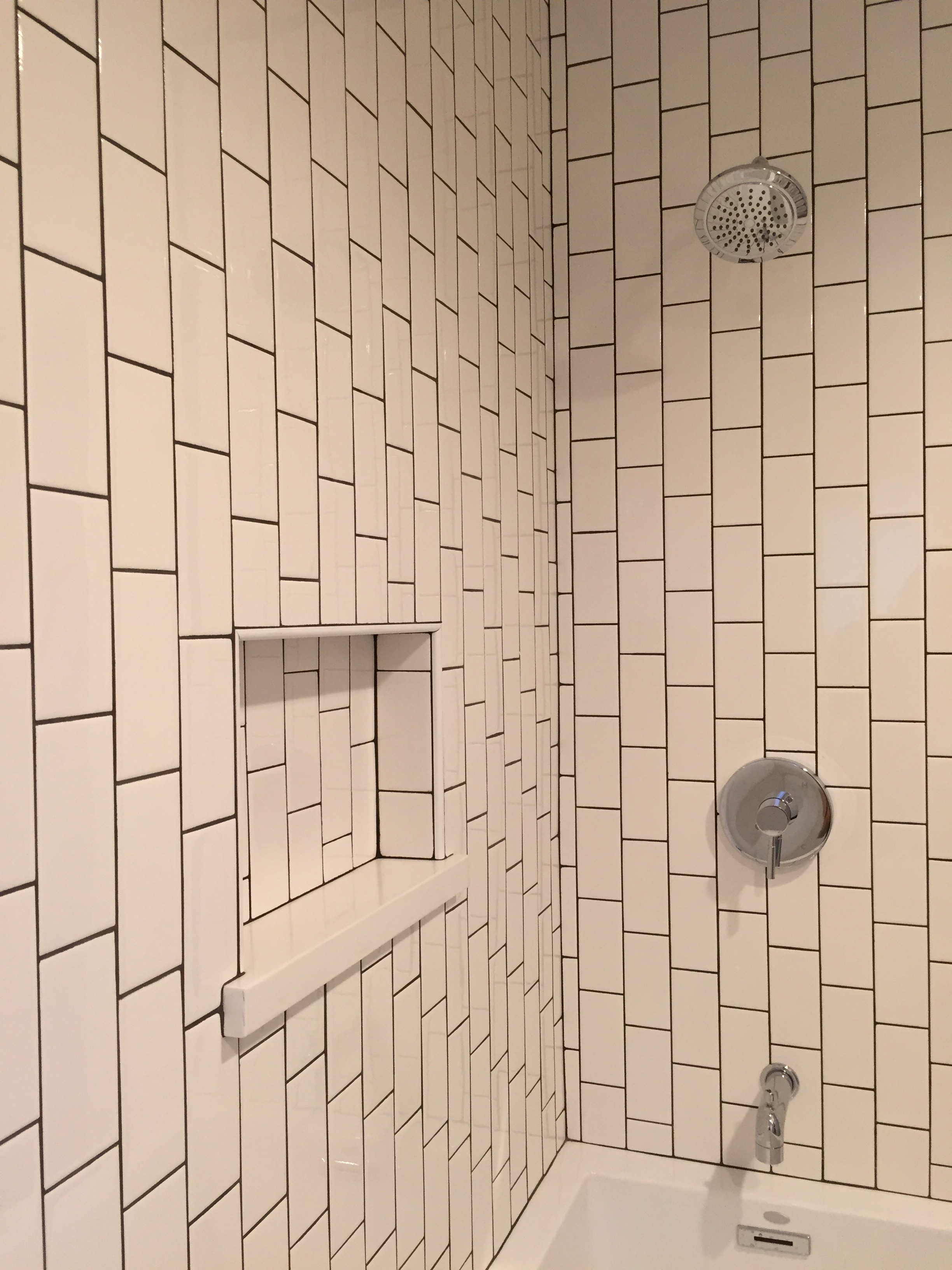
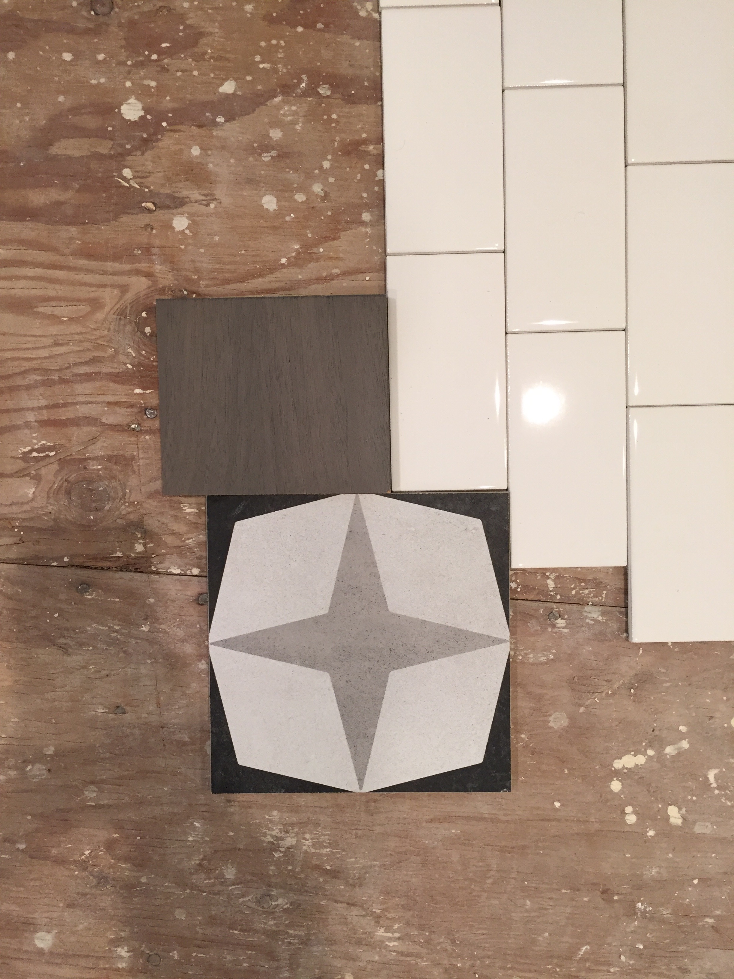 I decided to do vertical subway tile on the shower walls (durable AND affordable – they are like $1 at home depot) with dark grout to make it pop. The grey wood stain is for the custom floating vanity that is yet to come.
When they started installing the floor tile I had my usual moment of panic – was it too bold? would it make Brady’s head spin when he went to the bathroom??
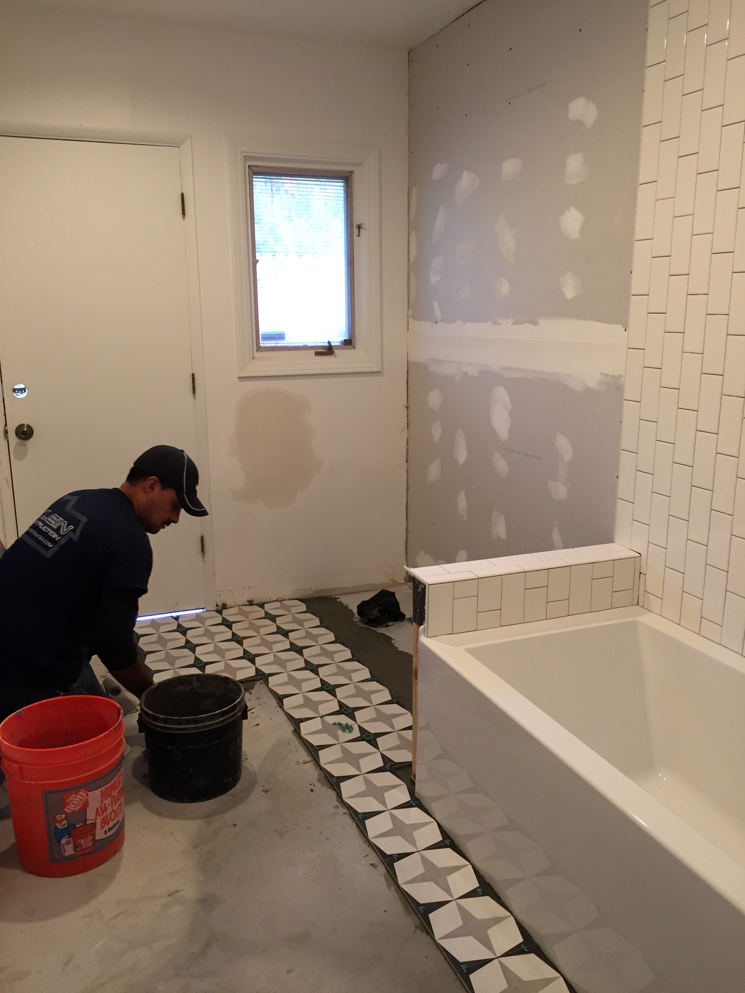
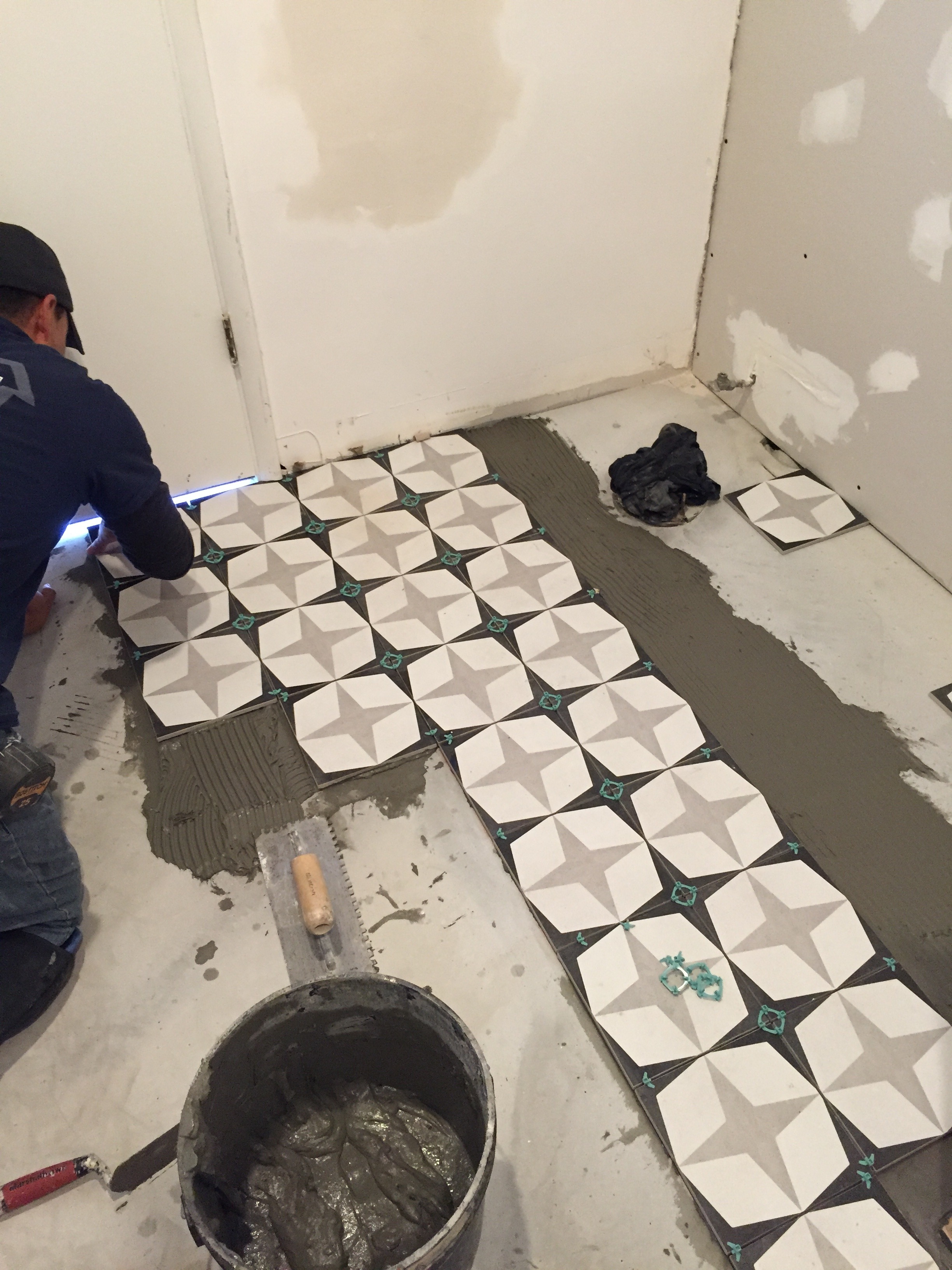
But as they progressed of course I fell in love with it
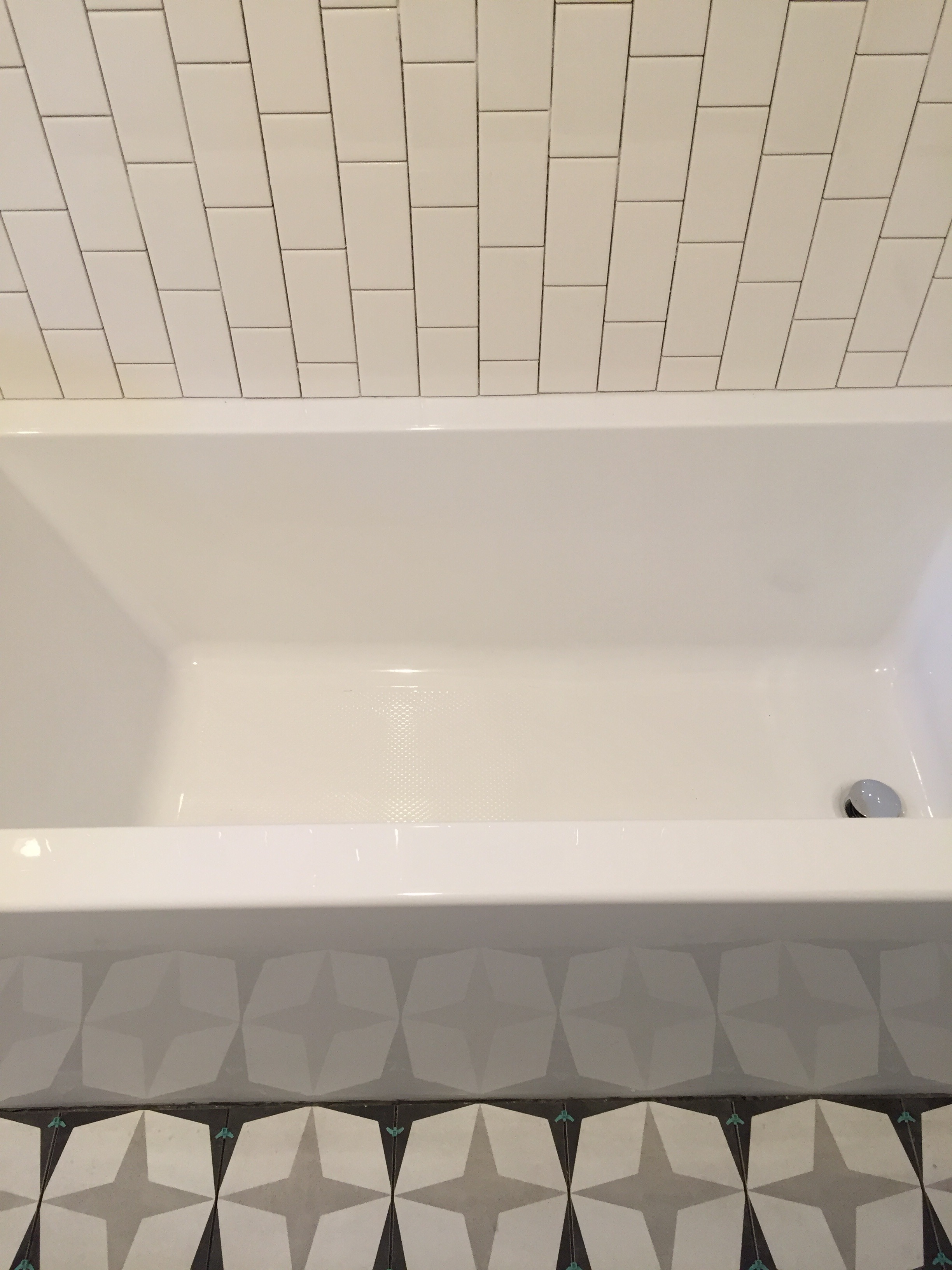

Once they added the dark grout to the subway tile and installed the chrome fixtures, things really started jiving:

Here’s a shot of Brady’s first time in the space. He was more excited to get into the tub, but I think he liked it??
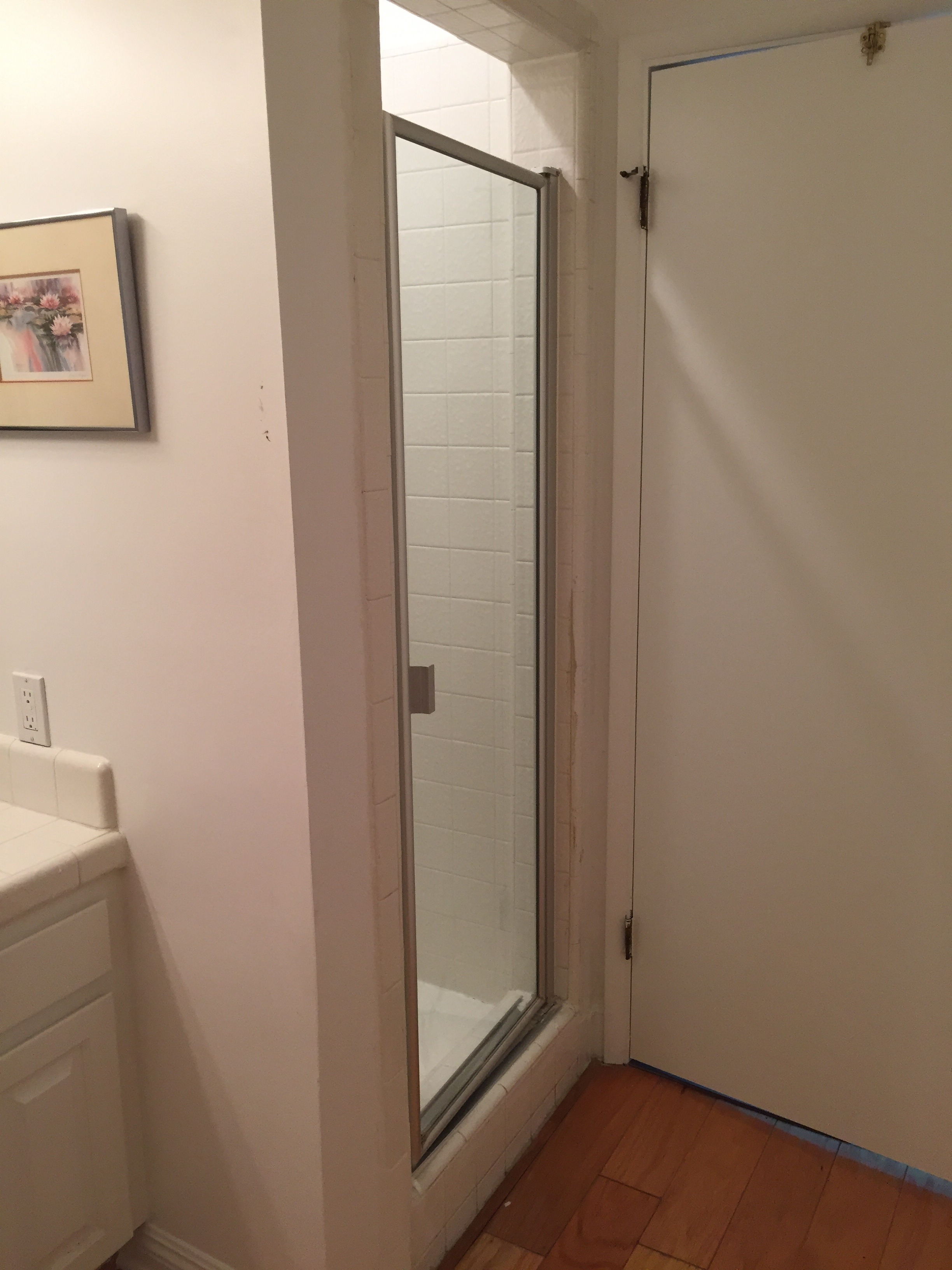
 We added one panel of glass above the pony wall for now – it didn’t make sense to add the other pane of glass with a door because we (and by we I mean Jeremy) is down there on the floor every night giving this kid a bath and adding that glass would really be in the way. So, eventually it will be added but for now it looks like this:
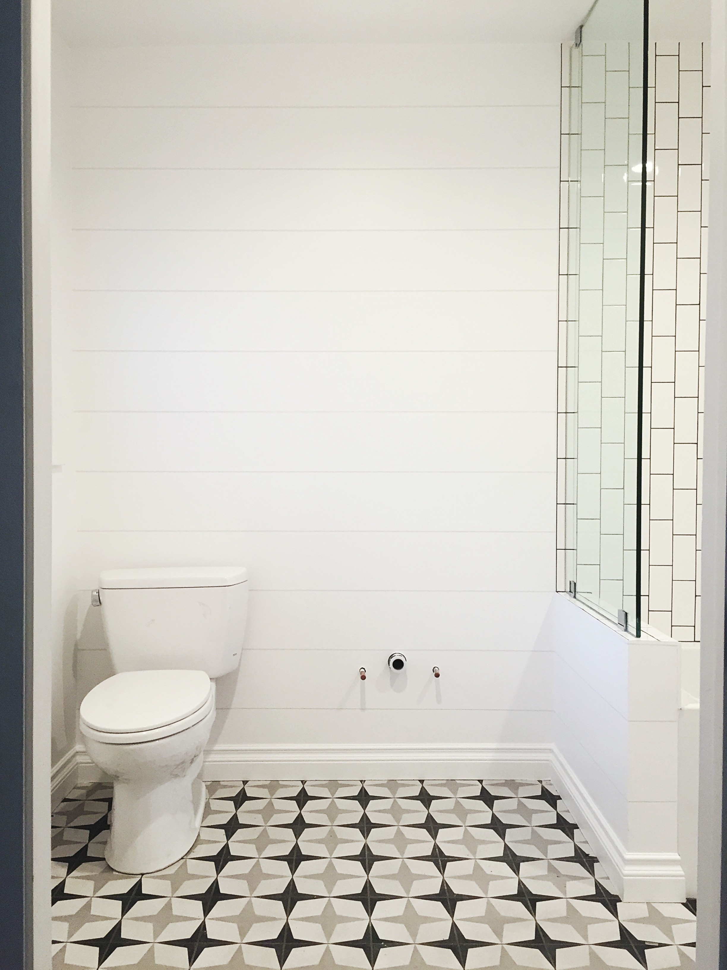
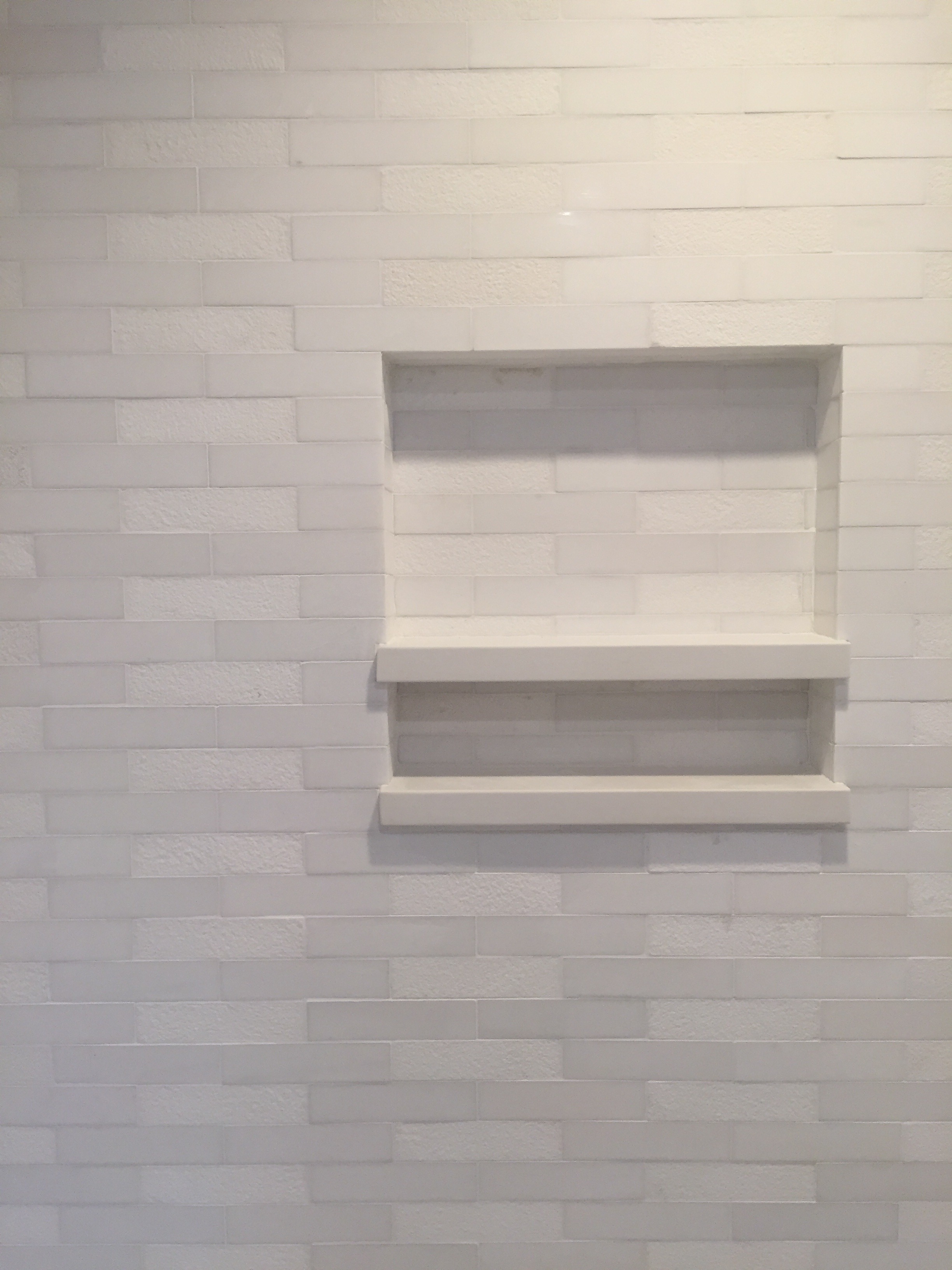
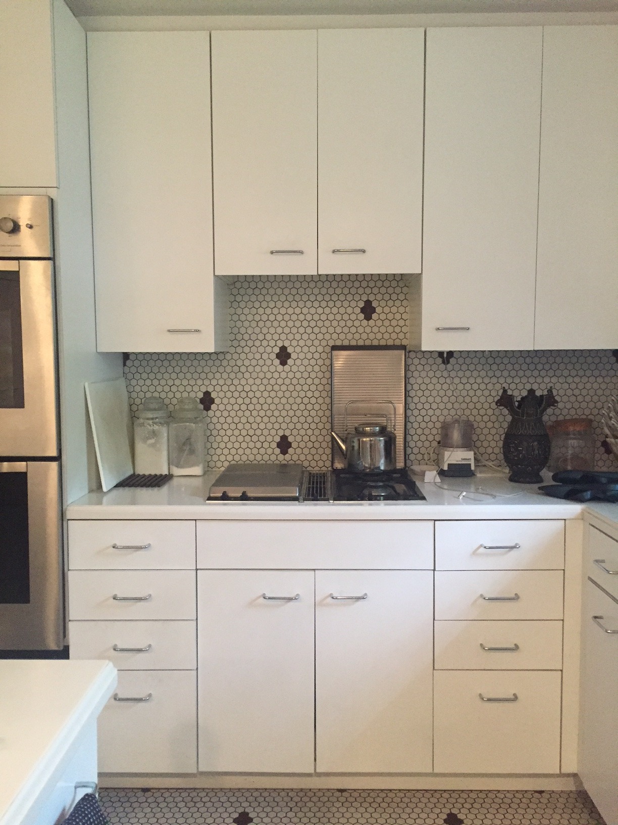
And here is where we stand today. I didn’t mention but we added paneling that mimics ship lap on the wall behind the toilet/vanity to break up that space a bit. It actually turned out great and wasn’t a big cost:
This week the vanity is being built and the stone top is being fabricated. All we will need after that is a mirror (which I have a brass round mirror from Brady’s bedroom now that I will use) and a sconce above which is TBD. Couldn’t be happier with how this turned out. Stayed tuned for the finished product soon! xo, AE
The post Update: Jack & Jill Bathroom appeared first on los angeles interior design firm.
Longest overdue post ever! 23 Dec 2016, 4:44 am
Oh man, I am behind on my blog posts. The house is coming together at lightening speed and we are 24 days until move in!!! I am there bi-weekly making big and small decisions….not to mention my son is sick (isn’t everyone’s kid sick?!), my husband is travelling, and I am one worn out mama. Anyways, there is so much to fill you in on but the room that’s making a ton of progress lately is the master bath.
Before shot refersher:
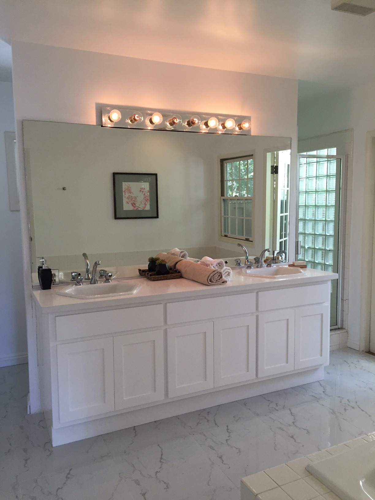
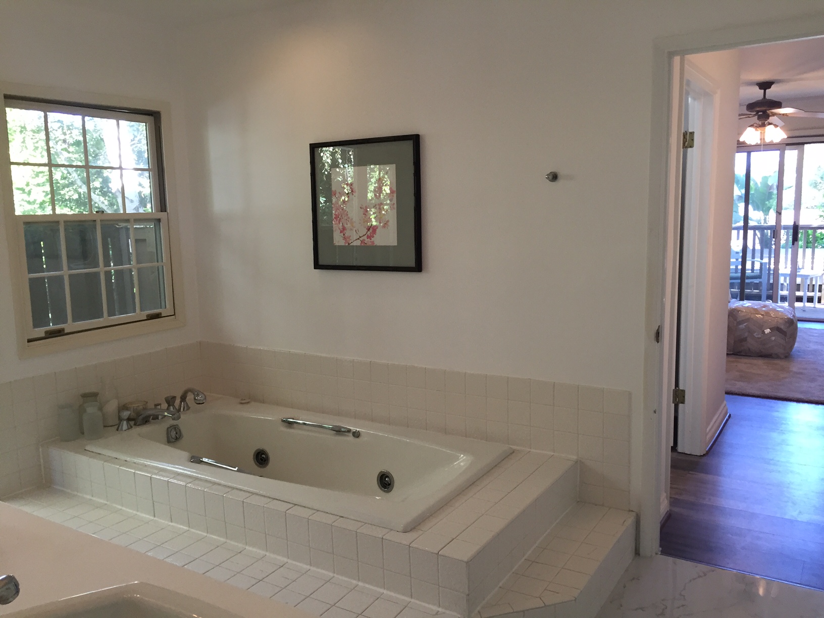
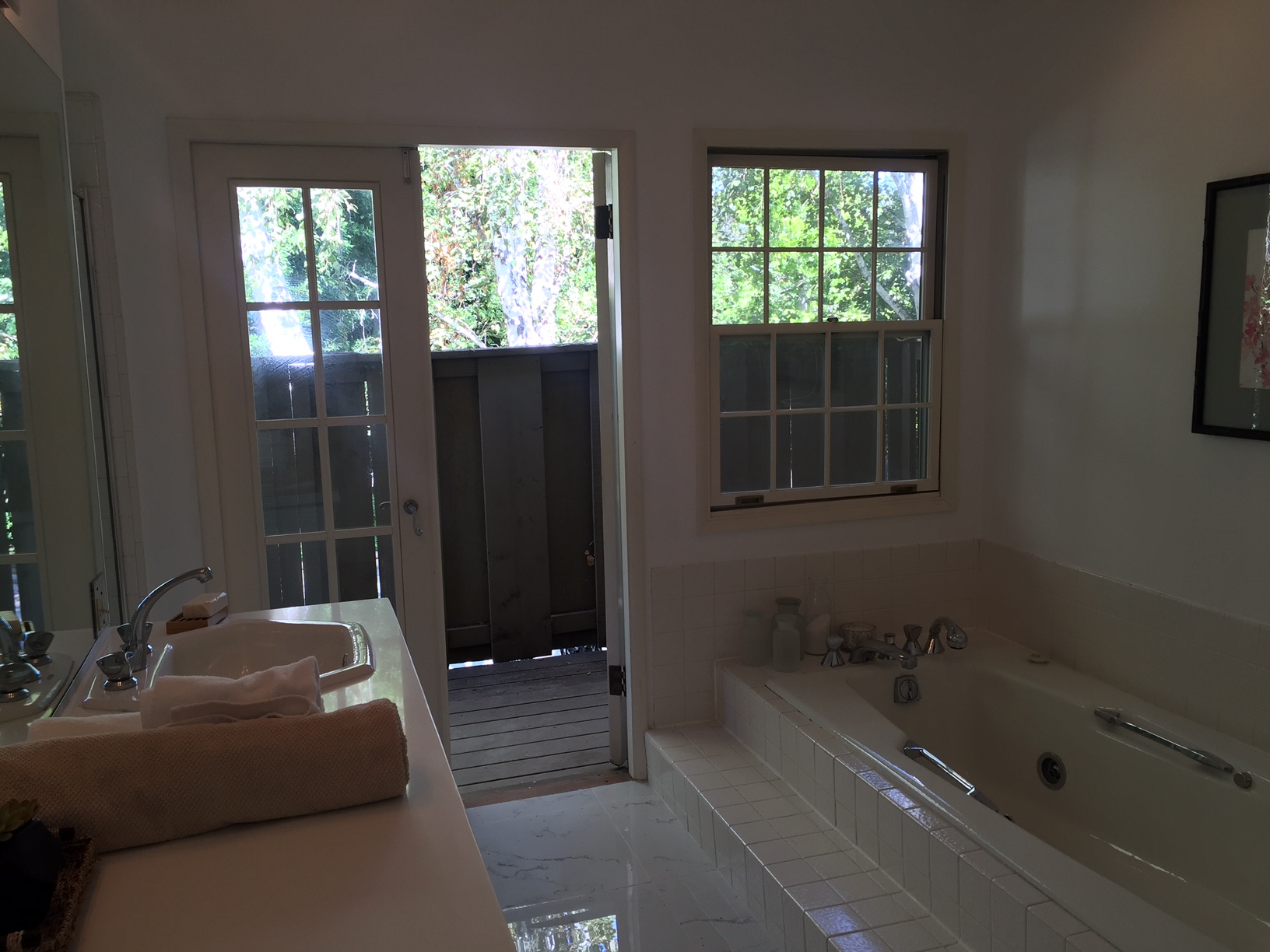
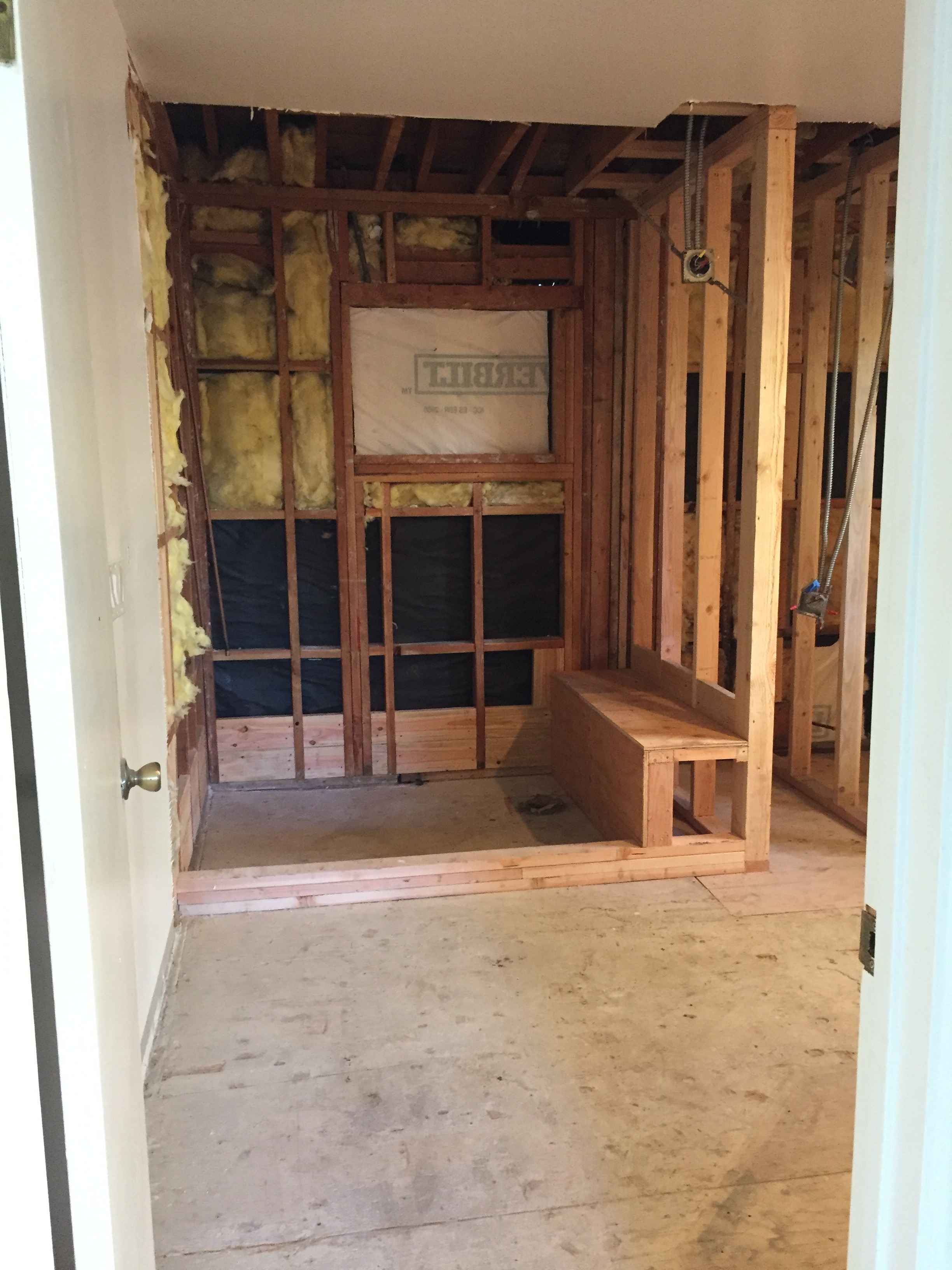
So the plan was: demo everything, remove all windows/French doors/transom windows, as well as removing the balcony that was so unnecessary and awkward. We moved the window that was previously over the tub to where the balcony doors were so we do have one window in the space. Well all went according to plan, except for the fact that the subfloor under the existing shower was extremely rotted from water leakage and had to be replaced, which only means we had to replace the subfloor which cost money!
Once demo and repairs were done, the framing went up and I was SO pumped to see how big that shower was gonna be:

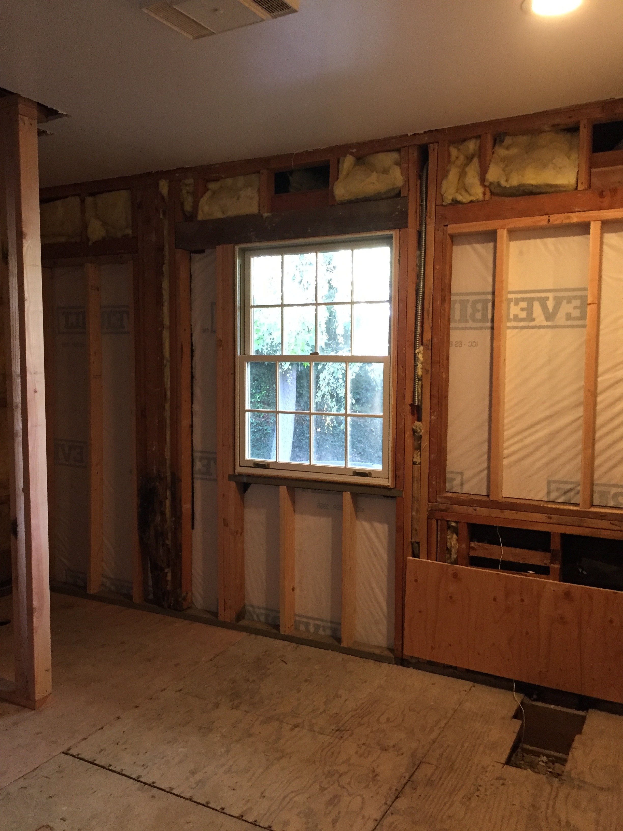
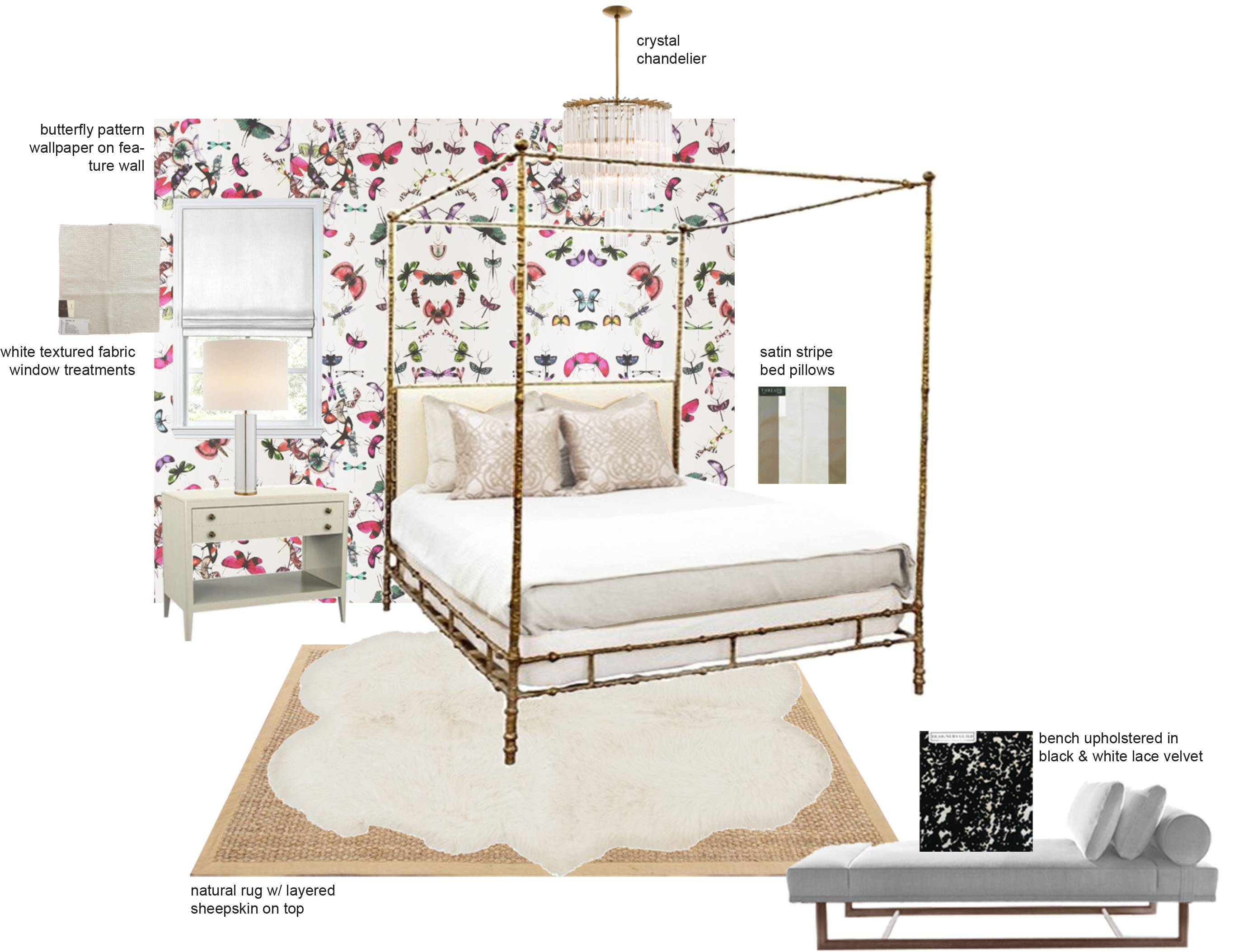
Moving on to the design of the space – I touched on this in another post but here is a more detailed description. Here is the design board I made for myself as we began selecting finishes so I could keep things straight in my head:
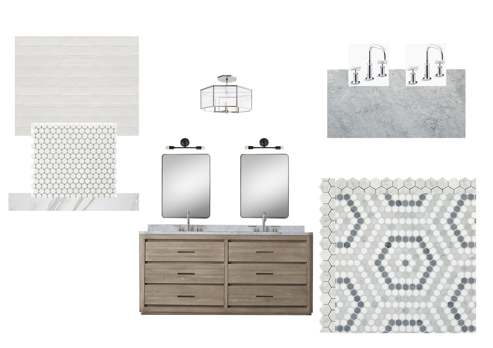
This gives you a good idea of the overall concept – mosaic hexagon flooring w/ carrrera hex border, natural wood vanity w/ Carrera slab top and chrome fixtures, assortment of white stone/tiles in shower with varying textures. The mirrors/lighting/hardware are TBD but I am really thinking I will add some black or dark bronze into the mix. That vanity is a just place holder because we are custom designing ours. Since I made this board we have decided to go a more modern route for the vanity because I fell in love with this image: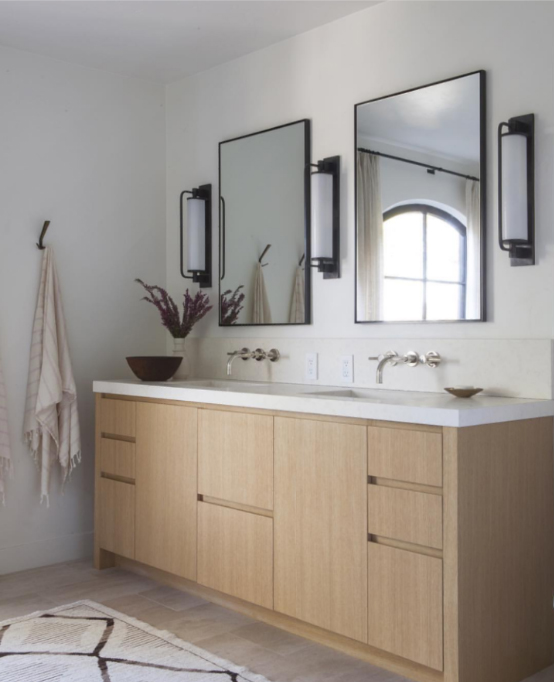
We are building something similar to this in design with some tweaking – I wanted to keep the cabinetry really sleek and simple in here and let the tile do its thing. We are also doing shaker cabinets in the kitchen and I wanted something different in here.
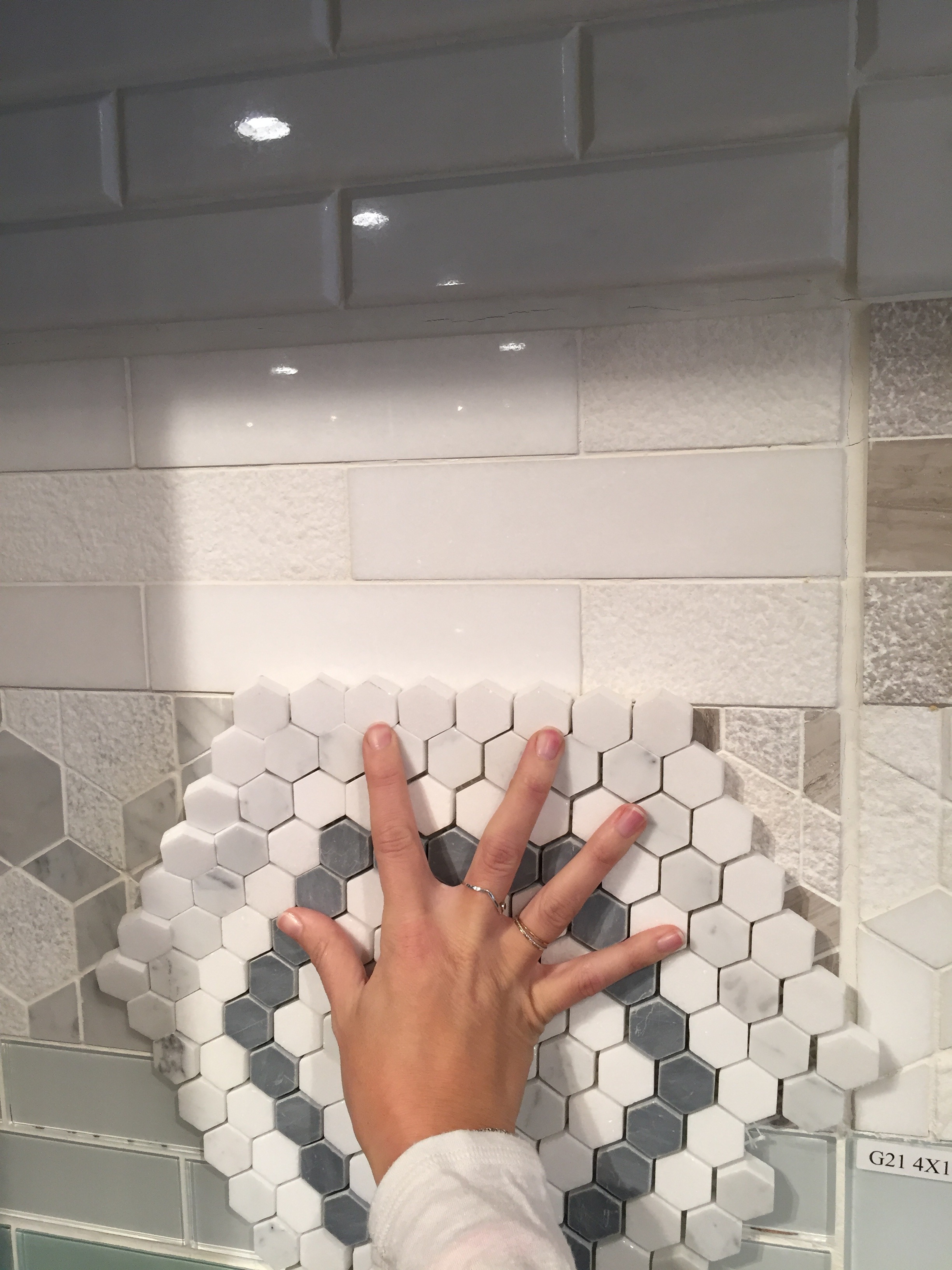
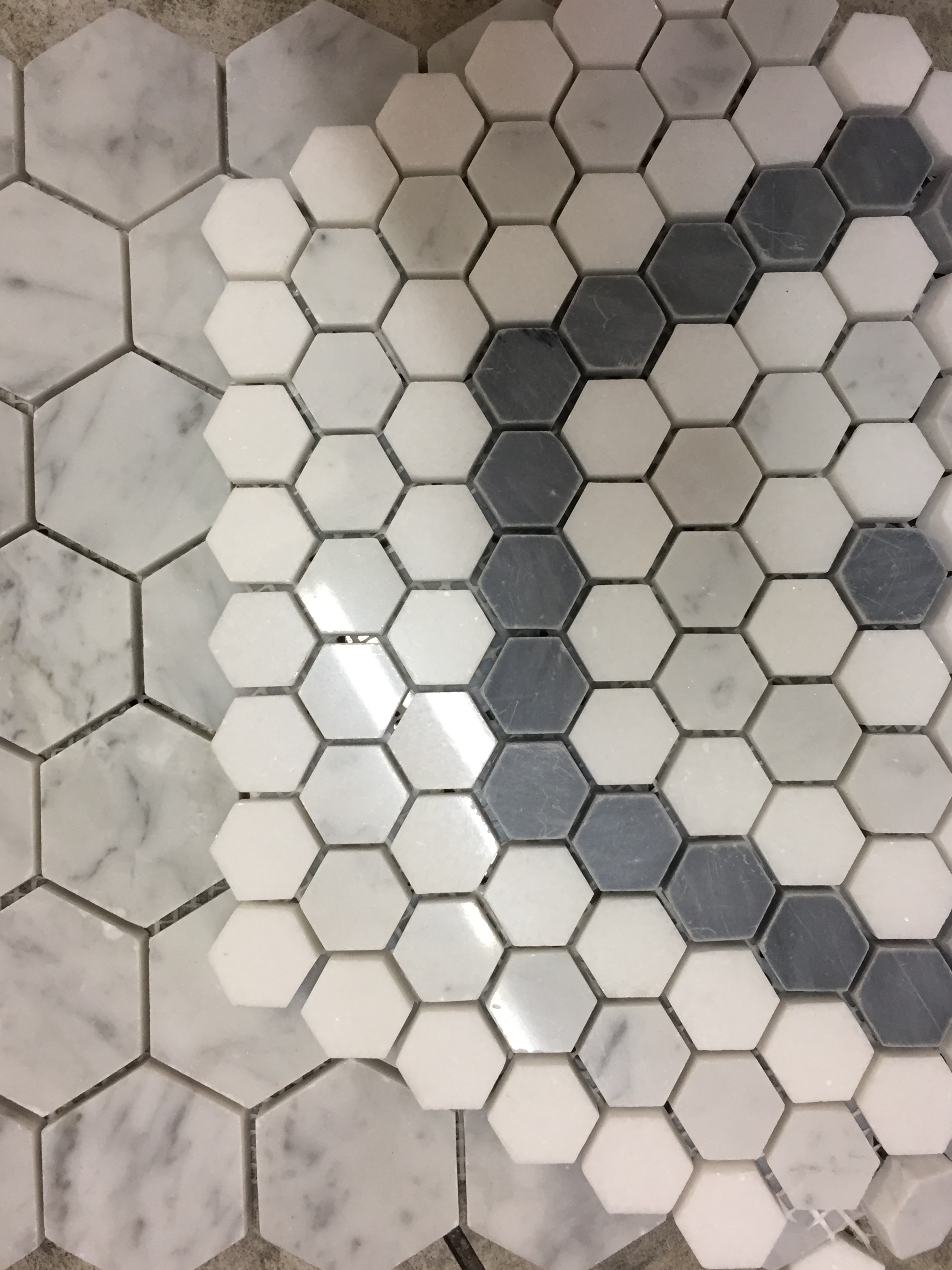
We had a lot of fun sourcing tile for this room. I had already decided on the Artistic Tile mosaic for the floor and we built the rest of the scheme around that. I wanted to do whites in the shower but it is SUCH a big shower that it needed some variation and changes in texture to break it up. I came across this dual-finish thassos 2×6 and it was obviously such a winner. It alternates between rough and polished thassos and it is seriously stunning in person:
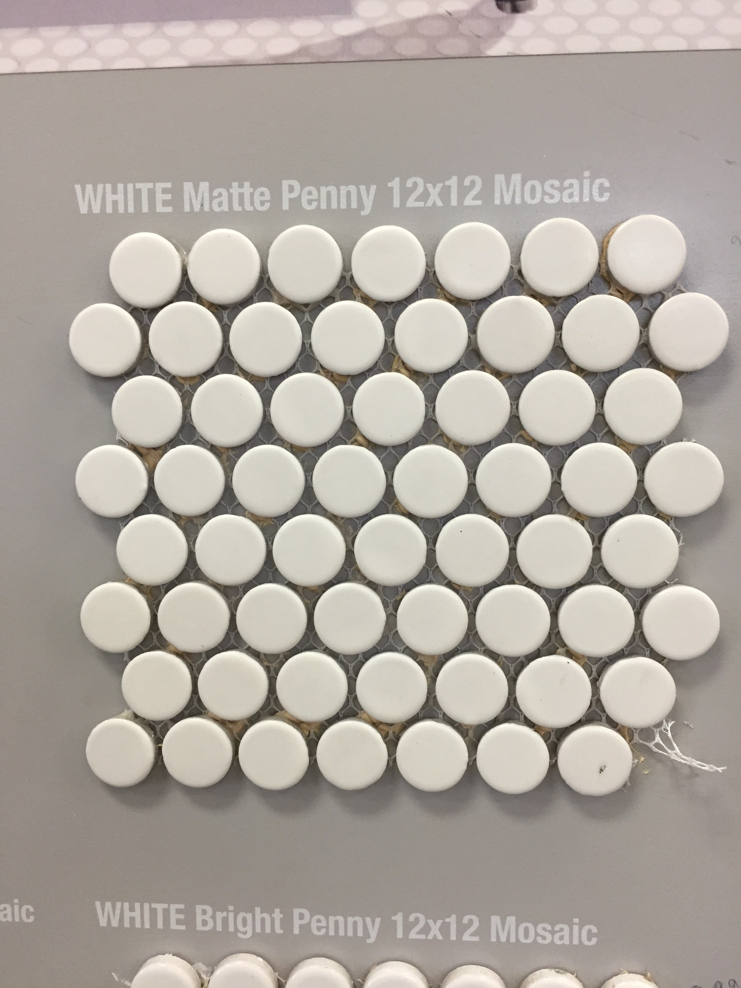
I knew I wanted to do penny tiles for the shower floor because they give a good grip and I get nervous about people slipping and falling (mostly me). We decided to do a platinum grout to pull in from the grays in the Carrera floors:
We also decided to add a border to the mosaic floor tile because I thought it would soften the boldness of the pattern – in my mind it was a way to phase it out towards the edges. We chose a large Carrera hexagon as the border and a porcelain marble to use as the shower curb:
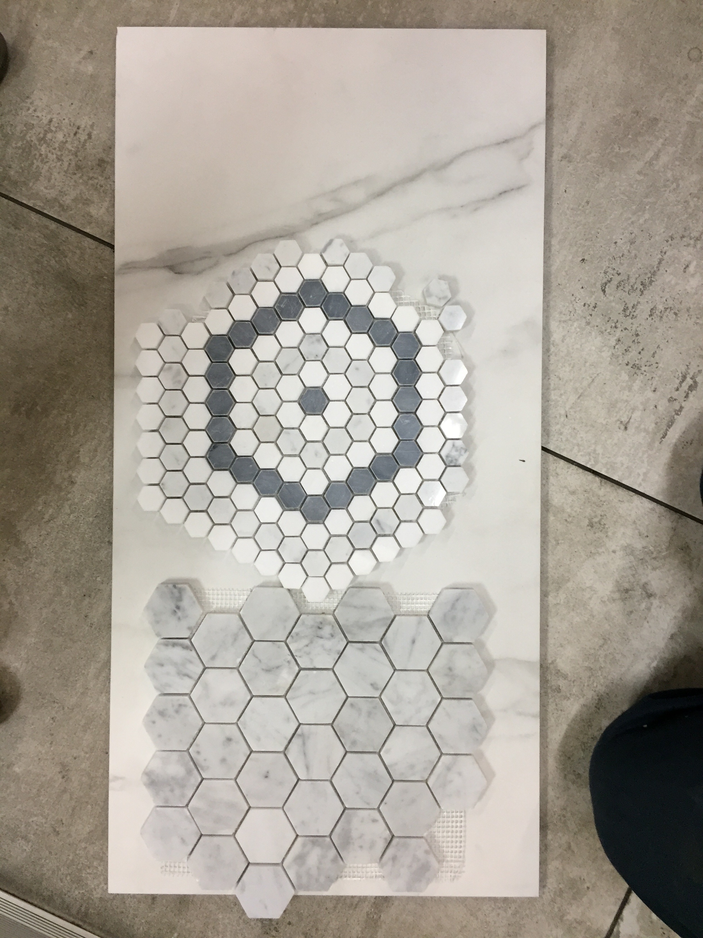
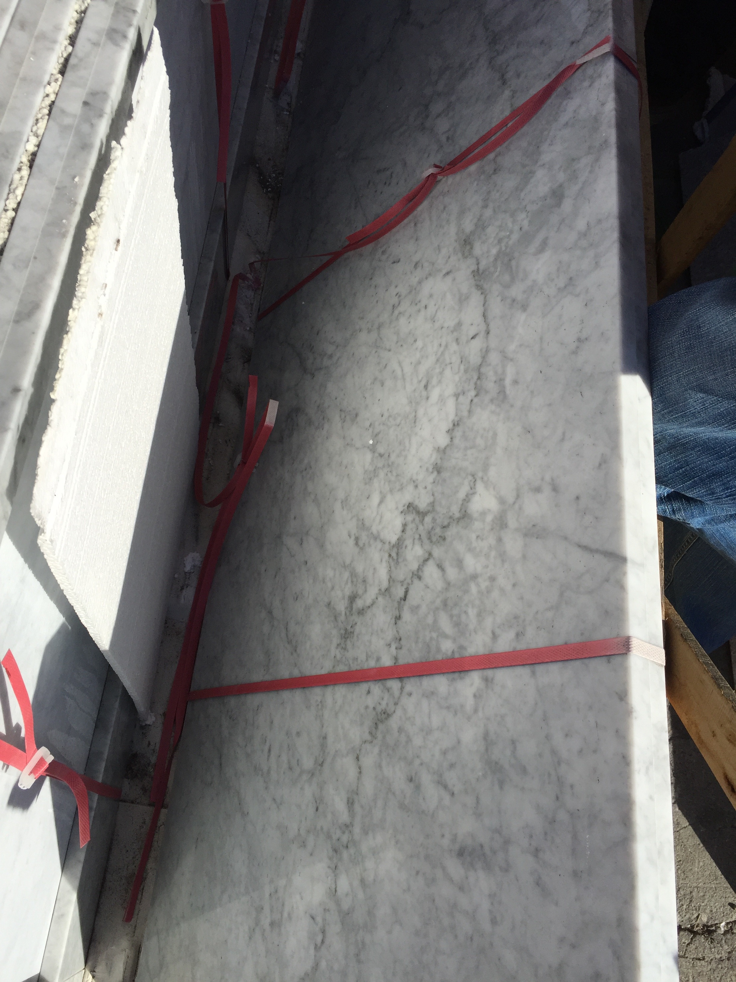
Last but not least, we found a pre-fab Carrera slab for the vanity top – YAYYYY I was so happy we were able to snag that:
 I felt like once I made the choices and bought all the tile that I had done the right thing but I was SUPER. NERVOUS. This is not your typical bathroom and I don’t want it to be, but taking risks can be scary. They started laying the tile in the shower last week and I was still feeling kind of wary:
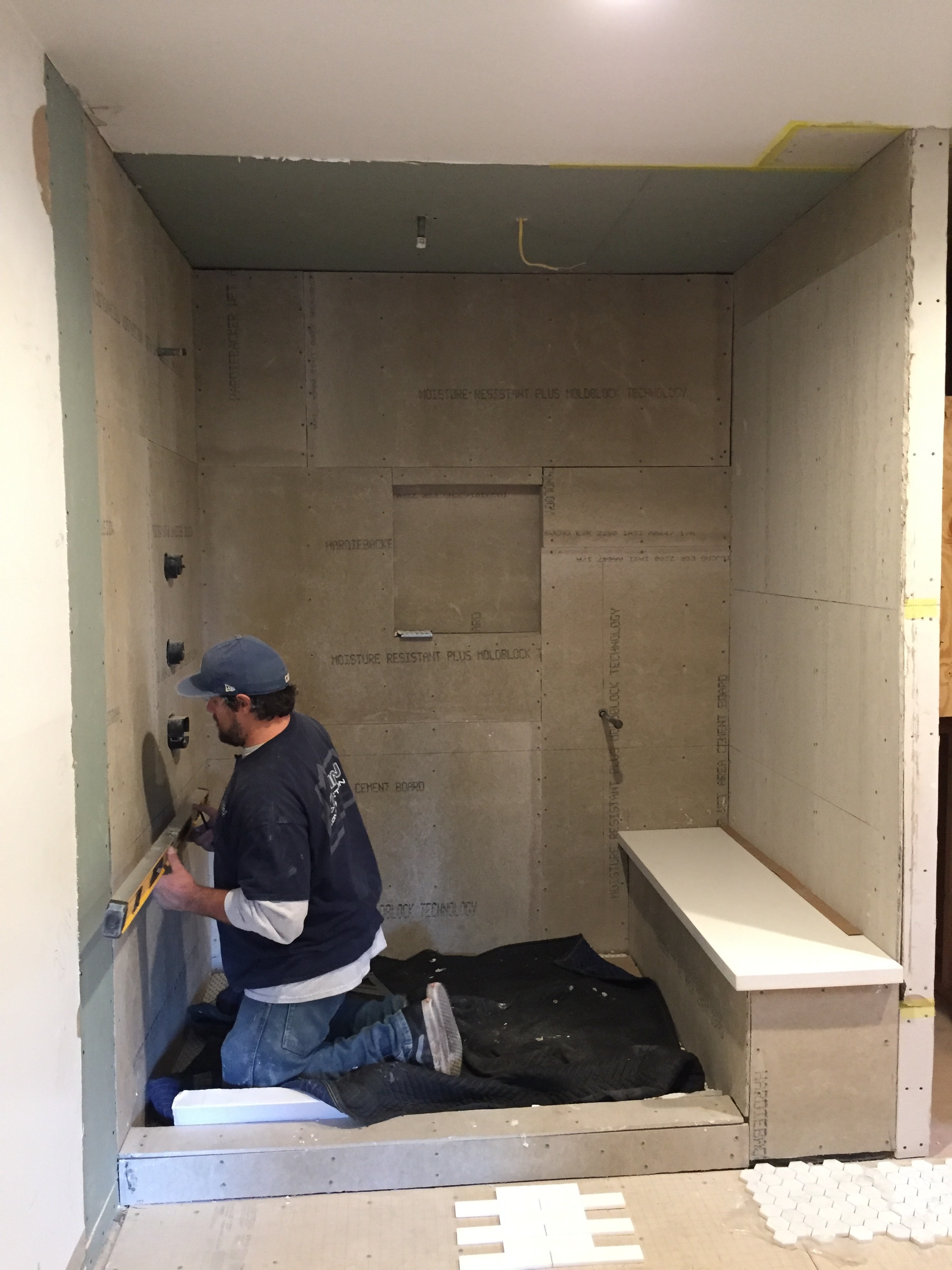
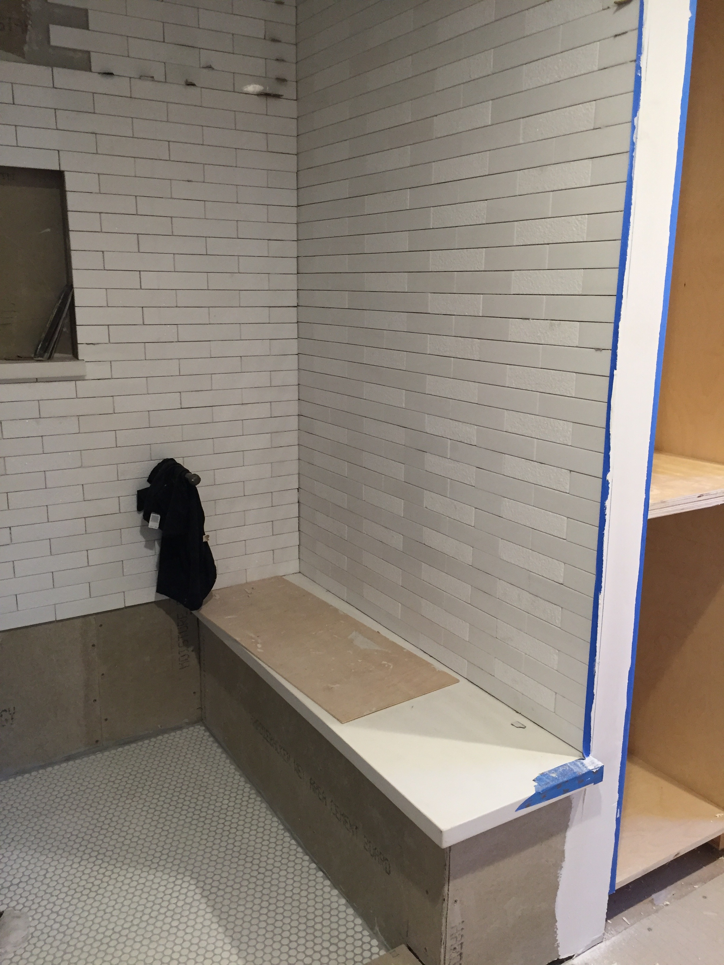
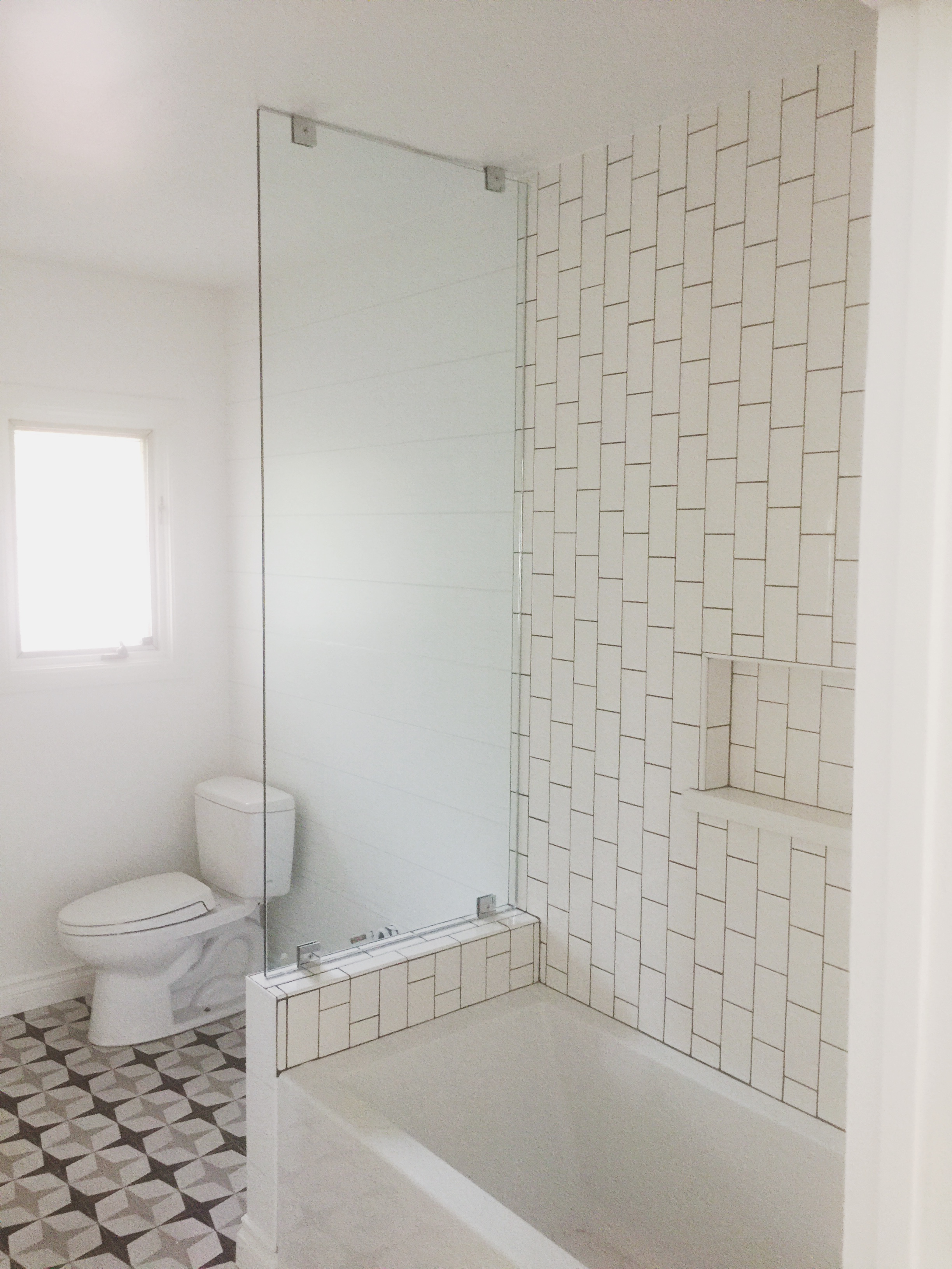
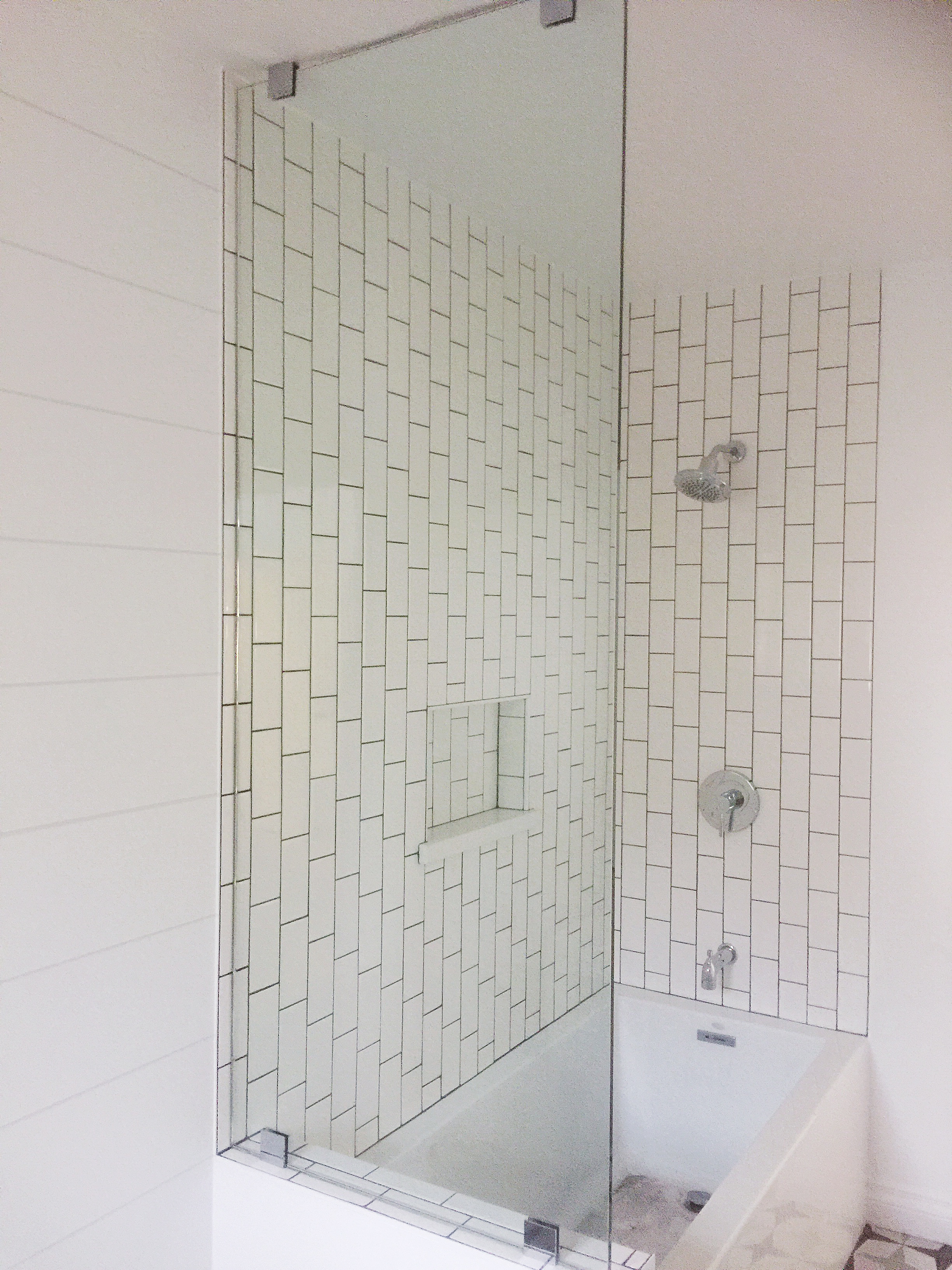
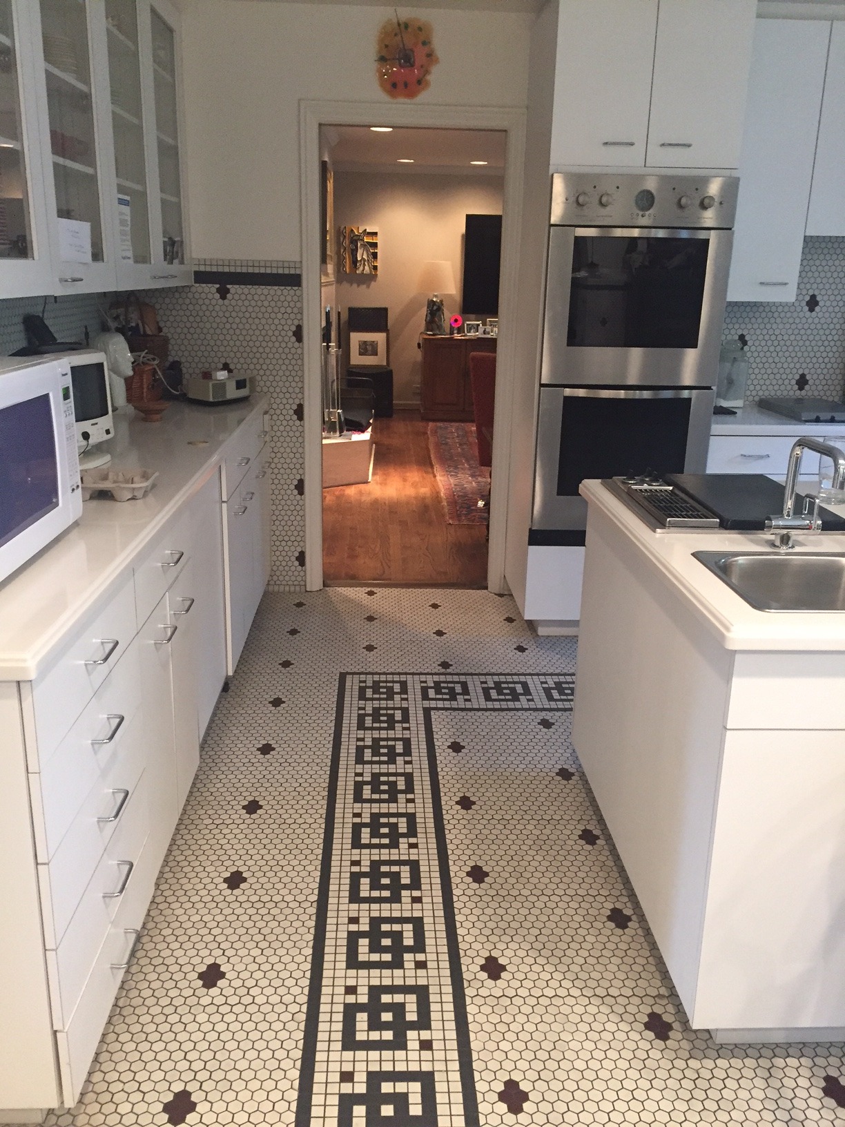
Tile is really hard to fully grasp until it is ALL installed, grouted, & finished. I liked the thassos but without the white grout I couldn’t really see it…until TODAY! My jaw dropped when I saw the final product (minus the fixtures):
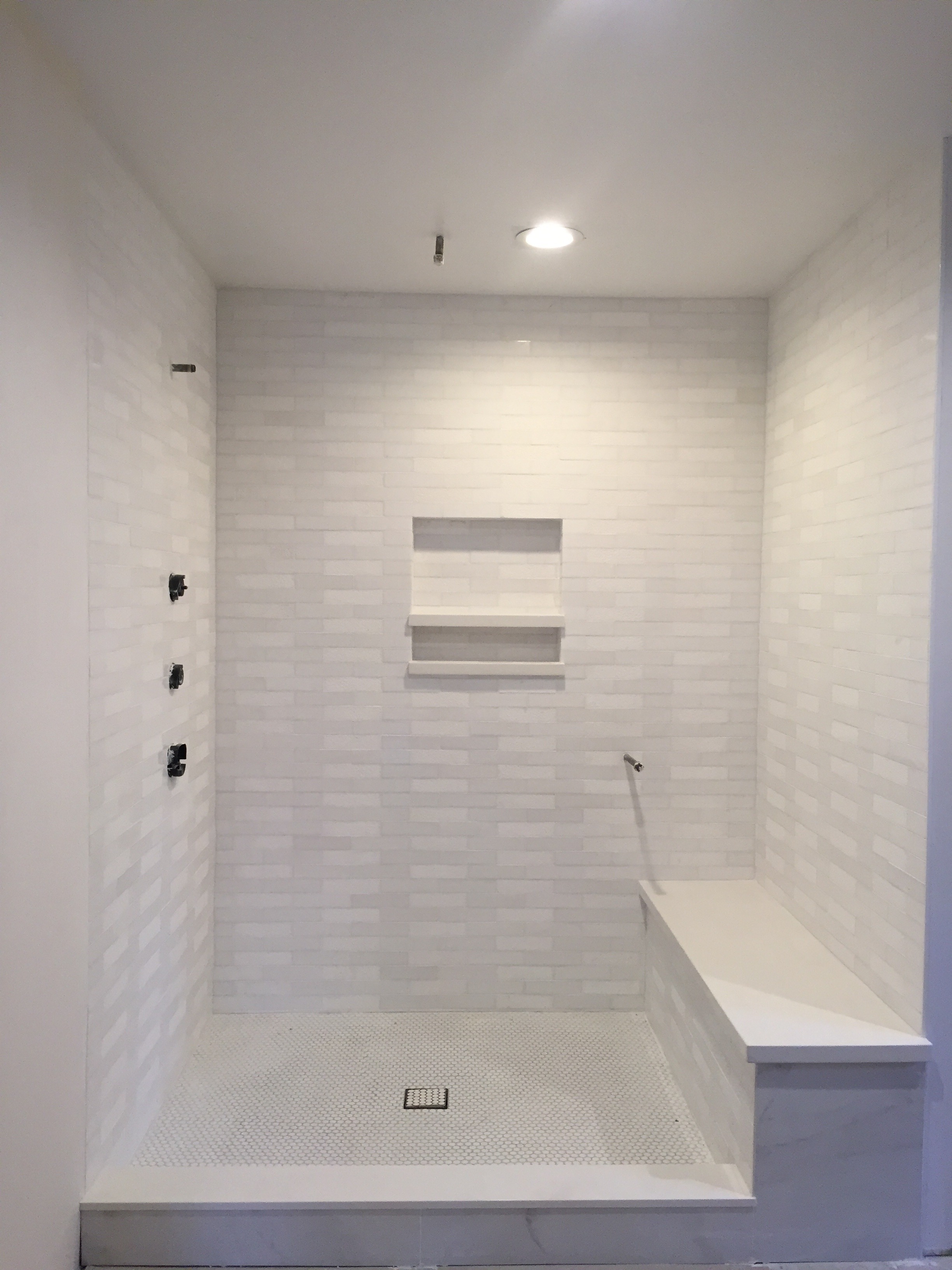

Its almost too pretty to touch. And how cute is my shampoo niche? We had some leftover white quartz from our kitchen slabs so we used it for the bench top and shampoo niche. The shower floor was also just as I’d hoped (tile in drain still needs grouting):

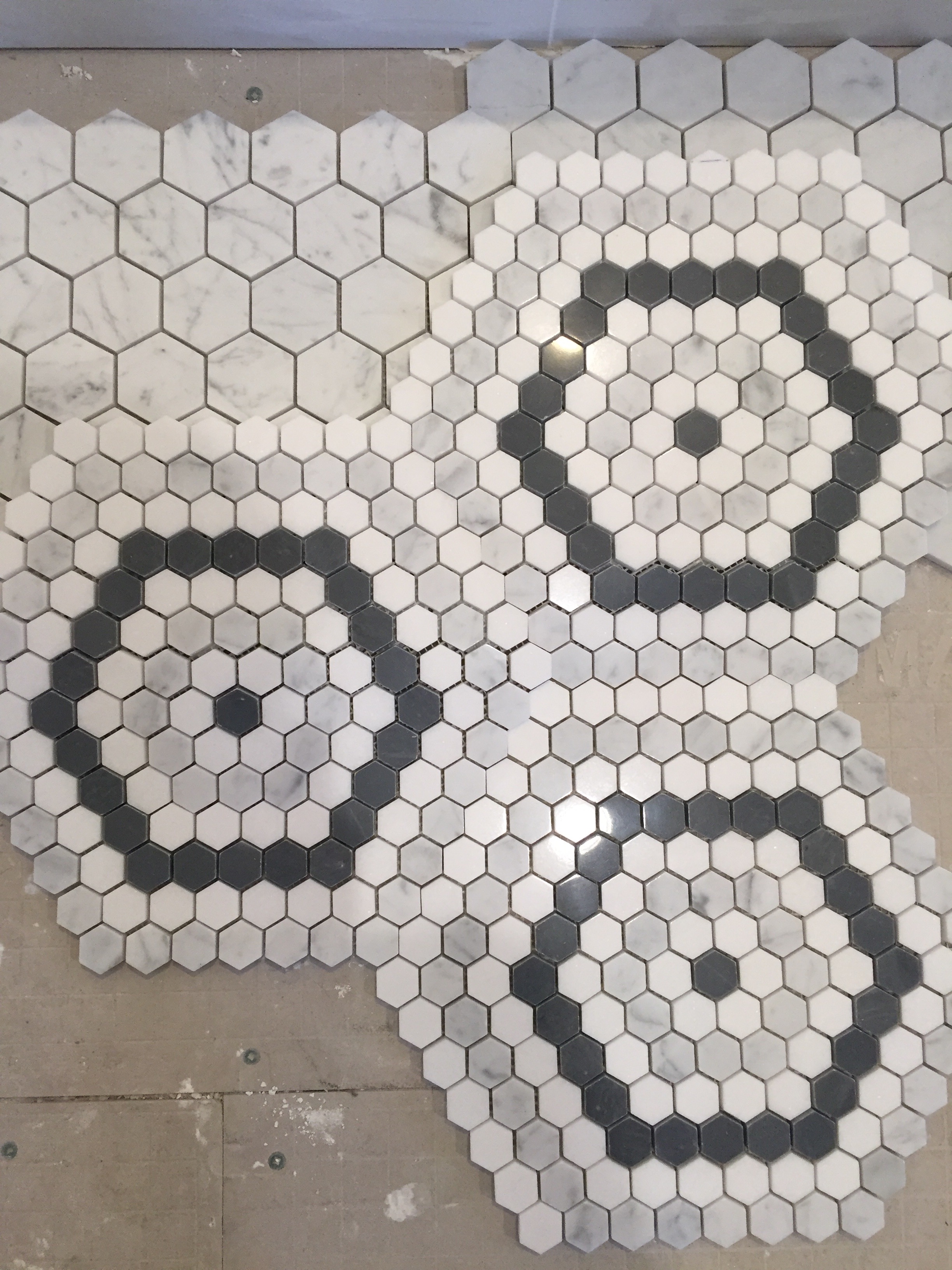
The platinum grout was definitely the way to go. Now the last piece (besides vanity which isn’t ready yet) is the BIGGEST piece – the mosaic floors. We started laying it out today because with the border it is a tad complicated. Seriously though, it looks AMAZING. I cannot wait to sit there and watch them install it like a total psycho:
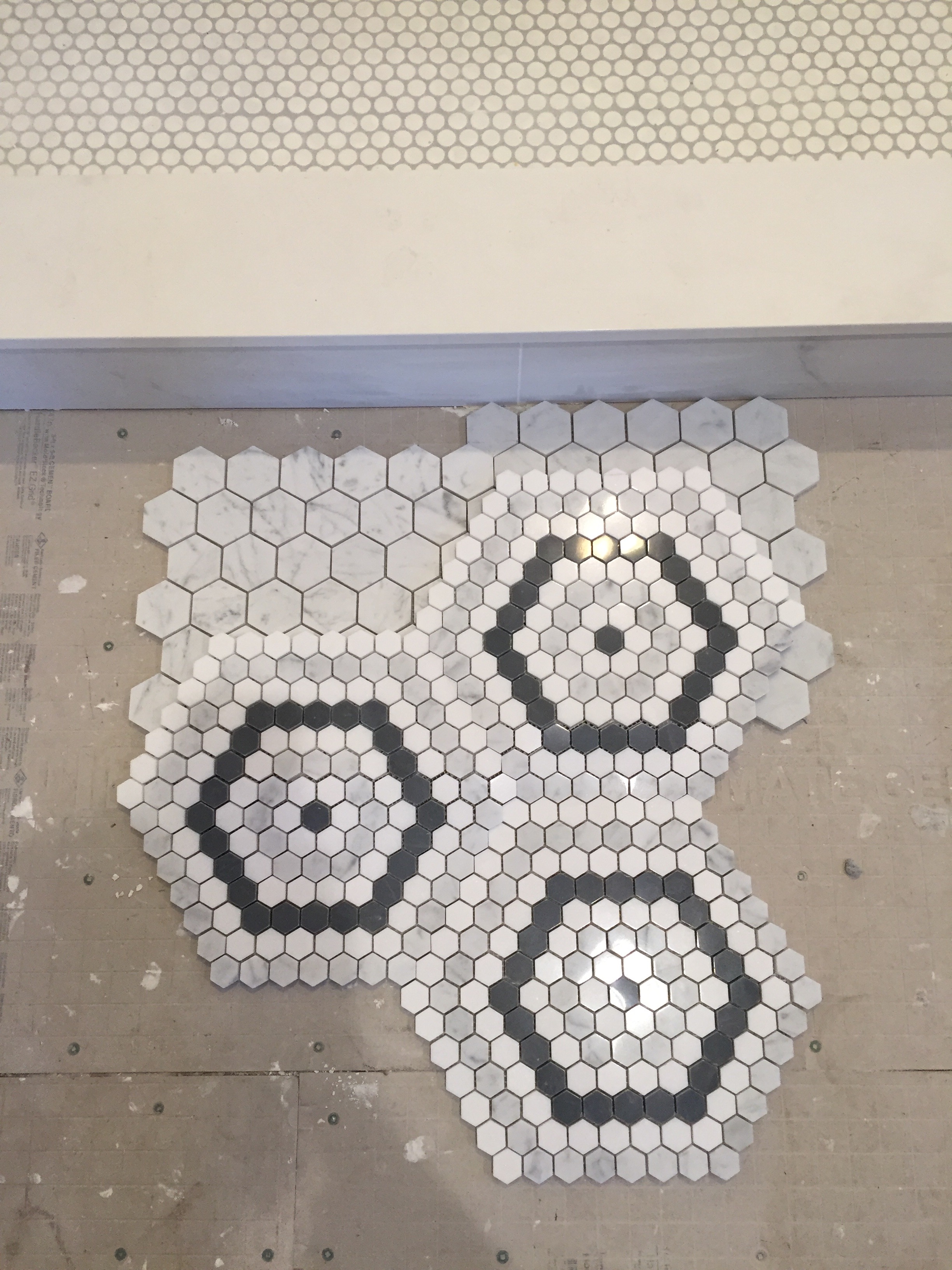
 That last show really shows how the room is going to come together. And I can’t wait to see how the wood on the vanity and the linen closet add some warmth to the space. I will give you guys an update on the jack & jill bath next week – stay tuned! xo, AE
The post Longest overdue post ever! appeared first on los angeles interior design firm.
Now to the outside… 3 Dec 2016, 12:11 am
Things are trucking along nicely over here at project #aedesignsherown and I cant believe the progress we have made. The subfloors have been leveled and new wood floors are being installed Monday (!), the ceilings have been taken down, new can lights put in, and new ceilings have been put back up, a lot of the walls are being put back up and finished as well. Soon tiles will start going up and cabinets are being built. We are moving in 44 days so I don’t have any time to procrastinate on decisions. Its really, really hard to work in design all day and not second guess my choices, but I am doing my best!
I started getting bids from painters to start on the outside of the house. Here is a current snapshot of the exterior of our house:

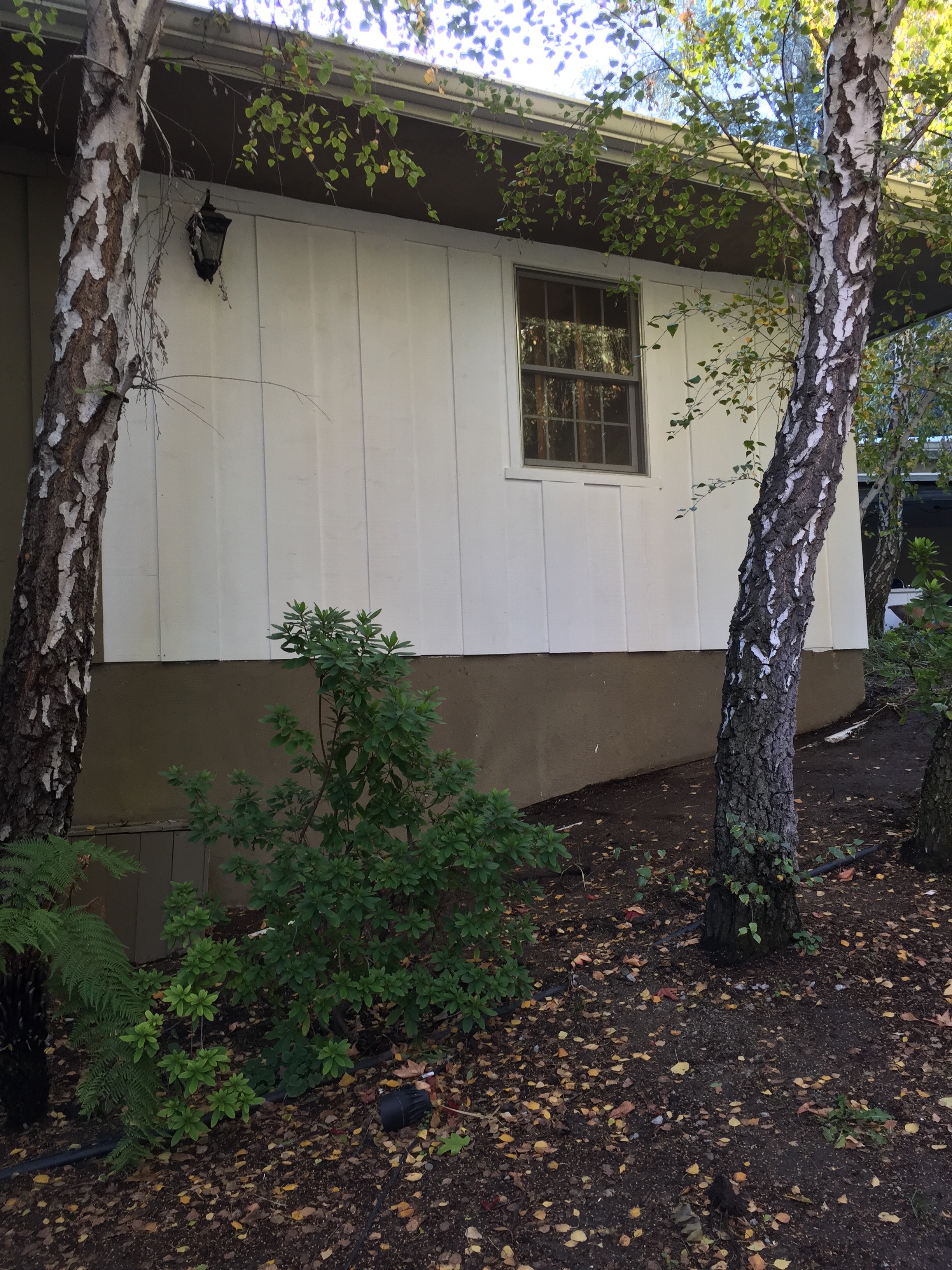


Not a pretty picture. The original color paint is a mucky avocado green that essentially camouflages the house into the landscaping (do you see the GIANT tree in front of the house??). The part that is white is the new exterior we had to replace because of water damage and because we removed a balcony and some windows (it is white because it is primed).
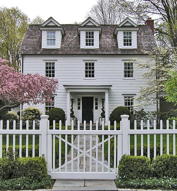
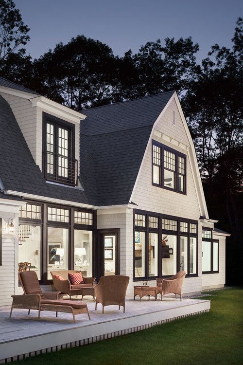
The house is really unique – it is made of stucco, brick and wood siding. It is hard to classify what kind of house it is – it was built in the 60s and it is a ranch house with a minimally sloped roof that you can barely see. Originally I was thinking of doing a blue-gray, like Benjamin Moore Hale Navy, because I thought it would give the house more of a cape cod feel, which is my favorite kind of house:


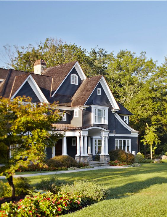
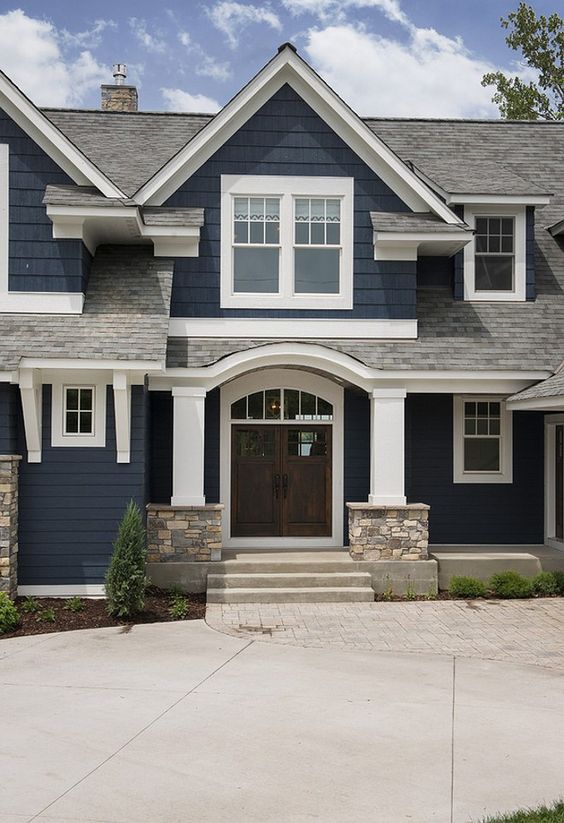
The thing I love about these blue houses is that they pop against the white trim and gray roof. Our house has very little trim in the front of the house and you can barely see the roof so I am concerned painting it this color will keep giving it that camouflaged look and I really want it to POP once you get up the driveway so you can really see the house.
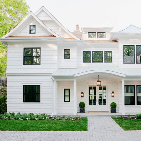
I hadn’t really considered white until the primer went up and I was like oh wow, its white! I am of course nervous it will get dirty from all the trees but I have been reassured our gutter system is working well and would prevent leaves etc from falling on house.
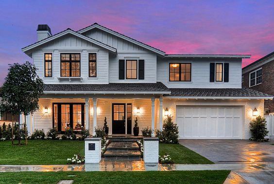
Now for some beautiful white houses:
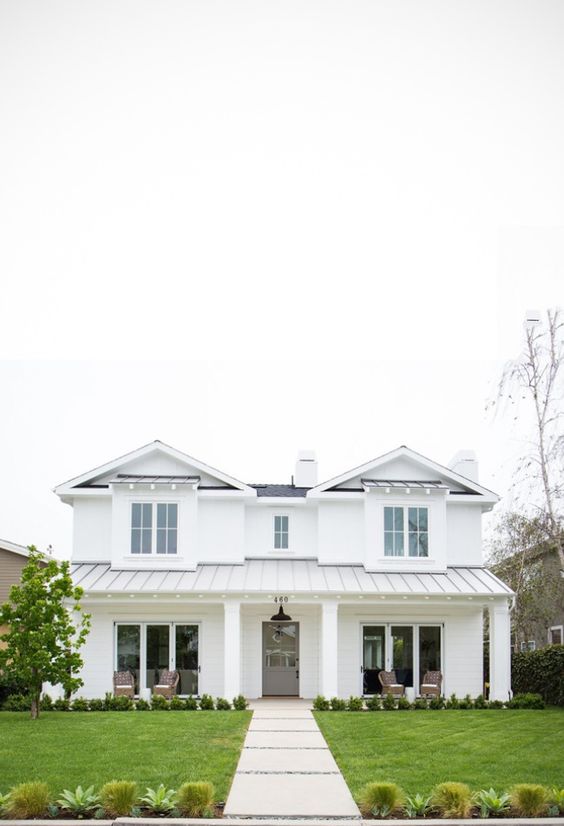
At least my kids/husband cant get spaghetti sauce on the outside of the house right? Well maybe they can, but its not as likely as a living room sofa.
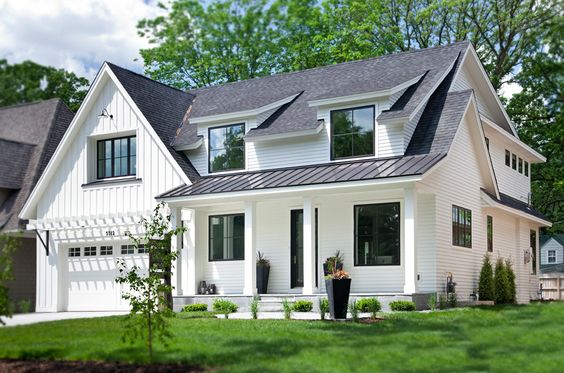
Along with a white house must come BLACK trim.
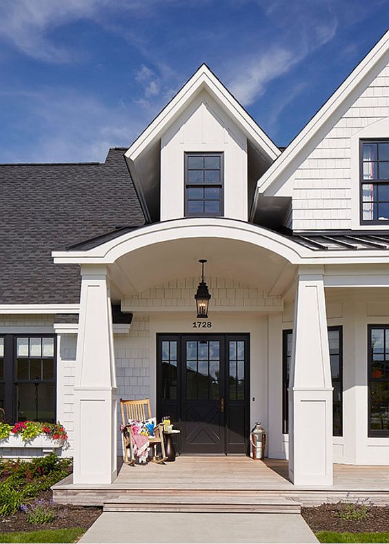
I don’t have a lot of trim on the outside of the house, but I think I could fudge it by getting creative (can I paint my gutters black??).
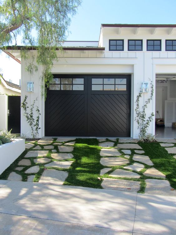
I would also like to paint the garage black. So rad.

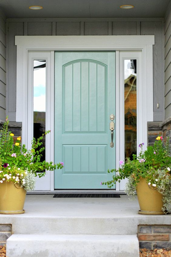
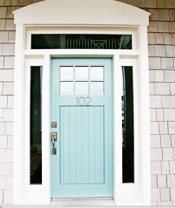
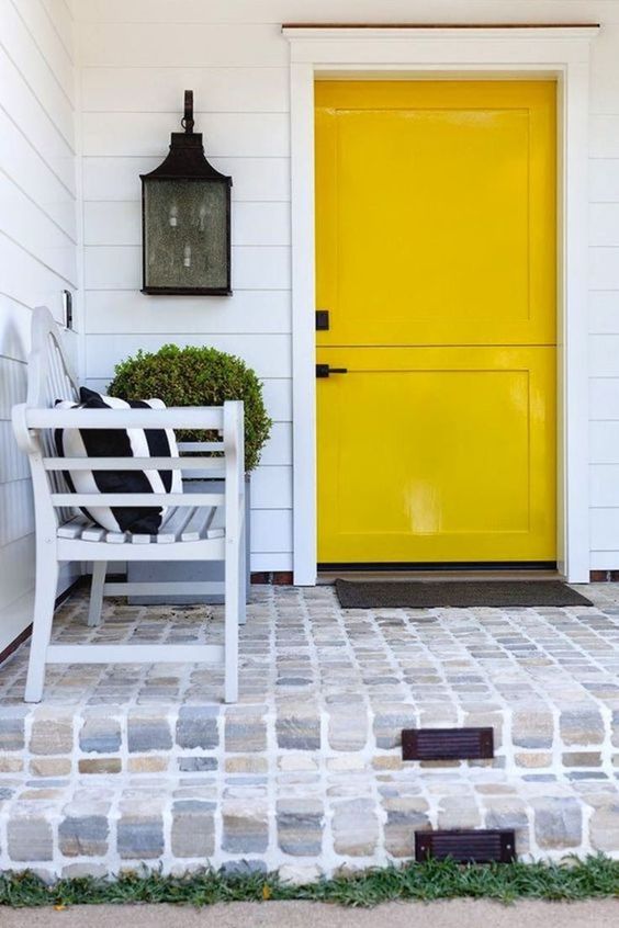
Once we are able to replace our front door (will be part of phase 2 – not a priority), I would love to paint it a cool color, maybe turquoise…
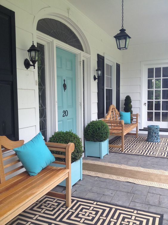
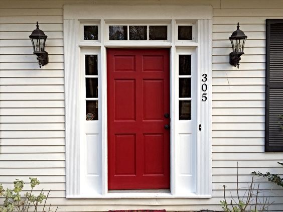
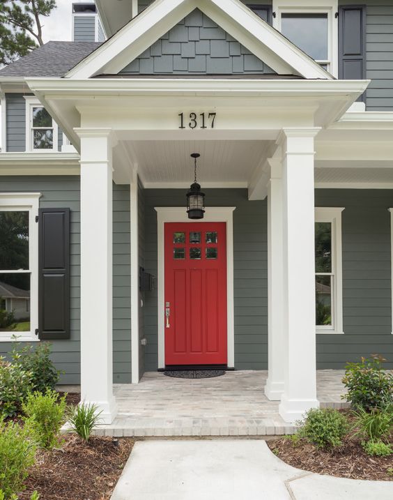
….or red…..
….or yellow?!

Expect many, MANY paint swatches to come. Can’t wait to post more exciting updates next week! Happy weekend! xo, AE
The post Now to the outside… appeared first on los angeles interior design firm.
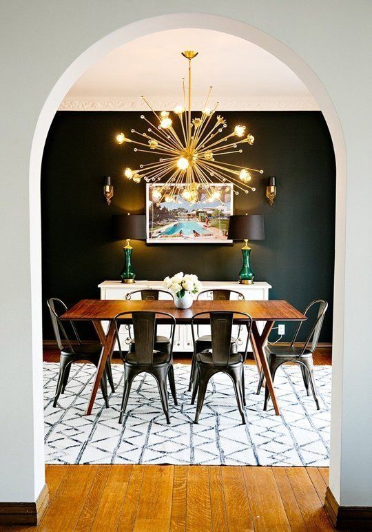
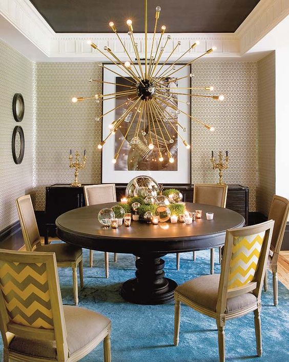
A space to feast 23 Nov 2016, 7:30 pm
As a tribute to the upcoming Thanksgiving feast, today’s post will focus on the dining room. I usually travel to the east coast to be with my family on this holiday, but things were too crazy here this year, what with the house in shambles and moving out of our townhouse any day (I also would be dreading taking my 22 month old on a 5 hour flight, so am lucky I was able to get out of it). It feels less “thanksgiving-y” in LA than on the east coast, and without all the stress of travelling, I keep forgetting that its coming up tomorrow! But when I went to see the progress on the house today, I was reminded of what will someday be our formal dining room and I got excited all over again.
This house has a formal dining room – a REAL dining room – not just a nook off somewhere near the kitchen (although we have one of those too). This means I am officially a grown up and will have to figure out how to cook meals and host guests in the near future. Here are some progress pics of the house as it is today:
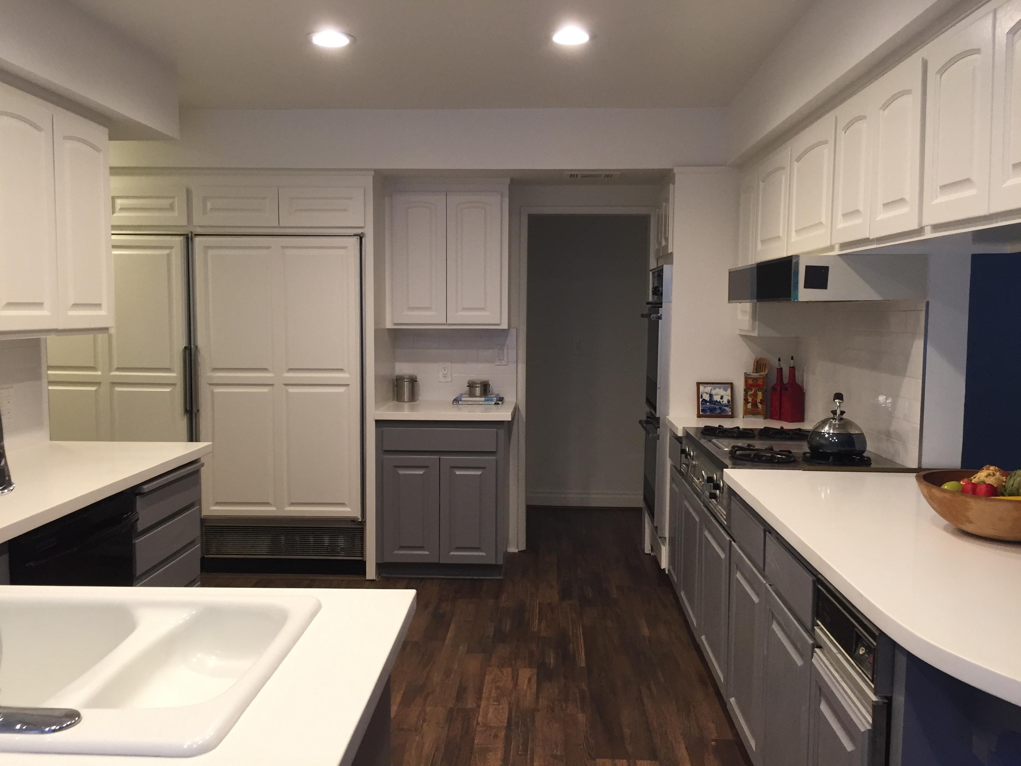
This is the kitchen. Say Hi to our new beam!

This is the walkway to the office and mudroom past the kitchen.
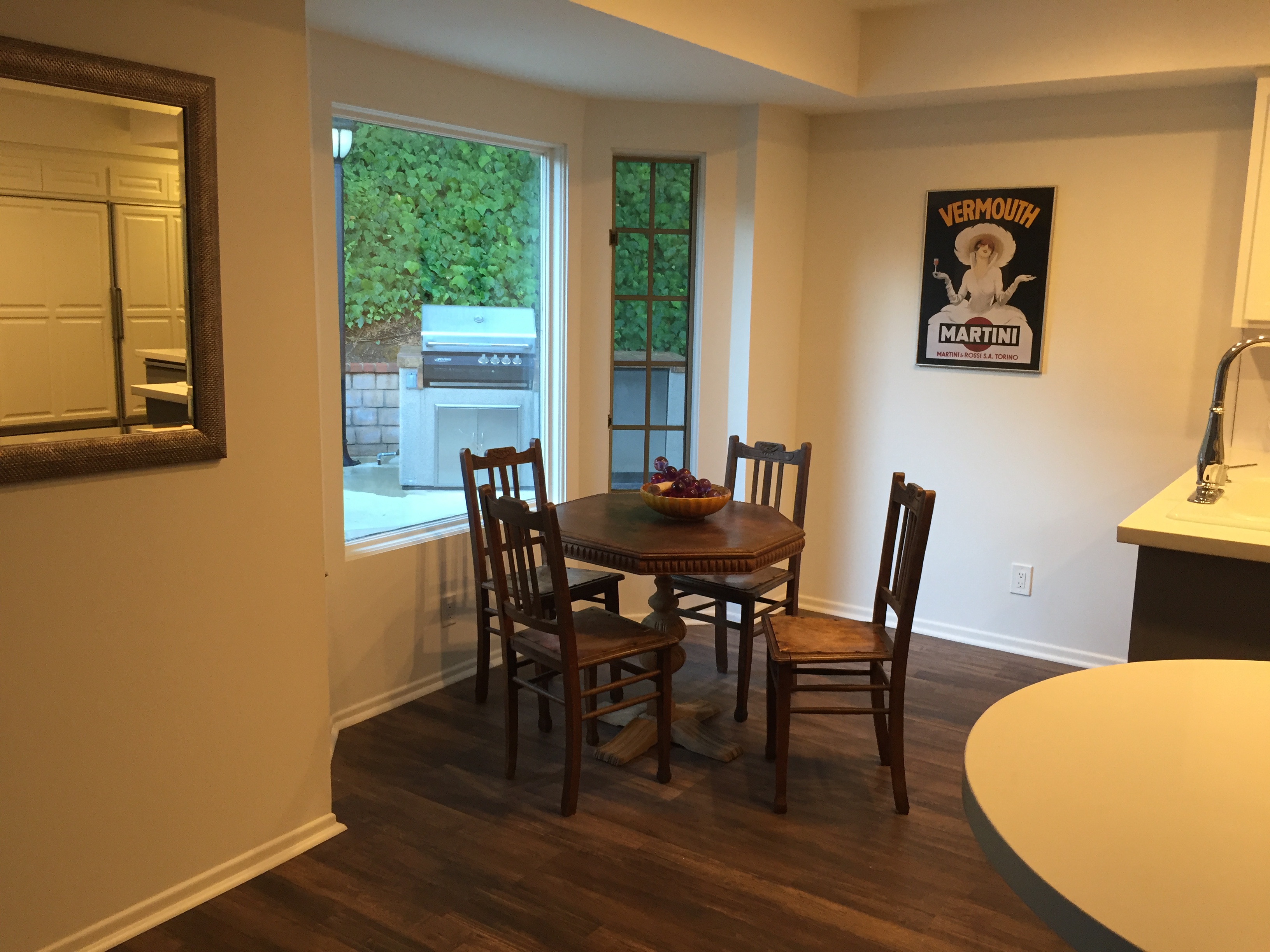
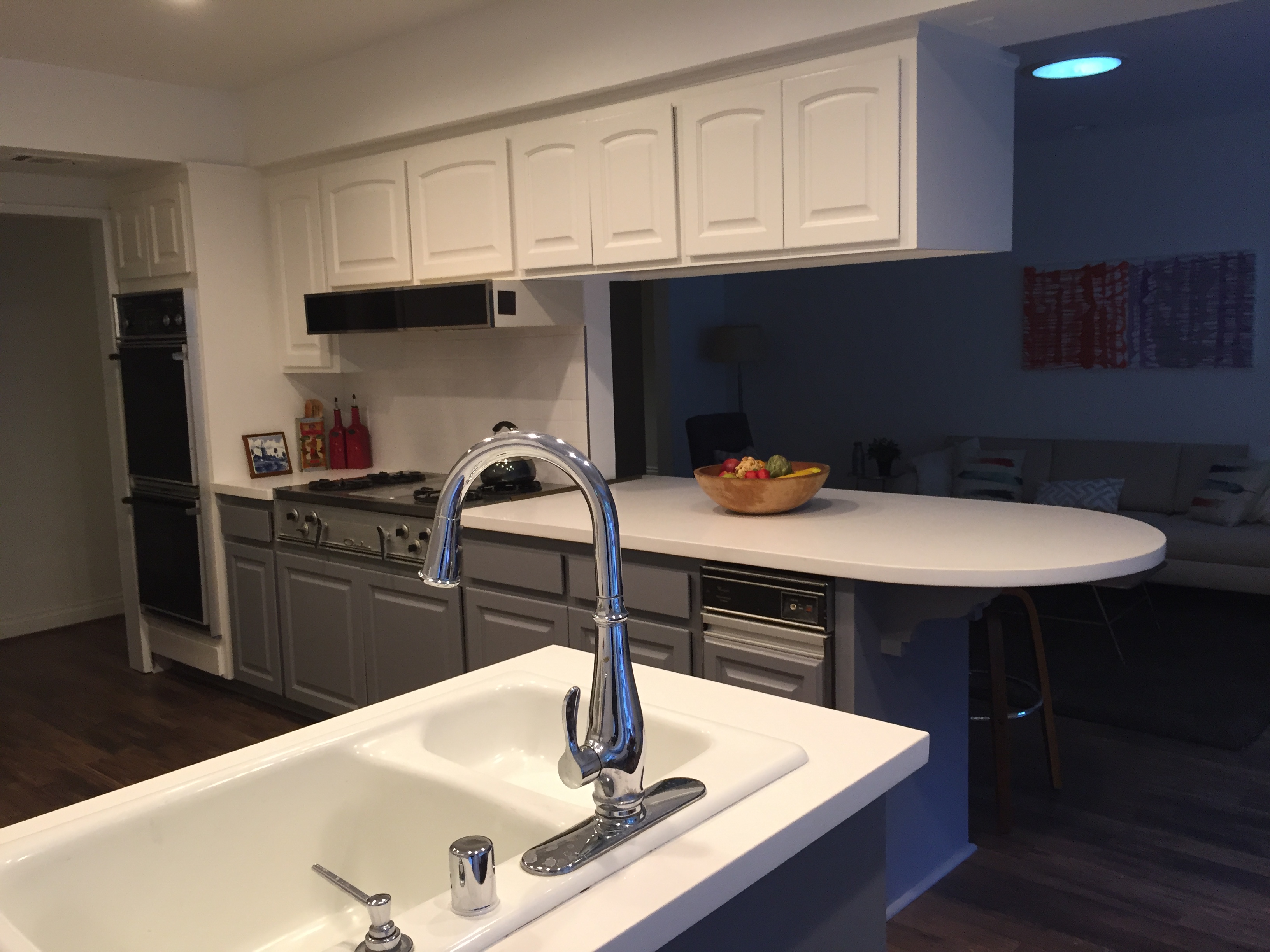
This is the dining room looking into the kitchen/family room.
Things are moving so fast! The house feels unbelievably open and I can’t wait to start seeing things built.
So the dining room is the first room that you see when you walk into the house. It is very open and you walk right through it to get to the kitchen/family room. At first I thought that was odd, but then I thought it would be a great opportunity to make a welcoming yet exciting space. I have had a few flashes of visions for this space, but figured I might as well start honing in on them and getting this space sorted out because otherwise people will walk into my house and be immediately greeted by an empty room.
I am planning to keep this room somewhat light, as in no dark or black walls (will be dong that in Brady’s room – stay tuned). I do think it would be nice to add some soft wallpaper to this room to define it as its own, like in this Southampton dining room by Tamara Magel:
I love that this room is supposed to be “kid-friendly” according to the article in My Domaine I read. My kid would DESTROY those chairs. However I do like the grasscloth walls, it gives the room some glam and warmth.
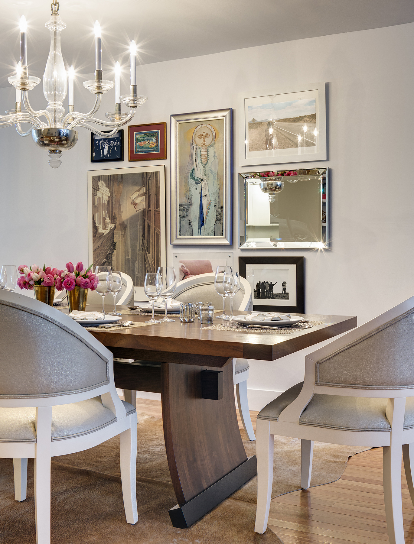
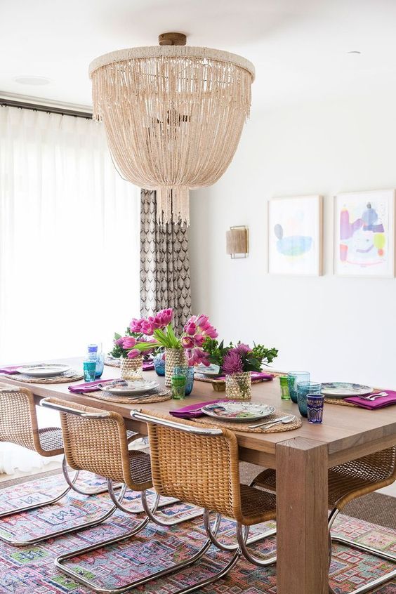
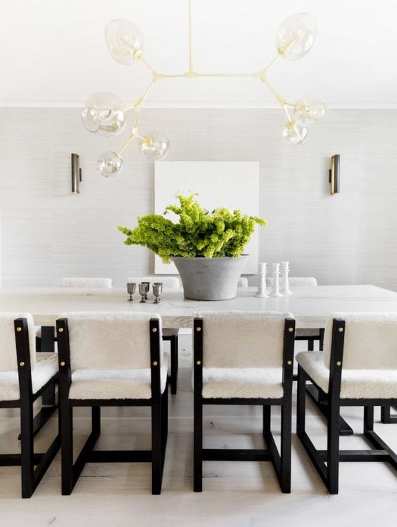
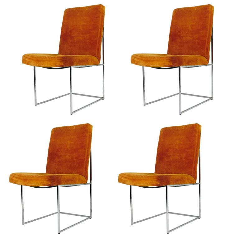
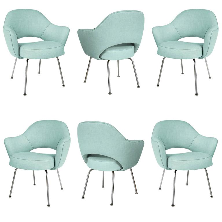
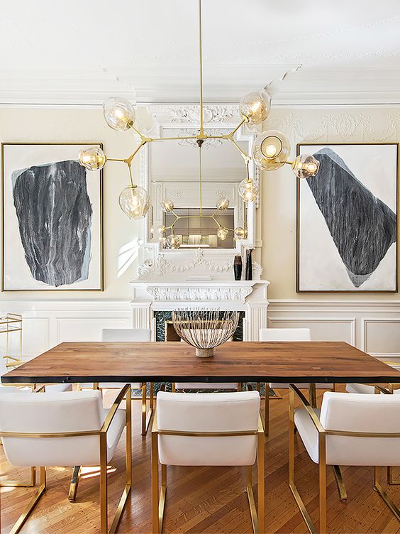
I also have been really into the idea of using vintage chairs for this room:
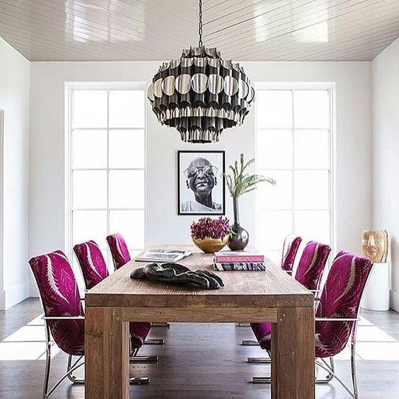
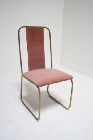
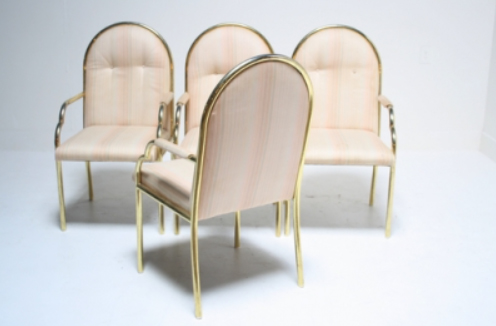
I LOVE both these dining rooms. They really bring the wow factor – mostly by lighting and awesome chairs. I am thinking definitely vintage in this room and a to-die-for fabric to reupholster. Sometimes I look around on Scout Design (based in Dallas) because they have awesome vintage finds at unbelievably low prices. Check out these 80’s brass chairs that would look so amazing in new upholstery:
When I am off in a fantasy land, pretending I am one of my clients, I take a peek on 1st dibs to see what I can lust after:

Milo Baughman, Paul Evans, Saarinen…can’t go wrong. I will probably end up scouring some flea markets with the pennies I have left after this renovation.
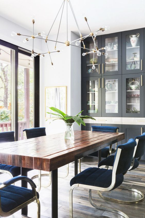
Something else I have been into lately is camel leather upholstered dining chairs. Leather is so easy to clean (my family is so messy) and the camel color is really warm – and goes well with bold colors like navy or emerald green:
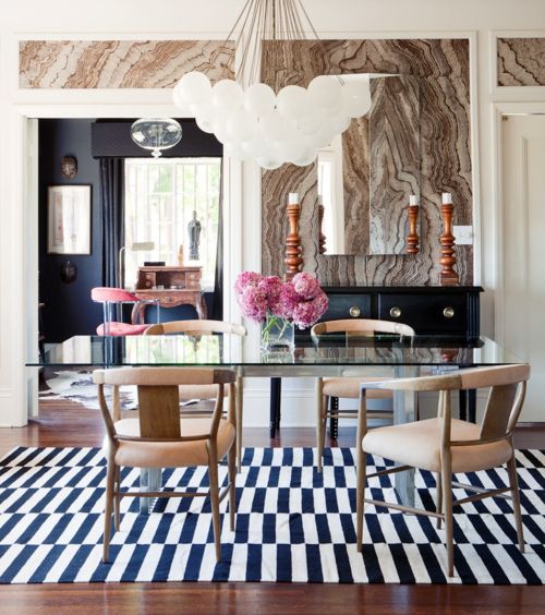
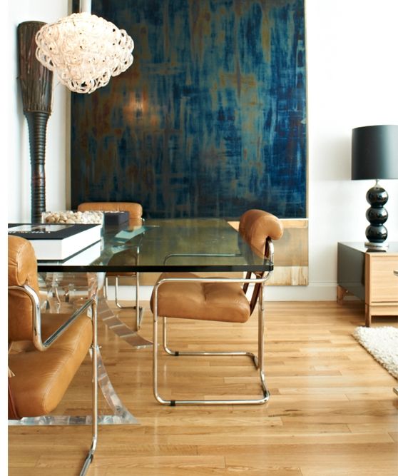
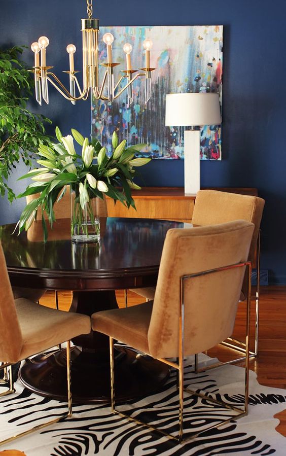
Lots of vintage-y looking chairs here too. These spaces are so warm and depart from all these cool, gray tones we are seeing so much of these days. And even though I said NO WHITE furniture in my house, these white leather chairs seem easy enough to maintain and give the rooms a crisp, clean feeling:
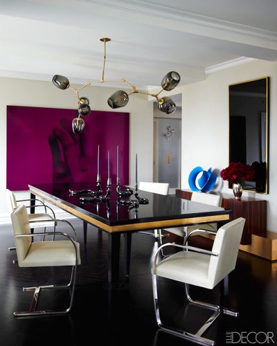
I am anti-Donald Trump but I am pro Ivanka Trump’s NYC penthouse – I have loved her dining room (above) for years. These spaces also benefit from the beautiful Lindsay Adelman light fixtures. Ugh dreamy!!
Nothing quite brings a space together like a big brass sputnik-type fixture. I will definitely be on the hunt for something jaw dropping over our table:
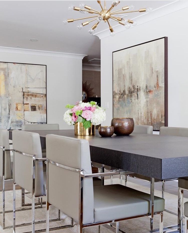
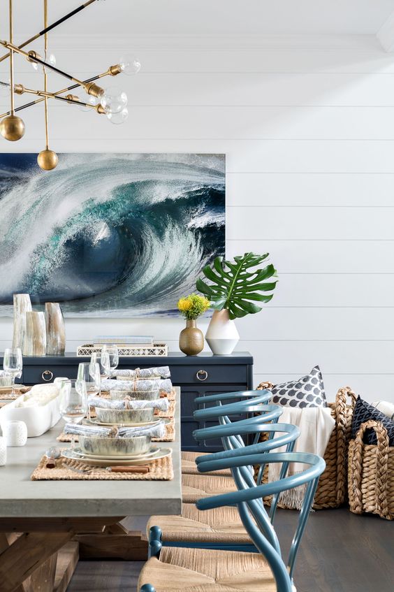
I have been lusting after this piece by Lambert et Fils (sold by twentieth design in LA). Its got the height and width to really fill a space but also feels light and airy. It also feels half vintage half modern, which is amazing:
 This reminds me a lot of the Apparatus arrow pendant that we just used in our Westlake dining room. Their pieces are on fire right now, so amazing!
I hope everyone enjoys their day and their feast. See you all next week! xo, AE
The post A space to feast appeared first on los angeles interior design firm.
D-Day 15 Nov 2016, 6:02 pm
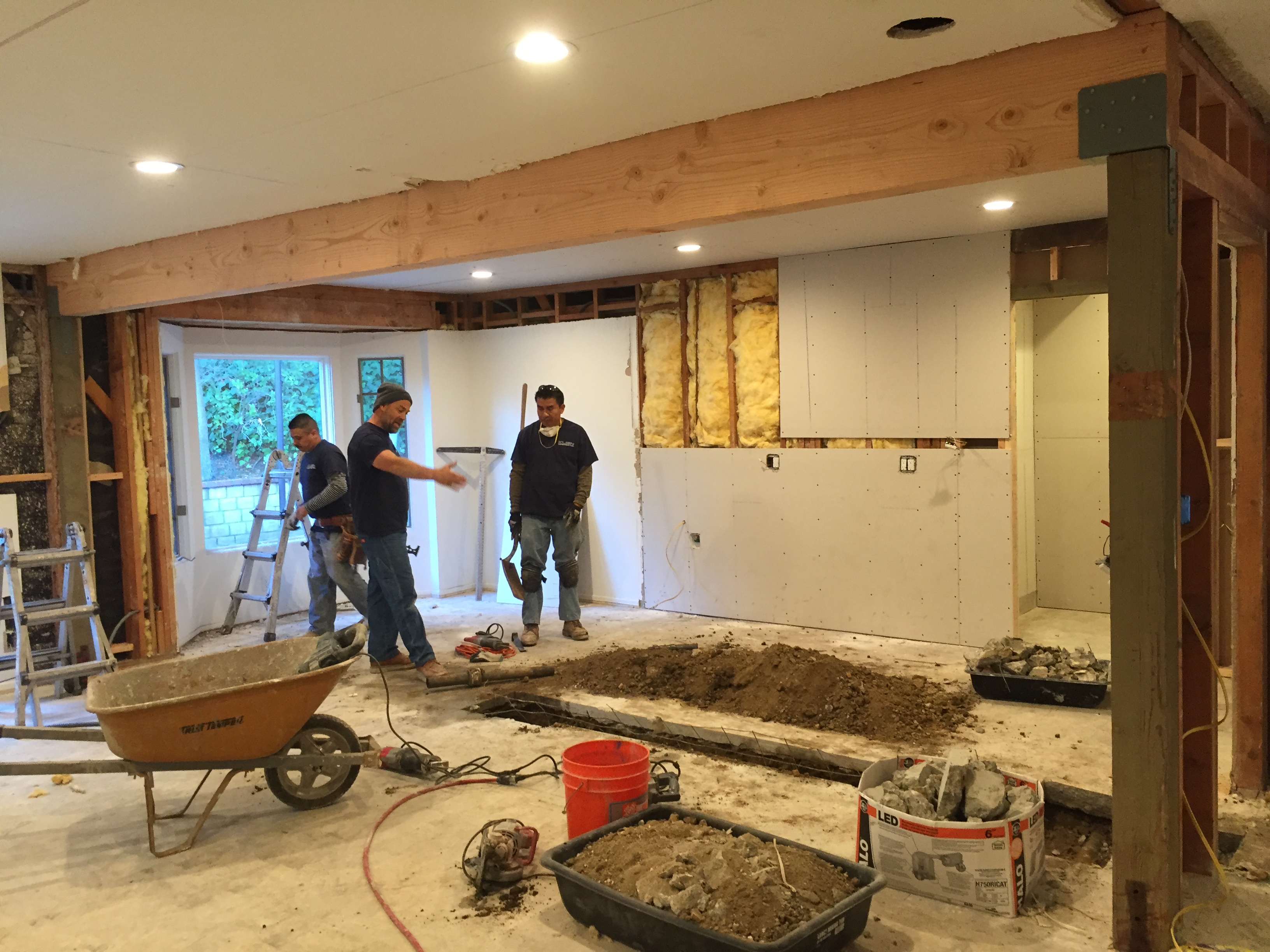
Never have I been so excited to receive pictures of partially broken down walls and a house (my house) looking like a total disaster zone. But when I got a text from my contractor with photos of what happened during day 1 of demo, I was over the moon. This house has an amazing layout but there were so many walls, it was almost hard to figure out where you were. During the open house the brokers were giving out floor plans so you understood where you were in relation to the rest of the house. It took me about 2 minutes to figure out that taking down a few of those existing walls would change everything. I prayed to the gods that there would be no load bearing walls or annoying beams in my way (will get to that later) and we laid out our game plan.
Here are some photos what the dining/kitchen area looked like before:

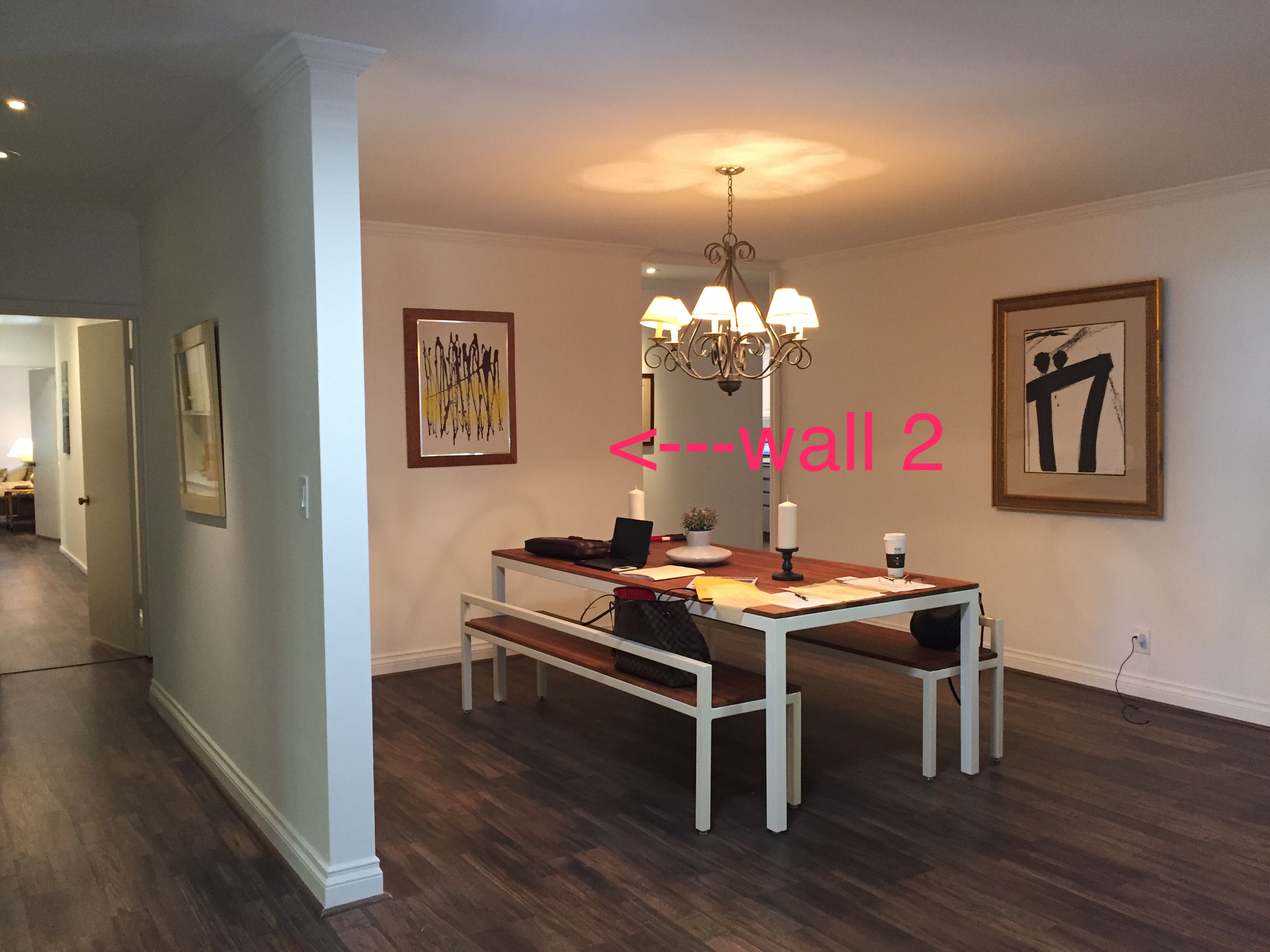
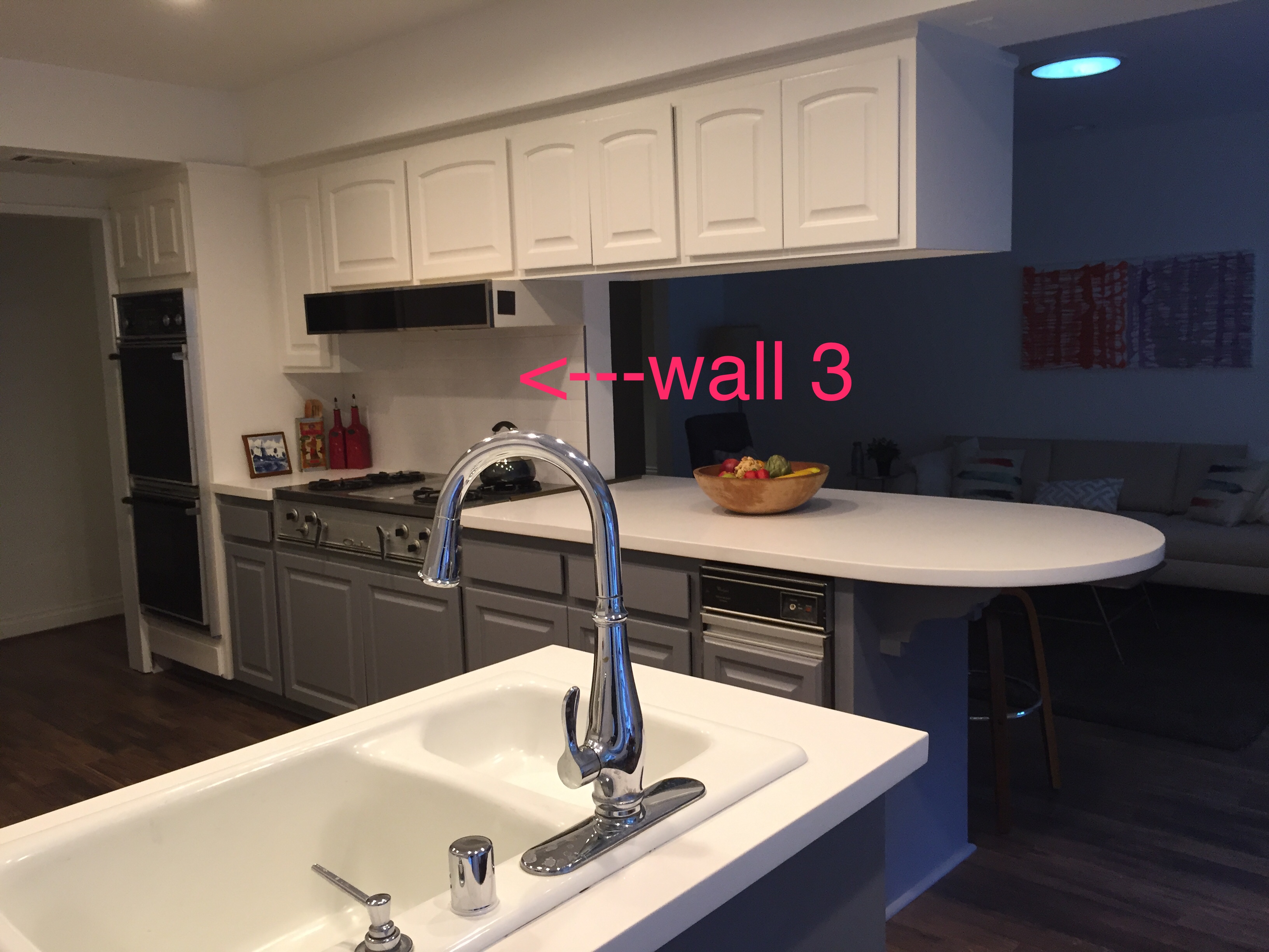
So those are the 3 walls that are coming down. Here is what it looked like after day 1 of demo:


When you first walked into the house, you couldn’t see the kitchen because there were these 2 (non-load bearing) walls that created a dining room. It was so odd and ridiculous and I was jumping up and down when my contractor told me those walls served no purpose and could come down asap. Now when you walk into the house, you can see right to those big bay windows where the kitchen banquette will go in the not so distant future.
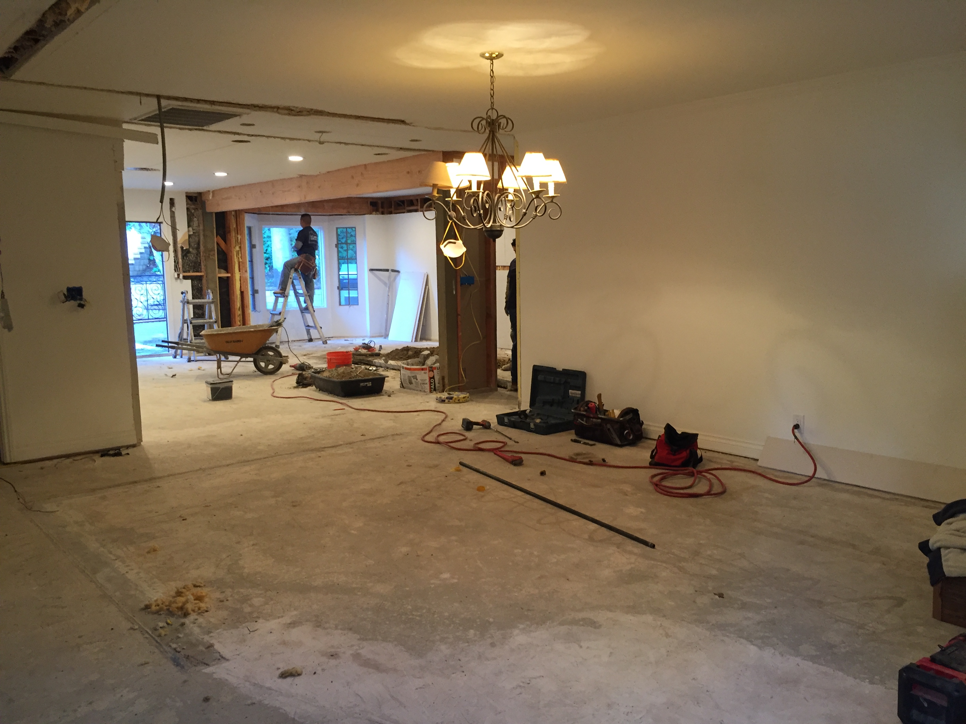
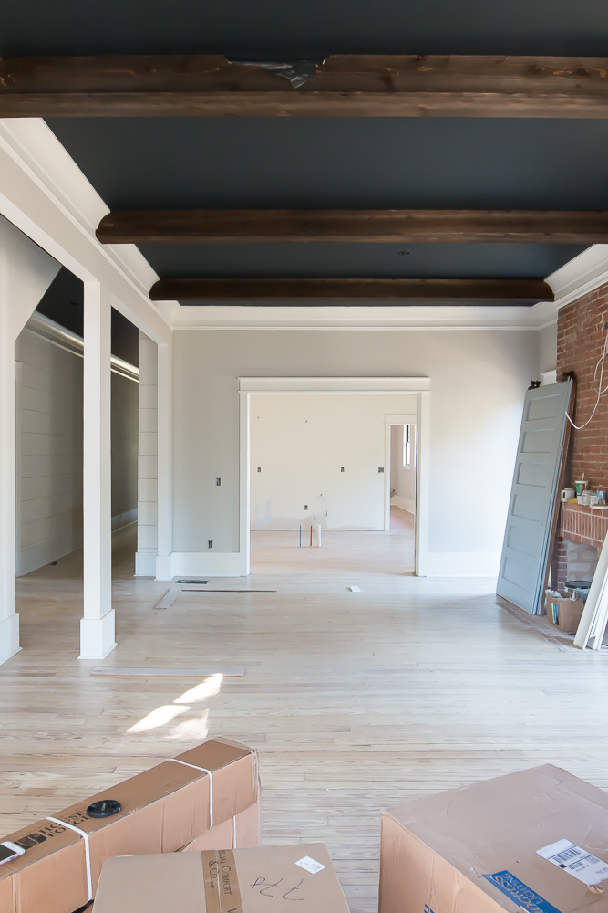
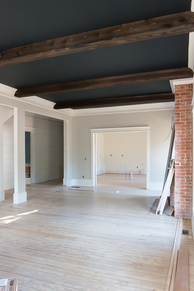
Of course, nothing ever goes smoothly in this world, and we knew we were going to encounter a problem with wall 3 (the partial wall in the kitchen). That wall is unfortunately supporting a very important beam….cue the tears. I was literally devastated about this and refused to design any sort of post or wall or structure to support this alleged “beam” until we learned more about it. Here is what we found today:
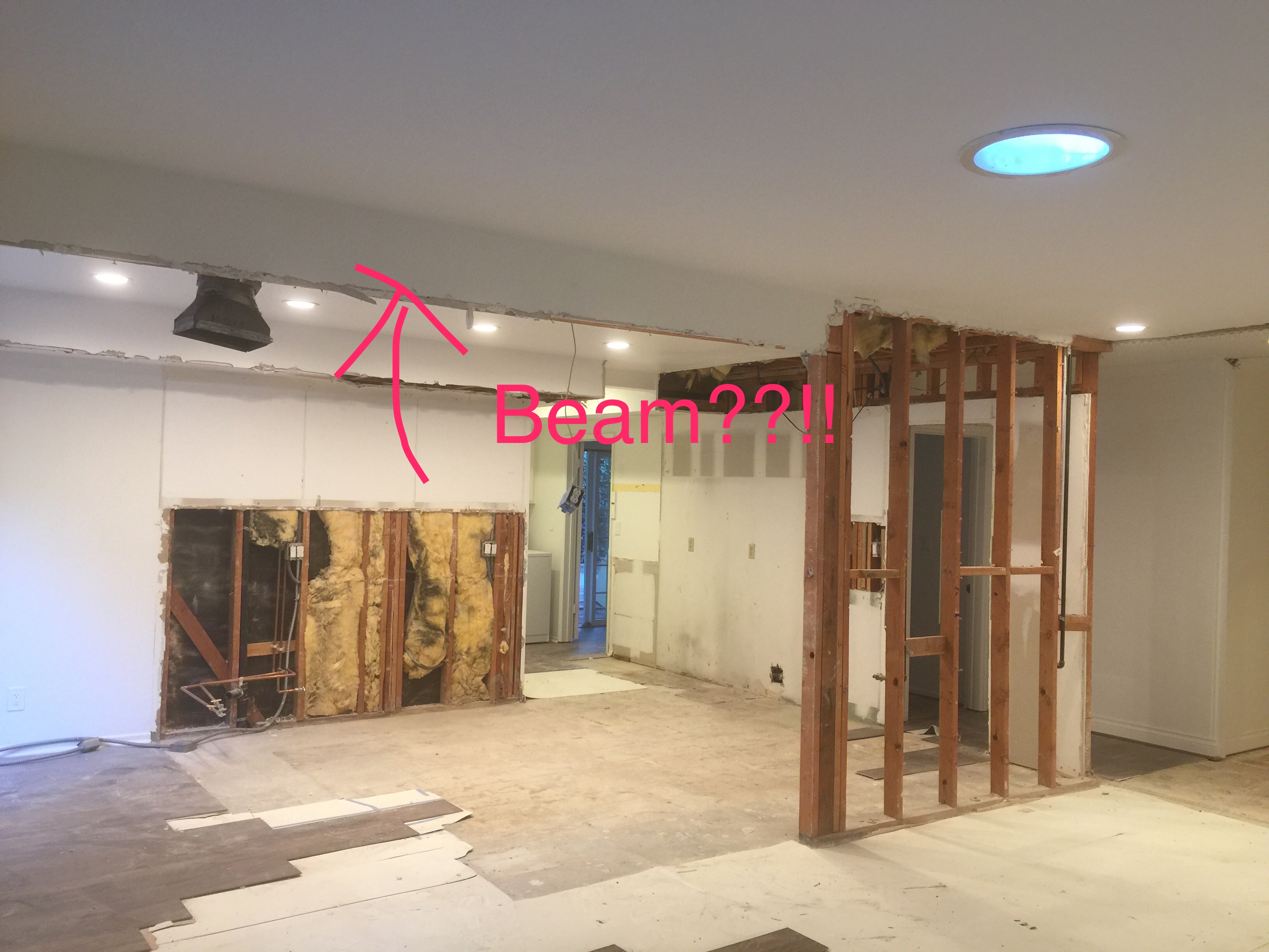
So, there it is, this hypothetical beam my contractor has been telling me during his trips into the attic (which I refused to join him in). BUTTT I did get some good news – yes we have to keep the beam but if we make the beam bigger – right now its just a 3.5″x11.5″ box covered in plywood – then we wont have to add any structural support aka an obnoxious post in the middle of my glorious kitchen! I told my contractor I was crying tears of joy and I think I freaked him out a little bit because he hasn’t been responding to my texts since then…
So having an exposed beam in the kitchen is really not a bad thing. Beams can be cool! Now I have to decide how I want the beam to look and how I want it to relate to the rest of the room. Do I want to make it a cool rustic beam? Do I want to turn it into a coffered ceiling? Do I want to paint it white and try to make it go away? To be honest, I have no idea. Let’s look at some options:
Cool, rustic, exposed beam (make it look like we uncovered something cool but really we are going to be adding it in):
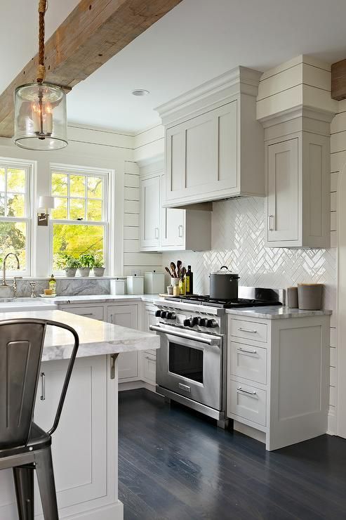
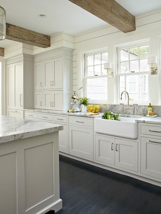
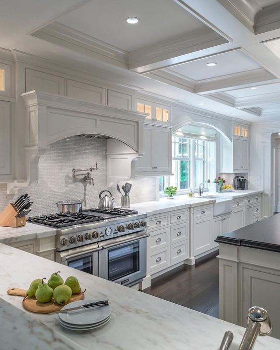
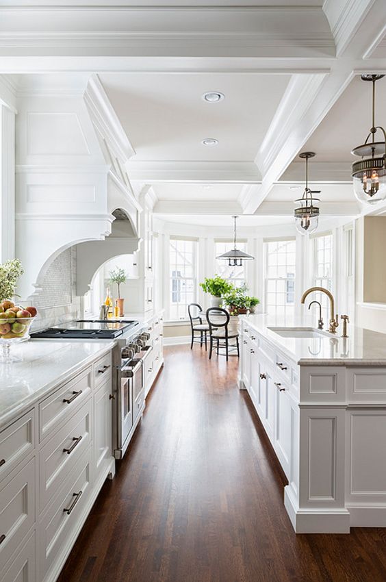
Here is a kitchen which is actually somewhat similar to what mine will look like – soft gray shaker style cabinets – but mine will be more modern with less ornate moldings and without the shiplap detail. These rustic beams are perfect in this space, they are soft and they work well with the “farmhouse” style of the room. I like how they contrast with the dark floors too.
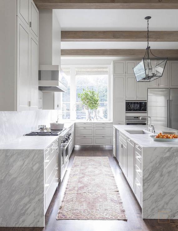
This kitchen is WOW. I mean, the marble waterfall edges are to die for. But lets focus on the beams here – this is a fairly modern kitchen, and although the beams are a somewhat washed out wood, the lines are super clean and they only enhance the feeling of the space. They appear to be slightly lighter than the floors which I think works nicely. This may be a good inspiration image for our kitchen.
 This makes me want to do an all white kitchen ASAP. How amazing is that framed opening with the rustic wood?? Its stunning with the all white and brass kitchen. I love the idea of bringing the beam down and wrapping it around like a frame, but I’m not sure I have the room to cut away at the open space I have (plus we just opened it all up so why would I close it back up?). It does make me think about how to incorporate the beam into something bigger though.
Make it disappear (paint it white):
Painting it white and adding some pretty architectural details is a great option. That way it isn’t stealing the show but its also adding some character to the space. Here is an example of a white beam with very nice details that gives the space a really sophisticated feeling:
That is really some beautiful work. The paneled ceiling doesn’t hurt the overall look, but I like how the beams have an interesting yet subtle design to them.
A lot of the time beams are incorporated into an overall ceiling design, such as a coffered ceiling. I love a coffered ceiling, especially in a room with high ceilings and lots of light:
 These ceilings often lend themselves to a more traditional space, with elaborate moldings and details. Considering we have 8’2″ ceilings and most of the house has NO crown molding, this doesn’t seem like an option for me. Not to mention, there is a lot of cost involved with doing all this detailing which likely wont fit in our already exploding budget.
The opposite: make it dark
To be honest, I’m not sure I would have the guts to make my beams and ceiling dark like Brittany, of the blog Addison’s Wonderland (please check it out – she is restoring/renovating a 1905 house and it is unbelievable), is doing in her home. I will say that it is stunning and magical and every other complimentary word I can think of.
Her floors are really light, like a white-washed wood, which maybe helps balance it all out, not to mention her 12′ ceilings! I have to say since I started reading her blog it has definitely opened my eyes to the endless options of finishes that can go into a house. I am yet to make a final decision on flooring, and hers is certainly on my mind…
More conversations will have to be had about the parameters of the beam, what size it needs to be etc, before we can make a final decision, but I think we will figure really nice out and my hopes is it will only add to the beautiful open space we are creating. More to come soon! xo, AE
The post D-Day appeared first on los angeles interior design firm.
Tile on the Brain 8 Nov 2016, 11:25 pm
Things are moving along over here at project #aedesignsherown and we are slated to start demo on MONDAY YAY!!!! I cannot wait to see this place get torn apart The transformation is going to be really something. I have been plugging away at finalizing my designs, picking finishes etc and trying really really hard not to change my mind a million times. The problem is I am endlessly finding new images of spaces that inspire me to come up with a new design, so I am trying my best to go with my gut and stick with what I like the first time around, because that usually works out best for me.
I have been focusing a lot of time on master bath because that is a) a seriously important room b) the second biggest renovation after the kitchen. Here are some before shots – brace yourself:
Obviously, we are keeping nothing. We are changing around the layout because the giant tub and vanity in the middle of the room are ridiculous. We are even losing the french doors (and the balcony it leads to) as well as the transom windows (so 80s).
I wasn’t sure which direction I was going to go in at all for this room, I didn’t have a vision for it like I did the kitchen. So I decided to start tile shopping for some inspiration and I came across this magnificent beauty:
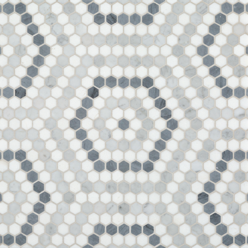
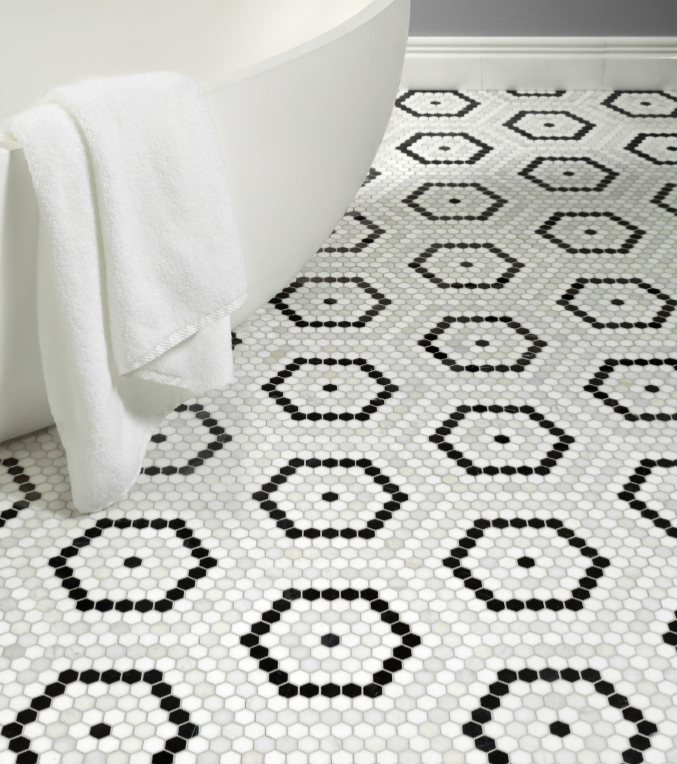
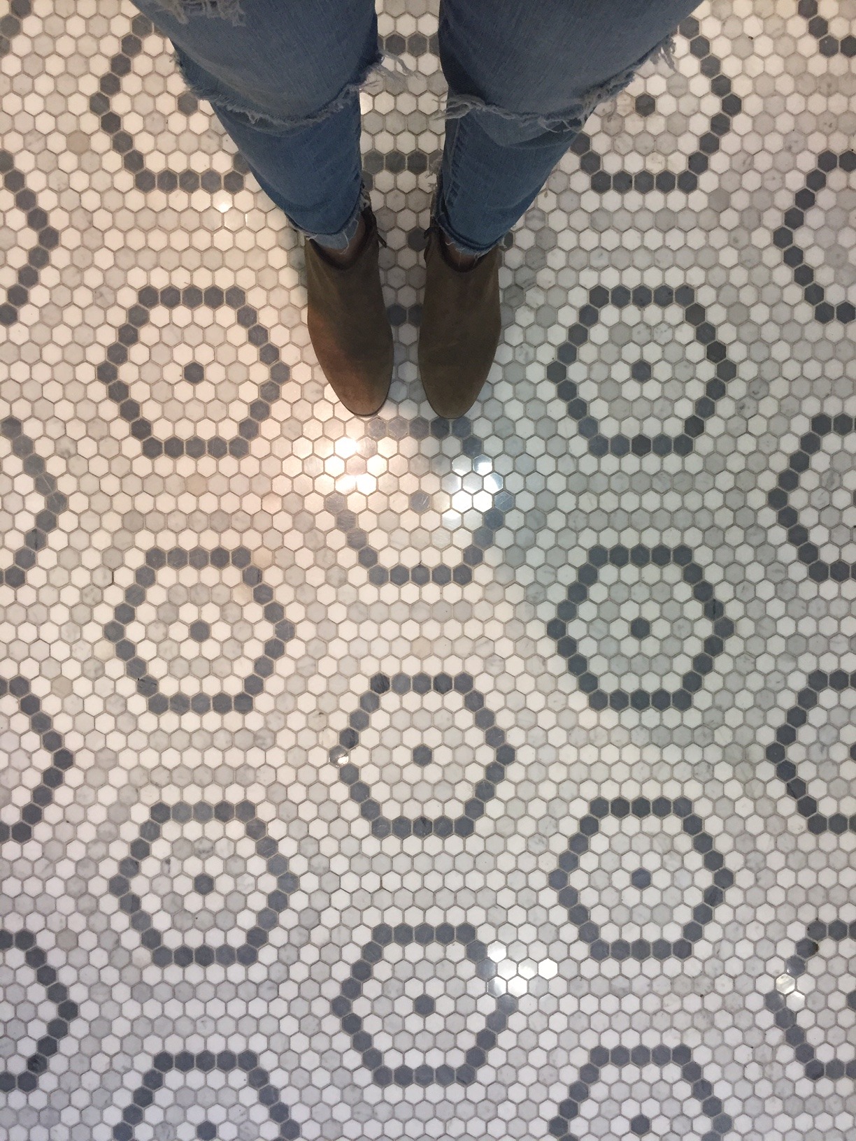
This is a marble mosaic from Artistic Tile and I saw it installed in a tile showroom near my current house. I fell in love with it immediately (the grey stones, not the black and white, although I love that too!). Its different and unique but also feels classic and like I wont get sick of it anytime soon. It also reminds me a lot of my grandmother, who loved her penny tile and had it all over her kitchen and laundry room:
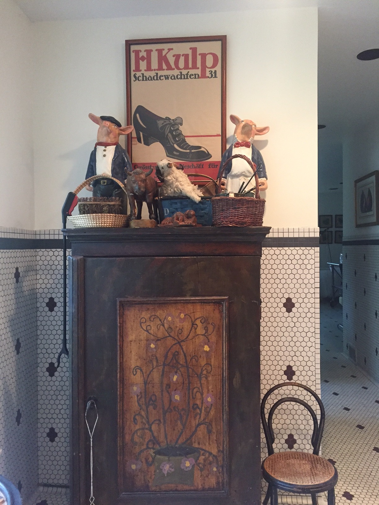
Wasn’t her kitchen fab? I love the all white everything with those crazy tiles.
Once I decided on that tile for the floors, it made everything pretty easy. When you have such a bold pattern somewhere in the room, its best to balance it out with complimentary, subdued pieces. I found a lot of inspirational bathroom designs that have the serene yet interesting vibe I am looking to accomplish:
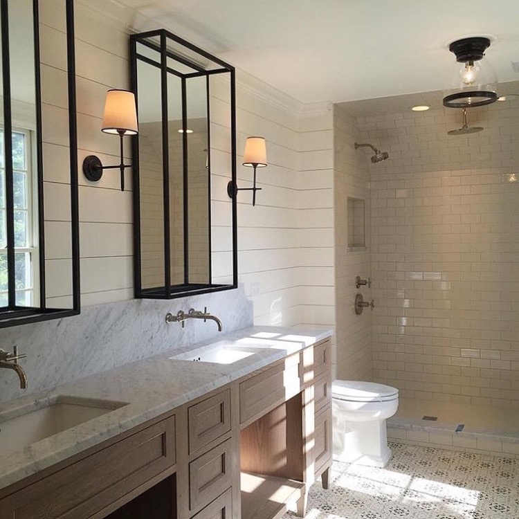
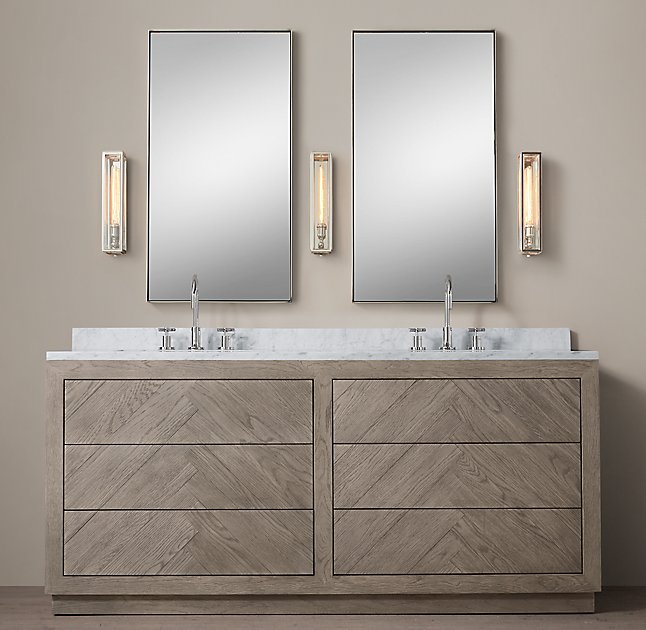
I love how these bathrooms feel contemporary and unique yet also so soft and classic. I particularly love the bottom image by Kate Marker Interiors with the natural oak vanity which I also think we will be doing. The wood feels softer than lacquer going against the patterned floors. I love this vanity from Restoration Hardware and will probably use it as inspiration when designing my own:
I haven’t gotten to picking out fixtures, hardware, mirrors, & sconces yet, although that is really the best part because it is like jewelry for the room. I will likely stick with polished chrome fixtures (like in above image) and mix up the metals for the hardware.
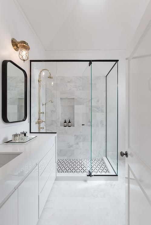
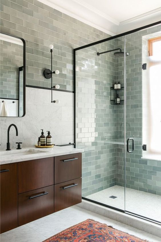
I’ve also been focusing a lot on shower doors – we are doing a BIG walk-in shower (no tub) and a built-in bench. At first, I was all set on doing something like this:
I love the windowpane design and how the black steel works with the patterned floor. Alas, my contractor told me doing something like that would basically bankrupt me, so I am thinking of compromising and doing a more simple black metal frame:
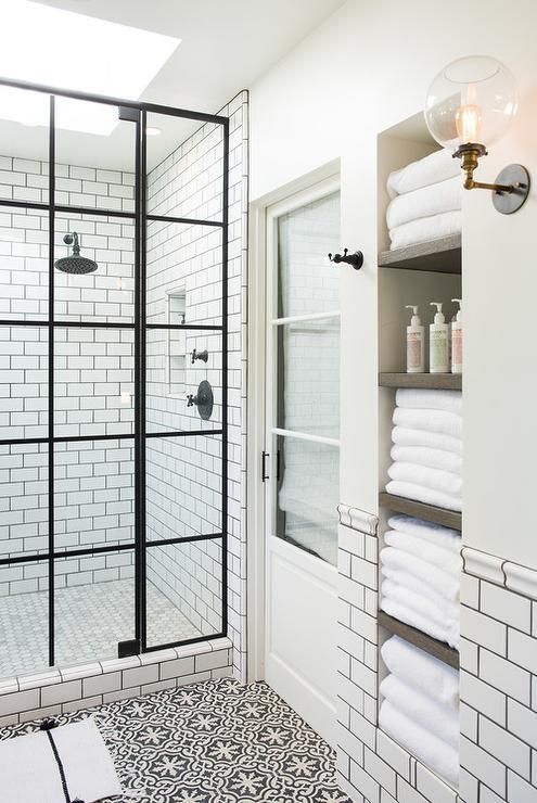
The other big ticket item in the bathroom is storage! Luckily we have the space to add a linen closet and shelving in the room to store things like extra towels & toiletries, and we are going to include a pull-out hamper which is a lifelong dream of mine! Hampers can be such eye sores, so I am excited to have ours hidden. Our storage will be between the shower and the toilet area and be vertical like these images:
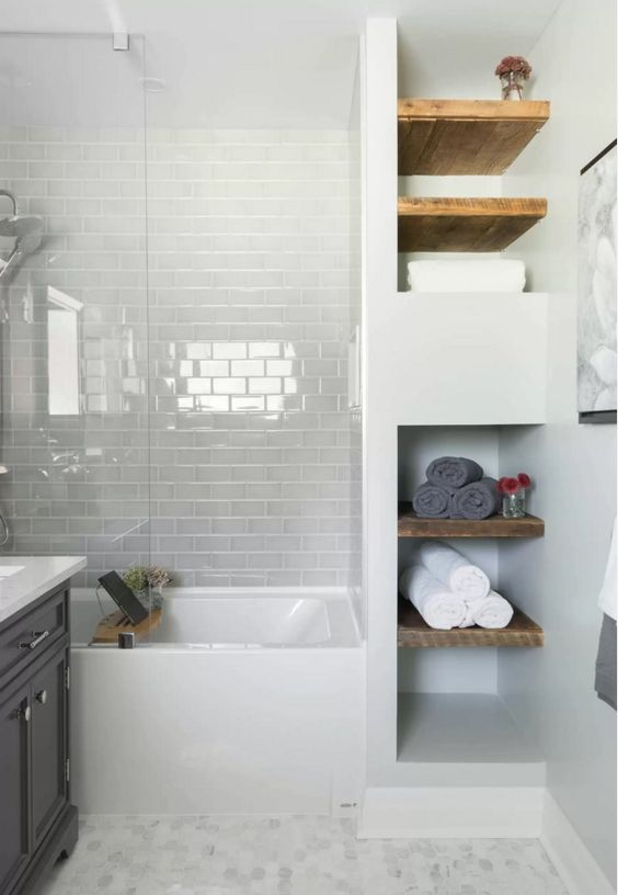
Super cool laundry contraption there. Next week I will be scouring the stone & tile stores in the Valley hoping to score a sweet deal and basically beg on my hands and knees for good pricing so I can afford that master bath mosaic!! Will keep posting updates, especially of me with my hammer next week (just kidding, I will be supervising, I’m not allowed near tools). xo, AE
The post Tile on the Brain appeared first on los angeles interior design firm.
We bought a house! 26 Oct 2016, 3:40 pm
Well, it finally happened. After seeing close to 100 houses since May, we finally found a gem. It checked off a lot of our boxes – big flat & usable lot, one story house, separation of master & kids rooms, quiet neighborhood with good schools…we knew right when we walked in that we had found something special. Now, not everyone was chomping at the bit for this house because it needs a lot, A LOT of work. Luckily, I am more than up for the task. Looking back at all the move-in ready houses we considered, I would never have been happy moving into a house someone else designed. So now what?! So much to do, and only so long I can last living with my in-laws We will be re-doing many aspects of the house, but for today’s post lets focus on the kitchen.
Here are some photos of the existing kitchen in all its glory:


Nothing to salvage here. The appliances basically don’t even work. This kitchen has been neglected and I am here to bring it back to life! I can be happy that there is a perfect spot for a built-in window bench which will become a cozy breakfast nook. Other than that, it all has to go! I am going to close up some walls and open up others to make this more of an L shaped kitchen with a big island in the middle. I am going to close up the pantry/washer dryer area with a frosted glass door and then put up a wall so the laundry room is accessible via the mudroom, which makes much more sense.
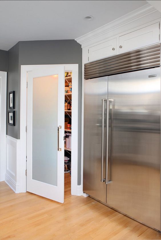
This frosted glass door to the pantry is very chic – love it.
Although I have spent hours lost in Pinterest finding amazing laundry rooms, it seems that will have to take a back seat for now. We may add a simple countertop over the washer/dryer to create a place to fold, but nothing fancy.
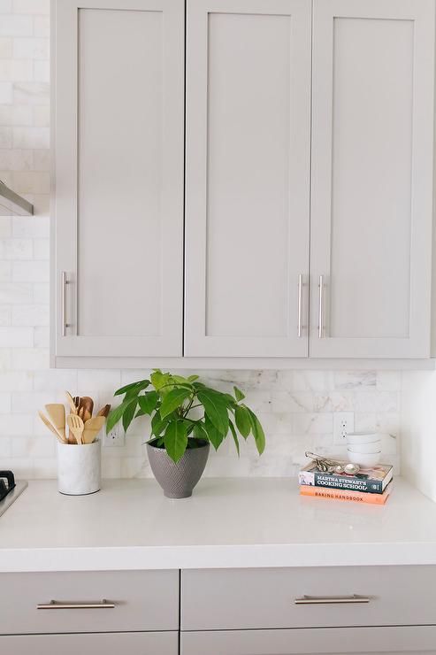
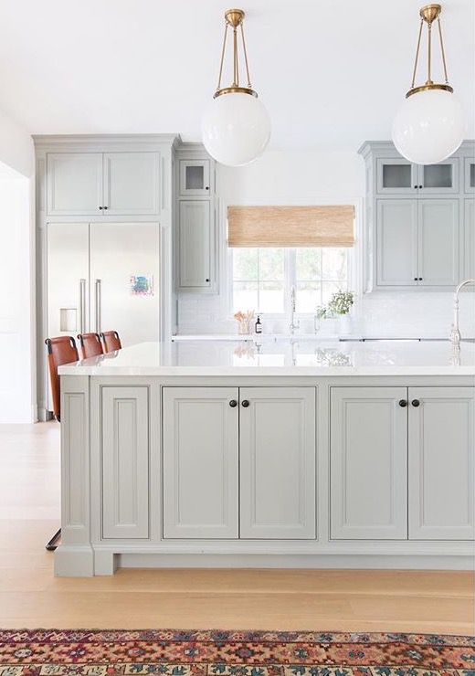
Now on to the meat and potatoes of the house – the kitchen. There are so many directions this could go, the house is a blank canvas, but something about this space to me screamed soft, French gray, shaker style cabinets. The walls are a really stark white, and although I love a white kitchen, I wanted something different. Here are some very inspirational images I have been studying:
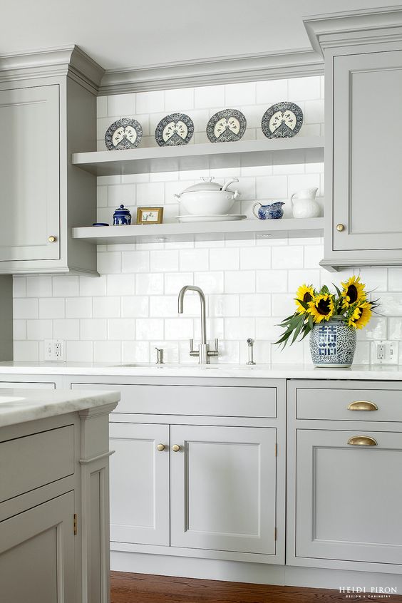
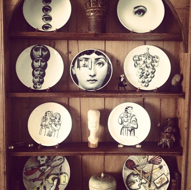
I love this grey and I love the brass traditional hardware. Probably I would do something more contemporary, but it works. I was also so inspired by these open shelves as I have a set of Fornasetti dishes from my grandmother that I would love to put on display somewhere (this is how she had them displayed in her living room).
Keeping with the grey and brass, I love this moment from another grey and brass kitchen:
I also am a huge fan of the herringbone backsplash. It is something I love but am concerned will few dated in a few years. Anyways, I love it for now!
Then I found this image, which is basically my dream kitchen.
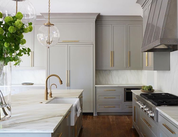
Love the marble slabs everywhere, although lets be serious, I could never afford that. I also love LOVE the oversized linear brass hardware. The grey shaker style cabinets are generally a more traditional look and that hardware gives it a rockstar edge. Winner!
Unfortunately I have realized other finishes also work with French grey, such as….
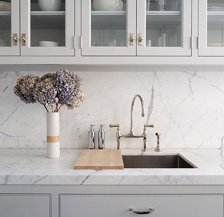
…polished nickel or chrome. Much more “traditional” kitchen finish, but it works SO well. It also feels really timeless to me.
Then Amber Interiors had to post this picture of this beautiful French grey kitchen she just completed, with awesome matte black hardware. Now I am lost yet again. I will probably change my mind 100 times before I purchase any hardware at all.
The countertops are going to be a white quartz, super simple yet durable. Backsplash is another aspect of the kitchen that is providing me with too many options. I have done a post before about all the wonderful options for backsplashes, and now I find myself lost in a sea of too many options:

Subway tile. Simple, timeless, but way too predictable! Just cant do it.
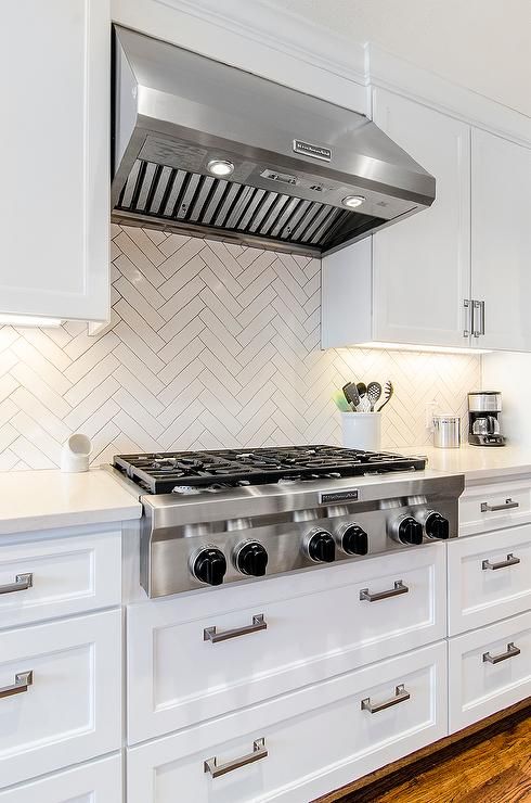
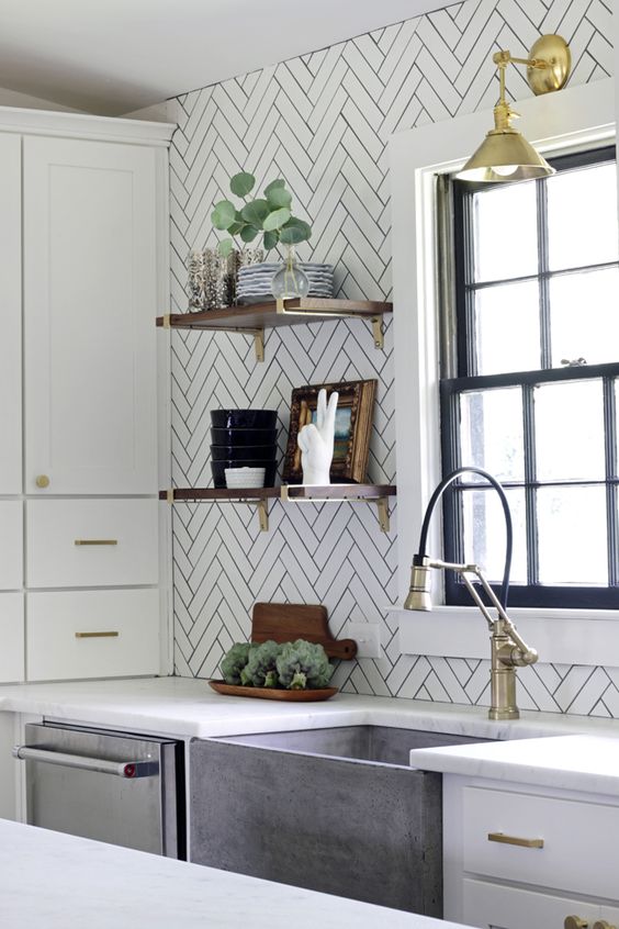
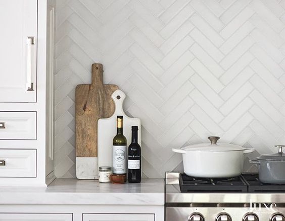
I mentioned Herringbone earlier, and I do love it. I really like it in a clean design like above.
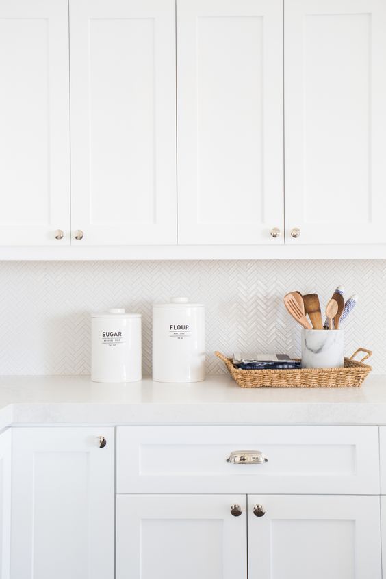
Now this is interesting. Teeny tiny herringone! From afar, it probably is hard to tell what the pattern really is, which I really like. This is definitely a contender.
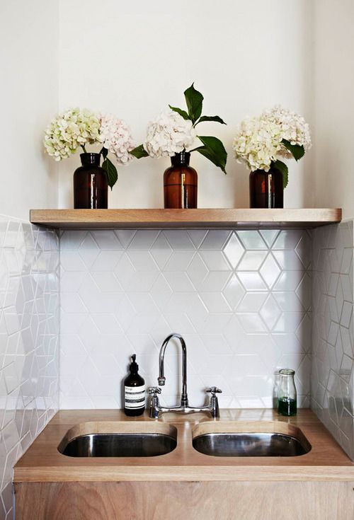
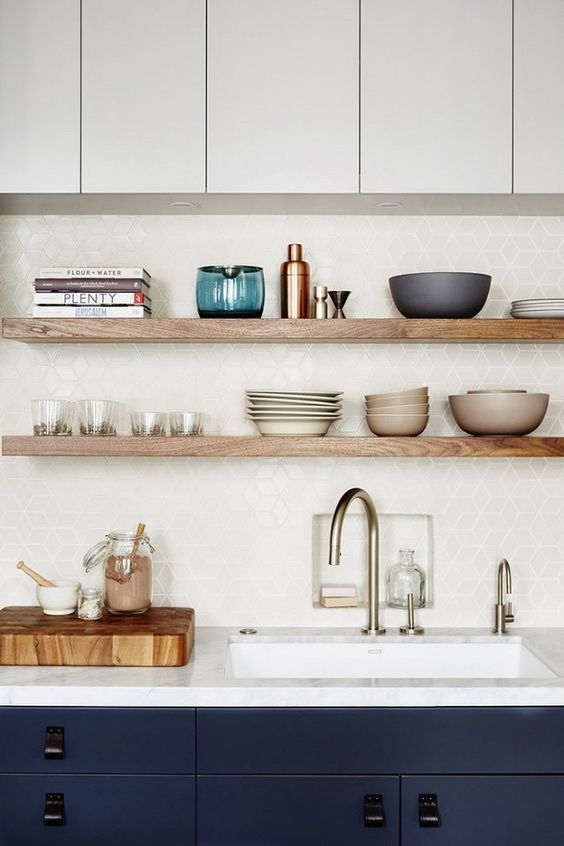
I still have a total thing for these diamond tiles from Fireclay tile. Something about the contrast of a really modern pattern mixed with the traditional cabinets really interests me.
So many more decisions to make, can’t wait to keep you guys posted on all of it. xo, AE
The post We bought a house! appeared first on los angeles interior design firm.