Add your feed to SetSticker.com! Promote your sites and attract more customers. It costs only 100 EUROS per YEAR.
Pleasant surprises on every page! Discover new articles, displayed randomly throughout the site. Interesting content, always a click away
Christopher Lee
Consumer Behavior and MarketingWhat is the definition of consumer behavior? 13 Dec 2020, 2:03 am
The definition of consumer behavior is human behavior.
That’s it. Often, I think we get too caught up in marketing with definitions, terms, and abstract references to “target market” or “consumers” or “customers” or “personas”. Those terms are important but, at the end of the day, all of those are people. Consumer behavior is why, and how, human beings behave in the way that they do.
You might assume that a consumer is somebody who is buying something. Perhaps. That is not always the case though. For example, right now. You are consuming this page. You made some sort of behavior to get here, are behaving in a certain fashion right now (i.e. reading), and perhaps even consuming (i.e. behaving) a beverage such as coffee.
What is the textbook definition of consumer behavior?
Let’s look at a few textbook and academic definitions of consumer behavior. In Consumer Behavior: Buying, Having, and Being, Michael Solomon defines it as:
“It is the study of the processes involved when individuals or groups select, purchase, use, or dispose of products, services, ideas, or experiences to satisfy needs and desires.”
In CB8: Consumer Behavior, Barry Babin and Eric Harris define it as:
“Consumer behavior is the set of value-seeking activities that take place as people go about addressing and attempting to address real needs.”
Where does psychology fit in?
In many ways, consumer behavior is applied psychology. With that in mind, let’s look at one of the early and prominent definitions of applied psychology from Applied Psychology by Harry Levi Hollingworth and Albert Theodor Poffenberger:
“every situation in which human behavior is involved and where economy of human energy is of practical importance.”
What do you notice about the above consumer behavior and psychology definitions?
The above definitions include people, individuals, and human. Again, consumer behavior is human behavior. It is about understanding people.
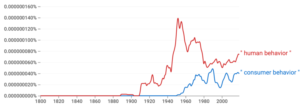
With that in mind, let’s look at when consumer behavior became a thing. If you look at Google’s ngram viewer, it wasn’t until the 1950s that the term even started appearing in books:

Now, let’s add in “human behavior” just for fun. As you’ll see, the term “human behavior” began appearing in books much earlier:
Finally, let’s do one last search. In many ways, consumer behavior is simply an applied version of psychology. It is applied in the sense of taking everything we know about human behavior and applying it to a business, or consumption, context. Thus, when did “applied psychology” begin appearing in books? As you’ll see, that started even earlier:
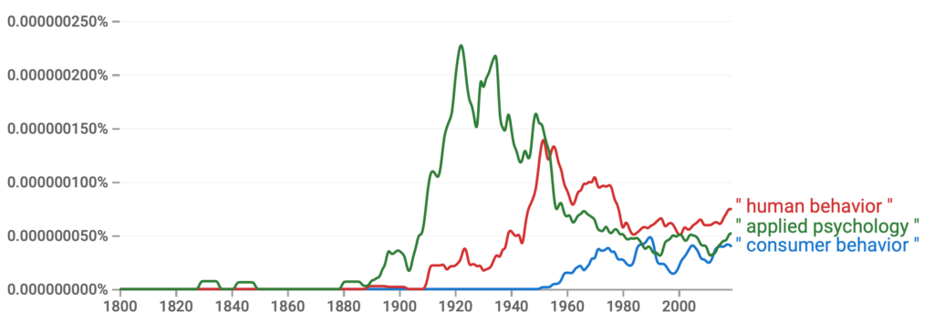
In short, the terms have evolved over the years and “consumer behavior” is a relatively new term. Thus, many of the consumer behavior definitions reference humans, people, and individuals. Consumer behavior is effectively an applied version of human behavior and psychology within a business (or consumption) context.
When are people interested in consumer behavior and human behavior?
According to Google Trends, interest in consumer behavior and human behavior appears to be seasonal:
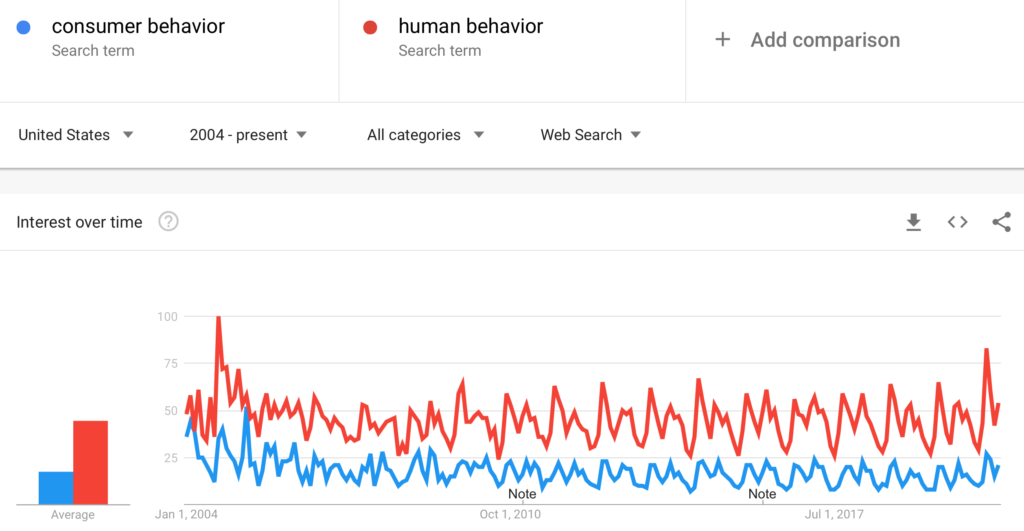
I suspect that the seasonal interest is due to education interests and, more specifically, college classes. Millions of students researching course titles and more information for potential assignments or quizzes. This isn’t overly relevant to the original question of the definition of consumer behavior, but it is interesting to see, using a modern tool, when people are interested in the term “consumer behavior”.
What does this all mean?
If you’re getting too wrapped up in the definition, take a step back. What is consumer behavior? It is the study of how humans behave. Outside of possibly sleeping, humans are *always* consumer something. Our senses are constantly evaluating (i.e. consuming) everything around us. The screen you’re looking at now. The smells in the room. The sound of the surrounding area (birds, cars, chatter in a coffee shop, etc).
At the end of the day, understand human behavior and you will understand consumer behavior.
The post What is the definition of consumer behavior? appeared first on Christopher Lee.
What’s In A Name? Stadium Section Names and Perceptions 25 Mar 2015, 1:44 pm
I flew out to Arizona last week to watch some spring training baseball. Since I was thinking about baseball and tickets, I wanted to explore the naming of sections within a stadium. In my experience, the naming of sections is not as calculated at it might appear (or should be). In other words, come up with a name for a section that sounds neat or luxurious and run with it. Although this isn’t a spring training example, let’s take a look at Angel Stadium. The Angels have the following section names in their upper deck:
Upper View
View All-Star
View MVP
Lower View Box
Lower View All-Star
Lower View MVP
The naming seems somewhat inconsistent. The “Upper View” designation doesn’t seem to align with anything else. That same section in the lower portion of the upper deck is “Lower View Box”. So why no “View Box”? Or if they want to go with the “Upper View” convention, why no “Upper View All-Star”? This type of inconsistency (and curiosity) led me to this week’s question:
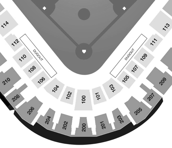
Imagine you are looking at tickets to go to a baseball game (see seating chart above) and have settled on seats in the following section:
VIEW 200
Please indicate how much you would expect to pay for one ticket in that section:
From $_________ to $_________ but most likely $_________.
Please enter numbers only below.
Some of you saw the section referred to as VIEW 200 (above). Others saw UPPER VIEW 200 or LOWER VIEW 200**. Why did I want to test those variations? As I mentioned above, I often see different naming conventions in seating charts and those three are somewhat common. Furthermore, I am very interested in how subtle word cues (ex. upper versus lower) alter perceptions. So what happened when I changed the names of the section?
I’ll preface the chart with an acknowledgment (as I do in all my #1QFriday posts) that these results could happen by chance given the small(ish) number of responses and lack of statistical analysis. What does “by chance” mean? It means if I ran the study again the results may be different. That being said, I strongly believe that paying attention to the naming of sections (or other products/categories in your business) is very important.
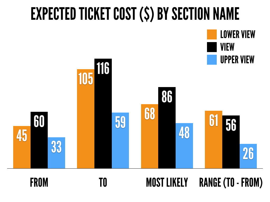
Most Likely. What is particularly interesting, and unexpected, is that people expected to pay more for seats in View 200 than Lower View 200. The assumption is that “lower” means seats are closer to the field and thus the expected cost should be higher. That was not the case. Why? It could have happened by chance. Or…the word “lower” may cue different responses (ex. the stadium is trying to scam me), resulting in a negative reaction and lower expected ticket cost.
Range. The reason I had the from $_____ to $_______ setup of the question was to gauge the range people would expect to pay. As shown in the chart, when people saw upper view, they expected to pay somewhere between $33 and $59 (a range of $26) but when they saw lower view they expected to pay between $60 and $116 (a range of $56). Why does this matter? Who cares? Because using a particular word may narrow the range a consumer expects to pay and influence their reaction to the price. For example, if I hear “upper view” my expectation of what I will pay may be much narrower so there is a better chance the posted price may fall outside my range of willingness to pay.
Although the #1QFriday question this week focused on the naming of sections, it could apply to any scenario in which we label a category of things. For example, some restaurants have large sodas and small sodas. Some have large, medium, *and* small. Some have regular and large. You might think these are meaningless names. I would argue they have the potential to change perceptions of willingness to pay or even willingness to consider that particular category/name as an option. Words are very, very, powerful.
Do me a favor and answer this one question: Does your business have some sort of naming convention for your products/service? For example, small/medium/large, view/lower view/upper view. I would love to hear what you name various categories in your business.
**I received a few responses on Twitter asking me “Are we supposed to consider it as an upper deck?” or “What kind of baseball game is it? MLB? NCAA?” My response was it doesn’t really matter. Why? It really didn’t matter because I’m not interested in pricing a section…I was interested in the difference between the various sections (upper view, view, lower view). Every person was randomly assigned to one of the three conditions so random assignment takes care of knowledge issues. For example, let’s assume 12 people thought it was MLB, 12 thought it was Minor League Baseball and 12 thought it was NCAA. Because everyone was randomly assigned to one of the three conditions, on average, I should have ended up with 4 people who thought it was MLB, 4 people who thought it was Minor League Baseball and 4 people who thought it was NCAA in each condition. Thus, any confusion with the scenario would be spread across the three conditions and any differences (ex. Upper View vs. View) would still be meaningful. Could more knowledge change the results? Sure. A person with season tickets might have a better understanding of expected prices than a person who has never been to a game. Although it is important to consider, it was not the point of the study though.
_______
#1QFriday is a blog series that includes my random thoughts and musings. I do not claim to be the first person to think of these things or deny that others have done research on them. I am simply discussing interesting marketing, psychology and linguistic topics that come to mind. Furthermore, I am avoiding fancy statistical analysis as I want the emphasis to be on the ideas. I recently read (Amazon affiliate link) Paul Grice: Philosopher and Linguist and was inspired by a less statistical and more philosophical approach. Thus, the results here could happen by chance. I want to focus on thinking about, discussing and debating the ideas at a broad level rather than whether or not the differences are statistically meaningful. I typically send out a quick survey on Friday and post an analysis/discussion the following week.
The post What’s In A Name? Stadium Section Names and Perceptions appeared first on Christopher Lee.
On Time Versus Late: The Effect of Framing on Subway Delays 9 Mar 2015, 5:30 am
After reading this post on Gawker about New York City subway delays, I was intrigued by how the information was (or could be) framed. The article mentions that 78.8% of New York City subway trains were on time in 2014. Mathematically, that suggests (as the article mentions as well) subway trains are late 21.2% of the time.
This got me thinking…what do people perceive as an acceptable rate for trains to be on time? What do people perceive as an acceptable rate for trains to be late? Look at those two questions again. Virtually the same question but framing the information in a slightly different way may influence perceptions. Thus, half of the people who answered the survey saw the following:
One report estimates that New York City subway trains are on time 78.8% of the time. Given a variety of potential issues (weather, construction, etc.), what do you think is a reasonable percentage for trains to be on time?
The other half saw…
One report estimates that New York City subway trains are late 21.2% of the time. Given a variety of potential issues (weather, construction, etc.), what do you think is a reasonable percentage for trains to be late?
Again…basically asking the same question but framed in a different way. One is positive (on time) while one is negative (late). Why is this important? As I’ve shown in previous posts, we tend to perceive things differently when framed in a positive versus negative manner. So let’s see if it applies here…
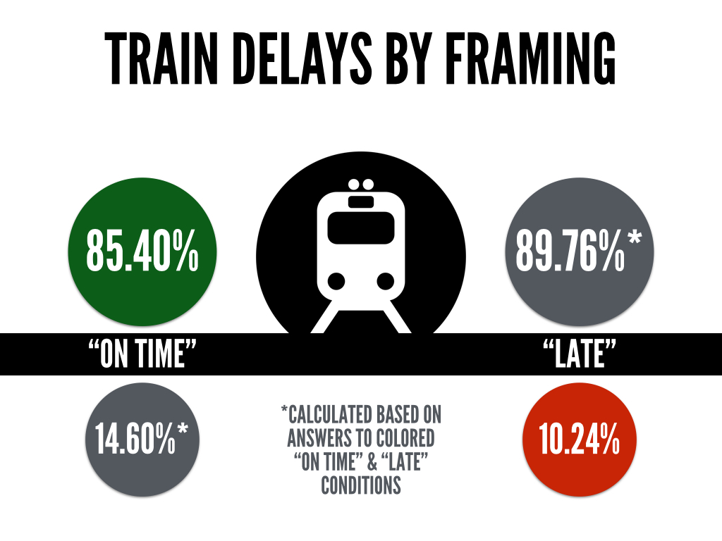
NOTE: Respondents answered what they thought was a reasonable percentage for trains to be on time (green circle) and reasonable percentage for trains to be late (red circle). The other two gray circles (with asterisks) were calculated to allow for easier comparison.
What do you notice?
There is a fairly big difference in what respondents thought was a reasonable rate for trains to be delayed depending on whether they were asked about them being “on time” versus “late”. Respondents thought 85.40% was a reasonable percentage for trains to be on time and 10.24% was a reasonable percentage for trains to be late. That adds up to 95.64% which suggests the on time versus late framing influenced responses.
Accepting 85.40% as a rate for trains to be on time (green circle) suggests 14.60% is a reasonable time for trains to be late. Similarly, if trains being late 10.24% of the time (red circle) is reasonable that suggests that a 89.76% on time rate is acceptable. Essentially, people thought 85.40% was a reasonable rate for trains to be on time in the “on time” condition and 89.76% was reasonable for trains to be on time in the “late” condition*.
*You could argue that people answering the “on time” scenario were also considering trains being early. Based on cues in the question (suggesting issues with weather, etc.) though it was pretty clear the question wasn’t asking about early trains. Thus, the calculations were done (shown above) to provide an easier comparison between people in the “on time” condition and people in the “late” condition.
What might play a role?
Positive versus negative framing. As mentioned, the information was either framed as a positive (on time) or negative (late). This influenced responses and it appears people are less tolerant with trains being “late” (10.24%) and more tolerant with trains being “on time” (85.4%). It should be the same. Again, those two numbers should add up to 100% but they don’t. Thus, the positive versus negative framing appears to have influenced perceptions.
Number anchoring. The numbers used in the question (78.8% and 21.2%) may have inadvertently, and unequally, anchored people. In other words, people might interpret 78.8 and 21.2 in unique ways. For example, maybe the ones digit (8 vs. 2) led people to stray further, or remain closer, to the number provided. The nature of the numbers (big versus small, odd versus even, etc) may influenced numerical perceptions.
So what is the takeaway?
Pay attention to how information is framed. Are you presenting “on time” rates to customers or “late rates”? We generally talk in positive statements. Think about sports. Batting average in baseball is the number of hits divided by at bats and NOT the number of non-hits divided by at bats. We reference winning percentage (wins/games) and NOT losing percentage (losses/games). What happens if you frame the information in a negative way instead of a positive way? Or vice versa? This post shows how positive versus negative framing can influence people’s perceptions.
What are some other business scenarios where you could frame the same information as positive or negative? Where do you see information presented in a positive manner (“on time”) when it could be presented in a negative (“late”) manner? Let me know in the comments.
_______
#1QFriday is a blog series that includes my random thoughts and musings. I do not claim to be the first person to think of these things or deny that others have done research on them. I am simply discussing interesting marketing, psychology and linguistic topics that come to mind. Furthermore, I am avoiding fancy statistical analysis as I want the emphasis to be on the ideas. I recently read (Amazon affiliate link) Paul Grice: Philosopher and Linguist and was inspired by a less statistical and more philosophical approach. Thus, the results here could happen by chance. I want to focus on thinking about, discussing and debating the ideas at a broad level rather than whether or not the differences are statistically meaningful. I typically send out a quick survey on Friday and post an analysis/discussion the following week.
The post On Time Versus Late: The Effect of Framing on Subway Delays appeared first on Christopher Lee.
Framing and Issues With Nutrition Labels 3 Mar 2015, 5:11 am
All of my #1QFriday questions thus far have focused on a numerical response. How few miles is it from Eugene, OR to Philadelphia, PA? What percentage of 40-yard field goals does the average college kicker make? All of them required some sort of numerical estimate. This week’s question switched to choice. Specifically, the task was to choose between two cans of soup:
Assuming you plan to eat the entire can of soup by yourself for dinner, which soup do you think is the healthiest choice?
The question remained the same in all conditions but there were two variations of the nutrition information (see below). One showed the nutrition information by serving (as we typically see with cans of soup) while the other showed the nutrition information by can (as if you were going to eat the whole can like a normal person).
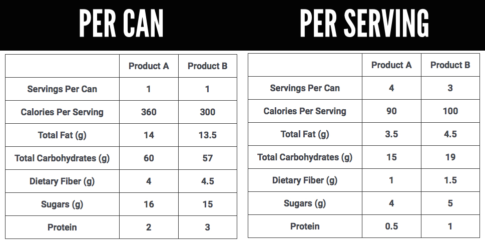
This idea was inspired by glancing at a few nutrition labels on canned goods and realizing that the perception of health can change due to the multiplier effect of servings per can. Consider the differences in the two options:
Product A: 4 servings per can | 90 calories per serving
Product B: 3 servings per can | 100 calories per serving
Ignoring what calories/ingredients are healthy, a quick look at this suggests Product A is healthier because 90 calories is less than 100 calories. But what if you actually do the math on a per can basis?
Product A: 4 servings per can x 90 calories per serving = 360 calories
Product B: 3 servings per can x 100 calories per serving = 300 calories
What happened? Product A had 4 servings per can while Product B had 3 servings. Thus, when they’re multiplied out, the health perceptions could/should reverse.
Who picks up a can of soup and thinks “I think I’ll only have 1/4 of this and save the rest for tomorrow.”!?!? NOBODY. Therein lies the problem. People are buying based on PER SERVING perceptions but actually eating the PER CAN information.
So let’s see if/how the framing of nutrition information actually influences choice…
What do you notice?
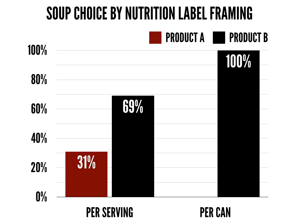
Preferences changed. A lot. 31% of people in the per serving condition thought Product A was the healthier choice. How many people thought Product A was healthier in the per can condition? ZERO. Not one person. What does this mean? Clearly, the framing of the nutrition information has the potential to drastically influence choice.
What might play a role?
Effort/Motivation. This could come in two forms. First, the people responding might have had zero interest in the survey, and thus didn’t really pay attention, read the question closely, etc. Or, more likely, we have developed mental shortcuts (known as heuristics) to process nutrition labels. Thus, we tend to avoid doing the math required (i.e. multiplying per serving information by the number of servings) and end up failing to identify the healthier option.
So what is the takeaway?
We (likely) have a huge issue with how nutritional information is presented and processed. I am not a nutritionist, nor a health expert, but I spend a lot of time researching how messages are framed. And framing of messages that influence health behaviors shouldn’t be taken lightly. Recently, the FDA proposed new nutrition labels:
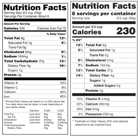
Beyond changes to the actual label above, this change will likely make a big difference:
“Require that packaged foods, including drinks, that are typically eaten in one sitting be labeled as a single serving and that calorie and nutrient information be declared for the entire package. For example, a 20-ounce bottle of soda, typically consumed in a single sitting, would be labeled as one serving rather than as more than one serving.”
In other words, a can of soup would presumably be labeled on a per can basis (as opposed to a per serving framing). We’ll see how it plays out. There is a fair amount of wiggle room in terms of how different foods can be labeled. The sample label above (provided by the FDA) and emphasis on labeling per package (ex. a bottle of soda is one serving) might not fully address the multiplication error/issue in this post though.
One important takeaway is that we make decisions on a day to day basis that we think we control. The reality is we don’t control our decisions as much as we think because framing plays a HUGE role. As shown in this post, 31% of people thought Product A was healthier on a per serving basis but when the information was FRAMED in a different way, not one person thought Product A was healthier.
Think about that. THIRTY ONE PERCENT to ZERO by simply framing information in a slightly different fashion. Same product. Same (general) information. Just framed in a slightly different way. If this doesn’t convince you that framing (and consumer psychology) matters, I don’t know what will.
The post Framing and Issues With Nutrition Labels appeared first on Christopher Lee.
Anchoring and The Effect of Survey Answer Format 24 Feb 2015, 5:30 am
A lot of the consumer behavior effects I have demonstrated thus far in my #1QFriday series have been on the question side of things. For example, “How many miles…” versus “How few miles” is a markedness effect built into the actual question. This week’s survey looks at the answer side of things:
What do you think is the average attendance at a (FBS) college football game?
Everyone saw the SAME EXACT QUESTION. There were no differences with the actual question. There were, however, differences with the format/structure of the answer slider. Two things were different:
- Starting point: people either started at 0 or 100,000
- Grid/guide: people either saw a grid (with references at 25,000, 50,000 and 75,000) or they did not.
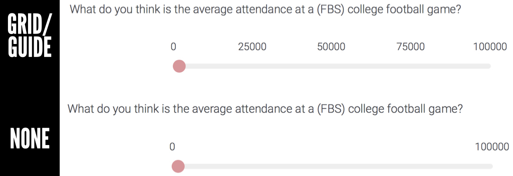
In other words, there were four possible answer conditions:
- Start at 0 with a grid (see above top)
- Start at 0 without a grid (see above bottom)
- Start at 100,000 with a grid
- Start at 100,000 without a grid
So why did I want to try this out? The starting point (0 versus 100,000) would likely result in an anchoring effect. I have talked about this in past posts, but anchoring essentially occurs when a person sees a number and uses it as a basis for judgment. In this particular scenario, one group was starting at 0 and dragging the slider to the right to determine attendance. The other group was starting at 100,000 and dragging the slider to the left to make an attendance estimate. Think that makes a difference?
The second part focused on whether there was a grid or not (see photo). The idea was that a grid would influence people as it would guide them toward a particular number (ex. 50,000) similar to an anchor. Or, potentially it would be tougher to keep passing the guide markers as it may take additional mental effort. In other words, if I start at 0 and drag the slider past 25,000 and 50,000, I might start second guessing whether I am estimating too large of a number. So let’s see what happened…
DISCUSSION
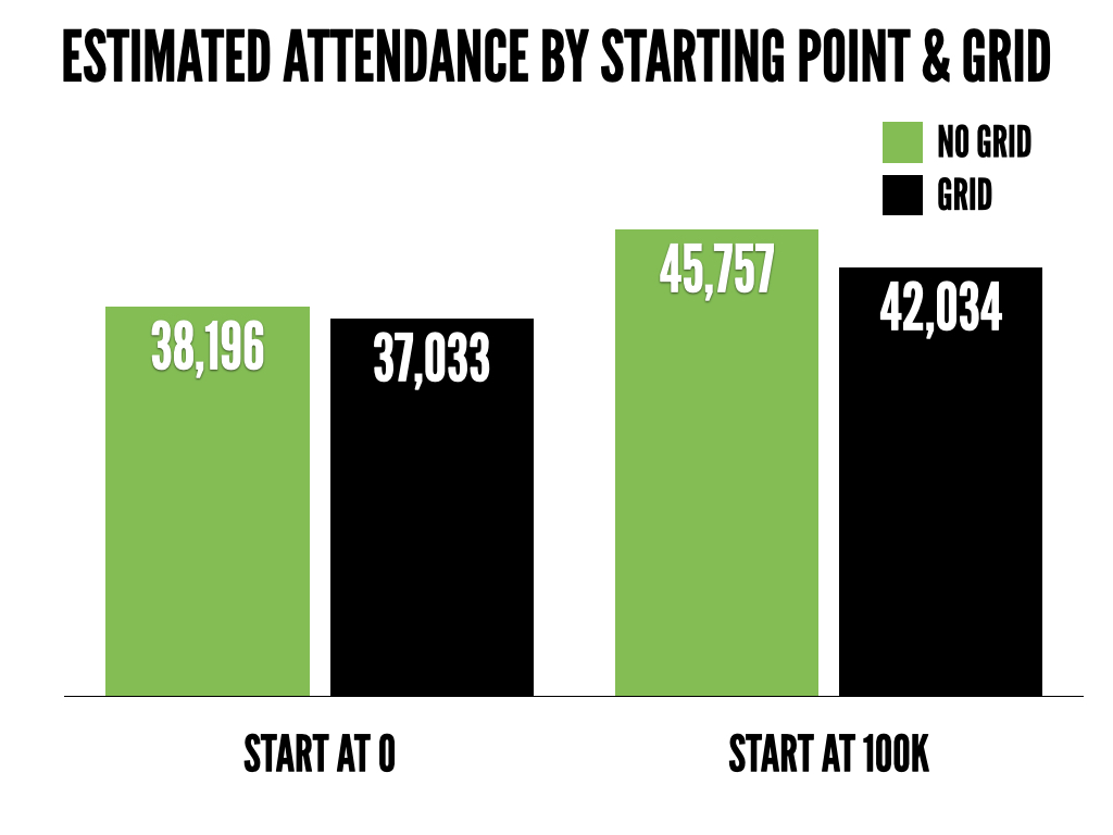
What do you notice?
Starting point. There is a pretty large difference in estimates between the people who started at 0 and the people who started at 100,000. Should where you start on a slider influence how many people you think go to a college football game!? NO. That is crazy! But it does.
Grid. There was not as big of a difference in the no grid vs. grid conditions as I anticipated. Still, it appears like it may have some effect. The people who had a slider with a grid/guide on it tended to answer lower.
What might play a role?
Anchoring. The people who started at 0 estimated lower attendance than the people who started at 100,000. Why? Because they were anchored at two very different estimates (o people vs. 100,000 people). In theory, this should make no difference but it does. Anchoring is one of the most powerful effects in psychology.
Knowledge. Let’s assume the majority of the people who answered are somewhat knowledgeable about college football. They probably aren’t going to guess that the AVERAGE attendance is 10,000 or 90,000. They know better. Thus, knowledge likely helped reduce the anchoring effect. What if I polled people who had zero interest in or knowledge of college football? The anchoring effect, and potentially the effect of the grid/guide, might have been even stronger.
So what is the takeaway?
In this particular case, the difference between starting at 100,000 with no grid and starting at 0 with a grid was over 8,000. That is, the answer format, influenced estimates of attendance by over 8,000 people. It would be interesting to look at combinations of question changes (ex. many vs. few) and answer format (ex. starting at 0 versus 100,000). That being said, as shown in this particular study, answer format matters. Even something that seems small such as starting them at a different point on a slider or including a grid.
The other question this brings up is what answer do you trust/use? Assuming this was some sort of market research study, do you only take the answers where the slider started at 0? According to CBS Sports, the average attendance at FBS games last year was 43,483. So if we’re rating responses by how close they were to the actual answer, starting people at 100,000 actually helped. As marketers, we try to develop good survey questions (ex. unbiased, don’t ask about too many things in one question, etc.) but the last two #1QFriday posts have shown how one word, the order of the words, or the answer format may DRASTICALLY influence responses.
_______
#1QFriday is a blog series that includes my random consumer behavior thoughts and musings. I do not claim to be the first person to think of these things or deny that others have done research on them. I am simply discussing interesting marketing, psychology and linguistic topics that come to mind. Furthermore, I am avoiding statistical analysis as I want the emphasis to be on the ideas. I recently read (Amazon affiliate link) Paul Grice: Philosopher and Linguist and was inspired by a less statistical and more philosophical approach. Thus, the results here could happen by chance. I want to focus on thinking about, discussing and debating the ideas at a broad level rather than whether or not the differences are statistically meaningful. I typically send out a quick survey on Friday and post an analysis/discussion the following week.
The post Anchoring and The Effect of Survey Answer Format appeared first on Christopher Lee.
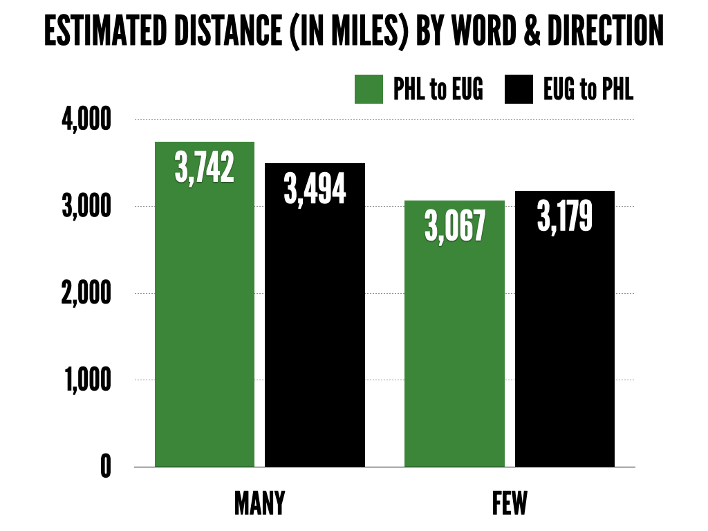
How Few Miles? Markedness and Distance 16 Feb 2015, 9:45 am
Markedness. Kind of a funny word. I barely knew how to pronounce it when I first saw it. But it has a serious influence on numerical perceptions. I have said on multiple occasions that words matter. A lot. This week’s question continues to explore that idea:
How many miles do you think it is from Philadelphia, PA to Eugene, OR?
As you might be used to (if you’re signed up to receive my surveys), there was more than one condition. Here are the other three options you might have seen:
How few miles do you think it is from Philadelphia, PA to Eugene, OR?
How many miles do you think it is from Eugene, OR to Philadelphia, PA?
How few miles do you think it is from Eugene, OR to Philadelphia, PA?
The questions are asking the same thing: the number of miles between two cities. Except they’re not perceived the same way.
(Note: If you don’t know where Eugene is, or have never been there, you’re missing out. Like sports? Here you go. Running and hiking? Check this out. Beer? Plenty of options. Now back to your regularly scheduled consumer psychology post…)
Markedness
If you’ve read excerpts from my guide to numerical perceptions you might be familiar with this term/idea. Think about the following question that we ask all the time:
How tall are you?
What are you asking for? Height. What else are you implying? Nothing. Now think about this question:
How short are you?
What are you asking for? Height. What else are you implying? They are short. Same question. Same expected response (height). But using a different word drastically influences how the question is interpreted. That is one of the primary ideas behind markedness. Essentially, phrases like “How tall are you?” are used so often they become the default and lose any additional meaning while the negative adjective (short) carries extra weight. Thus, this survey tested whether asking “how many” versus “how few” miles it is between the two cities.
Anchoring and Order Effects
I have talked about anchoring a couple times on my blog so I’ll save a long explanation. The general idea is you are priming someone to think big or small based on information you provide.
In this particular study, I wanted to see if going from Eugene, OR (small) to Philadelphia, PA (big) would result in different estimates than going from Philadelphia, PA (big) to Eugene, OR (small). Should it matter? NO. Last time I checked highways and/or planes go in both directions so the distance in miles is the same.
The idea though was that anchoring with a big city and/or altering the order of the cities presented might influence estimates. Let’s see what happened…
What do you notice?
There is a pretty clear difference between asking “How many miles…” and “How few miles…”. This is a markedness effect. Although they are asking the same question (number of miles), “How few…” implies that the distance is short.
There doesn’t appear to be any broad takeaway based on the direction of the trip (PHL to EUG versus EUG to PHL) other than it still *might* influence estimates. The estimates were different based on the direction but not in any consistent pattern between the “many” and “few” conditions.
What might play a role?
Markedness and conversational norms. As mentioned above, markedness (and conversational norms) play a very powerful role in how we perceive and estimate numbers. The negative adjective (“few” in this case) carries extra meaning and thus pulls down the estimates. Again, very similar to asking someone “How tall are you?” (standard question we ask all the time) versus “How short are you” (implying they are short).
Anchoring and order effects. One could argue “many” versus “few” is a form of anchoring as well. Similarly, ending the question with Eugene, OR (small city) versus Philadelphia, PA (big city) arguably combines anchoring and order effects. If you want to see some other examples about how powerful anchoring can be check out these two posts:
What is the length of the Mississippi River? Depends on the line you draw first.
Limit of 4 or Limit of 8? How anchoring affects the things we buy.
So what is the takeaway?
I would pay VERY close attention to the words you are using (and the order of those words) in your business. Think about marketing research and surveys. A MULTIBILLION dollar industry. I just showed how I could influence a person’s perceptions by 600+ MILES with ONE WORD.
Don’t think that can happen in any/all surveys your business is sending out? You might think your surveys are neutral or unbiased. They probably aren’t. Are you getting truly accurate information or you swaying responses by subtle word cues and order effects? What other situations (outside of market research) might markedness, anchoring and order effects play a role?
P.S. The actual distance from Eugene, OR to Philadelphia, PA is 2,879 miles.
_______
#1QFriday is a blog series that includes my random thoughts and musings. I do not claim to be the first person to think of these things or deny that others have done research on them. I am simply discussing interesting marketing, psychology and linguistic topics that come to mind. Furthermore, I am avoiding statistical analysis as I want the emphasis to be on the ideas. I recently read (Amazon affiliate link) Paul Grice: Philosopher and Linguist and was inspired by a less statistical and more philosophical approach. Thus, the results here could happen by chance. I want to focus on thinking about, discussing and debating the ideas at a broad level rather than whether or not the differences are statistically meaningful. I typically send out a quick survey on Friday and post an analysis/discussion the following week.
The post How Few Miles? Markedness and Distance appeared first on Christopher Lee.
Precision and Conversational Norms 9 Feb 2015, 6:23 pm
Last week, I asked about differences in perception between a 39-yard, 40-yard and 41-yard field goal. The primary goal was exploring how people perceive various distances and differences between those distances. In other words, we might have some rough understanding of how hard a “40ish-yard field goal” is and thus lump in 39 yard and 41 yard field goals into one big perception of “40ish-yard field goals” as opposed to truly recognizing differences in difficulty between 39, 40, and 41 yards. Furthermore, it showed the psychology behind round numbers (such as 40) and their potential to change behavior. This week’s survey explored a similar consumer psychology idea but in a different way:
Imagine you overhear two people talking about a high school basketball player.
Person A: “How is his shooting?”
Person B: “Good.”
What do you think the player’s shooting percentage (shots made/shots attempted) is?
The shooting was either described as “good” or “bad” which was similar to the survey from a few weeks ago. There was one key difference though: the slider (where you provided your answer) was set up to either show two decimals places (ex. 39.47) or round numbers (ex. 40). In other words, half the people could only answer with round numbers (39, 40, etc.) and the other half were shown numbers down to two decimal places (39.47, 39.75, 40.23, etc.).
Who cares (other than maybe the parents of the kid or the actual kid) whether a high school basketball player shoots 20.18% versus 20%? Thus, asking for that amount of precision is a bit odd and might influence responses.
Much of this is inspired by writings from Paul Grice, a famous linguist and philosopher (a Berkeley professor too – Go Bears!), who is known for his views on conversation norms. Essentially, these are general principles that seem to hold true in many conversations. One of them is the category of quantity which makes two arguments:
1. Make your contribution as informative as is required (for the current purposes of the exchange).
2. Do not make your contribution more informative than is required.
As mentioned, why would someone ask you to guess a high school basketball players field goal percentage down to two decimal places!? Why say 20.18% when you can say 20%? Nobody cares about the .18 difference. Thus, it (arguably) violates Grice’s norms and has the potential to influence behavior.
THE RESULTS
Although the point of my #1QFriday series is to discuss ideas and loosely test them through a survey, it would still be great to get a few more responses. So, if you haven’t already signed up (or know someone who might be interested) you can sign up for the email list here and I’ll send it out the survey link on Friday. That being said…
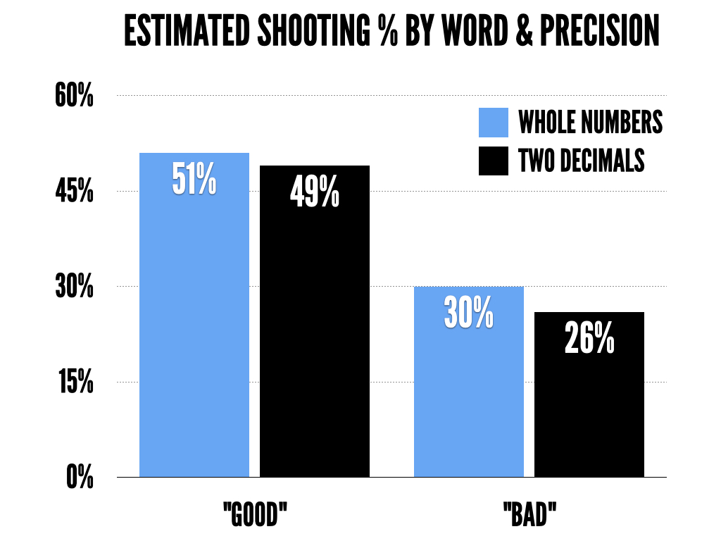
What do you notice?
There appears to be subtle differences based on the answer choice options (round numbers vs. two decimal places). For example, the people who saw the shooting referred to as “bad” estimated 30% when they could only respond with whole numbers but 26% when they were able to be even more precise (ex. 25.96% vs. 26%).
In addition, when looking at response times, the people who were forced to answer with round numbers took about 29 seconds while the people who were forced to answer with decimals took about 44 seconds. Keep in mind, the actual answer slider looked exactly the same (as shown above) in either condition. One argument is that in the precise condition (two decimal points) people *thought* about it longer because the answer required a certain level of precision.
What might play a role?
Gricean norms. As discussed, being more precise than the situation calls for (ex. shooting percentage down to two decimal places) potentially violates norms of conversation. Thus, it might have influenced responses and led to subtle differences (like you see in the bad shooting scenario) between people who answered with round numbers and those who did not.
Processing style and time. As the difference in response time indicates, people in the precise condition took much longer to respond. One argument is they are processing the information differently due to the answer format being in two decimals places. We don’t necessarily have a solid understand of shooting percentage down to two decimals places, or think of shooting percentage with that level of precision, and thus we might think about the question longer or differently.
So what is the takeaway?
Differences in precision matter. This study explored that idea in a slightly different way but you can also think about it in different ways such as a project timeline, as Zhang and Schwarz illustrated in their study. If I say it will take 364 days versus 1 year….in which case do I sound like I know what I’m talking about? “Your project will be done in 364 days” versus “Your project will be done in 1 year.” Mathematically and numerically they are equivalent but explaining the project in days is much more precise. As such, I’m probably trusting the guy/gal who says 364 days because they seem more confident in their estimate.
If it were me, I would look at every situation in my business where I present numbers. How precise are you? Should you be more precise? Less precise? It could be projects (365 days vs. 1 year), pricing ($3.57 vs. $4), discounts (17% off versus 20%), delivery times (1 week vs. 7 days), etc. It makes a difference. Any other examples/scenariors you can think of where you might be making tradeoffs between being specific and being general?
_______
#1QFriday is a blog series that includes my random thoughts and musings. I do not claim to be the first person to think of these things or deny that others have done research on them. I am simply discussing interesting marketing, psychology and linguistic topics that come to mind. Furthermore, I am avoiding statistical analysis as I want the emphasis to be on the ideas. I recently read (Amazon affiliate link) Paul Grice: Philosopher and Linguist and was inspired by a less statistical and more philosophical approach. Thus, the results here could happen by chance. I want to focus on thinking about, discussing and debating the ideas at a broad level rather than whether or not the differences are statistically meaningful. I typically send out a quick survey on Friday and post a follow up analysis/discussion on Monday.
The post Precision and Conversational Norms appeared first on Christopher Lee.
(Potential) Power of Round Numbers 2 Feb 2015, 6:37 pm
The majority of my research interests involve the relationship between words and numbers. How do words influence our (numerical) assessment of a situation? Last week, I asked what you expected a player’s shooting percentage to be when a player’s shooting was referred to as “good” vs. “not bad”. On that note, I was in New York City this weekend and heard someone refer to the weather as “not hot”. It was about 20 degrees outside. Apparently that idea plays out in the real world in terms of how people and businesses communicate. This week’s survey explores the same broad idea (linguistic influences on perception) but in a slightly different way:
What percentage of 40-yard field goals does the average college kicker make?
Similar to last week, there were multiple conditions. Some people might have seen one of the following:
What percentage of 39-yard field goals does the average college kicker make?
What percentage of 41-yard field goals does the average college kicker make?
The only difference between the conditions (i.e. what you might have seen compared to someone else who answered the survey) was the distance of the field goal. Why is that an important distinction? There is research indicating that round numbers drive behavior in unique ways. Or, similarly, approaching a milestone such as thirty changes behavior.
A recent article on NYMag.com discusses some of these unique behaviors such as more people signing up for marathons in their 9 year (ex. 29) than round year (ex. 30) or people being more likely to retake the SAT if they score under a round number. Powerful stuff. With that in mind, I wanted to build on this and explore whether it influences perceptions of chances of making the kick, difficulty, etc. Given the love for college kickers (#collegekickers) on Twitter, that seemed like an interesting way to test it.
RESULTS
Before I discuss the results, I want to acknowledge that not every survey I run will “work”. In other words, not every survey will have statistically meaningful differences, pretty graphs, etc. I am also trying to stay away from statistically analyzing the data and instead focus more on ideas*. The point of this blog post series is to try out, with your help, various ideas I am thinking about. The “file drawer problem” is a term used in academic circles which references studies that end up in file drawers (and not published) because the results don’t work out as planned. That won’t be the case here. If it works, I’ll talk about it and discuss why. If it doesn’t work, I’ll talk about it and discuss why. This is one of those studies that didn’t work out quite as I had planned. Nonetheless…the results:
What do you notice?
Although the differences aren’t quite as unique as last week’s survey, there still appears to be a bit of a trend suggesting a 40 yard field goal is perceived differently than a 39 or 41 yard field goal. For example, a 40-yard field goal was perceived as more difficult (lower estimates of field goal percentage) than a 39-yard or 41-yard field goal. Furthermore, the estimated difference between a 39-yard field goal and a 40-yard field goal was about 4 percentage points but the difference between a 40-yard field goal and 41-yard field goal was about 2 percentage points. This could have happened by chance (based on a fairly small sample size too)* so, like I’ve discussed before, don’t put too much stock into results from one study but it is still interesting to think about. In both scenarios, there is a 1-yard difference in the distance of the field goal but perceptions of how often a kicker makes the field goal are different.
What might play a role?
Power of 9 or 0. As previously mentioned, quite a few studies have shown the power of a 9 in a number and/or the power of a round number. A casual look at the graphs suggests something like this may be in play given the unique perceptions of a 40-yard field goal relative to a 39-yard or 41-yard field goal. For example, a 40-yard and 41-yard field goal are perceived similarly, yet a 39-yard field goal is perceived as much easier. Shouldn’t the perceived difference between a 39-yard and 40-yard field goal be the same as the perceived difference between a 40-yard field goal and a 41-yard field goal? These results suggest that is not the case. Why would a 40-yard field goal be perceived as more difficult than a 41-yard field goal? The milestone, based on the round number, of a 40-yard field goal appears to increase the perceived difficulty.
Knowledge. It could be that the sample that responded to this survey (presumably a lot of sports fans) are much more knowledgeable about football and thus less susceptible to any 39/40/41 bias. That being said, there does appear to be a slight perception difference due to the differences in the type of number (ex. 39 vs. 40 or 41).
So what is the takeaway?
Think about the numbers you are using in your day to day (business) life. Multiple studies have shown how people behave different depending on whether a number ends in 9 or 0. Although this study wasn’t as conclusive as I had planned, there does seem to be a slight difference in perceptions based on the number alone. For example, in a business scenario this could apply to delivery times (9 days vs. 10 days), pricing ($1.99 vs. $2.00), the age at which someone signs up for a product (such as the 29 vs. 30 marathon example), or a host of other scenarios that are influenced by framing. Can you think of other scenarios where this type of idea might apply?
P.S. I couldn’t find any data on college kicker accuracy by distance (let me know in the comments if you know of a study) but here is an interesting article from FiveThirtyEight on NFL kicker accuracy by distance.
*This post is part of a blog series that includes my random thoughts and musings. I do not claim to be the first person to think of these things or deny that others have done research on them. I am simply discussing interesting marketing/psychology/linguistic topics that come to mind. Furthermore, I am avoiding statistical analysis as I want the emphasis to be on the ideas. I recently read (Amazon affiliate link) Paul Grice: Philosopher and Linguist and was inspired by a less statistical and more philosophical approach. Thus, the results here could happen by chance. I want to focus on thinking about, discussing and debating the ideas at a broad level rather than whether or not the differences are statistically meaningful. I typically send out a quick survey on Friday and post a follow up analysis/discussion on Monday.
The post (Potential) Power of Round Numbers appeared first on Christopher Lee.
The Psychology of Not: Good Versus Not Bad 26 Jan 2015, 6:39 pm
Words are extremely powerful. One word can be extremely powerful. We tend to throw out words without always thinking about how they are perceived. It can be interesting though to take a step back and think about what we are really trying to say and how people interpret the words we use. That leads us to last Friday’s survey:
Imagine you overhear two people talking about a NBA player.
Person A: “How is his shooting?”
Person B: “Good.”
What do you think the player’s shooting percentage (shots made/shots attempted) is?
Now some of you are probably saying “Wait. I don’t think I saw ‘Good’. I saw ‘bad’ or ‘not bad’ or ‘not good’.” That might be true. The point of the survey was more about psychology and linguistics than the shooting percentage of a basketball player. Thus, there were four variations to the survey. Depending on the condition you were randomly assigned to, you would have seen Person B respond with one of the following:
“Good.”
“Bad.”
“Not good.”
“Not bad.”
My primary interest was exploring the use of not. Think about it. Not. Short word. Arguably a simple word. Or is it? The word not is:
“used as a function word to make negative a group of words or a word”
Fairly simple idea but let’s first take a closer look at the above example:
How is his shooting? Good.
How is his shooting? Bad.
There is little doubt that good refers to a higher shooting percentage than bad. Let’s throw a not in there now:
How is his shooting? Not good.
How is his shooting? Not bad.
Now what? Presumably not bad refers to a higher shooting percentage than not good? Or does it? Again, fairly simple statements but the not adds a unique twist. Take a look at the four variations again:
How is his shooting? Good.
How is his shooting? Not good.
How is his shooting? Not bad.
How is his shooting? Bad.
Here is the challenge. How would you rank these in order of highest to lowest shooting percentage? Good and bad seem like the two endpoints but the two in the middle get a bit tricky. By a pure definitional use of not, the following should be true:
good = not bad
bad = not good
In reality though, and given our conversational assumptions, not bad probably isn’t interpreted as good. Similarly, bad is likely not interpreted equal to not good. Furthermore, is the difference between good and bad the same as not good and not bad? Therein lies the interesting question(s) to test. Given a large portion of my Twitter followers are interested in sports, using a basketball example seemed like an interesting context to test this idea.
RESULTS
Every person saw the same basketball scenario with the exception of the word Person B used to describe the player’s shooting. Person B either described the player’s shooting as “Good”, “Bad”, “Not good” or “Not bad”. How did that affect estimates of the player’s shooting percentage?

What do you notice? There is a much bigger difference between good and bad than not good and not bad. The difference between a players shooting being described as “good” and “bad” was 14% but the difference between “not good” and “not bad” was only 4%. Why? From a linguistics and psychology standpoint, adding “not” results in the communication being interpreted differently. This particular study illustrates the unique nature of words, such as not, and their affect on perceptions.
What might play a role?
Certainty and confidence. Someone describing a player’s shooting as “good” sounds much more certain and confident than someone saying “not bad”. In this context, the use of “not” almost translates to “average” or somewhere in between “good” and “bad”.
Conversational norms. Why would a person even use the word “not” when they could describe the shooting as “good” or “bad”?
Context and knowledge. Were we talking about two point shooting, three-point shooting, relative to what, etc?
So what is the takeaway? I wouldn’t make household changes based on one study BUT it is important to carefully consider the words that you use in any scenario. Down to the individual word. For example, in a business scenario, is the product easy to setup or is it not difficult to setup? (Think about it, IKEA.) Is an employee bad at something or are they not good? There are a bunch of other ways in which a simple word such as not can affect perceptions. Can you think of any others? Let me know in the comments. The goal of these posts is to get as many people involved as possible to debate, discuss, and generate new ideas. As far as I am concerned there is not a dumb answer, question or idea. If your thought starts with “This is might be dumb but…” then write it down and submit it anyways!
P.S. If you’re curious, according to Basketball Reference, the league wide shooting percentage this season is 45%. The league wide three-point percentage is 35% while the two point percentage is 49%.
P.P.S. I’m pretty fired up about the next research idea/question I have. If you want to participate, I’ll be sending out the survey link on Friday. If you want to make sure you don’t miss it, be sure to sign up for my email newsletter and follow me on Twitter (although eventually I may only send out the link via email).
This post is the beginning of a series that includes my random thoughts and musings. I do not claim to be the first person to think of these things or deny that others have done research on them. I am simply discussing interesting marketing/psychology/linguistic topics that come to mind. I welcome any criticism, discussion, or new ideas!
The post The Psychology of Not: Good Versus Not Bad appeared first on Christopher Lee.
Why do prices end in .99? 4 Dec 2013, 4:09 am
Many of the questions people ask me are about pricing. One of the most popular questions is why do prices end in .99? It seems like everything from coffee to televisions and shoes to computers end with .99. So why do marketers do this?
There are several different consumer psychology arguments but I’ll highlight two:
Right-Digit Effect or “Meaning”
The right digit theories suggest that prices ending in .99 signal to the consumer that the item is low-priced or on sale. Think about buying a coffee:
Large: $2.99
vs.
Large: $3.00
The meaning argument suggests that the $2.99 price sends a message that the item is a good deal, low price or on sale. While this argument makes sense, there is another pricing theory that consumer psychology researchers focus on a bit more.
Left-Digit Effect or “Drop-Off”
The left-digit theories argue that consumers pay very little attention to the last couple digits of the price. Consumer attention and focus drops off. Let’s take the same pricing example as above:
Large: $2.99
vs.
Large: $3.00
The drop off theory suggests you read those prices and interpret them in the following way:
Large: $2.99 —> $2
vs.
Large: $3.00 —> $3
Which price looks more appealing? $2.99 seems like a better option than $3.00 because consumers interpret it as $2. There are other explanations for why this happens, how it happens, variations of how the .99 price is interpreted but I will save those for other posts.
Takeaway
Pricing matters. Numbers matter. Very subtle changes can result in big differences in how consumers respond. The two theories presented in this post argue that the $.99 ending either signals something to the consumer (like a sale) or is ignored by the consumer ($2.99 becomes $2).
How do you price your products? Do your prices end with .99 or do you use a round number (ex. $3)?
Sources/Credits:
- Bizer, G. Y., & Schindler, R. M. (2005). Direct evidence of ending-digit drop-off in price information processing. Psychology and Marketing, 22(10), 771–783. doi:10.1002/mar.20084
The post Why do prices end in .99? appeared first on Christopher Lee.