Add your feed to SetSticker.com! Promote your sites and attract more customers. It costs only 100 EUROS per YEAR.
Pleasant surprises on every page! Discover new articles, displayed randomly throughout the site. Interesting content, always a click away
Accessible Palette: stop using HSL for color systems → 16 Sep 2021, 7:41 pm
Recently, I set out on a mission to reconstruct a color system in Postmark. This project addressed several problems with our design system, involved a lot of research, and even required building a few custom tools. Now that this project is finished, I want to share the most important lessons I learned about color and present a new design and accessibility tool Accessible Palette born out of this work.
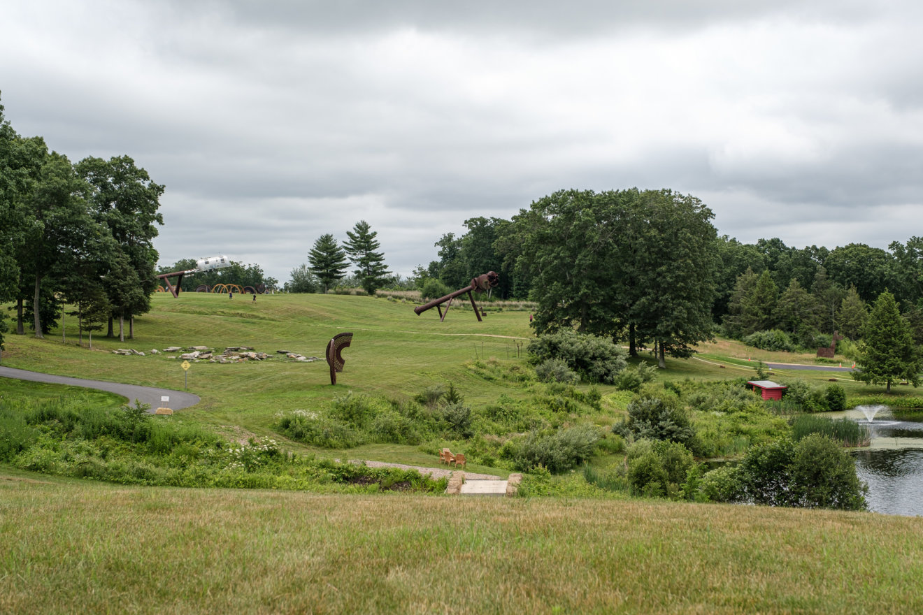
Edward Tufte’s Hogpen Hill Farms 11 Jul 2021, 9:03 pm
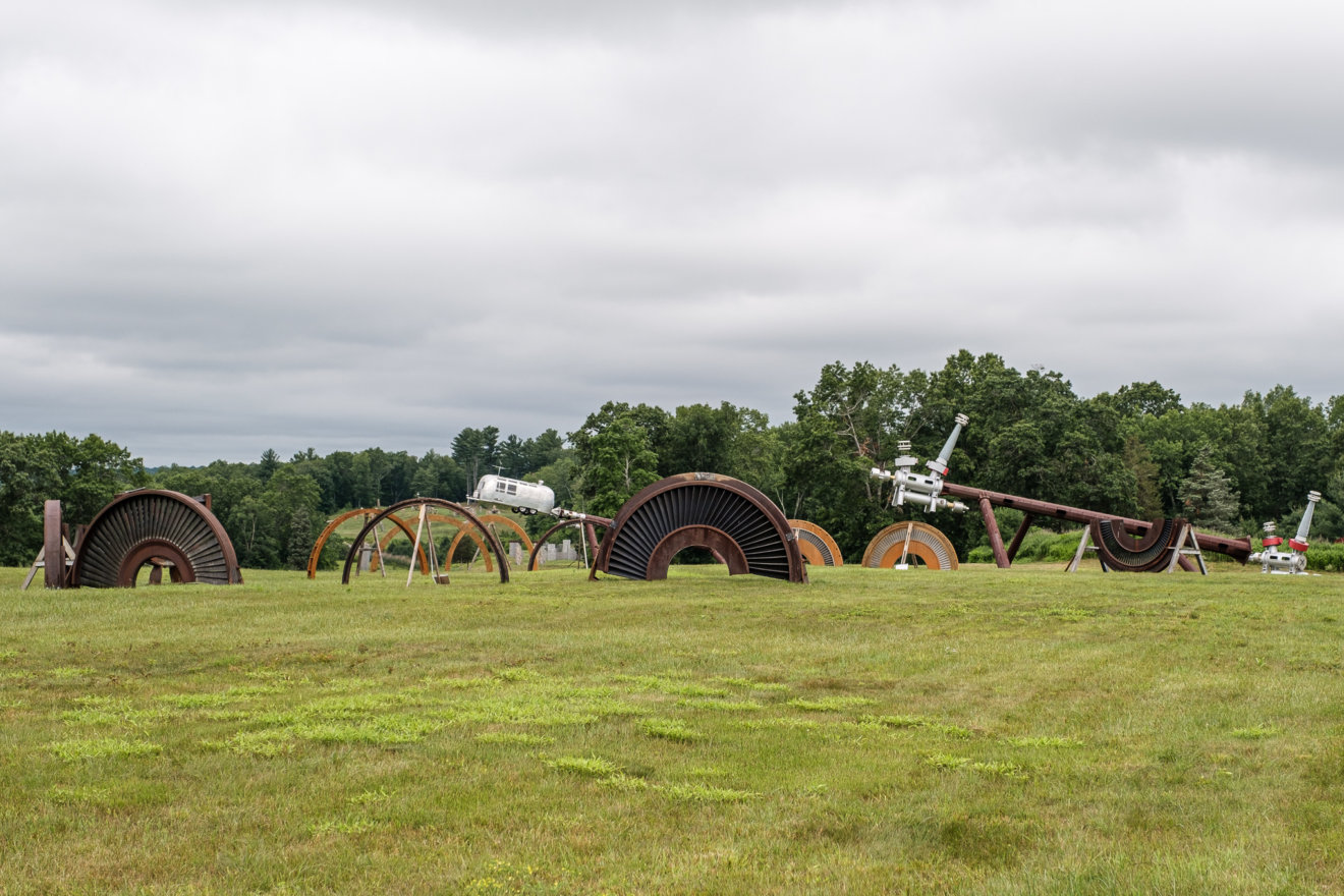
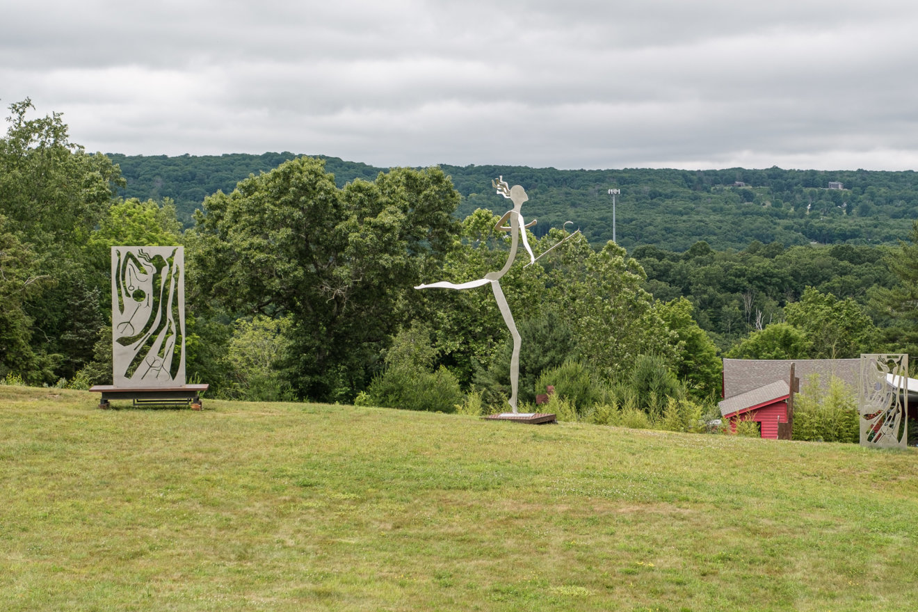
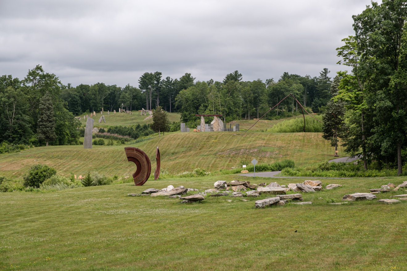
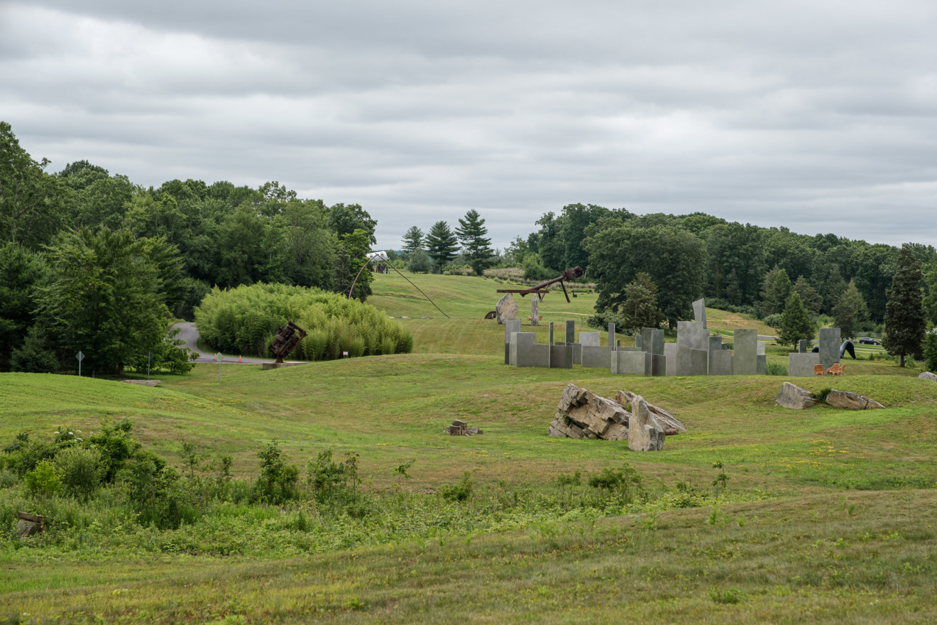
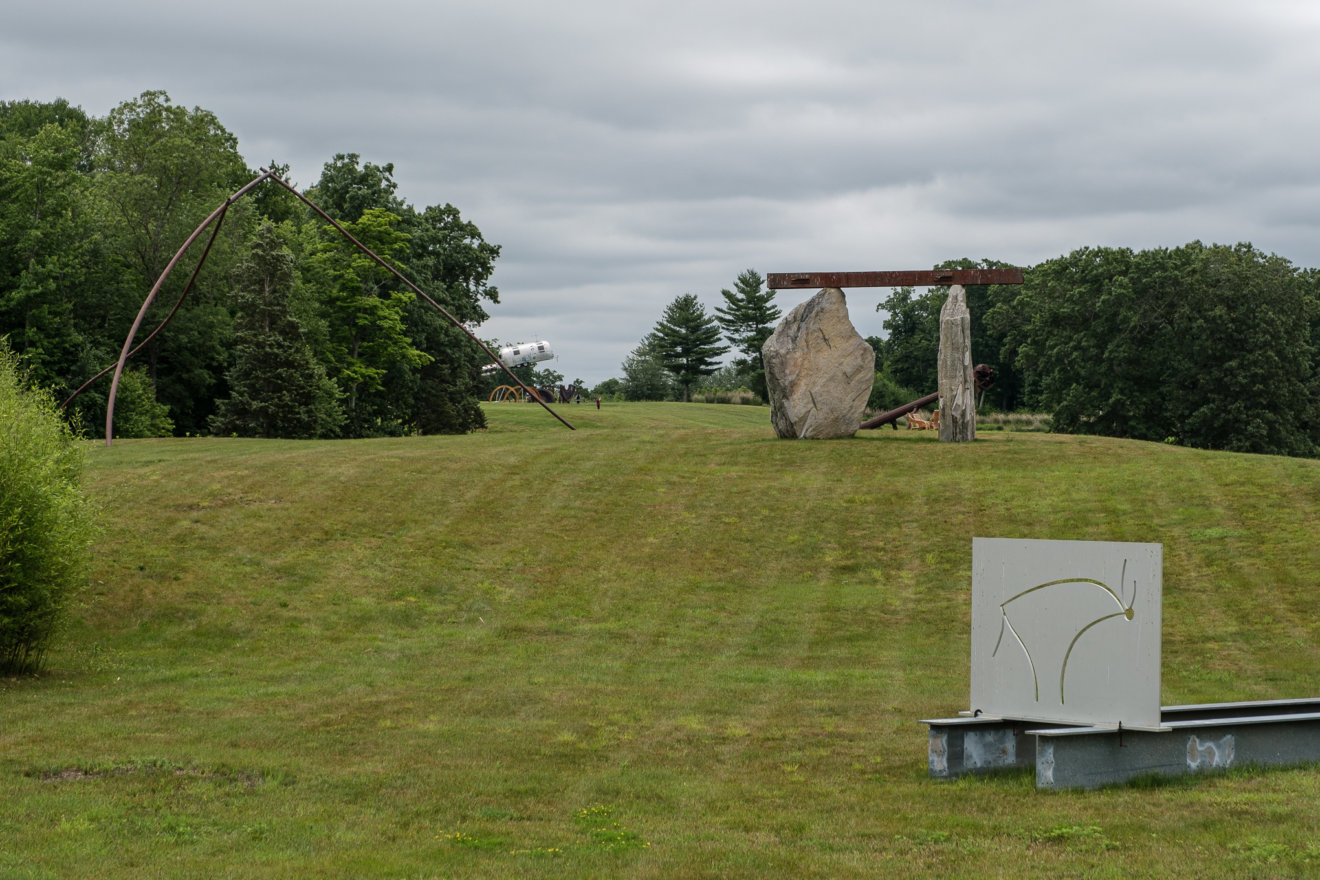
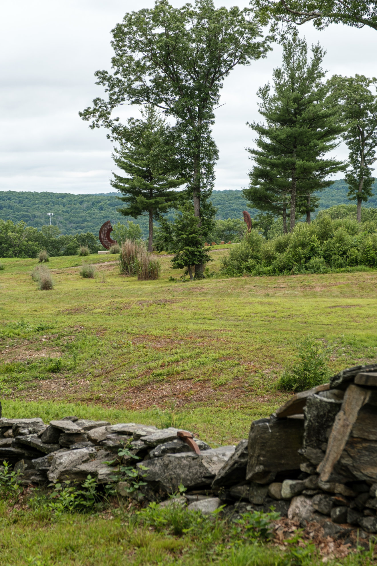
Edward Tufte is best known for his course and books on information design (or analytical design, as he prefers to call it): The Visual Display of Quantitative Information, Envisioning Information, Visual Explanations, Beautiful Evidence, and the most recent Seeing with Fresh Eyes. His abstract sculpture work is less known, perhaps because it was almost impossible to see. In the 2000s and 2010s, he exhibited in New York and Los Angeles art museums, and in 2004 bought a 234-acre tree farm in Woodbury, CT, to fill with his outdoor sculptures. Hogpen Hill Farms opened to the public for just one day per year, so chances to visit it were slim.
In 2020, Edward Tufte tweeted that his farm will be open for multiple days in October. Sadly, I saw this tweet only in November. Even while it was too late, I emailed asking him to add me to an email list for future openings. Almost a year later, at the end of May 2021, I’ve got an email that Hogpen Hill Farms will be open for a few days nearly every week of the summer. I immediately bought a ticket for Friday, June 25th.
The art farm in Woodbury, CT is about 200 miles away from my home in Ardmore, PA. My wife’s plans later changed, so I went on this trip with my 11-year-old daughter. We’ve never been to New Haven before and decided to go there on Thursday, explore the city, and then go to ET’s farm the next morning before driving back home.
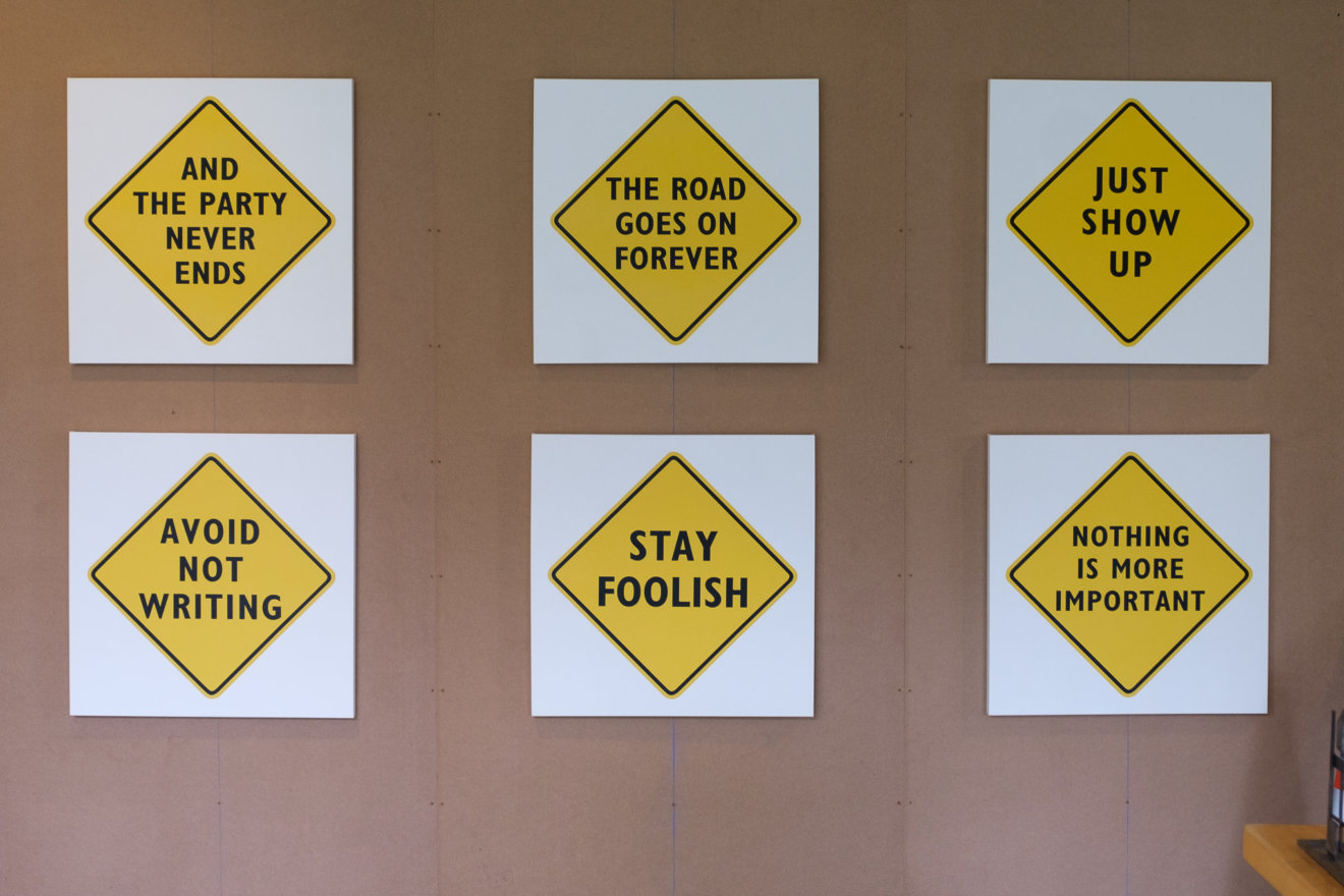
As soon as we entered the farm, it was clear that this is Tufte’s place — all information signs are set in his on-brand red Gill Sans:


Warning signs are special as well:


(No, the second photo wasn’t taken in a mirror.)
Before getting to the parking lot, we’ve been given a large handout with a visual north-to-south map of art objects and some information about the place on the back. (Notice the way toilets are shown on this map.) This reminded me of attending Tufte’s one-day course in 2013, where he started the day with assigned reading from the handouts.


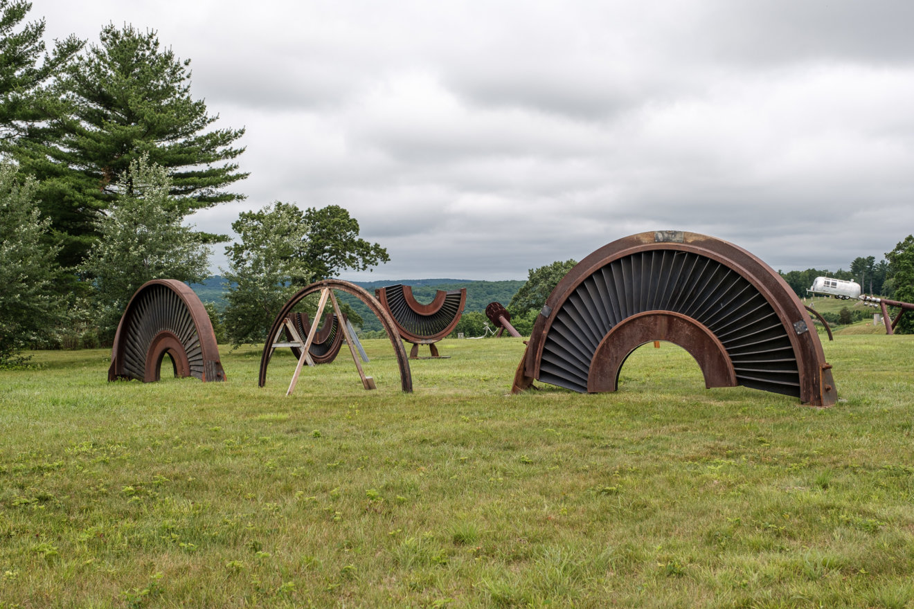
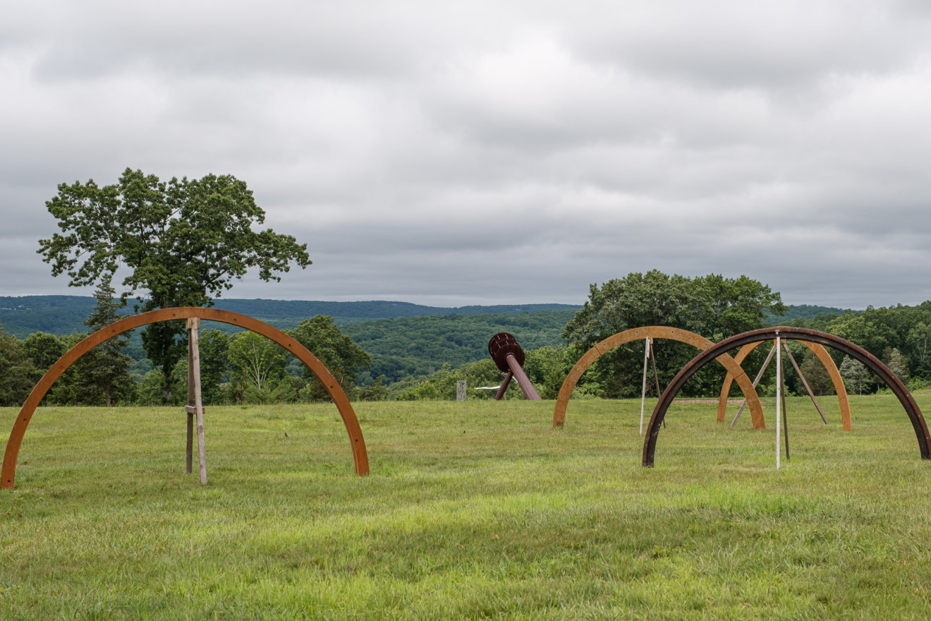
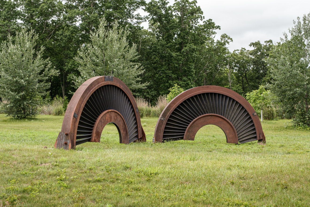
Seeing large-scale sculptures and installations placed in nature instead of being trapped inside a sterile art museum was a refreshing experience. As ET writes in his essay Seeing Around, Seen real by viewers walking around outdoors, abstract works provide a multiplicity of direct and vivid optical experiences: form, scale, color, shadows, volume, airspace, landscape.
This makes photographing his art tricky. In hindsight, I wish I had taken video time-lapses to show moving shadows and changes in color reflections from clouds and the environment.


")
")


, 2007")
On form and scale:
“Rocket Science, physically large, appears immense and disorienting to nearly observers on the land, delightful to children, and not all that big a presence compared to nearby land, trees, horizon hills.”
How it was designed and built at a concrete plant with scrap metal from a nuclear powerplant:
“Rocket Science was designed at full scale. Big cranes temporarily held together rough drafts of the artwork. A small cardboard model later helped engineer the legs and locate the piece. Photographs and videos were shot at several scales. Full-size mock-ups, small models, computer animations, sketches, confections, photographs, videos: whatever it takes to see, understand, and construct artwork.”
, 2009")
, 2009")
, 2011")
, 2011")
, 2011")
“Since Feynman diagrams describe the universal operations of Nature’s laws, they can communicate throughout the universe. Both sides of the Airstream Interplanetary Explorer show Feynman diagrams that might communicate with intelligent life anywhere. Better the cosmopolitan verbs of Nature’s laws on spacecraft than the local proper nouns of national flags, earthly Gods and Goddesses, government agency logos. For interplanetary exploration, better to send smart machines and their emblematic Feynman diagrams than human beings and their lawn chairs, toilets, teddie bears.”
Notice how extra webbing rolls are stored right next to a lawn chair, just in case a repair is needed.

ET created a “cosmic prank”, based on the Pioneer space plaque:
“Since the principles of physics hold everywhere in the entire universe, magic is conceivably a cosmological entertainment, with the wonder induced by theatrical illusions available to and appreciated by all, regardless of planetary system. Accordingly the original plaque placed aboard the Pioneer spacecraft for extraterrestrial scrutiny billions of years from now might have escaped from its conspicuously anthropocentric gestures by showing instead the universally familiar Amazing Levitation Trick.”


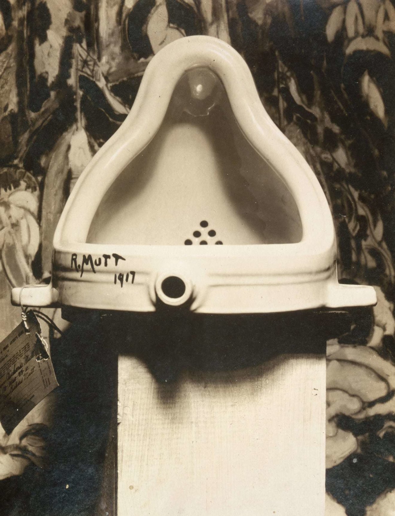
In 1917, Marcel Duchamp submitted an ordinary porcelain urinal signed “R. Mutt” for an exhibition of the Society of Independent Artists in New York. Duchamp described his intent with the piece was to shift the focus of art from physical craft to intellectual interpretation. Philosopher Stephen Hicks wrote in 2004: “In selecting the urinal, his message was clear: Art is something you piss on.” Well, I don’t think pissing on the electrical box near the World Headquarters would be a good idea.


, 2012")
ET in his essay The Cognitive Art of Feynman Diagrams:
“Made from stainless steel and air, the artworks grow out of Richard Feynman’s famous diagrams describing Nature’s subatomic behavior. Feynman diagrams depict the space-time patterns of particles and waves of quantum electrodynamics. These mathematically derived and empirically verified visualizations represent the space-time paths taken by all subatomic particles in the universe. The resulting conceptual and cognitive art is both beautiful and true. Along with their art, the stainless steel elements of All Possible Photons actually represent something: the precise activities of Nature at her highest resolution. Gathered together, as in the 120 diagrams showing all possible space-time paths of 6-photon scattering, the stainless steel lines (and their variable shadow, airspace, light, color, form) reveal the endless complexities that result from multiplying and varying fundamental elements.”


World Headquarters is used as a gallery and office. Some of the miniature sculptures and books were for sale outside. I’ve got a couple of printed essays on sculpture and installations, used as a reference for this post.


Escaping Flatland was one of my favorites. I think the overcast weather during our visit was perfect for seeing it. Polished stainless steel reflects green grass and grayish clouds, creating rich and deep colors without specks of light.

Pablo Picasso’s The Bull is a series of eleven lithographs created in 1945. It depicts the bull at various stages of abstraction, starting with a fairly realistic depiction and ending with nothing but a few lines. Tufte’s bull is even simpler but lost his balls in the process.

(See also Twitter thread by Trung Phan on how Apple has used Pablo Picasso’s Bull to explain innovation as “saying no to 1000 things” before you say yes. It even appeared in their famous “Think Different” ad.)


“Magritte’s smile, the sculpture, makes an overt reference to another painting of Magritte. Also the smile has the ambiguous status, perhaps, of a good many of Magritte’s images, their conjunction of presence and denial of presence. Magritte’s Smile, since it at least resides in three dimensions, is closer to a real fish and a real smile than flatland representations of the same.”
Took me some time to find the painting he refers to — “The connivance”, made in 1965:


This rock was the most puzzling piece of art on the farm. Or was it just a rock?
Contemporary art can feel snobby and haughty, but visiting Hogpen Hill Farms was a different experience. Even while driving through it on arrival, we were spinning heads and making stops, as it felt so unusual and plain cool. Facing a flying fish while walking through the woods, discovering a giant black swan on a pond, getting into a bamboo maze, or seeing an Airstream with an attached lawn chair on the way to explore other planets was just fun, both for my 11-year-old and me. Noticing some of the modern art references was intellectually satisfying, but just as an extra layer. To me, seeing Edward Tufte’s art and quirky jokes opened up a new dimension of his personality that I wasn’t sensing while attending his course or reading books. If you’re on the East Coast, interested in ET’s work or contemporary art, and can get hold of a ticket, I’d highly recommend making a trip.
Outlining text with CSS and SVG 6 Jan 2021, 3:06 am
A few weeks ago, I worked on a website refresh and wanted to outline text in a few titles. This is not the effect I’d normally use, but in this case, the titles were on top of a patterned background, and a thick outline in the same color as a background helped with the readability:

It took me a while to believe that there is no good way to do this with pure CSS. Unlike box-shadow, a text-shadow property doesn’t have the fourth “spread” value. Experimental property text-stroke sounded like a good fit until I realized that the stroke is always aligned inside the text:

After some experimentation, I solved this with a mix of SVG, CSS, and JS. Some parts weren’t very obvious, so I decided to document my solution in case it helps someone else. First, let’s walk through markup:
<h1>
  <svg viewBox="0 0 1000 90" xmlns="http://www.w3.org/2000/svg">
    <text x="500" text-anchor="middle" dominant-baseline="hanging" fill="white" stroke-width="22" paint-order="stroke">
      Product Manager
    </text>
  </svg>
</h1>
SVG acts as a wrapper on a title text, just to provide more styling properties:
paint-order="stroke"keeps the stroke behind the text. This is very important! SVG still only supports center stroke alignment, but this is a nice way to imitate an “outside” stroke alignment.- Because half of the stroke is hidden behind the text, the value of
stroke-widthis twice bigger than it should be. x="500"(middle of viewBox) andtext-anchor="middle"align text to the horizontal center of the block.- SVG’s height is set to match the line-height in CSS, and text is placed at omitted
y="0".dominant-baseline="hanging"renders text from the top instead of from the baseline, so it fills the whole block. Without this property, the text would be rendered outside of the box. - Stroke color is specified in CSS using
strokeproperty. - The font is inherited from
h1and specified in CSS as well.
All of that together adds a nice stoke to the text (made darker for the demo):

The only problem is that SVG has a fixed size (see viewBox) and doesn’t scale well. I could easily scale it as an image, but I’d rather keep the font size consistent with other titles and media queries in the projects. Wish I could avoid this, but I had to add a few lines of JS to update the viewBox value based on the size of the element:
function resizeTitle (el) {
  var width = el.clientWidth;
  var height = el.clientHeight;
  var text = el.querySelector('text');
  el.setAttribute('viewBox', `0 0 ${width} ${height}`);

  if (text !== null) {
    text.setAttribute('x', (width / 2));
  }
}

function svgTitles () {
  var svgs = document.querySelectorAll('svg');

  if (svgs.length > 0) {
    svgs.forEach(el => resizeTitle(el));
  }
}

window.addEventListener('DOMContentLoaded', svgTitles);
window.addEventListener('resize', svgTitles);
That’s it! The text now scales based on media queries just as any other title in the project, only with nice outlines. Considering the outlines are the same color as backgrounds, it’s hard to even say that they are there, but the text is much easier to read. This implementation can be seen live in Wildbit’s Good & Bad section or as a CodePen.
Figmalion: The First Year 16 Nov 2020, 4:20 am
On November 5th of 2019, I announced Figmalion, my regular newsletter about Figma, and a week later sent the first issue to 19 subscribers. I started it with zero expectations, but during this year it helped me connect with new people, created a small source of side income, and helped write a book. I want to look back at this year and share a few things that I learned.
Growing the audience
Reaching 1,000 subscribers was an important emotional goal in the beginning, and I hit it sooner than expected. It’s a tiny number compared to popular design newsletters (e.g., Designer News is 24,000 and Sidebar is 40,000 subscribers), but they’ve been doing this for a while and focus on a wide array of topics. Figmalion is about one app that is currently changing the landscape of design tools. I document how Figma evolves as a product and explore the creativity of its community. This niche probably won’t grow to tens of thousands subscribers, but I am fine with that.
Starting something new is similar to a flywheel — hard to start, but gets easier when you get some traction. Here is what I’ve been doing to grow the audience over the last year:
- Issue #2: 46 subscribers. Most new subscribers came from Twitter, but I also shared a link to the first issue on community resources, like Reddit and Spectrum.
- Issue #3: 90 subscribers. Shortly after sending the second issue, I reached out to John Morton from Craft Link List. His newsletter was one of my favorites while I was actively involved with Craft CMS, and we even met briefly at Craft Meetup in New York City in 2017. I asked him for advice on growing the audience and writing a consistently great newsletter for 5 years. John shared some thoughts, but the most important advice was to be present in the community all the time and try to answer any questions that I could help with.
At this point, my process for preparing new issues was very manual and time-consuming. I used TweetDeck to search for all mentions of @figmadesign on Twitter and looked for any interesting content in the results. (Funny to think that I worried there may not be enough content for a biweekly newsletter.) It was taking me almost the whole day to go through all the mentions from two weeks, and I took this as an opportunity to answer any questions about Figma that I’d see. I did this from the @FigmaNewsletter Twitter account, and inevitably some people discovered and subscribed to the newsletter.
- Issue #6: 130 subscribers. CEO of Figma Dylan Field tweeted about the newsletter. That felt like a breakthrough! I was really excited to see an inflow of new subscribers.
- Issue #7: 195 subscribers. I did a fun experiment with paying for an ad in a Russian-speaking Telegram channel about Figma plugins. If that seems like a strange choice, 80% of Figma’s active users are currently outside the United States, and Eastern Europe is responsible for a lot of them. About 200 people subscribed from it.
- Issue #10: 444 subscribers. Encouraged by the success of my Telegram advertisement campaign, I reached out to Jake Bresnehan for sponsoring his Web Design Weekly newsletter. I was a long-time subscriber, so selecting the project to sponsor was easy. Jake was very generous and featured my newsletter for free.
- Issue #11: 563 subscribers. Figma opened its Slack channel to the public. I started monitoring it for interesting links and answering questions whenever I had a moment. After checking with the moderator, I started sharing new issues with the community, and it became a solid source of new subscribers.
- Issue #16: 783 subscribers. As things slowed down a little, I looked for a place to introduce Figmalion to the new audience. I posted a link to Designer News in the beginning, but it didn’t get any traction. I wasn’t sure if it’s acceptable to repost the same link twice but decided to share it again, and it was on the front page for the whole week!
Designer News is a great community hub and a source of content for other resources. I was super excited when Sidebar.io included Figmalion in their daily roundup. I think it’s one of the biggest design resources right now, so from there it spread everywhere, and the number of subscribers almost doubled.
- Issue #17: 1,666 subscribers. I wrote a guest post at Prototypr.io about using Constraints with Layout Grids in Figma, and it got some traction. Figma Designer Advocate Rogie shared it on Twitter and in one of his videos, then Brendan Miller from YouTube channel Figma55 created a very cool video based on it.
- Issue #22: 2,045 subscribers. Hit another milestone!
- Issue #23: 2,102 subscribers. I released the book about Figma, and a number of people discovered and subscribed to the newsletter from it.
- Issue #27: 2,321 subscribers. Here we are, one year later! I’m truly grateful that so many people find this newsletter valuable and spread the word about it in the community.

The main thing I learned so far is that promoting your work is a never-ending process. Expecting that after creating something people will just discover it is a little naive. Lots of great resources get launched every day, and all of them compete for our limited attention. I’m still struggling with this as it’s more fun to work on the project than to promote it, but it actually forces me to step out of my comfort zone and connect with other authors and creators. That’s been my favorite part so far!
Sponsorships
I didn’t even think of offering a sponsorship until the founder of Folyo reached out and asked if he can sponsor one of the early issues. I replied that the newsletter is still in its infancy and doesn’t have many subscribers, but offered to do it in the future. After going back and forth, he showed interest even in a small audience, and I agreed to feature his project for a small fee.
I started Figmalion mostly as a research project for the book and didn’t really consider it a source of income, but the sponsorship model makes sense in hindsight. There is a growing market of commercial apps and resources built for Figma that might be of interest to the audience. For now, it helps to pay for the tools I use to create and send the newsletter.
After reaching 1,000 subscribers, I added a Sponsorship page and started offering them publicly. Later I was also accepted to a sponsorship marketplace Syndicate, which works with some of my favorite publications. The anniversary Issue #27 includes the first sponsored block from them.
Publishing the book
 On September 21st, exactly one year after registering its domain name, I self-published my book “Designing in Figma”. It may be unexpected, but I decided to start a newsletter only after committing to writing a book. Figmalion was my “accountability partner” for staying up to date with Figma news while working on the book, and it did this job splendidly. Just a few days ago, I updated the book with recently released features and new tips I learned while preparing the last few issues of the newsletter.
The newsletter also provided an initial audience for the book and helped spread the word. It’s hard to underestimate its role in this project.
Behind the scenes
 After 4 months of running a newsletter, I couldn’t keep up with a growing number of tweets to review and needed a better process. I started exploring existing tools, but they were either horrendous or prohibitively expensive for a small side project. Luckily, Mailbrew just launched and felt like a glass of ice water in hell. I set up a large daily digest of all Twitter mentions of @figmadesign that include links, which immediately reduced the number of tweets I needed to go through. This digest also includes tweets from their official account, YouTube videos, blog posts, and mentions in the news. It still has a lot of cruft, but I can dig out a couple of good links almost every day.
CAN-SPAM Act requires all bulk emails to include a physical postal address. I felt uneasy about including my home address, and at some point, registered a PO Box at USPS. The smallest box was $106 per year, which I consider reasonable for a little privacy.
Last but not least, let’s talk about email providers. I always admired the brand of Mailchimp (at least until they got inspired by another provider’s yellow color) and went with them from the beginning. Their deliverability rates are solid, but from my understanding, different customers get different IP ranges based on their reputation. My open and click rates were really high until late August when they started decreasing to just good (~53% open / ~23% click rate). I also heard from a few people that my confirmation emails were ending up in spam. All of the above, in addition to increasing annoyance with their cluttered UI, makes me want to explore other options. ConvertKit is the one I’m most interested in trying.
If you run a newsletter, I’d suggest regularly exporting and backing up your audience. Your list of subscribers is the most valuable part of the newsletter, and it takes only a couple minutes to protect yourself against a stupid mistake or a service failure.
What’s next?
Now when the book is finished, I’m thinking of building Figmalion v2. 733 links were shared in the newsletter this year, and I believe they represent a vast scope of knowledge about the Figma and its community. What’s needed is a better way to access them outside the scope of issues. I’m still shaping up the vision but excited about the possibilities.
The current email design is based on one of the standard Mailchimp templates. Not only it’s quite boring and limiting but also prevents me from easily trying other email providers. This is something I want to customize and automate in the future.
 Did you know that Figmalion’s name is a pun on Pygmalion, a play by George Bernard Shaw? I realized how bad I’m at naming only when everyone read it as “Figma-Lion”. My friend Julia even created an alternative logo just to mess with me. Not sure if the damage can be controlled at this point, but I’m curious to explore other logo directions.
Figmalion and people I met through it affected my life in a meaningful way this year. I’m excited about its future and looking forward to seeing where we’ll end up next year.
Getting Postmark’s Lighthouse Score to 100 → 30 Sep 2020, 4:00 am
Earlier this year, our design team spent a few weeks analyzing and improving the performance of the Postmark product website. Our app is known for lightning-fast email delivery, and we wanted to provide a similar experience to the visitors of the website. Conveniently, what’s good for people is also good for robots — search engines increasingly use performance and user experience metrics as a ranking factor in search results. Once completed, this project made the Postmark site significantly faster and increased our Lighthouse Performance score from 68 to a perfect 100.
Why Doctors Hate Their Computers → 5 Sep 2020, 6:09 pm
Important reading for anyone designing software.
On burnout:
Burnout seemed to vary by specialty. Surgical professions such as neurosurgery had especially poor ratings of work-life balance and yet lower than average levels of burnout. Emergency physicians, on the other hand, had a better than average work-life balance but the highest burnout scores. The inconsistencies began to make sense when a team at the Mayo Clinic discovered that one of the strongest predictors of burnout was how much time an individual spent tied up doing computer documentation. Surgeons spend relatively little of their day in front of a computer. Emergency physicians spend a lot of it that way. As digitization spreads, nurses and other health-care professionals are feeling similar effects from being screen-bound.
On the inability of a system to cope with surprises:
Last fall, the night before daylight-saving time ended, an all-user e-mail alert went out. The system did not have a way to record information when the hour from 1 a.m. to 1:59 a.m. repeated in the night. This was, for the system, a surprise event. The only solution was to shut down the lab systems during the repeated hour. Data from integrated biomedical devices (such as monitoring equipment for patients’ vital signs) would be unavailable and would have to be recorded by hand. Fetal monitors in the obstetrics unit would have to be manually switched off and on at the top of the repeated hour.
Using Constraints with Layout Grids in Figma → 6 Jun 2020, 4:52 pm
While working with Figma, I discovered a powerful way to lay out objects using a combination of Layout Grid and Constraints. The interface of Figma does not indicate a connection between the two, so it can be discovered either by a happy accident or from reading a help article. Luckily, the latter is my kind of fun pastime.
Obliquity → 4 May 2020, 4:12 am
This is an old essay, but the concept is timeless. Quick summary:
Strange as it may seem, overcoming geographic obstacles, winning decisive battles or meeting global business targets are the type of goals often best achieved when pursued indirectly. This is the idea of Obliquity. Oblique approaches are most effective in difficult terrain, or where outcomes depend on interactions with other people.
America Is Overrun With Bathrooms → 28 Jan 2020, 2:30 am
In the mid-19th century, American sanitarians came to believe that disease stemmed from “sewer gas” emitted by toilets, which encouraged home builders to cram tub, sink, and toilet into one well-ventilated room with exposed pipes, in order to limit the spread of disease. While the sewer-gas theory would be overturned by the science of contagion, the three-fixture bathroom remained a staple of the modern American home. (Elsewhere around the world, the toilet is far more commonly found in its own chamber, separate from the bath.)
That doesn’t sound like the most plausible explanation for the 3-in-1 trend, but I clearly remember how everyone combined toilets and bathrooms into single rooms in the nineties in Ukraine.
On bathroom remodels:
According to Zillow research shared with The Atlantic, a simple bathroom remodel—such as replacing the toilet, adding a double sink, or tiling the floor—carries the best bang-for-buck of any home renovation. At $1.71 in additional home value for every $1 spent, it’s three times as cost-effective as a kitchen renovation.
As always, Hacker News has an interesting discussion.
Small b blogging → 4 Jan 2020, 8:50 pm
This post rings very true and describes what I am trying to do with this personal site.
Small b blogging is learning to write and think with the network. Small b blogging is writing content designed for small deliberate audiences and showing it to them. Small b blogging is deliberately chasing interesting ideas over pageviews and scale. An attempt at genuine connection vs the gloss and polish and mass market of most “content marketing”.
And remember that you are your own audience! Small b blogging is writing things that you link back to and reference time and time again. Ideas that can evolve and grow as your thinking and audience grows.