Add your feed to SetSticker.com! Promote your sites and attract more customers. It costs only 100 EUROS per YEAR.
Pleasant surprises on every page! Discover new articles, displayed randomly throughout the site. Interesting content, always a click away
Tom Meagher
Investigative Data JournoI Spent Six Years Running a News App Tracking Executions in America 20 Feb 2021, 5:00 am
Adapted from a Twitter thread I put together when we ended The Marshall Project’s long-running feature, The Next to Die, which monitored and reported on every execution scheduled in the country for many years.
On Feb. 11, Alabama planned to execute Willie B. Smith III. It was the first scheduled execution in the U.S. since The Next to Die began in 2015 that we weren’t monitoring. And the execution—which was stayed by the courts and did not proceed that night—left me mulling many of the challenges facing data journalists and the state of capital punishment in the U.S.
When we started The Marshall Project over six years ago, capital punishment was an important part of our coverage of the criminal justice system. Our first major stories were on the death penalty. Gabriel Dance, our then managing editor, was really keen to do something data-driven and visual on it, and so was I. We wanted to raise the general public’s awareness of executions and nourish a sense of urgency about the issue. There were groups collecting calendars of executions, but we needed minute-by-minute information. We didn’t want this to be abstract. People were being put to death today, and it felt like no one really paid much attention.
Gabriel’s original idea was to make a simple clock that counted down the time until the next execution, but we couldn’t find a data source detailed enough. It didn’t exist. The important theme was time: The minutes until someone was facing the executioner, the days since someone was killed. Pegging it to the fleeting, and universal, nature of time would make people pay attention, we hoped.
If we were going to pull this off, we decided, we had to make our own data.
So in early 2015, Gabriel and I started planning how we could tackle this. We didn’t have expertise in these disparate parts of the country where the executions were happening. But we knew people who did: local reporters covering the courts and prisons.
Largely through connections made through Investigative Reporters and Editors, we pieced together a network of journalists around the country. Michelle Holmes in Alabama. Lise Olsen in Houston. Cary Aspinwall and Ziva Branstetter in Oklahoma. Adam Playford in Tampa, and others.
With these journalists, we could make the data we needed, up to the minute, and also provide more detailed background on each case, all in one place: The Next to Die What began as Gabriel’s idea for a simple, jarring graphic evolved into a full-fledged news app.
To make all this doable by a small team, we wrote thousands of lines of code to automate much of the production work, to redraw graphics and to power an automated Twitter bot for the project.
The site itself was built around the idea of time slipping away, and Gabriel and Andy Rossback’s designs tied it together to a T.
With help from Ivar Vong, we launched publicly in September of 2015, days before Oklahoma wanted to execute Richard Glossip. (They didn’t, though they likely will try again.)
Capital cases were happening that we could help to shine a light on, and our partners were great. More and more reporters got involved. At various points, more than 40 people at 11 news outlets contributed to The Next to Die. Among our most prolific contributors were Maurice Chammah, now the author of the excellent new book “Let the Lord Sort Them”, and Keri Blakinger, who started with us when she was at the Houston Chronicle and later joined The Marshall Project.
More states started seriously planning executions, and so we added them to our tracker. And then came the feds. We began with 9 states and grew to cover 15 states and the federal Bureau of Prisons.
But we never really planned for how we might end it.
The executions kept coming, and coming. Even after Gabriel went back to The New York Times, and many of our reporting partners left their papers for new jobs, executions kept happening. Hundreds of people were given death dates and scores executed.
Even as the death penalty is in steep decline, it’s not dead and gone yet. And it isn’t going be in the near future. I started scheming with Maurice and Keri about new ways we could write about capital punishment at The Marshall Project and how we could tell larger stories that would get more people’s attention. That led to our new series, Death Sentences. With Death Sentences gaining steam, it felt like a good time to wind down The Next to Die.
Five and a half years is a long time to do any project, particularly one as voluminous, and traumatic, as monitoring every single execution, writing about the people facing death and the people who lost their lives in crimes. To end the Next to Die, we looked back at the data we’d collected and found trends that raise questions about how fairly and how well the criminal justice dispenses punishment.
To do this, another amazing of group of Marshall Project colleagues—Andrew Calderón, Katie Park, Elan Kiderman, Gabe Isman, David Eads and more—helped me tell the story with a haunting and stark design.
Looking back, I’m acutely aware of how lucky I’ve been to have so many great collaborators and to work at a news organization like The Marshall Project. Beyond Gabriel, editors Bill Keller, Kirsten Danis and Susan Chira have been incredibly supportive of the project from the outset. Now, after thousands of hours of reporting and coding and tens of thousands of words written, the Next to Die is over.
Here’s my advice for other journalists who want to do this kind of work. Be bold. If the data you need doesn’t exist, make it. Build crazy systems to collect it (and vet it). Recruit like-minded journalists to help you. And try at the start to think how you’re going to end it.
On that note, I’ve got to get back to collecting our weekly data on the spread and toll of coronavirus in American prisons.
But first, I’ve got to go talk with Keri Blakinger about our next Death Sentences story she’s working on.
Onward.
I Spent Six Years Running a News App Tracking Executions in America was originally published by at Tom Meagher on February 20, 2021.
All about the WSJ's penalty kicks interactive 3 Jul 2014, 4:00 am
Cross-posted from Open News’ Source blog.
In the days before the World Cup’s knockout stages, with their potential for games to end in shootout finishes, The Wall Street Journal unveiled an app that visualized the tendencies of the top penalty kicks takers on the teams advancing in the tournament. Chris Canipe, senior news apps developer on the Wall Street Journal’s interactive graphics desk, talked with me about the thinking behind the project and how he and his colleagues put it together. What follows are edited excerpts from our conversation.
###The Concept
The World Cup [interactive coverage] working so well has been completely a product of working with great reporters, who knew what they wanted to do and had great ideas. That makes all the difference. Geoff Foster is one of our main sports guys, and Matthew Futterman, who wrote the Klinsmann profile, wanted to focus on penalty kicks. Geoff Foster had done a video about saving penalty kicks where he went to the Red Bulls’ practice facility and talked to a goalkeeper about them.
Penalty kick success rates are very high. It’s almost paper, rock, scissors. You go right, you go left or you go middle. But very rarely people go middle. (Freakonomics looked at this phenomenon in the run-up to the World Cup in South Africa, four years ago.)

Overall success rates are about 78 percent. If you kick to the middle, that goes up 7 percent, because a goalie, they are diving to the left or diving to the right–they don’t have time to think about it.
I’m a baseball guy. [This penalty kick analysis is similar to] the idea of where to place fielders based on a hitter’s spray pattern.
###The Data
We have a pretty good data provider we work with called Opta. They’re particularly good with soccer data. They gave us all kinds of stuff. Included in the game event summaries, they had X- Y- and Z- coordinates for penalty kicks. We were really impressed with the level of detail.
It was really easy to put in a request, “Here’s a list of players, can we get every penalty kick that they’ve ever taken?”
There were some limitations with the data set. Not everybody has a significant body of penalty kicks in their career. (Opta also doesn’t have comprehensive data for players on club teams outside the highest echelons, making it harder to get stats for someone who plays in the Iranian league, for instance).
We kind of wanted to do this at the beginning [of the tournament], but the more we played with the data, the more we sketched it out, we saw it would work better with a smaller number of teams.
[We settled on] two players for each team in the round of 16, but still we have a bunch of the guys in the set who only have one kick. Algeria, we only had one player [with data]. We were hoping for Russia to beat Algeria (to advance out of the group stage) because we had two guys for Russia.
This doesn’t comes as XML or JSON; this comes as a spreadsheet. You get the matchup, the date… X is length of the pitch, Y is the length of the goal side of the field, Z is up and down. [For a goal, you get the] end-Y and end-Z position, and end result or outcome. It’s either a goal, or it’s saved, or it hit the posts or it’s a miss.

As a baseball fan, I think of MLB’s pitch-by-pitch Gameday view. I always figured that part of [the data collection] was some computer recording the position. But it’s these data vendors [like Opta]. They employ rooms full of people who are watching every event of the game and coding it. That’s really interesting.
We ran into an issue initially where we had Y-positions that were reversed on the field, because Opta had not corrected–we caught it–which side of the field kicks were being taken from.
To catch problems in the data, you go and watch lots of videos and make sure everything is lining up. You find as many of these on YouTube as you can, so you have confidence all of them are correct.
When we got the [corrected] data back [from Opta], we watched maybe 10 kicks, random spot checks. It’s hard to find video of these. You have a shaky cell phone view of people watching on TV.
You’re working with data that is hand-coded, so any time you’re working with a vendor like this, you’re taking a little bit of a risk. There’s a lot of room for human error in something like this.
Design
The actual work itself, it was not hard to put together. The hard part was narrowing down and coming up with what we wanted to say with it.
It worked really well as a small multiples piece, because you get to compare all of these guys together, especially if they have a large enough sample size, like Messi, Hulk, Cavani.
It’s built with D3. The small multiples approach was sort of obvious from the beginning. Part of the reasoning is that it reflows so easily for mobile. Small multiples rule.
You want to see guys side-by-side. Do guys spread out their kicks? How many guys actually do go to the middle? Most guys go left or right.

There’s that filter in the top, “Trends Left” or “Trends Right.” Nobody trends to the middle, except for the guys who had two kicks in their set.
After launch, that first game, was a shootout. It almost made us seem prescient. I was sitting at home, watching that game. The Journal main desk tweeted it out. We got a ton of traffic right at that moment. In that first game, you could see penalty kick patterns for Vidal and Hulk.
This is definitely not a case where it goes up, and the traffic dies off immediately. All of our stuff, I’m really surprised how much social traffic things are getting.
This is the beauty of the World Cup stuff. It has this sort of long life.

All about the WSJ's penalty kicks interactive was originally published by at Tom Meagher on July 03, 2014.
U.S. World Cup Roundup for Source 3 Jul 2014, 4:00 am
Cross-posted from OpenNews’ Source blog.
There are few newsroom cliches more stale than the one that says “every night is election night on the sports desk.” But if there’s any grain of truth in it, then the World Cup must be a month of election nights.
For this year’s edition of the World Cup, the analogy holds up a little better, largely because this tournament has been a showcase for some of the best interactive storytelling and data visualization we’ve seen since, well, election night.
###Predictions and Prognostication
FiveThirtyEight brought its statistical models to the World Cup, handicapping each team’s chances of advancing from the initial group stage to the knockout rounds and then deeper into the tournament.

Similarly, the New York Times’ Upshot offered odds on how likely teams were to progress. But what was even more cool about this piece from the Upshot, at least as I watched it during the workday afternoon matches, was that as each group played its final matches, the app offered a live breakdown of the current standings, along with the time left in the game.
"...we at The Upshot have been obsessed with helping you understand the variety of possible outcomes: what teams must do to win their group, advance or, at the very least, spoil the fun for others."
Whenever a team scored, the app updated within seconds, showing the latest view of who would progress and who wouldn’t. It was a one-stop dashboard for the most pressing question that many fans had: “Right now, will my team make it out of the group stage? And if not, how much time do we have left to try to win?”

In a similar vein, for the United States’ game against Germany, the Upshot used a square pie chart to show the 984 possible score combinations that would determine whether the Yanks would keep going in the tournament. During the game, the app updated in real time, showing the current score along with the possible next scores and whether they would help or hurt the U.S.’s chances.
###Minute-by-Minutes
Several outlets covered every play in obsessively fine-grained detail.
The Huffington Post’s live match reports, powered by a feed from the popular Opta sports data vendor showed the shape of the teams and the location of every shot, along with touches, passing percentage and other stats for every player.

Chartball.com also used a feed from Opta to craft post-game recaps for the Wall Street Journal.

A few other apps focused on a single critical play. Leading up to the World Cup, the Wall Street Journal profiled U.S. head coach Jurgen Klinsmann, and as part of the piece, the Journal compared the differing playing styles of several national teams. The interactive graphic contrasted the straight forward tactics of a country like Portugal (get the ball to Cristiano Ronaldo and let him do his thing) with the elaborate passing of Spain. It’s one thing to read about Spain’s tiki-taka. It’s another altogether to see each of the 42 passes they strung together before scoring against Scotland in a game in 2011.

###Extra Time
In the past three weeks, scads of great work has been done on other aspects of the Cup. The Washington Post analyzed whether the U.S. was really being punished when it drew the worst travel schedule in the tournament. The Wall Street Journal visualized how the best penalty kick takers on each team in the round of 16 tend to shoot (for more on this project, see our chat with WSJ news developer Chris Canipe).
Two apps illustrated how the players on each nation’s team spend most of their professional life playing together on the same club teams and in the same leagues.
Before the tournament started, the Guardian collected the good, bad, and ugly jerseys from World Cups past for the 32 teams who qualified. The Guardian US’s interactive team has been tracking the race for the Golden Boot, which goes to the top scorer in the tournament. The app also looks at how often the Golden Boot winner has historically pushed his team to victory in the final.
The Wall Street Journal took an interesting approach for a static graphic and calculated its own telling metric about the sport. The Journal’s team counted the amount of time each team spent during its group stage games theatrically rolling around on the field with mysteriously fast-healing injuries.
While many have done fantastic work so far, the New York Times has released an incredible stream of clever and engaging projects at a rate that is unmatched. The Times drilled into the history and construction of the iconic balls used at every World Cup since 1930. It employed animation and sound to tell the story of the goalkeeper who made all of Brazil weep in 1950. It explored the exuberant commentators’ voices that become inextricably tied to the best gooooooooooooooals. One of the most fun news games of the year is the Times’ Spot the Ball in which a user has to try to guess where the ball, which has been digitally erased, should be on a photograph. (Trust me, it’s addictive. You have to try it.)
With three rounds remaining in the Cup and games resuming on Friday, we can only hope that there will be even more great visualization work coming in the next couple of weeks.
Did I miss one of your favorite interactive visualizations or World Cup apps? Tweet at me or share it in the comments.
U.S. World Cup Roundup for Source was originally published by at Tom Meagher on July 03, 2014.
Things I never learned at newspapers about making news on the internet 3 Jun 2014, 4:00 am
Adapted from a lightning talk I gave at ASNE’s Hacking News Leadership conference in Austin, Texas in May. You can see my original slides here: http://bit.ly/tdnewslead.

Over 21 months at Thunderdome, we created a lot of great projects, from interactive graphics for the Newtown shootings and the Boston marathon bombings to deep-dive data analyses and visualizations. They included pieces like:
- Our crime map framework
- The Waffler news game
- Firearms in the Family
With each of these projects, our data team and our colleagues across the newsroom learned so much. We learned new ways to visualize data and new code libraries for user interaction. We learned about code management and how to (and how not to) open source our work. We learned how to report, design and release smarter, more engaging interactives. As we wrapped things up in our closing days, I realized that some of the biggest lessons from our time at Thunderdome were more cultural than technical, and they were ones we never anticipated in our previous jobs in print-first newsrooms.

##The Internet is not a deli
The first misconception newspaper veterans have is the notion that interactive news teams are simply new-fangled print graphics desks. Although the two roles have skills in common (visual-thinking, smart data presentation), there are enough differences to make the comparison worrisome. Many newsrooms treat their graphics desk like a deli counter. A reporter reports a story and files it on deadline. At that point, an editor looks at it and says, “We should have a graphic for this.” That editor takes a number from the graphics desk, if there is one, and waits for a suitable print-ready image to be sliced to size.
This mindset, and the idea that interactive news developers should be a support desk, is counter-productive (pardon the pun). This work is too expensive, in terms of time and resources, to follow the old print graphics desk model. Journalist-developers must be woven into the assigning side of the newsroom and involved in stories from the very beginning, not sitting around waiting to pretty things up at the last minute. At ProPublica, the developers on Scott Klein’s news apps team are expected to not only design and build interactives for the web, but also to help with the reporting. They’re involved in the entire process, from start to finish.
This is a hard adjustment for newspaper reporters, who are accustomed to having time to figure out what their story is before filing it at the last possible minute. They need to think on a timeline that allows developers to help. We can build on deadline when news demands, but the rest of the time, we shouldn’t have to.
It took a while for the data team to figure out how to deal with this. We noticed a turning point when we stopped waiting for other desks to pitch ideas on our timetable and began to pursue more of our own projects. Anyone was welcome to join the fun, but we knew if we wanted to get something good done for the 50th anniversary of JFK’s assassination in November, for instance, we’d need to start working on it in August. And it worked.

##Hire new skills
When we started Thunderdome, there were several roles we weren’t even thinking about that became integral to our online storytelling.
In the original plan for the newsroom, there was no data team. Thankfully, our editor, Robyn Tomlin, knew we needed one.
We also didn’t initially think about web design, front-end programming or motion graphics. These were jobs we never had at any of the newspapers I worked at. But without the first two, our data team couldn’t have done a single interactive project. Without our awesome motion graphics designer, our presentations for many of our later projects would have been lackluster, at best.
The expertise that this new style of storytelling demands simply doesn’t exist in most news organizations. Our job is to develop these skills where we can and to hire for them now, and the smart editors will recognize that you’re probably not going to find people with these skills by only posting on journalismjobs.com.
##Herd all the cats
In a newspaper, the chain of command, established over a century of practice, is very simple and well-known. In our interactive newsroom, it was a little harder to determine sometimes.
For many of our more ambitious stories, we had contributors from the data team, the design team, the video team and the features, news and sports desks. We’d often be working with reporters or editors at the local DFM papers. Many of our most successful projects crossed traditional department boundaries. But we noticed quickly that it wasn’t which editor should be orchestrating the work.
In one case, we had a really outstanding intern coordinating a project, but there was confusion between myself and another editor as to which of us was really in charge. We learned that projects like these require new levels of collaboration, and that’s not always easy. You need someone who can corral the players across the newsroom, as well as someone in a traditional editor’s role, focused on getting the story right and telling it well. We started to insist that every project have a project manager and an editor, someone calling the shots.
Anyone can lead a project, but somebody must lead.

##You need a sandbox
An interactive team must have a space outside of the CMS to experiment and to be able to break shit without bringing down the entire system. At one point at Thunderdome, the local papers in our company had at least four CMSes. Trying to build interactives that would painlessly work in each system was a monstrous task. But without a sandbox of our own to experiment in, it would have been impossible.
Most CMSes are designed to prevent the kind of monkeying around that this new kind of online storytelling requires. News development teams that do this well all run their own servers, often in the cloud through something like Amazon Web Services. This offers the flexibility to try new tools and to iterate at a speed that most corporate IT departments just can’t adapt to. If you’re starting a team from scratch, the very first thing you have to do is give it the tools it needs to succeed, and an autonomous development sandbox is at the top of that list.
##Iteration leads to bigger successes
Failure is an option. Our data team was willing to try anything new, knowing that even if it bombed spectacularly, we’d walk away with the know-how to make our next project work.
Many of our most successful apps began as more humble ones. We iterated and used most of what we learned from the JFK project on the Firearms in the Family. Bracket Advisor was the second or third iteration of a tool we originally created with our sports desk for the NFL playoffs.
At a daily newspaper, looking back at how well a story succeeded was never even considered. To be fair, when you’re writing quick stories every day, you learn and adapt much faster. When your projects take weeks, or sometimes months, that learning process has to be more deliberate.
The key to good iteration was in our post-mortem reviews. After each deployment, we’d pause to collect our thoughts, to write down what worked and what didn’t and to craft a list of features we’d want in the next project. Then we’d use those ideas over and over again to make our work better.

##Be the journalist you want others to become
If you do good work, other journalists will pay attention. Every project was a learning opportunity for our team, for colleagues at Thunderdome and at our local papers.
A big part of our data team’s mission was to evangelize for smart watchdog reporting, strong data analysis and good online presentation. We wanted to share our ideas and to learn from our colleagues. It was gratifying to see others pick up on this, whether it was a producer in Thunderdome embracing DocumentCloud or an editor in Michigan asking for advice on tools for searchable tables and interactive maps.
When we began, we inherited a small email list of a couple dozen local DFM journalists who were data-curious. By the time Thunderdome shut down, the listserv had grown to about 120 people, from San Jose to New Haven. Newspaper journalists want to learn how to do data analysis and develop for the web. A newsroom that supports them in practicing and mastering those skills will reap the benefits. You have to start building that culture.
All images are Creative Commons-licensed. You can see the credits for each of them here: http://bit.ly/tdnewslead.
Things I never learned at newspapers about making news on the internet was originally published by at Tom Meagher on June 03, 2014.
Lessons in open source code management 20 May 2014, 4:00 am

Cross-posted from OpenNews's Source blog. This piece ran a few days after the closure of my employer, Digital First Media's Project Thunderdome.
Nearly every time the data team at Project Thunderdome prepared to launch an interactive graphic, a CAR story, or a news app, I’d say to myself something along the lines of, “As soon as this hits production, we’ll go back and beef up the inline documentation to save ourselves headaches the next time we try something like this.”
Of course, despite our best intentions, we never went back until so much time had passed that we’d completely forgotten just about everything we had tried to do.
I suspect that the Thunderdome data team is not peculiar in this respect. But last month, we were given a pretty good reason to revisit our code one last time. Faced with the demise of our newsroom, we decided to open source much of our code under a permissive MIT license. In doing so, we hope that our now former colleagues at Digital First Media, the nation’s second-largest newspaper company, can fork and reuse our work.
Just as importantly, we hope journalist-developers in other news organizations will build on our code, so they don’t have to reinvent the wheel every time they want to do something simple that we figured out. And maybe, just maybe, sharing this code, as so many other great news organizations have already done, will encourage more newsrooms to do the same.
On April 2, we learned that Digital First Media decided to shut down the Thunderdome newsroom. Among our many duties, the data team–Peggy Bustamante, Vaughn Hagerty, Nelson Hsu, MaryJo Webster, and me–built interactive news applications and pursued computer-assisted reporting, on our own and with colleagues across the company’s 75 local newsrooms. After the announcement, we were left scrambling to figure out how to finish a half-dozen projects and how to preserve the code behind our work when no one would be responsible for picking up the pieces after we left.
Our team had six weeks to wrap things up, which seemed like plenty of time. But we had projects that we desperately wanted to finish, like our election news game, The Waffler or our examination of why national data on soaring heroin deaths is so flawed. That left us with a little less than two weeks to clean up our code base.
When I mentioned to Scott Klein that we wanted to prevent nearly two years of work from disappearing, he offered a simple suggestion: open source it.
Last week, as we walked out the door of Thunderdome for the last time, we did just that.
How We Did It
First, we had to get permission. Our bosses, editor Robyn Tomlin and managing editor Mandy Jenkins, had been incredibly supportive of the data team and our work from the outset, and they didn’t require much convincing. So we had a brief meeting with our CEO, John Paton, and made our pitch that to not publish our code under an open source license would be a waste. To his credit, John, who has spoken and written extensively on how our industry needs to innovate and to invest in digital storytelling, required no more convincing. He gave his approval, and we were off and running.
Our next step was to review all of our code that was stuffed into private Github repositories and prioritize projects for release. We put a checklist in a Google Spreadsheet and each member of the team labelled her or his projects:
- Reusable—we had used this code over and over as a template or that we thought others might find useful.
- Just publish—these we’d like to share but were probably discrete and didn’t warrant a lot of additional polishing work.
- NO—these were either stories that hadn’t yet published or applications that had a reasonable expectation of being used by our papers for some time, like our crime maps in St. Paul and Denver.
- Bury it in a swamp—these were so embarrassing or would require such a monumental amount of work to make them presentable, that we preferred to pretend they never happened.
We went through scores of repos and categorized them, ending up with about 40 or so that we wanted to release. For each of them, we reviewed all of the code for security and to ensure there was nothing proprietary or worrisome in it. We added a more helpful README (using a template borrowed from NPR Viz’s fantastic app-template) and an MIT license.
For the most reusable projects, we wanted to offer guidance on how someone else might bootstrap it or abstract the code to make it a more generic template. And this is the area where we simply ran out of time and fell short.
Why? Because as many of you have probably already thought to yourselves, this whole endeavor was inherently flawed. We made this much, much harder on ourselves than it needed to be, because we did it all backwards. We should have been releasing our code as open source from the outset, in a sane way. But when you’re pushing code on a news deadline and storing it in private repos, robust documentation is not always the priority that it needs to be.
It can be hard to make the case to executives that open sourcing code isn’t the same as giving away the farm. We benefitted in this regard here, because we had a good track record within the company, and we had a body of work to point to. We could honestly say, “Look at this work. There’s nothing here that would damage the company, and in fact, if we don’t publish this code, we’d be preventing many people in the company from ever using it again.” That this was our dying wish probably helped seal the deal.
What We Ended Up With
In our new public Github organization we pushed dozens of projects, built in HTML, CSS, JS, a bit of PHP, and a smidgeon of Python. Among those, there are nine in particular that we think other newsrooms might find most useful, including a balloting tool, an interactive bracket, a profile tool and more. But we still need help to finish the job.
If you want to use one of these, help us to beef up the documentation and truly abstract it. Fork it and send us pull requests. If you want more advice on how to get started, email me.
And in your own work, start writing good documentation from the start of every project, and don’t wait to open source your code until it’s too late.
Lessons in open source code management was originally published by at Tom Meagher on May 20, 2014.
Chasing the 8-hour app 19 Oct 2013, 4:00 am
Cross-posted from the Sunlight Foundation's OpenGov Voices blog.
A few weeks ago, Hack Jersey brought a group of journalists and developers together to wrestle with campaign finance data. We thought it would be a good opportunity for many to get their hands dirty and to start thinking about new ways of reporting and building with the data.
In one room of our event at the New Jersey Institute of Technology, a group of journalists went on a data expedition, learning how to explore reports from the state's Election Law Enforcement Commission. In another, we gathered developers to try to build a campaign finance app for New Jersey using the Sunlight Foundation's APIs in a single work session.
We began Hack Jersey about a year ago, starting with some conversations between journalists and developers who wanted to work together to improve news and data in the Garden State. Since then, with the support of the NJ News Commons and Knight-Mozilla OpenNews, we sponsored the first news-themed hackathon in New Jersey and several smaller training events.
We've been eager to take the excitement from the traditional hackathon competition and translate it into projects that news organizations and news consumers can actually use. We wanted our "Law, Money & Politics" hackday to entice developers to work together to solve a news problem instead of competing against one another. We were psyched to be able to use Sunlight's APIs in that effort and to have the support of the foundation, which helped sponsor our event.
There was clearly an interest among developers in this approach. About 15 coders--from computer science programs at local universities, the startup community and nearby news organizations--came to work, and another four helped us plan the project in our pre-hack meetups.
As the group took shape, we needed to figure out what we wanted to build. We spent almost four hours over two weeks talking and thinking about ideas we solicited from local news organizations. What problem did we want our app to solve?
We all agreed that campaign finance is a murky, labyrinthine realm and that people in New Jersey could use all the help they could get understanding it. We love the Sunlight Foundation's InfluenceExplorer API and the way it makes state data, cleaned and cared for by the National Institute for Money in State Politics, accessible. We could spend a whole hack day or two trying to mold our state ELEC data into a more useful format, but InfluenceExplorer and NIMSP has done a lot of that dirty work for us.
After what we thought was much discussion and tinkering with the API, we zeroed in on the idea of comparing campaign donations coming from industries into state elections. What industries were backing the most winners in New Jersey? How was campaign spending by industry changing from cycle to cycle? What industries were behind some of our more notable politicians?

Hackers at Hack Jersey's Law, Money and Politics Hack day. Photo by Tom Meagher.
With that much decided, our team members volunteered to take certain development roles, and we got ready for the hack day. We imagined a front page with a 30,000-foot-view that would show charts of how much industries have spent on all New Jersey campaigns available in the data, going back more than 10 years. After that, we thought our user could drill in to look at specific industries and how their spending changed from cycle to cycle. Or you could put candidates in specific races side-by-side to see what industries supported them.
But we quickly realized that the API, which offers access to individual campaign donations by state, only really returns requests for top industry spending across the whole nation. There was no method (yet) to let us grab the top industries in just a certain state or a specific year.
As the day went on, we hit a few more snags when we realized there wasn't an easy way through the API to get all the candidates who lost elections. So we downloaded the bulk data from Influence Explorer and pulled those candidates out ourselves. With each unexpected misstep, the minutes and hours flew by. In the hopes of finishing a project, we'd shrink the scope and tighten our focus.
We finally decided, with a couple of hours left, that we could build a demo app that would let you pick an election cycle in New Jersey, and then browse the available races and see what industries supported each candidate. Two of our developers, who also happen to be the leads for our event sponsor Broadstreet Ads, led the final sprint. They helped pull together a Python web.py framework with Angular.js and Highcharts to power the front end. We could almost see the finish line. And then we ran out of time.
It's hard to build anything in 8 hours, much less bring 15 people together to make a single, deep and useful news application. Although we fell short, we had fun and learned a lot in the process for how to do it better next time:
- We could have had a better handle on the very wide range of experience and backgrounds our developers brought to the team. By taking a little more time talking about our skills, we could have focused our project more closely on an attainable goal for such a short window of coding. Time is expensive and in short supply. There is no time for indecision.
- Double the time spent planning before the event, and then double it again. Although we did a good job of considering the overall vision and anticipating some of the quirks of the data, we needed to set very specific tasks for everyone on the team and make sure people were clear about their roles and comfortable. A large group doesn't always lend itself easily to collaborative exploration or problem solving. People need to feel like they're in the mix, especially if they're giving up a Saturday for a civic hack project.
- Do more pair programming. With so many developers, we should have put everyone in pairs from the outset, so each person would have a buddy to help spot mistakes and typos that can eat up precious time. We also could have designated experienced developers as leaders for each aspect (back end, front end, design, documentation), who could have helped make some of the design and implementation decisions more quickly.
- Read the documentation. Test the methods. It seems so simple, but although we spent a few hours with the Influence Explorer documentation, we still kept finding unexpected nuances in the data it returned, very late in the day. If we had spent more time with it, we could have spotted potential detours more quickly.
This was an experiment for us. Some experiments don't work, but you can learn a lot from failure. Nearly everyone who participated said they want to work on more news hacking initiatives in the future. Several have said they plan to dig deeper into campaign finance and Sunlight's APIs.
Are you interested in our idea? Take a look at the repo, fork it and hack away. We'd love to get others involved, whether you're from New Jersey or elsewhere.
Although we didn't get as far as we would have liked, it was a good experience for us at Hack Jersey. We got 15 developers thinking about campaign finance and starting to learn the ins, the outs and the possibilities.
We couldn't grow an orchard in a day, but we planted a lot of good seeds. And that's a pretty good place to start.
Chasing the 8-hour app was originally published by at Tom Meagher on October 19, 2013.
Diving into data with SPJ 12 Apr 2013, 9:26 pm
Today, I had a chance to speak at the Society of Professional Journalists’ Region 1 Spring conference, held at Rutgers University in New Brunswick. Debbie Galant of the NJ News Commons and I talked about the projects that came out of our Hack Jersey hackathon. Then I laid out a map for building data skills in the newsroom.
For those who attended (and those who didn’t), here are links to some of the tools we discussed and tutorials to start to learn them.
The slides: bit.ly/R1C13DATA
We started by sharing examples of data-driven news applications on the web:
- CrashDataNJ
- BecauseofUs.net
- Cost of Radiology in New Jersey
- USA Today’s “Ghost Factories” project
- WNYC schools waitlist map
- ProPublica’s Dollars for Docs
So how do you do this kind of work (or get to Carnegie Hall)? Practice. Practice. Practice.
A brief detour on the history of data journalism included a data piece in the first issue of the Manchester Guardian in 1821 and the cover of the program for IRE’s first computer-assisted reporting conference in 1993. And now, to today…
The disciplines of data reporting
1. Collection
- PANDA Project - a newsroom warehouse for data, with search alerts when new data arrives
- FOIA Machine - a new site to help track FOIA requests
- DocumentCloud - a free tool for journalists to store, annotate, publish and embed PDF documents
- For scraping web pages - http://www.reporterslab.org/scraping-roundup/
- Comet Docs - a free service to scrape PDFs
- Tabula - a new project to help make PDF scraping easier
2. Cleaning
- My go-to cleaning tool for relatively small data sets (less than, say, 10,000 records) is Open Refine. Can’t say enough good things about it. In this blog post are links to my Open Refine class and several others to get you started.
- MaryJo Webster’s “Excel Magic” class for cleaning data in Excel.
- For the truly adventurous, check out Dan Nguyen’s great new ebook introducing regular expressions.
3. Analysis
- Excel is going to be your favorite tool ever. There are a number of good tutorials on basic Excel and more advanced Pivot Tables listed here, as well as a link to a great, free online course introducing databases.
- And don’t forget the formula for percent change = (new-old)/old
- Only for a few more days, you can get 50-percent off of all Excel e-books from O’Reilly here: bit.ly/R1C13EXCEL
4. Visualization
- Sharon Machlis of ComputerWorld’s great list of 30 free dataviz tools.
- A favorite for making embeddable maps and charts, Google’s experimental Fusion Tables.
- Fusion Tables tutorial (on the second half of the post).
- More Fusion Tables tutorials.
- Tableau Public, another free data viz program.
- DataWrapper, more free charts, powered by your Google Spreadsheet
- Google’s new, free Map Engine Lite
- Make searchable, sortable tables and embed them with FreeDive
5. Interaction
- The open source code from Hack Jersey on Github. (Remember the caveat that this is hackathon code and in most cases probably not ready for prime time)
- The wonderful Source blog from Knight-Mozilla Open News
Support groups
- Investigative Reporters & Editors
- IRE’s NICAR-L email list for computer-assisted reporting and data journalism discussion
- Hacks/Hackers
- Online News Association
- And for more advanced topics, Chrys Wu’s blog posts rounding up all the tools, classes and workshops at IRE’s CAR conference are must-reads.
What are your favorite data techniques, tools and tutorials? Please share them with me. I’d love to check them out.
Diving into data with SPJ was originally published by at Tom Meagher on April 12, 2013.
What I learned organizing a hackathon 4 Apr 2013, 3:08 pm
It all started in September, at the Online News Association’s conference in San Francisco. I crashed the #wjchat party and ended up meeting the infamous Debbie Galant, the force of nature behind Baristanet who was just starting the NJ News Commons. We talked about journalism in Jersey. I floated the idea of a news hackathon, and she was intrigued.
Fast forward through a hurricane, an election, months of planning and promotion, and 24 hours of hacking. I sat in a lecture hall at Montclair State University listening in awe to 11 teams of journalists and programmers pitch their projects to change news in New Jersey.
Of course, I’m glossing over many logistical details here. I’ll just say that we could not have pulled it off without the generosity and advice of our sponsors and partners, especially the News Commons and the university, Knight-Mozilla OpenNews, CartoDB, O’Reilly, The Star-Ledger, The Record, Patch, Echo and many others.
I couldn’t believe we pulled it off. There’s no way I could have imagined in September how much I’d learn about building community, blending cultures and sowing the seeds for us to think about news and data in new ways. Among those lessons:
- It was a serious miscalculation on my part to try to start at 9 a.m. on a Saturday. Neither journalists nor developers are early risers. As we waited for folks to drift in, we had to start late and rush some of the presentations.
- One of the biggest challenges was trying to manage people’s expectations of what they’d get out of giving up a weekend to stare at a computer screen on a college campus. Some people wanted to learn to code. Others wanted nerds to help them with their next big project. A few, I imagine, wanted to network for a job. We wanted everyone to feel like she or he could be a part of this experience and could offer something, no matter previous experience or skill level. For some newsroom denizens whose only exposure to developers was their much maligned IT staff, this was a revolutionary idea. They have been trained to treat technologists like a deli counter: Order up whatever newfangled internet thing you need and wait for it to show up. My hope was at the end of the hackathon, our reporters and developers could start to imagine how they can work together. I think on that front we succeeded.
- We may have overloaded the schedule with speakers, and our talks were geared too heavily toward journalists. Some of the participants would have liked more discussion of the process of creating news apps rather than the concepts of data journalism and news app thinking. Others wanted less yakking and more hacking.
- It’s just as important for us to bring programmers to the news world as it is to introduce journalists to the development process. We succeeded on the latter, but we need to do more for the former. We could have used speakers from the tech world who would have lured more programmers.
- I wish we had more diversity in our roster of speakers. I was thrilled to have Emily Bell as one of our judges. A majority of the folks on our planning committee were women, as were many of our participants. But I think we erred in not having more women presenters, giving a false impression of the state of news development and the programming world as a whole.
- We just didn’t have enough developers. We needed to have more than one on each team, preferably someone with backend skills and someone else with frontend skills. Some of the teams had one developer and four journalists. That just didn’t work.
- We found some teams didn’t need more than one or two journalists, even those with significant computer-assisted reporting skills. Some of the CAR veterans had a hard time translating their expertise in analyzing data to the idea of developing a reusable application.
- To my surprise, many of the programmers were not really familiar with version control or git. Only Sunday morning, as the deadline loomed, did some teams ask about how to use Github, leaving me to run around and teach people. Some teams also didn’t have server space to host a demo site, something I assumed was a given. A suggestion from judge and mentor Jonathan Soo was to have us offer hosted server space for the teams and to require everyone to push an initial commit to Github within the first hour of hacking.
- The teams with strong projects at the end either came with an idea or settled on one very quickly. We need a mechanism for teams to find members and for people to think about data and project ideas ahead of time. Some teams spent far too much time arguing over ideas or failed to really evaluate the data they were hoping to use. Suggestions were made for a pre-networking event a week before or a forum or email list for people to talk ahead of time.
- I realized far too late that our website was good for displaying details on the event planning, but the blog was completely unusable. The commenting system didn’t work at all. Next time, we need to test that earlier or set up a functional blog at blog.hackjersey.com.
- Of our 11 projects, three teams didn’t finish enough to present anything beyond what they learned from not finishing. Another four teams had very rough demos, but had proofs of concept to show. So four teams finished pretty much functional projects.
- If you want to build a strong community, the best way to start is by recruiting a broad coalition of journalists, developers, designers, hackers, educators, nonprofits and bureaucrats to help plan the event. Thanks in large part to Debbie Galant, we had more than 20 people on our organizing committee, and their ideas and dedication made this hackathon work.
All in all, I considered our first Hack Jersey event a success. And that leads us to think about what’s next. We have a few ideas:
- An ongoing sponsorship from the New Jersey News Commons and the School of Communication and Media at Montclair State University.
- A hack day aimed at scraping a poorly structured public dataset that could be hosted for all to use freely.
- Programming training, perhaps through a partnership with other groups who have already invented that wheel.
- Basic data reporting training, which many working journalists say they are hungry for.
- Solicit ideas for newsroom tools from news organizations large and small. Take that list of use cases and host a hack day or series of hack days to build open source tools.
What do you think Hack Jersey should work on next? What would be most useful to you as a journalist? If you’re a developer, what kind of projects would you be interested in working on with us? I’d love to hear your ideas. Please share them in the comments, or email us at hackinfo(at)hackjersey(dot)com.
What I learned organizing a hackathon was originally published by at Tom Meagher on April 04, 2013.
Learning to commit to version control 1 Mar 2013, 4:33 am
At this week’s computer-assisted reporting conference in Louisville, IRE has me doing double-duty. In addition to my class on OpenRefine, I’m also teaching a hands-on session on git and Github.
This assumes you’ve already downloaded git and created an account on Github. I use the command line, although if you master that, the GUI clients will be a piece of cake.
I’ve somehow, inadvertently become a bit of a Git evangelist, not out of any mastery, but mostly because of my convert’s zeal for version control. And the one-two punch of git and Github have changed the way I think about my job, web development and sharing knowledge. Here’s a quick run-through of the class. If you’re a visual learner, the slides are here: http://bit.ly/car13gitslides
What is git?
-
a distributed version control system (If this doesn’t mean anything to you, don’t sweat it. It’s mostly for the nerds)
-
a command line utility to track changes to a file and to share those changes with others.
-
good for any kind of text - stories, csv, html, .js, .py, .rb.
-
not so great with images, audio, video
What does git do?
In a broad oversimplification, it uses diff to compare every addition and subtraction in your code and shows you how your files evolve.
It lets you take snapshots of your code and roll through them over time (or back in time) as needed to follow how a file changes from save to save to save. And you can have several authors of a file branch off their own versions to edit and then later merge them all back together into one master file.

How does it work?
There’s a lot of things going on behind the curtain in git, that you can figure out eventually, but don’t worry about it here. For right now, basically you only need to really know six commands.
The first thing you want to know is
git statusThis will orient you to where you are, what files have changed and whether you’ve saved your snapshot of your project (which we’ll soon start calling a “commit”). This is your friend.
Where you work and where you edit your code is the working directory. When you’re ready to take a snapshot of your code, you “add” your file to the staging area.
git add foo.py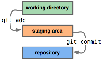
After you’ve made all the changes you want, and you’ve “added” all of your updated files to the staging area, it’s time to make a commit. And with each commit, you want to add a short message describing what the changes are.
git commit -m "finally debugged my own idiocy. maybe..."Now all of your updates are saved in your file respository, and if you want to, you can your snapshot is made. You could very easily stop here and just keep the audit trail on your machine. But the other half of this happy marriage is Github.
##What is Github?
![]()
Github is a social coding site, and it’s a hosted remote repository.
It lets you back up all of your code online (for free if it’s open source), and it lets you see how other developers do it and learn from their work.
Here’s how you do it:
git push -u origin masterYou “push” your code from the “master” branch that’s on your machine to your remote repository on Github, which we call “origin.” (This may have already been configured for you if you cloned your repo from github. Otherwise, you would have to
git remote add origin git@github.com:tommeagher/myrepo.git)
One of the many great things about Github is that you can see the diff in your files without the Matrix hypnosis of command line.
The last couple commands I’ll tell you are how you get your commits from the remote repository on Github back on your machine.
You can use
git fetch originto gather the updated files from your remote “origin” repository. Now you want to “merge” the changes from the master branch on your remote “origin” repository into your master branch on your machine.
git merge origin/masterNow your files are updated from the remote repository. Now keep coding.
If you want more, you can visit the repo for this class, where I have a cheat sheet for the most common basic uses and commands and more in-depth tutorials.
This really just deals with the basics. We haven’t even had a chance to talk about merge problems, branching, forking or cloning, but you know how to Google, so you can figure it out. Fork my repo, improve the cheat sheet and send me a pull request.
What’s your favorite tip or cheat in git? Leave me a comment. I’d love to read it.
Learning to commit to version control was originally published by at Tom Meagher on February 28, 2013.
More tips for using OpenRefine 27 Feb 2013, 3:37 am
At IRE’s computer-assisted reporting conference this week in Louisville, I am once again teaching a course on using OpenRefine to clean data. Although the program has changed names over the last few months, its features are pretty much the same, and it’s still an amazingly powerful and free tool for cleaning and standardizing difficult data. If you ever find yourself frustrated with typos, misspellings or any number of other mistakes in the data you get from government agencies, OpenRefine will change your life.
I won’t repeat verbatim my Refine tutorial, which you can find here, but I will share some of the resources again and point you to a few other tutorials.
First, check out the updated slides for my class. If you’d like to follow along with the class, you can download our data for the lottery winners, the hospital report cards, and the campaign finance data.
If you’re just looking for a good cheat sheet of Refine’s key functions, try this.
If you thought my class was easy, and you’re looking for more help with Refine, I can recommend these tutorials, from Refine creator David Huynh, developer Dan Nguyen and journalism educator Paul Bradshaw.
What’s your favorite use for OpenRefine? Leave a comment here, drop me an email or mention me on Twitter. I’d love to hear what you think.
More tips for using OpenRefine was originally published by at Tom Meagher on February 26, 2013.
Talking data in the Nutmeg State 11 Dec 2012, 5:08 pm
Update: In mid-December, I led two days of training in data journalism techniques for my colleagues at the New Haven Register. On a Thursday evening, I took the Amtrak train home to New Jersey, feeling good about turning a group of journalists on to the power and fun of incorporating data into their reporting.
The next morning, the horrible shooting at Newtown Elementary School threw our world upside-down. Only now, more than two months later, have I been able to take a moment to revisit the rough notes and links I dumped here in December to try to make them a little more useful.
The first class was an overview discussion of “data journalism” and the many and sundry techniques that encompasses. The second class was a hands-on walk-through of Excel and Google Fusion Tables. The handouts and cheatsheets cover nearly all of the tips we discussed. If you have questions, or would like to know more, please leave a comment or send me an email.
Intro to data - slide deck
Handouts:
- Newsroom math overview
- Numbers in the Newsroom by Sarah Cohen by Sarah Cohen
- Newsroom math crib sheet by Steve Doig
Extra reading
- The roots of “precision journalism”
- How Jason Hoppin predicted a close local election
- A video of Ben Welsh’s talk on data journalism. He explains it very well, ”It’s only in journalism that we continue to distinguish ourselves with the use of Microsoft Excel.”
###Hands-on Excel & Fusion Tables class
####Data for Excel exercises
- Schoolsdatav1.xlsx
- 2010-2011hs-prresults.xlsx
- DemographicSnapshotEdited.xlsx
- Appointments.xls
- Crony.xls
- citybud.xls
Let’s do something fun and map the data for a story, using Google’s experimental (and free) Fusion Tables program. We’re going to download a spreadsheet in the CSV format of the violent crime rates for every town in Connecticut.
Go to DataHaven.org Go to indicators>Public safety>Community safety>Violent crimes> total violent crime rate Select all towns and hit the submit button. Click “All years” and hit submit again. Now you can download the CSV, which stands for comma-separated values. It’s essentially a spreadsheet without any of the fancy highlighting or formatting of Excel. It’s a universal format, and when given the option, it’s a good idea to get your data in CSV. Because of its simple structure, it’s easy for a human to read and just about any computer can understand it.
Now, we have our data, but if we want to visualize it, we need a map to put it on. We can get this map from a SHP (pronounced “shape”) file. Luckily, in many states, the government or academic institutions often have a clearing house for this kind of geographic data. In Connecticut, you can find it at the U. Conn. library. Point your browser toward http://magic.lib.uconn.edu/, then look under the “CT GIS” column and click on the “Boundaries” section.
Grab the “Connecticut Towns” shapefile from 2010. Then you have to convert the file to a format that Fusion Tables can use. Luckily, there is a free website called “Shp Escape” that can help. Give it your shp file and log into your Google account and it will automatically transform the file and ship it into your Fusion Tables account. Some times the site can be a little busy, so it may take a few minutes. Be patient.
Now, that you have your map file in Fusion Tables, you need the data you want to visualize. Go to Google Drive, click the “create” button and choose Fusion Table. Choose the “download.csv” file that you got from Data Haven and put this into your Fusion Table. (Notice, Fusion Tables also allows you to import tabular data directly from a Google Spreadsheeet.
Clean up the column headings in the file to make the more meaningful. Now we’re going to merge the data file back to the shape file we already uploaded. Under the “File” dropdown menu, choose “Merge.” Find your Connecticut Towns shape table. And you have to determine which field to join the tables on. What field is the same in both tables? Notice that the “town” field in the crime table matches the “NAME10” field in the shape file. That’s your key to join the tables together. Just be certain that each town name only appears once in that column in each table (in this example, it does).
Once it sends you into Fusion Tables, click the “About this table” link under the File dropdown menu and “edit table information.” Update the name of the table, give it a meaningful description, attribution and a link to the original download. This can help you later to retrace your steps and bulletproof your reporting. It will also help others who look at your work and want to see your primary source material. Click on the “Share” button and make the map public.
We have both tables combined together into one, new, merged table. But if you click on the “Map” tab, it probably still doesn’t look right. We need to style the representation of the data. While you’re on the map tab, go to the “Tools” dropdown and click on “Change Map Styles.” This will allow us to choose how we want to color code the towns based on their crime rate. Instead of points, we want to click on “Fill color” under the “Polygons” section. Points would be if we were color-coding pins on individual addresses. Instead, we want to shade an entire town based on its crime rate, thus we want “polygon.” For the fill color, let’s pick the “buckets” tab, which means we can choose four different colors to represent the range of crime rates in our area. If you want to fancy, you can choose whatever color you want for each bucket. Hit the “save” button. Are all of your towns filled in with a color? (You can ignore the “Southwick Jog”). If not, then you probably haven’t set the range of values for your crime rate to the include all of them. Adjust the high and low ends of your range until none of your towns are blank. This may take some jiggering.
Play with the bucket sizes and colors of the buckets. What makes sense? Is everything in there?
Click on the title to change the attribution and background info for the merged table. Share the merged table and make it public. Then click Tools> Publish. This gives you the embed code for you to put it in your story.
Once you get the hang of this, you can but producing web-ready interactive maps in 20-30 minutes, a task that would have taken hours or days not all that long ago. This is an awesome tool.
There are a few more things that you can tweak, if you like. You can go to Tools>Change info window layout, to tweak the information that’s displayed when you click on a polygon.
And one last tip, you don’t always have to upload your own data or map files. You can go to Help>Search Public Tables and browse through all of the data that other Fusion Tables users have uploaded. Of course, as with all reporting, the caveat is to mindful of the source. Always confirm the information and data with other parties. But if you find a good shapefile, you could use it again and again. It’s definitely worth exploring.
That’s the super fast and dirty introduction to Fusion Tables. Now, go explore it some more on your own. What’s your favorite trick in Fusion Tables? Drop me an email, leave a comment or mention me on Twitter and I’ll add it here.
Tipsheets and tutorials
- Getting around Excel
- Sorting in Excel
- Power formulas in Excel
- Excel filters and pivot tables
- More Fusion Tables tutorials
- Examples of cool uses of Fusion Tables
Talking data in the Nutmeg State was originally published by at Tom Meagher on December 11, 2012.
Not another blinking PDF! 5 Aug 2012, 10:50 am
There are few things more frustrating than trying to get a simple spreadsheet from a government agency and being told by a spokesman that the data (say, a table of property tax rates in municipalities that was clearly created in Excel) only exists in a locked PDF format.
For the sake of expediency, you sometimes just have to bite the bullet and try to wrestle the data free from the PDF’s clutches so that you can gently guide it into a more useful spreadsheet.
It’s not always easy, but here are a few resources to do just that:
Dan Nguyen at ProPublica crafted this very helpful and comprehensive guide to the various strategies for unlocking data from PDFs.
I’ve also had some success using CometDocs, a free site that had a surprisingly high accuracy rate for converting documents on one particularly labor-intensive project.
If you’re not afraid of installing a simple command line program, I’ve also had some luck with PDF2text. Here’s a nice tutorial from IRE (looks like the link may be temporarily broken), as well as a guide to how to automate the conversions and not be bothered by the pesky command line.
I’ve heard good things about the commercial software DeskUnPDF, but I haven’t had an opportunity to use it myself.
When you don’t have the time or patience to negotiate with an agency to give you what you want how you want it, give these solutions a try.
If you have other techniques for culling data from PDFs, please share them.
Good luck!
Not another blinking PDF! was originally published by at Tom Meagher on August 05, 2012.
How to get a head count at the parade 28 Jul 2012, 4:01 pm
This is another in the series of “Best Practices” posts from my archives from the Herald News. This was also written by Jonathan Maslow, and offers some solid street reporting tips for counting the crowd at any large public event.
News reporting often involves telling how many people took part in or attended an event. Sometimes the seating capacity is known, as in the case of a sports stadium. Sometimes an official estimates the crowd size, sometimes the organizers estimate. Sometimes they don’t agree. Sometimes no one estimates.
It’s a good practice for the reporter to do his or her own estimation in all cases.
For inside events, a quick head count with a qualifying “about” is good. (“about 75 people attended the planning board session.”) The tried and true method of estimating crowd size is as follows: 1) make a careful measurement of the area in which the event takes place. Simply put, that’s length times width equals square feet. In some cases, it may take a slightly more sophisticated algorithm (the crowd covers the sidewalks on six blocks. Ask officials how long each block is, walk off the width of sidewalk. Multiply).
2) Decide whether it’s a dense crowd or a loose crowd. People packed into a subway car, for example, are a dense crowd and occupy 2 square feet per person. A loose crowd, such as a parade of journalists on May Day, has one person per five square feet.
3) Divide the area by the crowd density, and you’ve got your estimated crowd. Example: A political rally takes place in the square outside City Hall. You pace it off and find it’s 150 feet long and 100 feet wide, or 15,000 square feet. You wade into the crowd to test the density. Some places toward the front are packed, but in the back it’s loose. You choose a density in between of one person per three square feet. Divide 15,000 by 3 = 5,000 people.
To recap:
area: 150 x 100 = 15,000 estimate of density: 3 sq. feet/per person 15,000 divided by 3 = 5,000 attendees
If AP is covering an event, check your estimate against theirs, which is based on aerial/satellite photography and should be accurate. If yours and theirs are at great odds, dig in your heels and insist the wire services are an ass.
Note: [Then] Passaic County Sherriff’s communications man Bill Maer says the county uses a slight variation:
1) Count how many people are actually in a 10 x 10 foot area (that’s 100 square feet).
2) Measure on foot or get a good estimate of the size of the entire area.
3) divide the total area by 100 (the number of 10 by 10 squares)
4) Multiply the result by how many people are in the sample 10 x 10 foot square.
Personally, I think this adds an unnecessary step, but it does make the reckoning of density a bit more accurate and hence, perhaps, the crowd estimate itself.
- Jonathan Maslow, Herald News, Nov. 2003
How to get a head count at the parade was originally published by at Tom Meagher on July 28, 2012.
Nerds need credit too 22 Jul 2012, 2:57 am
It seems odd in 2012 that in some newsrooms the data journalists don’t get the same kind of credit for their work that other reporters receive. I suppose it’s understandable, if NICAR-L is any indication, because to some of our colleagues data work is a mysterious and opaque contribution to a story and thus they don’t quite know how or when to give us a byline.
This is the policy we used when I was the CAR reporter at the Herald News, and it was heavily modeled (in some parts verbatim) on the one adopted by Rob Gebeloff, then of The Star-Ledger and now at the New York Times. This slightly updated policy also guides us today at The Star-Ledger as we decide when our work merits a byline. It’s a good place for newsrooms to start the conversation about the work of their data people.
- The data journalist is available every day for assistance, large and small, on daily, breaking and enterprise stories. The reporter is here to help locate data. When another reporter or editor asks for a quick fact here or there (such as a basic Census figure), no credit is necessary. It’s part of the job.
- Many times, the quick fact search turns into an analysis of data. When this analysis produces “proprietary information” that supports a story, the data journalist should receive a tagline on the story. For example, a colleague wants a complete breakdown of Census data for a particular neighborhood—a task that would require the reporter to assemble the data piecemeal from several tables or sources—this would create proprietary information unique to our news gathering. If this information is even just a few paragraphs of the story, a tagline is appropriate.
- If the data journalist does a significant analysis of data that creates proprietary information that becomes the thesis of a story, he or she will receive a byline. Even if the data journalist does not write another word in the published piece, his or her reporting forms the basis of a story and thus warrants a byline.
For example, the journalist analyzes a new set of data released by a government agency and finds that homeowners in suburban Passaic County are scooping up flood insurance hand over fist. The reporter assembles the analyzed data and passes it on to the real estate reporter who finds additional sources for quotes and writes the story. The nut graf of the story should say “a Herald News analysis of TK data has found…” and the data journalist shares the byline with the other reporter.
-Tom Meagher, Herald News, July 2006, via Rob Gebeloff at The Star-Ledger
Nerds need credit too was originally published by at Tom Meagher on July 21, 2012.
Waking from an election results nightmare 1 Jul 2012, 3:14 am
Sometimes, especially after a particularly trying election night, it starts to feel like we may be suffering from post-polls PTSD.
For the past year and a half, we’ve been experimenting at The Star-Ledger with ways to improve how we report election results online and in print. In many elections, we’ll have hundreds of races spread across a dozen counties. And none of the officials overseeing those elections provides a useful electronic feed of results.
We’ve tried off-the-shelf products to input election data into tables with disastrous, near-comical results. Without a single developer in our newsroom, we’ve cobbled together solutions and written hundreds of lines of code to reverse engineer our hand-collected data and take it from our website into our print pagination system. For something that’s over in just a few hours, we invest an incredible amount of time and effort into getting it right, often without being really satisfied with the product.
All of that struggle has led us here, to our proposal for the Knight Foundation’s News Innovation Challenge for a project we’re calling VOTER.
VOTER is a browser-based program that will help organizations streamline the collection of election results and create embeddable online graphics that will work on any website, especially the common blogging platforms that power many news operations. It is still very early in the development process, but we’re excited about the News Challenge and even more psyched about the possibility that we can turn our trauma into something that will save newsrooms everywhere a whole lot of heartache.
What do you think? We’d love to hear your experiences, both good and bad, from the election nights you’ve covered. What’s worked for you to get results online and what hasn’t? Leave a comment here or tweet at me. And, most importantly, tell us what VOTER will need to do to make it useful for your organization.
Waking from an election results nightmare was originally published by at Tom Meagher on June 30, 2012.
Bolstering transparency in our reporting 24 Jun 2012, 3:55 pm
Back at the Herald News, several of the editors and reporters wrote a regular series of columns for the newsroom called “Best Practices.” In digging through my archives, I’ve found several that are timeless that I will gradually repost. This first one was written by Jonathan Maslow, and his tips for being transparent in our reporting and writing continue to ring true.
Our credibility as journalists and as a newspaper is the most important equity we have in the marketplace of ideas. The more readers trust us, the better our performance. We have to earn that trust every single day. One of the most important ways to do this is leveling with our readers: telling them what we know, how we know it, what we don’t know, why we don’t know it and what’s what. In practice this entails the highest degree of transparency possible in our publication. Work toward greater transparency:
1) Don’t use hearsay. Don’t describe things you didn’t see, but rather attribute it to a firsthand witness and tell the reader who that witness was. If you are writing about a public meeting you did not attend, be aware that readers must not be given a false impression. You don’t need to say you weren’t there. But you can’t report things as if you were there.
2) Don’t just use the boilerplate “sources said,” but give the reader as much information as you can without breaching trust, for example: “two sources in the AG’s office familiar with the case,” or “a high official in the department who asked her name not be used because she feared political retribution.”
3) Don’t just use the cliche “the mayor could not be reached for comment.” Use instead: “the mayor did not return repeated phone calls for comment over a three-day period, although City Hall said he was not on vacation or out of town on business.”
4) As you know, we sometimes have problems getting information from police on weekends. Don’t just let this go with “police did not release information.” Tell the readers, e.g., “Sgt. Troy Anthony said he could not release any information about the incident, because Mayor Sammy Torres, who is also acting public safety director, has told the police department that all news releases must go through his office. The mayor did not return five phone calls Sunday.”
Transparency is a habit, a muscle. Flex it and it gets stronger. And your work gets more accurate, better, more useful to readers.
- Jonathan Maslow, Herald News, June, 2004
Bolstering transparency in our reporting was originally published by at Tom Meagher on June 24, 2012.
Clean data is the best weapon against the monkey insurrection 15 Jun 2012, 4:06 am
Updated: I added the link to the rough cheat sheet of handy and common Refine tasks at http://bit.ly/ire12refinecheats. Send me your favorite tricks to add to the list!
This is a rough walkthrough of the class I’m teaching at the 2012 IRE conference in Boston on how to use Google Refine to clean data. If you’d like to see them, these are the slides from the session, http://bit.ly/ire12refineslides. Please forgive the weird line returns of WordPress. If you hit any hiccups or have suggestions for improvement, please leave a comment or mention me on Twitter @ultracasual.
You’re faced with a dilemma that’s fairly common in many newsrooms.
Say, for example, a series of accidents kills a number of children crossing busy streets near you. Now, you want to know the deadliest roads or intersections in your area (this is not the dilemma, just wait for it).

We always say in the news business to check it out, and we shouldn’t trust anecdote and the frailty of human memory. So where do you go?
Does this guy, right, look like he has an encyclopedic knowledge of every fatal accident in your five-county coverage area?
File a public records request and get the data. It should have the answer you need, right? You pick up your CD with the data, or if you’re really lucky, the state police will have a file you can download from their website. You expect to get a tidy Excel spreadsheet with very orderly numbers on it. Everything will be geocoded, and you’ll just need to do one quick pivot table or one quick group-by query and drop it into Fusion Tables and BAM! you’re done with your story. It writes itself, right?

You laugh, but this is what I spent years believing, and every time I was–and continue to be–flabbergasted by the sloppiness of the public data I get my hands on.
When I worked on the dangerous intersections story, I got something that looked like this:
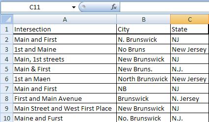
(This is a dramatization)
As David Donald said in his CAR panel yesterday, cleaning is the longest and hardest part of the data process. Assume any data you get is dirty and full of holes.
Government data is hardly unique in this respect, but it is our bread and butter, and frankly we should expect better from the government, so I’ll pick on it today.
Why is so much public data such a mess?
-
Much like journalists, government agencies are not nearly as good with numbers as they ought to be.
-
When databases exist, they are often built on things never intended to be turned into relational data, like hand-written accident reports.
-
Many agencies seem to subscribe to the infinite monkey theorem.

For anyone unfamiliar with it, the infinite monkey theorem more or less says that given an infinite amount of time and an infinite number of monkeys with typewriters, eventually the monkeys will write the complete works of Shakespeare or “A Tale of Two Cities.”
When you work with a lot of public data, this is what feels like. Occasionally there’s something correct, but before you find it, you have to wade through what seems like a near-infinite number of errors. I’m not suggesting that government employees are primates, but I am pretty certain that they’re outsourcing their data entry to monkeys… and it gets worse.
Because these monkeys are not geniuses.

They are enemies of good data.
These monkeys are mean, and they hate puppies and clean data (and water). To be fair, in my completely unscientific survey, the data has gotten better in the past decade, but it’s not where it should be.
Every data entry mistake possible will be made. Often you fill find new mistakes that you never, ever would have considered or imagined in your wildest dreams.
These clerical errors will make your life miserable. You can either welcome our new monkey overlords or you can arm yourself.
The old tools
-
Excel: filters, pivot tables, string functions
-
Access: Group by queries
-
Notepad++: Regular expressions
-
Scripting language for automated, repetitive cleaning
With these, the cleaning of the database could take days or weeks or longer.
Now you can do it with Google Refine in a few hours or less.
![]()
It can take that crap and turn it into a diamond.
What is Refine good at?
-
Transforming data, either on individual cells or whole columns at a time
-
Clustering data to find similar values that repeat for exploration and cleaning
-
And many, many other tasks.
Refine does a lot of really amazing things, and this class will give you just a tiny taste. It can help high-level programmers with repetitive tasks, and it has its own expression language for accessing and scrubbing data. But it is also a great tool for the less technical set. If you’re comfortable with Microsoft Excel, you should be right at home with Refine. You don’t have to be a comp sci PhD to love it.
The two big areas we’re going to concentrate on today are clustering data and transforming it
So let’s get started. Here are instructions to install Refine on your computer.
We’ll start with a dataset of lottery winners from New Jersey. Say you want to know what areas spend the most on lottery tickets but win the least.
Download the lottery dataset here.
Refine runs through your web browser, but don’t worry, it works offline as well.
You can import a table file in many formats, either from your computer, from Google Docs or from a URL for a file on the web. Once you have Refine running, click “Create Project.”
You’ll see a preview of what the data looks like. When you pull in the CSV of lottery data, make sure to uncheck the “Parse cell data…” option.
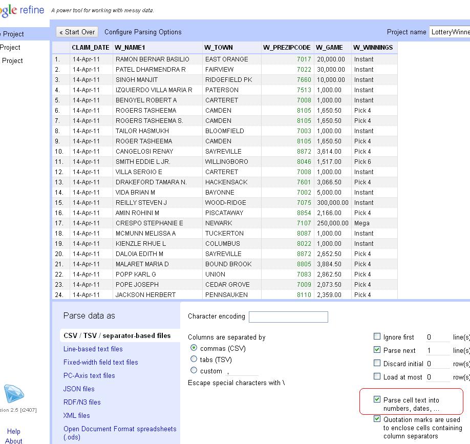
New Jersey zip codes start with zero. If Refine guesses that column is a number, it will drop the leading zero, so unchecking the option will preserve the zips as text.
With this data, we’re going to use Refine to clean up the W_TOWN column to standardize the names of municipalities. But we never want to work with the raw data, so let’s copy the column that we’ll actually transform into something usable. So click on the arrow at the top of the W_TOWN column and choose the Edit Column>Add column based on this column option.
Enter a name for the new column. We’ll use “TOWN.” Original, I know.
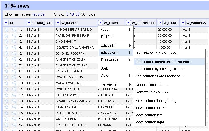
Now, initially Refine will only display 10 rows, but there are 3,100 in this dataset, so let’s look at a for more. Click the number 50 next to “Show as” to see more.
In Excel, one of the first things you’d do with a dataset is sort it. So click on the arrow at the top of the TOWN column and choose “Sort” from the options. Now, you can filter out just a few records. Click on the arrow and choose “Text Filter” from the options. You’ll see a box pop up in the left column. Type in Atlantic and see how it plucks out only the towns with “Atlantic” in the name: Atlantic City, Atlantic Highlands, Atlantic High and West Atlantic City. As you might guess, not all of these are real towns.
Let’s lose the filter. Click on the X in the upper left corner of the filter box. Now, we’re going to add a Facet> Text facet. Dan Nguyen at ProPublica calls Refine’s faceting “the better way to filter.” He’s totally right.
The facet will create a box in the left column with the total number of choices and a list of all the possible choices in this column and the number of each. You’ll see there are 608 options. At the top is “ABERDEEN” with 3 occurrences. Scroll to the bottom and click on “Facet by choice counts.” This will create another box that will let you display only the choices that occur a certain number of times. It shows the range of values in a column and helps you to spot anomalies or outliers. For instance, if you move the boundaries to only show the choices with between 120 and 140 uses, you’ll only see “JERSEY CITY” and “NEWARK” rows. Close the “Facet by choice counts” box.
Scroll through the text facet box a little ways into the Bs. See the option for “BELEE MEAD”? It has one occurrence. Notice that two lines later appears “BELLE MEAD,” the actual name of the town. If you hover over “BELEE MEAD,” you will see the option to “edit” appear to the right. Click on that and then fix the spelling of the name in the box that appears. Notice that the choice count drops to 607.
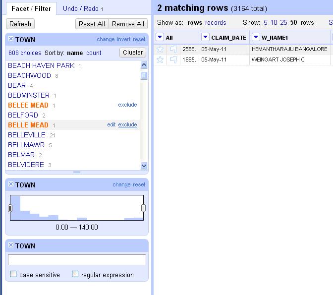
Let’s look at another way to clean data. Scroll down a few more lines. Notice that there are two lines in a row for “BERKELEY HEIGHTS.” They’re spelled the same, so why are they listed separately? Because one of them has an extra space at the end of it that screws up the grouping. This is the kind of thing that back in the bad old days would make you throw your PC out the window two weeks into a data project. Instead, let’s get rid of all the extra, invisible spaces. Click at the top of the TOWN column, edit cells> common transforms> Trim leading and trailing whitespace. Notice again how the choice count dropped. We’re down to 573 town names now. We’re getting there.
So you could spend hours scrolling through and eyeballing similar names and editing them by hand using these methods, or we could unleash the real power of Refine: clustering.
Click on the “Cluster” button in the facet box. Click it and you’ll see something like this. The default method is “key collision.” That should only show a couple of options. Try changing it to “nearest neighbor.” I can’t exactly explain the algorithm behind it, but it’s obvious that it finds town names with similar names that should probably have the same name. You see similar sets like “POMPTON LAKES” and “POMPTON LAKE” or “E. ORANGE,” “E ORANGE” and “E.ORANGE.” Click the “merge” button next to each grouping and type the name you want them all to be changed to in the “New Cell Value” column and hit the “Merge selected and recluster” button at the bottom. You’ve just cleaned those messy columns to a single value.
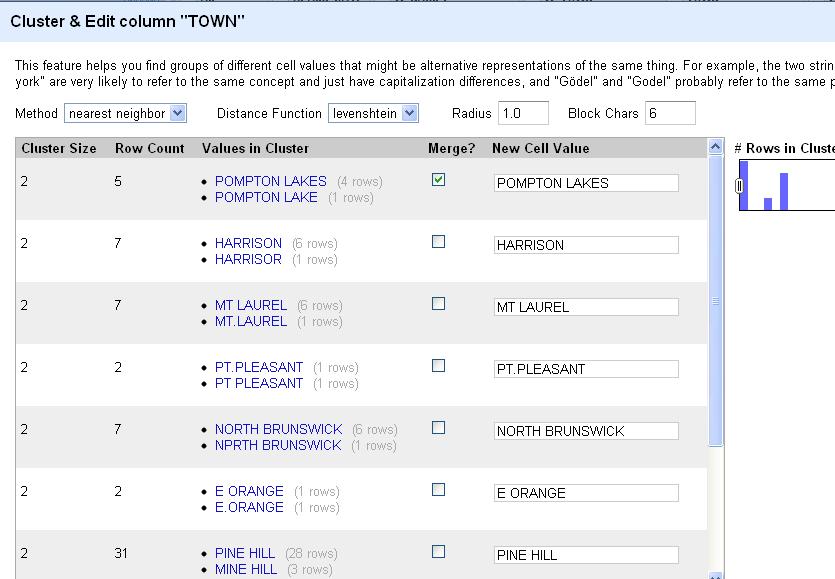
Scroll through the list, reclustering and editing whole chunks at a time. This is a huge time saver. When you’re done with the “nearest neighbor” clusters, experiment with “key collision” and see if it picks up any other similar names.
Now, keep in mind that to get this right, you’ll have to do some additional reporting. You’ll need to be certain that “NORTH BRUNSWICK” and “NPRTH BRUNSWICK” are indeed the same place and not separate values as they came to you. If you’re confident in your reporting, Refine makes the data cleaning easy.
When you’re satisfied that you’re done, click on “Export” on the upper right corner. You can output the file as html, TSV, CSV, Excel or any number of formats. Pull it into your favorite spreadsheet program and run your analysis. Then run it all again to make sure you got it right. To be certain, start from scratch and triple-check it.
As cool as this is, Refine has a few more tricks for the beginner. Let’s look at this file of NJ hospital report cards.
Create a new project and import it into Refine.
Anything look weird? How about that first column. Seems like it includes information we’d probably want to split into several columns. In Excel you’d do this with a series of nested functions. In Refine, we can do it with a single click. At the top of the “Hospital” column, choose the drop-down menu and Edit column>Split into several columns…
When the wizard menu pops up, choose a semicolon as the separator and uncheck “remove this column,” because we always want to be compare against our original data, right?
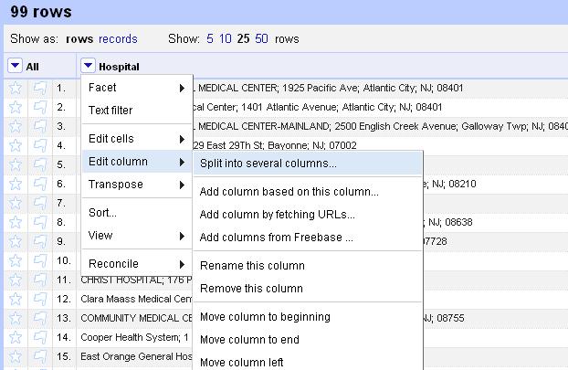
So this looks better, with the name, street, town, state and zip code in separate columns. But something isn’t quite right. What about the zip code? Why is it only four digits? Oh yeah, New Jersey zip codes start with zeroes. Refine assumed that column was an integer and lopped off the zero at the front.
Another great feature of Refine is that it logs everything you do with the dataset. When you make a mistake or you want track back through your work, click on the “Undo/Redo” tab at the top of the left column and you can tiptoe back through your process.
Look at the list and click on the item at the top, “0. Create project” to jump back to that step.
Now, redo the “Split into several columns…” step and this time uncheck “Guess cell type” to preserve the zips as text.
Be sure to make note of the undo option at the top of the screen. You can move a single step back at any time by clicking on this, much like the undo prompt that appears in Gmail after you archive or delete a message.
Finally, notice that the names of the hospital are inconsistent. Some are all uppercase. Others are only upper-cased. Let’s standardize them.
Click on the arrow at the top of the Hospital column and choose Edit cells> Common transforms > To titlecase.
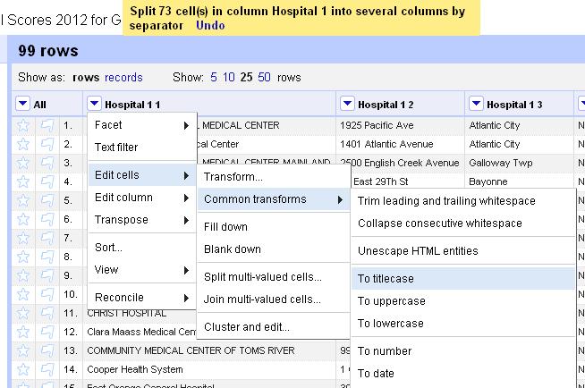
Voila. A cleaned dataset. You’re welcome.
Let’s try one last dataset, this one looking at contributions from Nassau County, N.Y. police unions to political candidates.
Import the data into Refine and let’s start by trying to clean up the town names.
Add a text facet to the City column. Click Edit cells> Common transforms> trim leading and trailing whitespace
See the count change from 240 to 238.
Now, let’s cluster the city names to see if we can consolidate any entries.
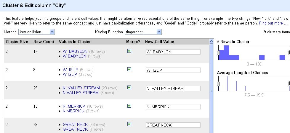
How do you see the count change in the city column?
Now, let’s turn our attention to the Name column. For this exercise, let’s start by adding a filter on the city and just looking at “Albany.” You can also do this by clicking on Albany in the text facet box.
Keep in mind that any changes we make from here on out will only affect the “Albany” subset of the data until we clear this filter (or facet). Now, add a text facet to the “Name” column. Browse the first few entries. Notice there are a lot of very, very similar names here.
For the sake of argument, let’s say we’re interested in looking at how much Sen. Joe Bruno got from Nassau police groups. There appear to be 10 groups here with similar names receiving donations for Bruno. Seems like a good chance that many of these are the same organization. For the sake of argument, let’s say your reporting shows that yes, these are the same group and we want them to all have the same name for our analysis. Hover your cursor over each one and when the option to “include” appears on the right, click it. Once you’ve “included” them all, click the cluster button.
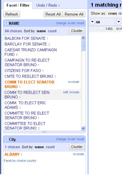
This will attempt to cluster the choices just in this selection to offer suggestions on names that could b the same. Change the method to “nearest neighbor” and the distance function to “PPM.” If you merge all of the offered suggestions under the same name, it will condense six of the 10 choices into one name. Then you can merge and re-cluster. Once you clean up all the suggestions, you can browse the data in the facet one last time and clean up any stragglers individually as needed. Believe it or not, Refine has just saved you a massive amount of time and energy.
What did we learn here today?
Refine is a huge time saver and allows you to do commonly tedious data cleaning tasks with a few clicks of the mouse. We saw how to:
- Import and export data.
- Copy and edit columns, trimming whitespaces or changing the capitalization.
- Use facets to filter and edit data
- Cluster a column to standardize spellings and entries.
This has been a whirlwind sprint through this program, but hopefully it’s given you a taste of what it can do.
In an ideal world, we’d get all of our data handed to us perfectly clean in easy to access, user-friendly, real time feeds that make for simple analysis and display.
But until then, we’re going to have to wrestle with the murky and messy datasets produced by those infinite monkeys making an infinite number of mistakes. Use Refine as your new big gun and never give up the fight.
And remember, if you let the monkeys who enter data into government spreadsheets win, this is where it will lead.

They’ll make a monkey out of you too.
Finally, if you want to keep messing with Refine, here are a pair of tutorials that put it much better than I can.
David Huynh, Refine’s creator: http://davidhuynh.net/spaces/nicar2011/tutorial.pdf
Dan Nguyen of ProPublica: http://dannguyen.github.com/NICAR-Google-Refine/
Good luck!
Tip of the hat to Liz Day of ProPublica for demanding more Simpsons and suggesting I add Troy McClure’s star turn in “Stop the Planet of the Apes, I want to get off!”
Clean data is the best weapon against the monkey insurrection was originally published by at Tom Meagher on June 15, 2012.
Checklist to bulletproof your data work 3 Jun 2012, 2:30 pm
Updated on 6/23: I’ve included, marked by an asterisk, several fantastic checklist suggestions offered by David Donald at the IRE ‘12 conference in Boston.
Much like surgeons, journalists who work with data can always use help ensuring they’re getting things right. I compiled this checklist of questions I ask myself whenever I work with a data set. It’s evolved into a tool that The Star-Ledger data team uses on every story we write.
- Where did the data come from?
- Who created it? Is this the best source for this data? What was the methodology behind its collection?
- What documentation came with it?
- Did you read the documentation?
- Is there a record layout or data dictionary?
- Did you save an original copy of the database if you need to retrace your steps?
- Are your field headings accurate? Do you have the columns labeled correctly?
- Are you looking at the correct tab? Is there additional data in other tabs in the worksheet?
- How many records are in your table or database? How many should be there? Are there any missing? Too many? Any chance you maxed out the number of fields the software can handle?
- Are there duplicates in the records? *
- Examine each column of data one at a time. Is it formatted in the appropriate manner? Are there any gaps in the column? Are any data missing?
- Have names and entities been cleaned and standardized? *
- Check the aggregation. How was it done? *
- When joining tables, are you certain the join worked? How many records are there now? Too many? Not enough?
- When pasting tables with common columns side-by-side in Excel, do they line up? Any chance two records might be switched?
- What calculation are you trying to do? Are you using the appropriate formula or function for this task?
- Do your cell/column references in functions point to the right places? Are any columns transposed? Can you trace the formula’s path? Have you pasted the correct formula all the way down the column to the bottom of the table?
- When sorting, did you sort the entire table together and not omit any columns?
- When pasting, is it a good idea to Paste Special>Values to strip out any pesky underlying formulas that may become misdirected?
- When moving columns, were there any $ anchors that you pasted that now point to the wrong column or row of data and throw off your calculations?
- Does your calculation make sense?
- Are you looking at outliers or values in the middle of the pack? *
- Is there an expert–either an agency data guru or academic–who has vetted your process or calculations?
- Have you verified your records against the original records or a sample thereof? *
- Have you spot-checked individual records to ensure the numbers match up? Did you ask a colleague to assist by reading off numbers to be CQ’d?
- Have you asked an uninvolved colleague to look at your process, review the numbers and poke holes in the methodology?
- Can you reproduce your calculations from the beginning or explain step-by-step how you arrived at your conclusion?
- What numbers are you using in the story? Have you circled them and reviewed them in the database? Is the description of the numbers accurate? Does it omit any pertinent details that might mislead an unwary reader?
- Are the numbers here based on counting, estimates, projections or guesses? *
- Are there any graphics with the story? Have you checked them? Can you verify every number? Are the introduction and column heads accurate? Are there numbers missing from the graphic that are important to the story?
- Is there a methodology/nerd box to run with the story? *
- How did you get here, and does it make sense?
Print a copy of the checklist.
How do you bulletproof your data work? At the 2012 NICAR conference in St. Louis, Tom Johnson and Cheryl Phillips led a seminar discussing their tips for validating data. I’d really like to hear any advice or ideas you’re willing to share. Leave a comment here with your techniques or tweet at me.
A * indicates questions added after hearing David Donald speak about bulletproofing CAR work at IRE ‘12 in Boston.
Checklist to bulletproof your data work was originally published by at Tom Meagher on June 03, 2012.
Help Wanted 24 Jun 2011, 7:12 pm
We have a job opening up on our CAR team here at The Star-Ledger.
I’m not even going to try to compete with Matt Doig’s hilarious and infamous job post, but I will preface this by saying the Ledger is a very good place to work.
We’ve got great journalists here who make a habit of exposing the mind-boggling arrogance, greed, incompetence and corruption of the Garden State’s public officials. One of our colleagues just won a Pulitzer in feature writing for her investigation of the sinking of a small fishing vessel that killed six men. We’re led by top-notch editors who care about writing and about watchdog journalism that gets results. My (relatively) new team is starting to do some cool work, and we have an ambitious agenda for the year ahead.
I’m looking for strong candidates soon. Please pass this along to anyone you think might be qualified. Here’s the job description:
The Star-Ledger is looking for a journalist to fill an entry-level position on its computer-assisted reporting team. The reporter will be responsible for acquiring and analyzing public records and data to support enterprise stories for print and online. He or she should be comfortable filing public records and freedom of information requests with agencies at the local, state and federal levels. The reporter will also contribute to the redesign and maintenance of NJ By The Numbers, our home for databases and statistics vital to New Jersey readers.
Qualifications: A background in local or investigative reporting for a daily news outlet and an affinity for math, web development and programming. Ability to identify and mine public databases for stories large and small and to build and manage relational databases. Experience displaying data graphically in print and online to engage readers.
Proficiency with Microsoft Excel and Access, SQL, HTML and CSS, ESRI ArcView and Google Maps. Bonus points for candidates who have experience or interest in scraping, scripting, frameworks (Django, Rails, ASP.Net) or statistical analysis with SPSS, SAS or R.
If you’re interested, send me a cover letter, resume and clips to my work email, tmeagher(at)starledger(dot)com.
Help Wanted was originally published by at Tom Meagher on June 24, 2011.
Hacks, Cops and the Internet 20 May 2011, 3:50 pm
About six months ago now, I started a new job, taking over as The Star-Ledger’s Computer-Assisted Reporting Editor. For anyone who follows me on Twitter, this may help explain why many of my online comments lately have dealt with statistics, data visualizations and programming.
In a slight departure from my day-to-day role working with numbers, I was asked to fill in for one of my bosses at a symposium hosted by John Jay College’s Center on Media, Crime and Justice. The round table discussion brought together police and journalists from across New Jersey to talk about working together and how using social media tools can help all of us do our jobs.
It was an interesting day to say the least. I sat in a room with 45 cops, reporters and editors who often have an adversarial relationship. I met cops who my reporters have been interviewing for years, as well as competitors whose bylines I knew well. It was refreshing to step out of the daily grind for a few hours and talk about our shared frustrations and how we can do things better, particularly with the explosion of social media tools at our fingertips.
After the jump, some of my prepared remarks, without the slight diversions I took when I delivered them.
What the public and the news media want from the police on the internet
1) Speed. Like news organizations and police departments everywhere, we have seen our resources dwindle. At the same time, competition has grown exponentially. We want the information fast. We want to know what’s happening before it happens and then we want to be able to alert our readers.
It can buy police departments time. If you get a tweet out quickly to alert the public or confirm or deny an event, then you can avoid calls from dozens of media outlets hounding you in the short term. It’ll give you breathing room to gather the facts on the investigation before responding to follow-up questions or releasing more details. We know the scanner chatter is often wrong, but often we can’t afford not to chase a story unless the police confirm that it’s wrong.
A tweet is a starting point. It can be a great way to immediately alert a lot of people to a major news issue (a high-profile arrest) or a public safety or infrastructure concern (tunnel closing, fire or tornado). But there needs to be….
2) Interaction. The nature of the internet has changed communication. It is not a one-way platform. For it to have any relevance, you have to interact.
People will come to you looking for answers. if you don’t provide them, lots of other people on the internet will try to fill in the gaps, often with misinformation. A tweet from a passerby that says something like, “I drove by a fire on Main St., and it looks like a plane hit a house. It’s carnage everywhere.” could have just been a small kitchen fire that sent lots of smoke into a residential street. There is no replacement for an investigation from the authorities.
This will inevitably raise a number of questions in departments large and small: Who is in charge of the Twitter feed? Who is empowered to post on it? Is there a policy for replying to tweets or Facebook comments? It can be time consuming to keep up to date. But a social media presence isn’t particularly useful as simply an archive of static press releases. (As I learned at the event, the International Association of Chiefs of Police Center on Social Media has drafted a model policy for law enforcement agencies on how to adopt social media tools).
Being on the internet has to be faster than telling reporters that they have to wait three days to talk to the designated PIO about a homicide (which we hear far more often than one would expect). And posting a single statement online isn’t sufficient. It’s a good place to start so we know what kind of story we’re dealing with, but we need to be able to follow up. We need to be able to ask questions to clarify statements and probe for more detail. You don’t have to answer all of the questions, but we need to be able to ask them.
We don’t want to ever have to attribute information to an agency’s website or Twitter feed. We use these as planning tools. Then we want to confirm the information with a real person in the department to make sure we got it right.
And the police can use these social media platforms to their advantage. The LAPD used Twitter to seek information in a hit and run of a valet at a restaurant, for instance. They later arrested an elderly man in the case, although it’s not clear if the tip that led to his arrest came from a Twitter user.
The NJ State Police has used Twitter to dispel rumors and bad information from scanner reports about a plane crash in South Jersey or SEALs training in the Delaware River. They’ve also used it to get out initial information on fatal accidents and crimes before being bombarded by reporters.
3) The internet is just a tool. If your department or PIO refuses to share public information with the public, then there’s no point in being online. You have to have information that people want for it to be worthwhile. Posting about park closures or issues of minor significance are not good enough. Users on social media, particularly Twitter and Facebook are voracious news consumers. They want substance and lots of it. If you’re not answering phone calls from reporters who need information, there’s no reason you’d do it online.
The benefit of encouraging an air of transparency in your department however is that it can help demystify the process of police work and humanize law enforcement officers.
4) Facebook and Twitter can also be investigative tools. When we background a subject of a story, a crime or otherwise, these sites are among the first things we look at.
In several cases in New Jersey lately, it’s been a key component of criminal charges against young people. In the Tyler Clementi case, his former roommate is charged with trying to doctor his Twitter account to remove incriminating information. In the case of a group of Old Bridge teens accused of beating a man to death, they allegedly held extensive conversations on Facebook about the night in question and the beating.
And it helps us track people down, like the Hoboken woman who shot the amazing picture of the Space Shuttle from the window of her airplane. We found her on Facebook.
My talk went well, although it was a bit disconcerting to notice that one of my fellow panelists, Capt. Mike Parker of the Los Angeles County Sheriff’s Department, was looking up my resume on his laptop as I spoke. Even though I post all these things to the whole world on the internet, it’s easy to forget sometimes that anyone actually looks at it.
The rest of the day’s discussions offered a good opportunity to see some of these sources in a less-heated environment and learn from the other attendees and panelists (including Ted Gest of Criminal Justice Journalists and Nancy Kolb of the International Association of Chiefs of Police) about some of the resources we all have at our fingertips. I found out about The Crime Report, put together by Criminal Justice Journalists and The Center on Media, Crime and Justice. I also heard about IACP’s handy directory of police agencies with a presence on social media.
Probably the best reminder I heard all day though came from one of the other panelists, Capt. Jeff Paul, public information officer for the Morris County Prosecutor’s Office. He bristled at receiving calls from reporters asking for information, in some cases demanding answers, without ever coming to introduce themselves to him.
Even with all of this magic from the interwebs to help us communicate faster and easier, there really is no replacement for building a personal relationship, face-to-face, with a police source, before you’re on deadline in the middle of a catastrophe.
Leave a comment below or follow me on Twitter @ultracasual and tell me about your experience working with police or journalists on social media networks.
Hacks, Cops and the Internet was originally published by at Tom Meagher on May 20, 2011.